Invoice - Automated Billing Landing Page Template
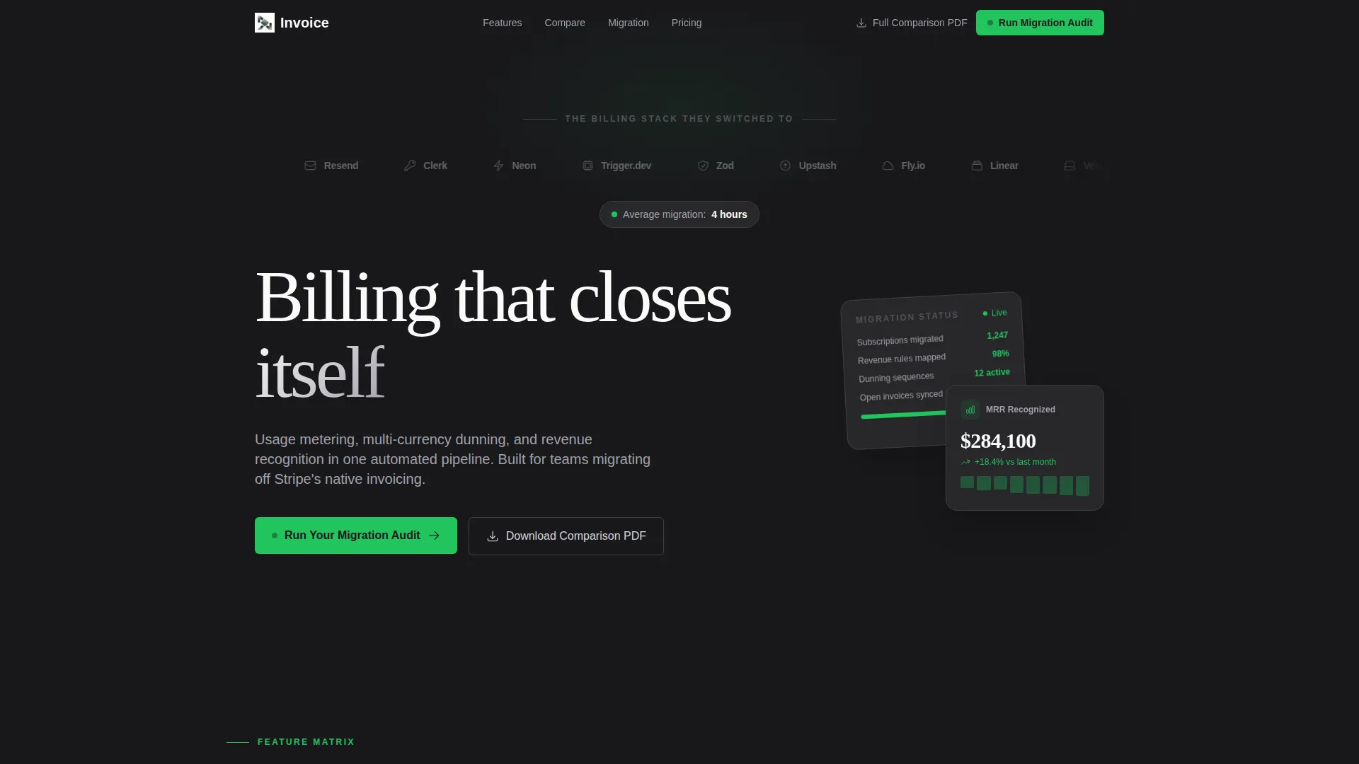
This SaaS billing and invoicing landing page template is built for teams ready to replace fragmented billing tools with a single automated pipeline. It uses a card-grid feature matrix layout, a monochrome steel visual identity, and a comparison-first conversion flow. The primary call to action, "Run Your Migration Audit," appears in the nav and repeats after every third comparison row.
by Rocket studio
Quick summary
A focused, evidence-led landing page for a SaaS billing and invoicing platform. The template uses a card-grid feature matrix to compare capabilities row by row against competing tools. A pinned navigation call to action and a gated PDF download create two clear conversion paths. The design is monochrome steel with a single signal-green accent reserved for action states.
Who this template is for
This template is built for technical and operational founders who have outgrown their current billing setup. It speaks directly to the people most likely to run a migration audit.
- Series A CTOs moving off a basic billing provider toward a purpose-built invoicing platform
- Finance operations leads currently stitching together spreadsheets and automation tools to manage recurring charges
- Bootstrapped SaaS founders who have just hit the compliance requirements of their first enterprise contract
What problem this template solves
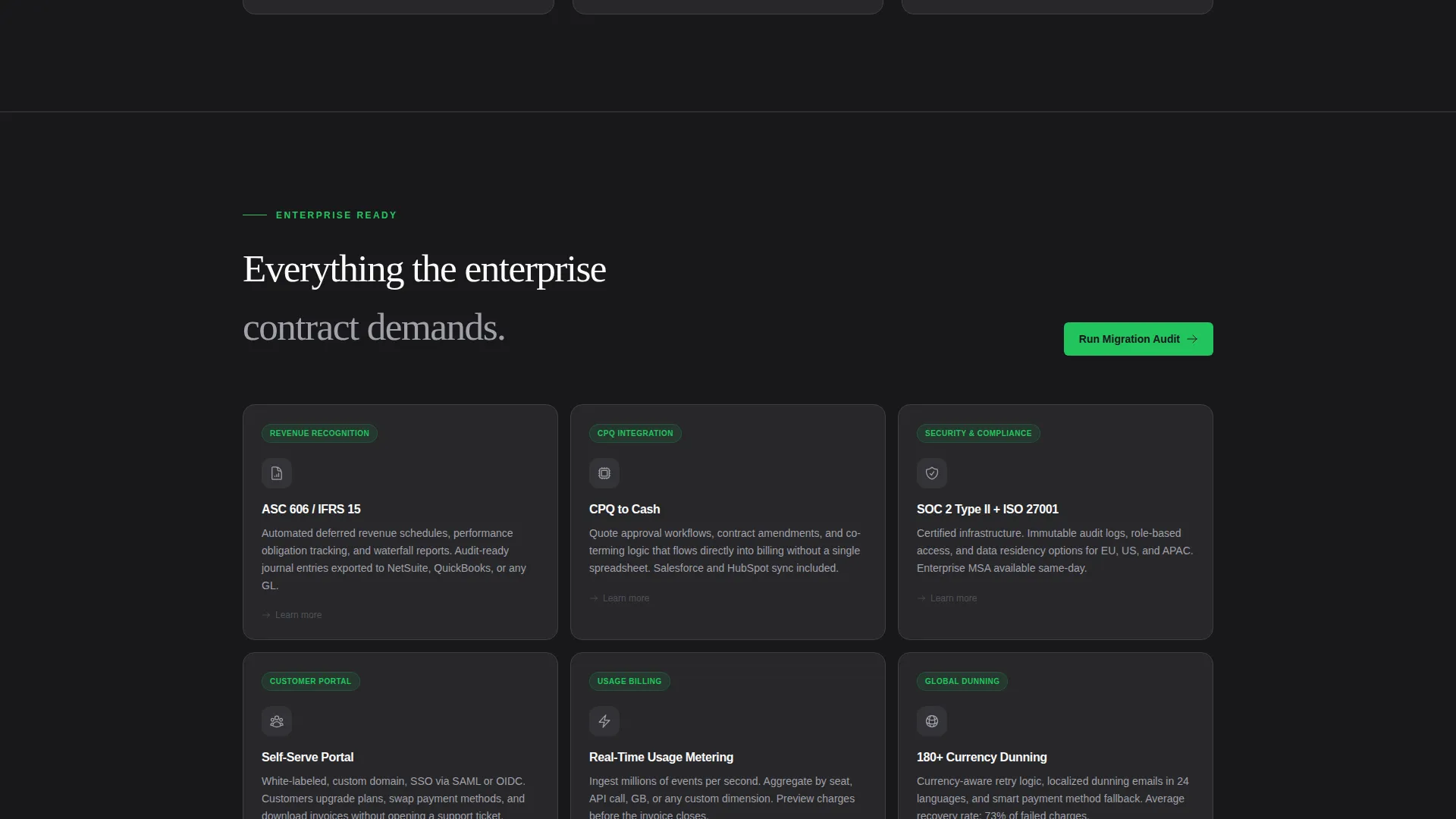
Many SaaS teams reach a point where their billing stack stops scaling. The native invoicing tools they started with cannot handle usage-based metering, multi-currency dunning, or enterprise revenue recognition without heavy manual work. This template gives that audience a landing page that names the problem clearly and presents the solution through structured evidence.
- Visitors arrive already skeptical, so the page replaces persuasion copy with direct capability comparisons
- Teams evaluating multiple billing platforms need a fast, clear way to see where gaps exist across competing tools
- Founders who have already done informal research need a final resource that confirms their thinking and prompts action
What you get with this template
The template delivers a complete single-page layout structured around a feature matrix comparison flow. Every section works together to move a technically minded visitor from first impression to conversion without relying on marketing narrative.
- A scrolling logo bar header with a single-line headline and a migration time subhead
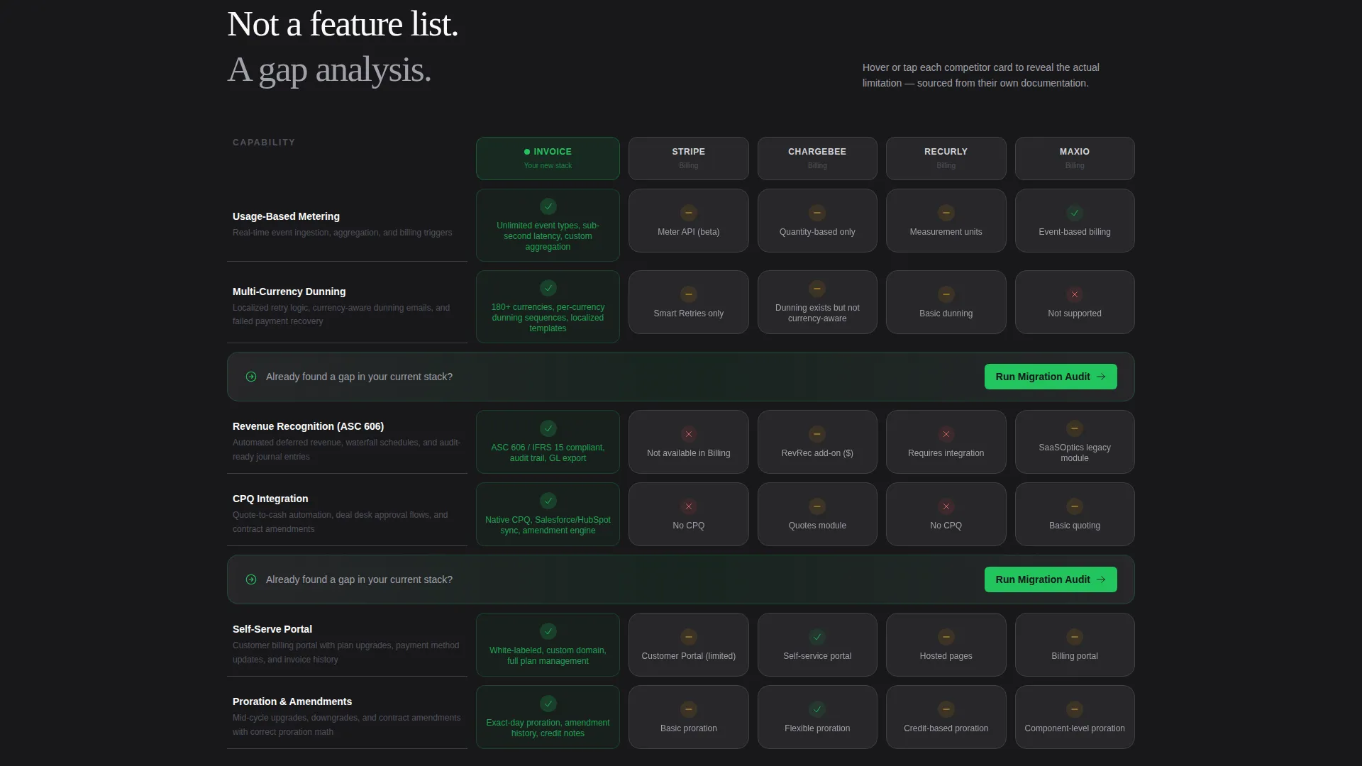
- A modular card grid where each card represents a competing billing tool and expands on hover to reveal documented limitations
- Two conversion paths: a two-field migration audit form and a gated PDF download, each capturing leads at different stages of intent
Feature list
This section covers the core built-in components and interaction patterns included in the template.
Scrolling Logo Bar Header
The header opens with a horizontal ribbon of recognizable SaaS company logos scrolling at a slow, confident pace. A single-line headline sits above the ribbon. A polished chrome subhead below states the average migration time as a concrete switching cost indicator.
Modular Comparison Card Grid
Each card in the grid represents a competing billing tool placed side by side with the platform across rows of specific capabilities. Cards flip or expand on hover to reveal documented limitations pulled from each competitor's own materials. The grid covers usage-based metering, multi-currency dunning, revenue recognition, CPQ integration, and self-serve portal functionality.
Pinned Navigation Call to Action
The primary call to action, "Run Your Migration Audit," is pinned in the navigation bar so it remains visible throughout the entire scroll. It also repeats inline after every third comparison row, reinforcing the next step at each natural decision point.
Two-Field Migration Audit Form
Clicking the primary call to action opens a focused form with two fields: company email and current billing provider selected from a dropdown. The minimal form reduces friction for high-intent visitors who are ready to start a migration conversation.
Gated PDF Download Path
A secondary conversion path offers a full comparison document gated behind an email field only. This captures visitors who are still in the research phase but willing to read a detailed resource. The two-path structure means the page works for both ready-to-act and still-evaluating audiences.
Signal-Green Accent System
The signal-green accent color is reserved exclusively for call-to-action buttons and positive-state indicators across the page. Every other element uses the monochrome steel palette, which means green draws the eye instantly without competing with any surrounding element.
Page sections overview
| Section | Purpose |
|---|---|
| Logo Bar Header | Establish credibility through recognizable SaaS logos and a concrete migration time claim |
| Headline and Subhead | State the platform's positioning and switching cost in two lines |
| Comparison Card Grid | Present capability gaps across competing billing tools row by row |
| Inline call to action Rows | Repeat the migration audit call to action after every third comparison row |
| Migration Audit Form | Capture high-intent leads with a two-field form triggered by the primary call to action |
| PDF Download Gate | Capture research-stage leads behind a single email field |
Design & branding system
The template follows a Startup Velocity theme built entirely on a Monochrome Steel color system. The palette is deliberately cold and precise, designed to feel engineered rather than decorated.
- Four palette values anchor every element: forge black (#18181B), brushed graphite (#27272A), polished chrome (#D4D4D8), and signal green (#22C55E)
- Signal green appears only on call-to-action buttons and positive-state indicators, so it always reads as an action prompt
- Typography and spacing follow the same restraint as the color system, with no illustrations or hero images used anywhere on the page
Mobile & speed optimization
The card-grid layout is modular by design, which means it adapts naturally to narrower viewports without restructuring the content hierarchy. The comparison rows remain readable on smaller screens because each card is self-contained.
- The modular grid reflows gracefully at mobile widths, keeping each comparison card fully readable
- The pinned navigation call to action remains accessible at all scroll depths on both desktop and mobile viewports
How this template helps you convert
The page is built around a Comparison/Versus conversion strategy. Every design and copy decision is oriented toward making the migration audit feel like the logical next step after reading the comparison grid.
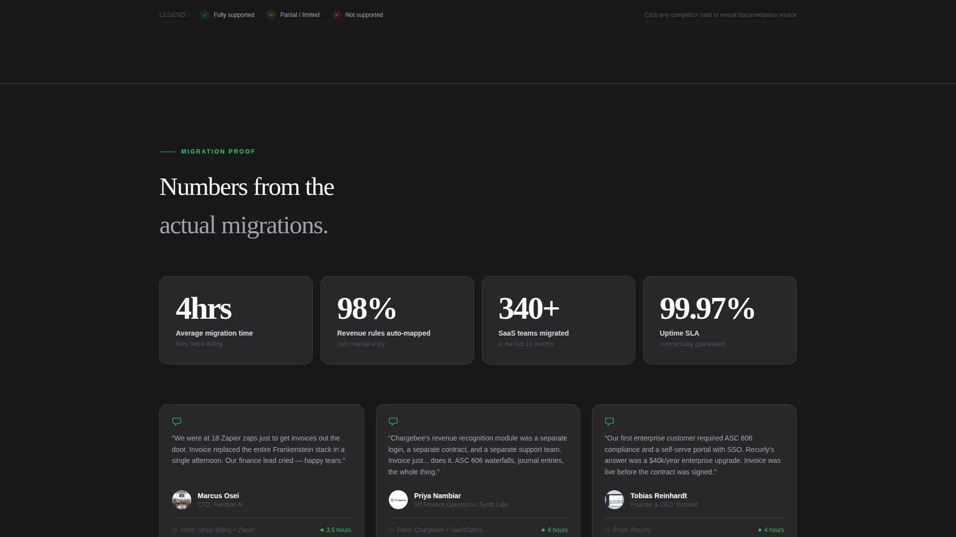
- The feature matrix builds evidence row by row, so by the time a visitor reaches the third comparison section, the capability gaps feel undeniable rather than argued
- The pinned call to action and inline call to action repetition mean a high-intent visitor never has to scroll back to find the next step
- The two-path lead capture system, audit form for ready buyers and PDF download for research-stage readers, ensures the page captures intent at multiple stages of the decision process
Other information about this template
This template is part of a broader set of SaaS billing and invoicing focused assets designed for the Technology category. It is suited for teams in the SaaS Software and SaaS subcategory who need a polished, conversion-ready landing page that communicates platform depth to a technical audience.
- The template style is Card Grid (Modular), which makes it straightforward to add, remove, or reorder comparison rows without rebuilding the layout
- The Feature Matrix creative direction is specifically chosen for Comparison/Versus landing pages where evidence density matters more than narrative storytelling
- The header concept, Logo Bar, works well for platforms that already have recognizable customers and want social proof to lead the page rather than follow it
Theme
Startup Velocity
Creative direction
Feature Matrix
Color system
Monochrome Steel
Style
Card Grid (Modular)
Direction
Comparison/Versus
Page Sections
Scrolling Logo Bar Header
Modular Comparison Card Grid
Pinned Navigation Call to Action
Two-field Migration Audit Form
Gated PDF Download Path
Signal-green Accent System
Related questions
Who is the primary audience for this landing page template?
What conversion paths does this template include?
Can I customize the comparison cards with my own competitor data?
What does the call to action flow look like?
Does the template include a hero image or illustration?



