Serverless Computing Technology Professional Website Template
Invoke is a Bold Brutalist landing page template built for serverless computing newsletters and communities. It uses a dashboard-style data grid header, a versus comparison section, a sample issue card, and a community activity feed. The void-black and deep violet color system gives the page the feel of a live production monitoring terminal.
by Rocket studio
Quick summary
Invoke is a single-page landing page template designed for serverless computing newsletters and technical communities. It opens with a brutalist data grid showing real newsletter metrics, fires through a versus comparison section, and closes on a full-width subscribe call to action. The aesthetic is raw, intentional, and built for engineers who trust data over decoration.
Who this template is for
This template is built for technically minded creators who want a landing page that speaks the language of their audience. It skips soft marketing visuals and leads with cold, hard numbers instead.
- Platform engineers and infrastructure writers launching a serverless newsletter
- CTOs and indie hackers building a technical community around cloud architecture
- Developer-focused content creators who need a high-signal, low-noise subscription page
What problem this template solves
Generic newsletter landing pages feel like marketing brochures. They do not earn trust from engineers who spend their nights debugging Lambda timeouts and migrating monoliths to event-driven architectures. This template closes that gap.
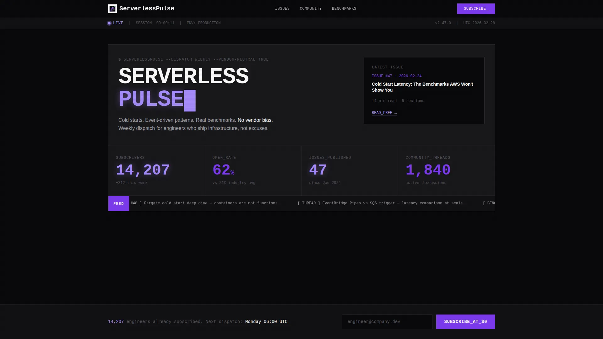
- No hero image filler: the data grid header puts real subscriber counts and open rates front and center
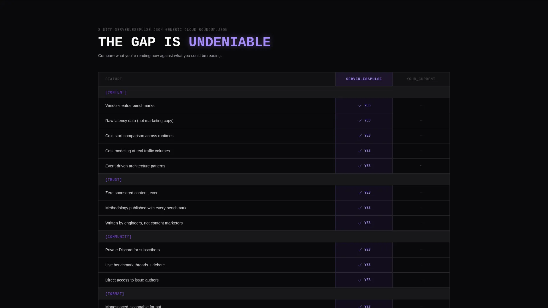
- No vague value claims: the versus grid makes the newsletter's edge over generic cloud roundups impossible to ignore
- No friction before the click: the subscribe field requires only an email, and a free issue link lets skeptics verify quality first
What you get with this template
You get a complete, ready-to-customize single-page landing page built around a bold brutalist design system. Every section is structured to guide a technical reader from curiosity to subscription without a single soft sell.
- A live-style dashboard header with oversized violet metrics, monospaced typography, and a scrolling community thread ticker
- A two-column versus comparison grid, a brutalist sample issue card with real section headers, and a community activity feed
- A full-width violet subscribe bar with a monospaced email placeholder and a secondary free-issue read path
Feature list
This section covers the core built-in components and design capabilities included in the Invoke template.
Brutalist Dashboard Header
The header renders as a data grid showing newsletter metrics: 14,207 subscribers, a 62% open rate, and the latest issue title. Numbers are set in oversized violet type, hard-left aligned, with concrete-gray labels stacked beneath like command-line interface output. No hero image is used. The data is the hero.
Versus Comparison Grid
A two-column brutalist grid pins this newsletter directly against a generic cloud roundup. Violet checkmarks fill the left column. Empty void cells sit in the right. The comparison covers benchmark depth, community access, vendor-neutral stance, and sponsored-content policy. The gap is made undeniable before the reader reaches the subscribe field.
Sample Issue Brutalist Card
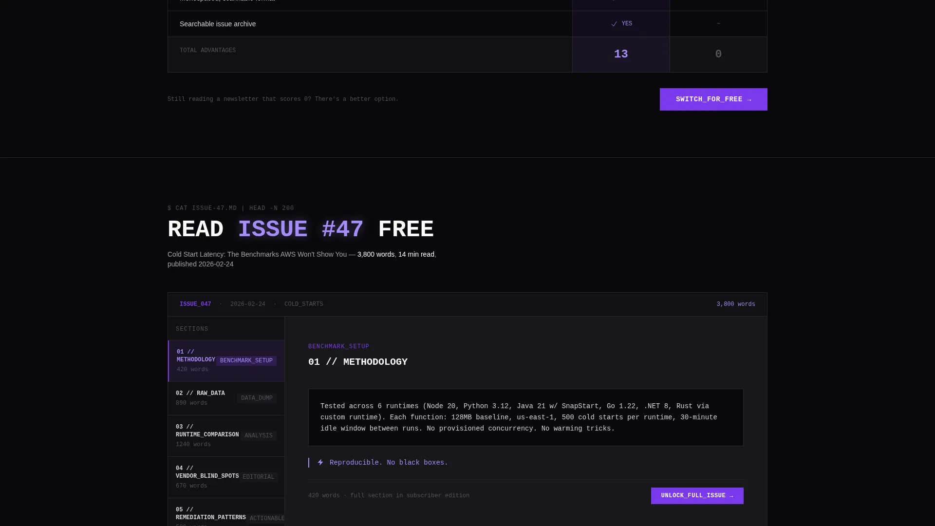
A dedicated card section renders a sample newsletter issue with real section headers and word counts. It gives skeptical readers a concrete preview of content quality before they commit to subscribing. The card follows the same monospaced, grid-snapped visual language as the rest of the page.
Community Activity Feed
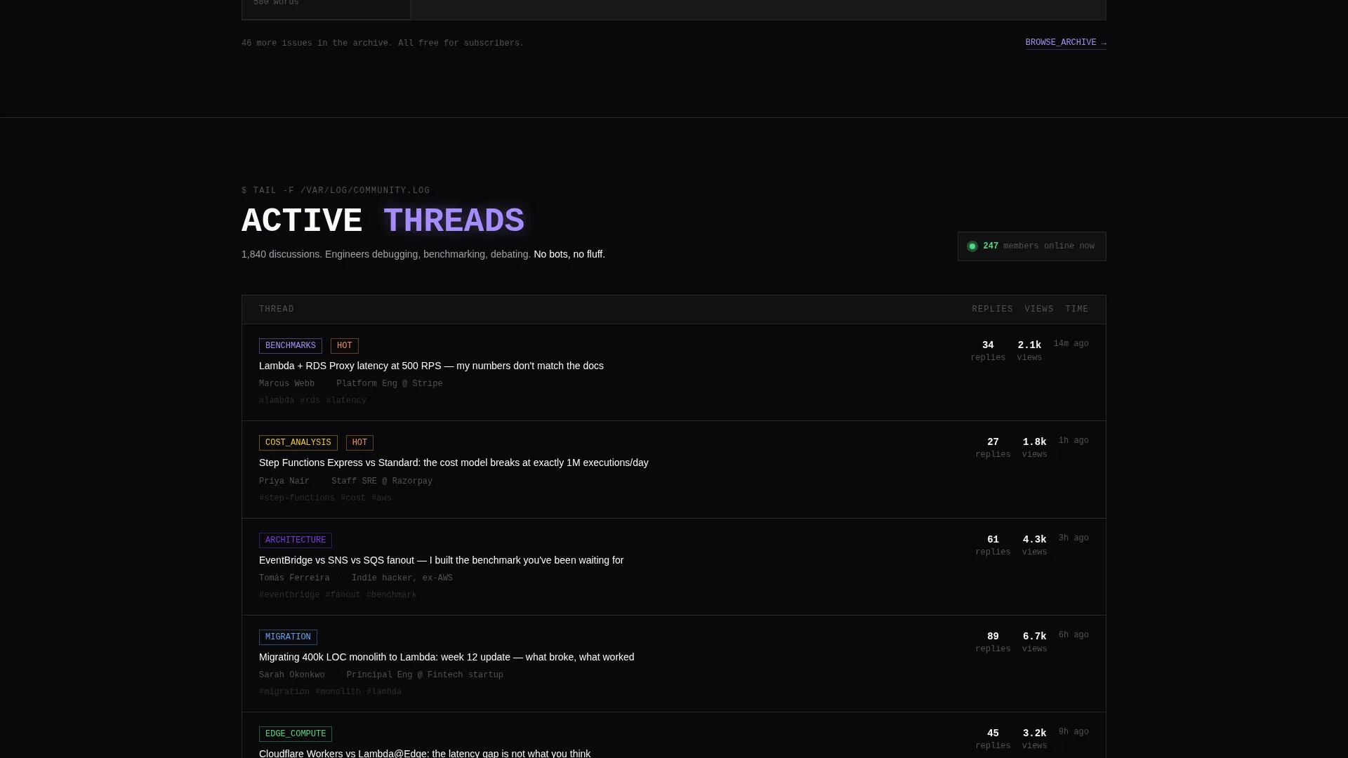
A live-style community thread feed shows actual discussion topics from the readership. It reinforces that a real technical community exists behind the newsletter. The feed section continues the dashboard aesthetic with labeled rows and tight grid alignment.
Full-Width Subscribe Bar
The primary call to action is a full-width violet bar containing a single email input field. The monospaced placeholder text reads engineer@company.dev. A secondary link reading "Read Issue #47 Free" sits alongside it, offering a no-commitment entry point for readers who want proof before signing up.
Scrolling Thread Ticker
A horizontal scrolling ticker inside the header cycles through recent community thread titles. It adds live-dashboard energy to the page load experience and signals an active, engaged readership without requiring any additional copy.
Page sections overview
| Section | Purpose |
|---|---|
| Dashboard Metrics Header | Display subscriber count, open rate, and latest issue title as a live data grid |
| Scrolling Thread Ticker | Cycle recent community threads to signal an active readership |
| Versus Comparison Grid | Contrast newsletter strengths against generic cloud newsletters with a stark two-column layout |
| Sample Issue Card | Show a real issue preview with section headers and word counts to build content trust |
| Community Activity Feed | Surface actual discussion threads to demonstrate community depth |
| Subscribe call to action Bar | Capture email with a full-width violet input and a secondary free-issue read link |
Design & branding system
The visual identity is built on a Void and Violet color system. Every design decision is intentional and grid-locked, with no gradients, no soft shadows, and no decorative imagery.
- Core palette: absolute void black (#09090B) for backgrounds, deep terminal violet (#7C3AED) for calls to action and data highlights, phosphor highlight (#A78BFA) for active states, and raw concrete gray (#A1A1AA) for secondary text and grid borders
- Typography is monospaced throughout, echoing command-line interface output and deployment log streams
- All elements snap to the grid with hard edges, consistent with the Bold Brutalist theme and an infrastructure-as-code visual philosophy
Mobile & speed optimization
The template is structured for clean rendering across screen sizes. The brutalist grid system adapts without losing its hard-edged identity.
- Single-column stacking on smaller screens preserves the data-grid hierarchy and readability of the metrics header
- Monospaced type and flat color blocks keep the layout lightweight, with no image-heavy hero sections to slow the initial render
- Section transitions use a subtle upward snap animation, like containers spinning up, keeping scroll energy intact on mobile without heavy overhead
How this template helps you convert
Every section of this landing page is sequenced like a deployment pipeline, designed to build trust and reduce hesitation at each stage.
- The dashboard header leads with real metrics, so a technical reader immediately sees proof of an active, credible newsletter before reading a single marketing sentence
- The versus comparison grid removes ambiguity by showing exactly what this newsletter offers that generic alternatives do not, making the subscribe decision feel logical rather than emotional
- The dual call-to-action structure, a zero-cost subscribe bar and a free issue preview link, removes every remaining barrier and lets the reader choose their own entry point
Other information about this template
This template is part of a broader set of Bold Brutalist design system templates suited for technical content brands in the serverless computing and cloud infrastructure space.
- The template style is classified as a Dashboard and Data Grid layout, making it well-suited for any technical newsletter that leads with performance data, community metrics, or benchmark results
- The creative direction follows a Launch Energy approach, meaning each scroll section is paced to accelerate reader momentum rather than let it plateau
- The Comparison and Versus landing page direction makes this template especially effective for newsletters entering a crowded market and needing to differentiate on depth and independence
Theme
Bold Brutalist
Creative direction
Launch Energy
Color system
Void & Violet
Style
Dashboard/Data Grid
Direction
Comparison/Versus
Page Sections
Brutalist Dashboard Metrics Header
Two-column Versus Comparison Grid
Sample Issue Preview Card
Community Activity Feed
Full-width Subscribe Call to Action
Scrolling Community Thread Ticker
Related questions
Can I update the metrics shown in the dashboard header?
Does this template require a specific email platform?
Can this template work for a newsletter outside of serverless computing?
What does the free issue secondary link point to?
Can I remove or replace the versus comparison grid?



