Serverless Computing Technology Cost Calculator Website Template
Invoke is a single-page serverless computing landing page template built for platforms that bill by the microsecond and scale without warning. It combines a live metrics header, an interactive cost calculator, and a multi-provider comparison table into one focused lead generation flow. The design uses a terminal-dark color system that makes every data point feel authoritative.
by Rocket studio
Quick summary
Invoke is a dark-themed, data-driven landing page template for serverless computing platforms. It opens with animated performance metrics, drops visitors straight into a live cost calculator, and closes with a transparent provider comparison table. Every section is built to earn trust through numbers, not marketing copy.
Who this template is for
This template is built for teams that need to communicate technical credibility without writing a wall of prose. It speaks the language of engineers and technical decision-makers.
- Backend engineers who are tired of managing server infrastructure and want to evaluate a faster path
- CTOs at growth-stage startups who need to demonstrate scalable architecture without hiring a dedicated infrastructure team
- Platform teams at enterprises gradually breaking apart monolithic systems one endpoint at a time
What problem this template solves
Most serverless platforms struggle to convert technically sophisticated visitors. Those visitors do not trust headlines. They trust data. A generic product landing page with feature bullets and a hero illustration fails this audience immediately.
- There is no easy way to show cost advantage without letting visitors run the math themselves
- Comparison claims feel hollow without a structured, side-by-side table they can verify
- Lead capture often happens too early, before the visitor has seen enough to act
What you get with this template
This template gives you a complete, single-page lead generation experience designed specifically for a serverless computing platform. Every section is intentional and data-forward.
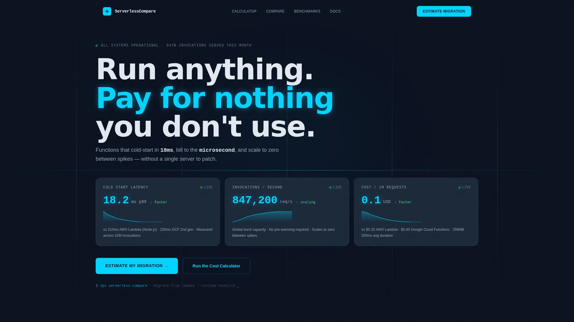
- An animated stats wall in the header with live-counting metric cards and spark-line graphs for cold start latency, invocations per second, and cost per million requests
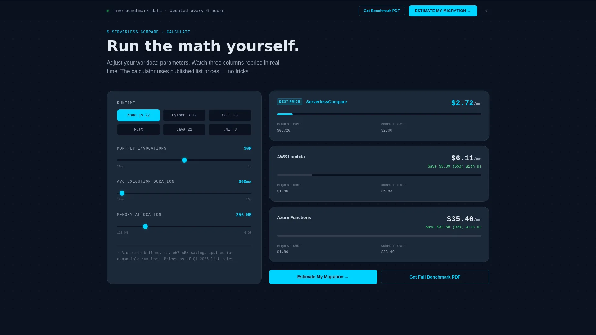
- An interactive cost calculator with runtime, invocation volume, execution duration, and memory inputs that reprice three provider columns in real time
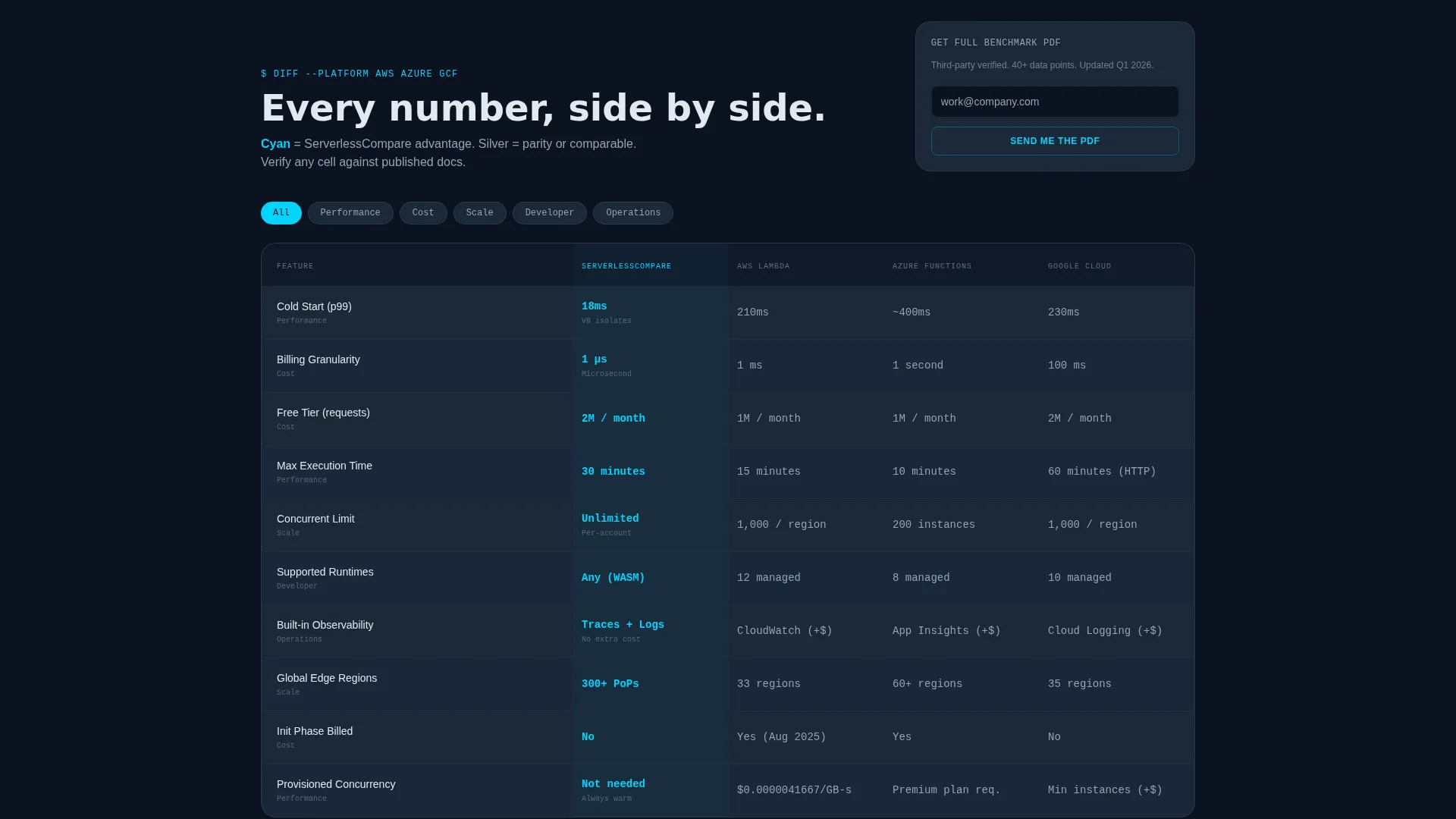
- A structured comparison table with color-coded cells, a secondary benchmark download gate, and two placements of the primary call to action
Feature list
This template includes the following built-in sections and functional components, all grounded in the source brief.
Animated Metrics Header
Three oversized metric cards open the page with numbers that count and tick on load. Cold start latency counts down, invocations per second tick upward, and cost per million requests calculates live against visible baseline figures. Tiny spark-line graphs sit beneath each card to reinforce that the data is moving, not static.
Interactive Cost Calculator
Visitors select their runtime environment, estimated monthly invocations, average execution duration, and memory allocation. Three pricing columns update in real time as inputs change. This section does the persuasion work before any call to action appears.
Multi-Provider Comparison Table
A full comparison table displays rows for cold start speed, maximum execution time, concurrent limits, supported languages, built-in observability, and free-tier thresholds. Cells are color-coded: cyan marks a clear advantage, slate marks parity. The layout is scannable and invites independent verification.
Dual-Path Lead Capture
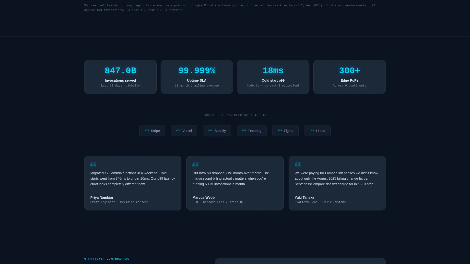
The primary call to action, labeled "Estimate My Migration," appears beneath the calculator and again in a slim pinned bar after the comparison table. The form collects work email, current cloud provider via dropdown, estimated monthly invocations via range slider, and an optional free-text field. A lighter secondary gate offers a benchmark report download in exchange for email only.
Directory-Style Dark Layout
The page uses a terminal-dark visual system with a void-dark navy background, deep slate card surfaces, electric cyan interactive highlights, and muted silver for secondary text. The result feels like a live mission control dashboard rather than a marketing page.
Page sections overview
| Section | Purpose |
|---|---|
| Animated Metrics Header | Opens with live-counting performance and cost stats |
| Interactive Cost Calculator | Lets visitors compare provider costs using their own inputs |
| Comparison Table | Side-by-side feature and performance rows across providers |
| Primary call to action Form | Captures qualified leads at peak calculator-driven intent |
| Pinned Bottom Bar | Re-surfaces the primary call to action after the full table is read |
| Benchmark PDF Gate | Secondary email capture for visitors still in research mode |
Design & branding system
The visual identity follows a Directory and Discovery theme expressed through a Midnight Blue color system. The result feels like the inside of a mission control room: dark enough that numbers glow, structured enough that every cell has meaning.
- Background is void-dark navy (#0B1120), card and table row surfaces use deep slate (#1B2838), and interactive elements and active states use electric cyan (#00D4FF)
- Secondary text, grid lines, and supporting labels use muted silver (#94A3B8) to keep the hierarchy clean without adding visual noise
- No hero image or illustration is used; the header opens directly with data, keeping the terminal-at-2-AM aesthetic consistent from the first scroll
Mobile & speed optimization
The layout is built for screens of all sizes, with the data-heavy sections adapting cleanly to narrower viewports.
- The metric card wall stacks vertically on smaller screens so each number remains legible without horizontal scrolling
- The calculator inputs and three-column pricing output reflow into a single-column layout on mobile, preserving usability without sacrificing the reprice behavior
- The pinned bottom bar with the primary call to action remains visible on scroll across all screen sizes, keeping conversion intent accessible at every point in the page
How this template helps you convert
Every layout decision in this template is oriented toward a single outcome: capturing a qualified lead at the exact moment the math becomes convincing.
- The animated metrics header establishes credibility before any copy is read, so technically skeptical visitors see proof first and marketing claims second
- The interactive calculator creates a personal cost comparison specific to the visitor's own numbers, making the value concrete and harder to dismiss
- The dual-path lead capture provides both a high-intent form for visitors ready to act and a low-friction email gate for those still evaluating, so neither audience leaves empty-handed
Other information about this template
This template is categorized under Technology, specifically the Serverless Computing Platform niche within Serverless Computing Technology. It is well-suited for any platform competing in the function-as-a-service space where buyers are actively comparing options.
- The template style is a Comparison Table layout, making it directly applicable to competitive positioning pages in cloud infrastructure markets
- The creative direction is Calculator-first, meaning the most persuasive interactive element appears above the fold rather than buried in the footer
- The header concept is a Stats and Metrics wall, which aligns with audience expectations from backend engineering and platform operations roles
- The landing page direction is Lead Generation, with two distinct conversion paths built into the layout to match different stages of the buyer evaluation process
- This template can support use cases involving function-as-a-service platforms, event-driven compute tools, and edge function products that need to communicate pricing transparency
Theme
Directory & Discovery
Creative direction
Calculator/Tool First
Color system
Midnight Blue
Style
Comparison Table
Direction
Lead Generation
Page Sections
Live Animated Metrics Wall
Interactive Multi-provider Calculator
Color-coded Comparison Table
Dual-path Lead Capture Forms
Pinned Conversion Bottom Bar
Related questions
Who is this landing page template designed for?
Can I customize the calculator inputs and comparison table rows?
What does the dual-path lead capture mean in practice?
Does the template include the header animations and spark-line graphs?
Is this template suitable for a platform competing on pricing transparency?



