Iron - Adaptive Training Landing Page Template
Iron is a Bold Brutalist fitness training landing page template built for adaptive programming platforms. It opens with a strength benchmark calculator, moves into a brutally honest comparison grid, and earns the signup before asking for it. The Slate and Sky color system, dark glass panel header, and modular card layout make every section feel as deliberate as a well-written program.
by Rocket studio
Quick summary
Iron is a single-page fitness training platform template designed around one idea: prove competence before asking for commitment. A live benchmark calculator greets visitors first. Modular comparison cards follow. The signup only appears after the platform has already delivered value. The visual identity is Bold Brutalist, industrial, focused, and completely undecorated.
Who this template is for
This template is built for fitness software founders, independent coaches, and training platform teams who need a landing page that does real work. It fits anyone selling an adaptive, data-driven training product to a performance-minded audience.
- Fitness software and SaaS teams launching or repositioning an adaptive training platform
- Independent coaches or programming services converting curious lifters into paid members
- Competitive amateur athletes and training communities promoting a structured meet-prep product
What problem this template solves
Most fitness landing pages lead with a hero image and a vague headline. They ask for the email before proving the product thinks. Visitors leave unconvinced. Iron solves that by reversing the sequence entirely.
- Generic fitness templates rely on stock photography and aspirational copy instead of demonstrating platform intelligence
- Static signup-first flows lose intermediate and advanced lifters who need proof before they commit
- No standard template includes a calculator-first interactive hook tied directly to a conversion path
What you get with this template
You get a complete, modular landing page structured around a Calculator/Tool First creative direction. Every section has a defined role in moving the visitor from curiosity to confidence to action.
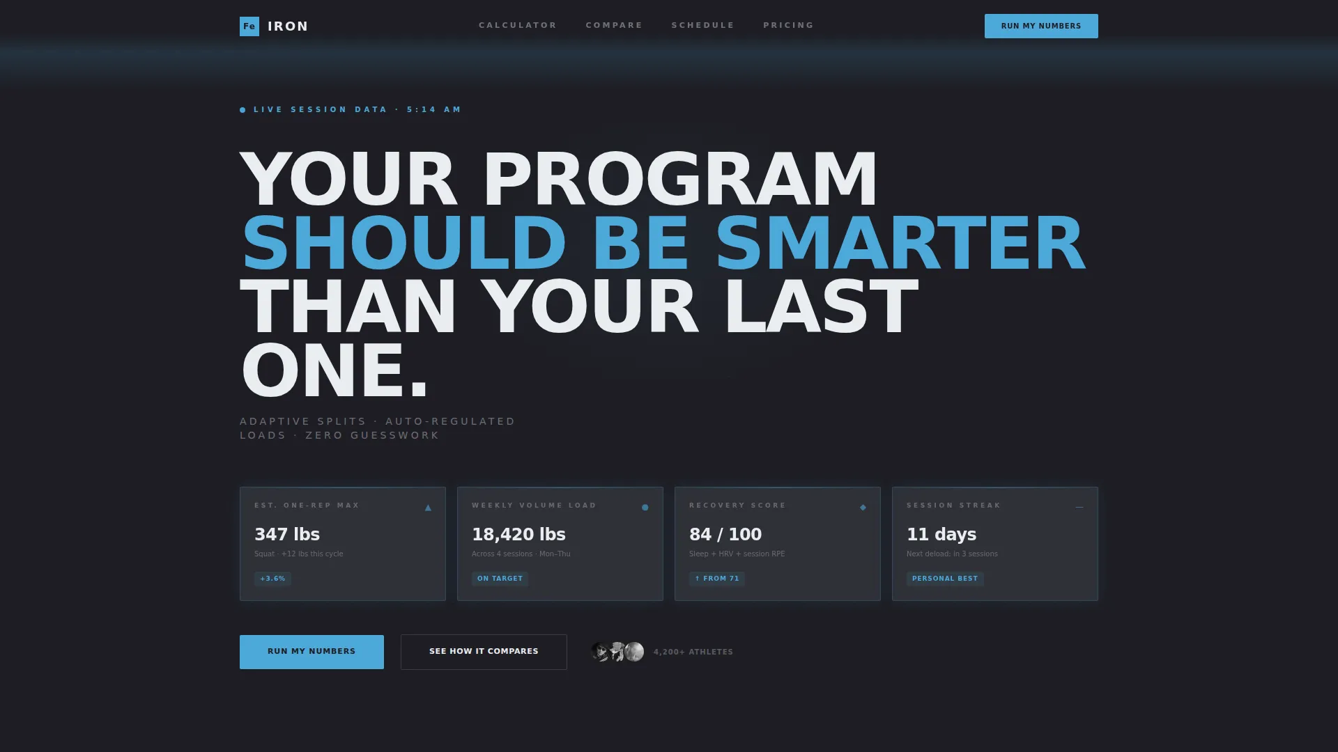
- A dark glass panel header displaying real-time metric cards: estimated one-rep max, weekly volume load, recovery score, and session streak
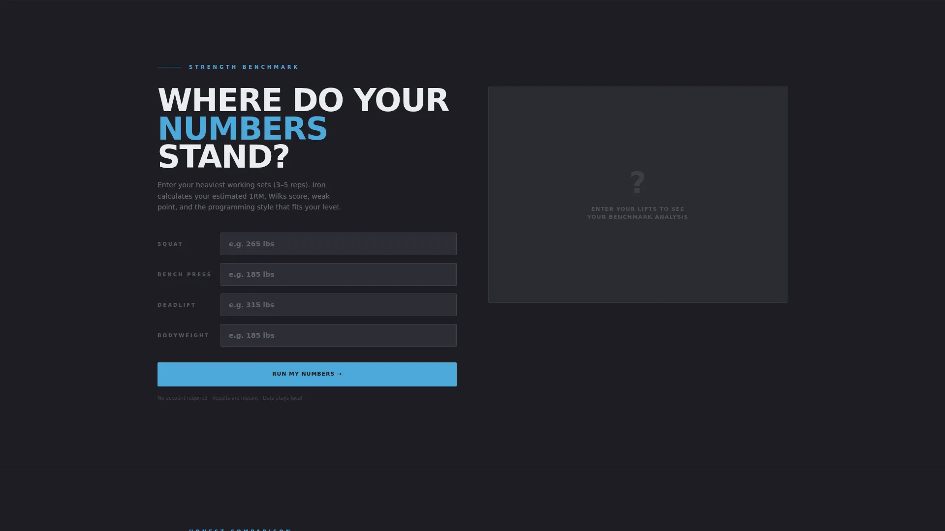
- A strength benchmark calculator as the first interactive element, delivering immediate, personalized output before any signup wall appears
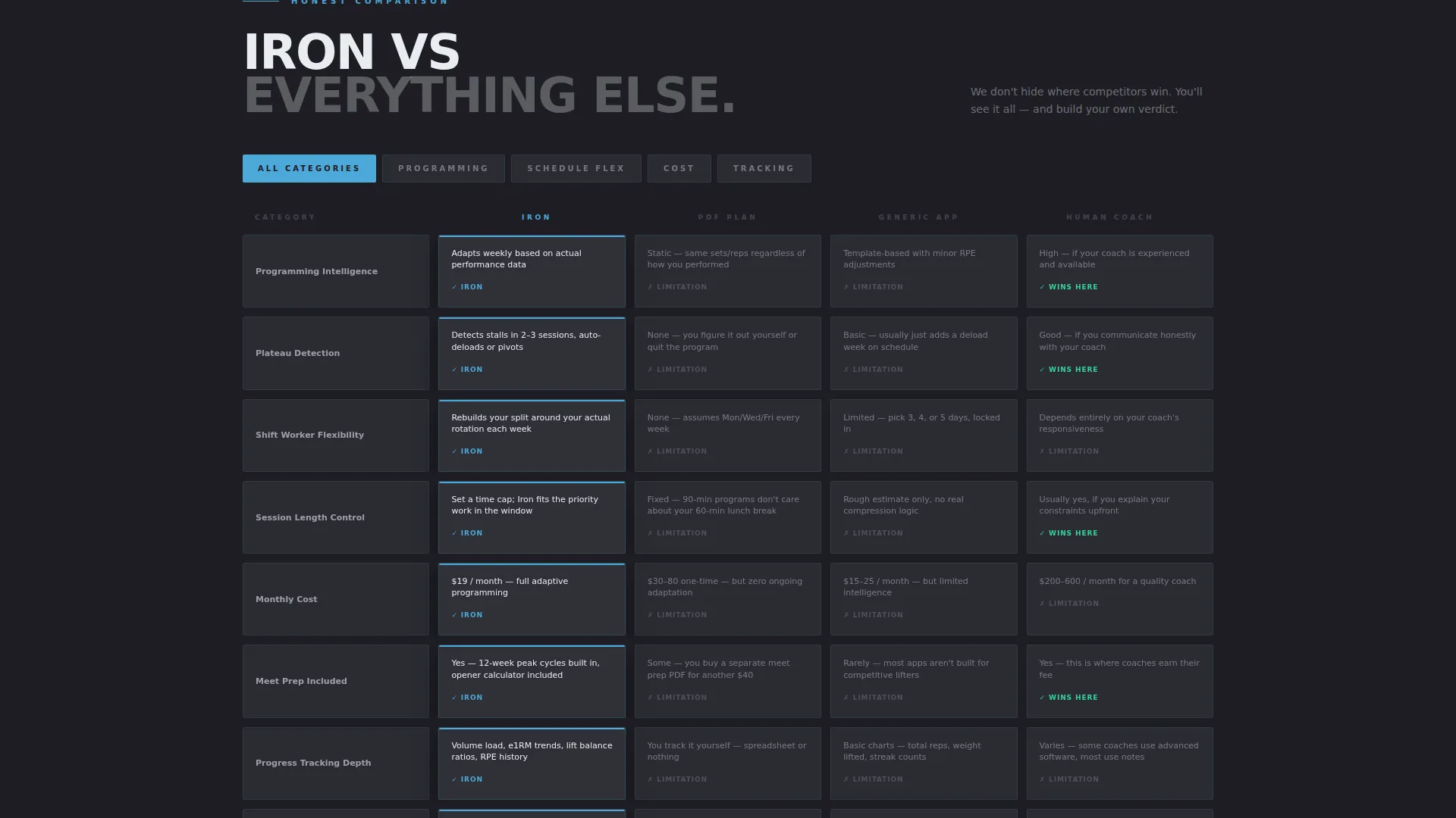
- A modular comparison card grid contrasting adaptive programming against static plans, generic apps, and human coaching
Feature list
This template ships with a focused set of components, each tied directly to the conversion logic described in the source brief.
Dark Glass Panel Header
Four translucent charcoal cards float over a faint gym environment. Each panel shows a distinct real-time metric. Cold blue reflections catch the card edges. The headline "Your program should be smarter than your last one" runs across the top in oversized condensed type. No hero image, no lifestyle photography.
Strength Benchmark Calculator
Visitors enter their big three lifts and instantly receive a ranking, a weak-point breakdown, and a programming style recommendation. This is the first interactive element on the page. It earns attention and builds trust before any call to action appears.
Modular Comparison Card Grid
Cards stack side by side comparing Iron's adaptive approach against static PDF plans, generic app templates, and human coaching. Each card is honest about where competitors have an advantage. The grid reorganizes by category: programming intelligence, schedule flexibility, price per month, and progress tracking depth.
Tiered Call-to-Action Architecture
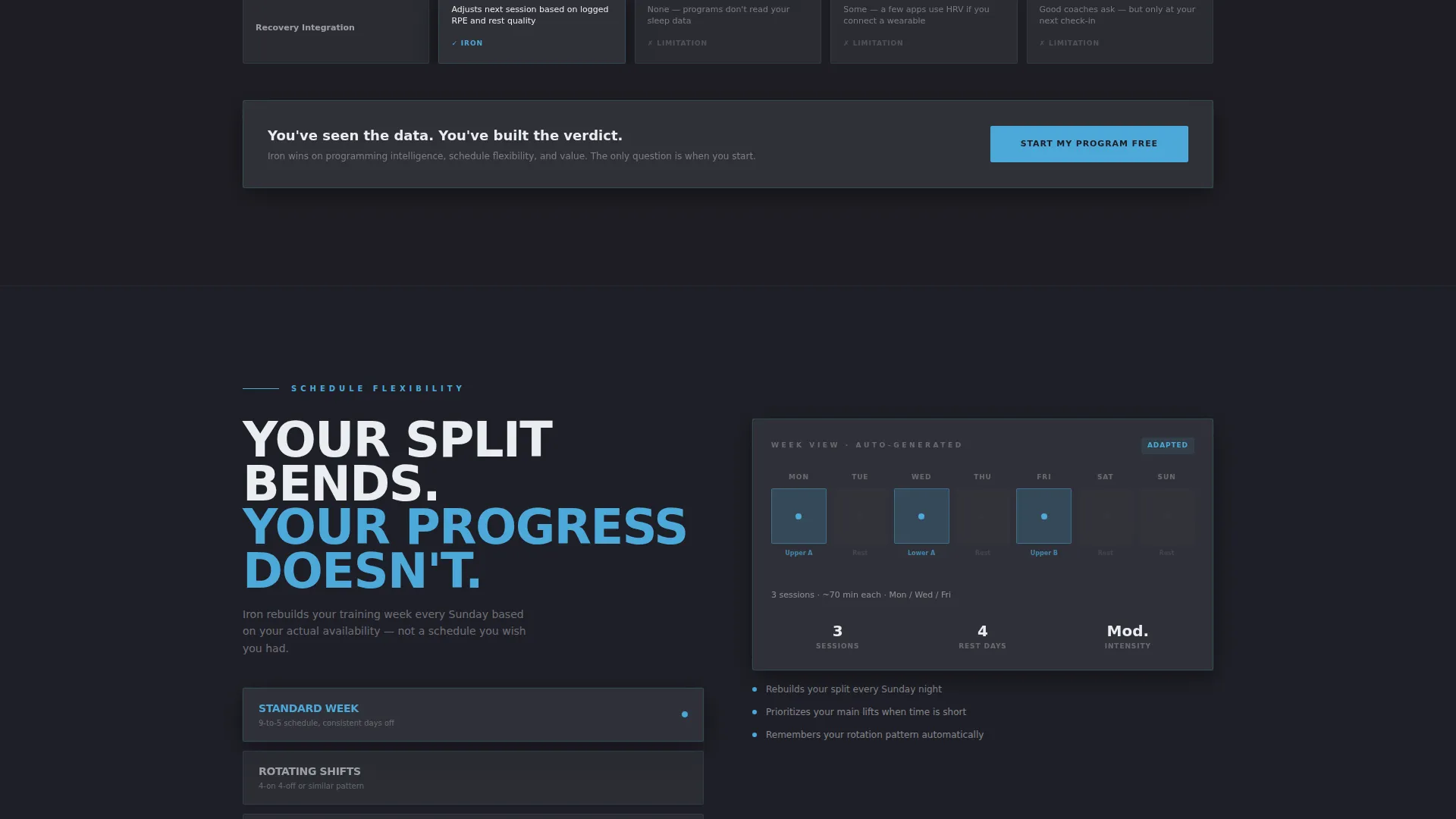
Three distinct calls to action are layered across the page. "Run My Numbers" anchors to the benchmark calculator. "Start My Program Free" appears after the tool delivers results, requiring only an email and training experience level. Each comparison card carries a tertiary prompt linking to deeper feature breakdowns.
Condensed Brutalist Typography System
Oversized condensed type sets the hierarchy throughout the page. All type is rendered in chalk-dust white against deep charcoal or cold iron gray surfaces. The type system communicates weight and precision without decoration or softening.
Page sections overview
| Section | Purpose |
|---|---|
| Dark Glass Header | Display real-time training metrics and set the visual tone |
| Benchmark Calculator | Deliver instant personalized lift rankings before signup |
| Calculator Results Panel | Show weak-point breakdown and recommended programming style |
| Comparison Card Grid | Contrast Iron against static plans, apps, and coaching |
| Grid Category Filter | Let visitors reorganize cards by priority category |
| Feature Deep-Links | Connect comparison cards to detailed capability breakdowns |
| Secondary call to action Block | Capture email and experience level after tool engagement |
| Program Free Signup | Finalize conversion with a minimal two-field form |
Design & branding system
The visual identity is Bold Brutalist, built on a Slate and Sky color system that feels like a rubber-floored power rack room with one high window letting in winter morning light. Every color choice has a functional role.
- Deep charcoal slab (#1E1E24) forms the base background; cold iron gray (#3A3D45) surfaces the card grid; open-sky blue (#4DA8DA) highlights interactive elements and data callouts
- Chalk-dust white (#EAEDF0) is used exclusively for typography and card surfaces, keeping text sharp against dark industrial backgrounds
- Oversized condensed typefaces carry all primary headlines; no decorative elements, rounded corners, or lifestyle imagery appear anywhere in the layout
Mobile & speed optimization
The modular card grid is built to reflow cleanly at smaller breakpoints. Each section is independent, so the layout adapts without breaking the visual logic of the page.
- Modular card components stack vertically on narrow screens while preserving the comparison structure and category filter behavior
- The dark glass panel header condenses gracefully, keeping metric cards readable without horizontal overflow
- The benchmark calculator input and results panel are designed to function as a single-column flow on mobile devices
How this template helps you convert
Iron is built around a Comparison/Versus conversion strategy. Every layout decision supports the sequence: engage, prove, then ask.
- The benchmark calculator runs before any signup prompt appears, so visitors experience the platform's intelligence firsthand and arrive at the call to action already engaged
- The comparison grid lets visitors build their own verdict by reorganizing cards, which removes sales pressure and replaces it with earned confidence
- The tiered call to action architecture keeps the ask proportional: a low-friction calculator entry, followed by a free program signup requiring only two fields
Other information about this template
This template sits at the intersection of fitness software, SaaS product marketing, and performance training culture. It is specifically designed for platforms that compete on programming intelligence rather than brand lifestyle.
- The template style is Card Grid (Modular), making it straightforward to add, remove, or reorder sections as a product evolves
- The lp direction is Comparison/Versus, which suits any fitness SaaS positioning itself against established incumbents or manual alternatives
- The header concept is Dark Glass Panels, a design pattern that communicates data-first thinking without requiring a custom illustration or photography budget
- The creative direction is Calculator/Tool First, which is especially effective for audiences like intermediate lifters, shift workers with rotating schedules, and competitive amateurs in meet-prep cycles who need evidence before they trust a product
Theme
Bold Brutalist
Creative direction
Calculator/Tool First
Color system
Slate & Sky
Style
Card Grid (Modular)
Direction
Comparison/Versus
Page Sections
Dark Glass Panel Metric Header
Strength Benchmark Calculator
Modular Comparison Card Grid
Tiered Call-to-action System
Condensed Brutalist Type Hierarchy
Category Filter for Comparison Grid
Related questions
Can I use this template without a working calculator backend?
Is this template suitable for a solo coach or only for SaaS teams?
How customizable is the Slate and Sky color system?
Does the comparison grid require a fixed number of competitor cards?
What makes this template different from a standard fitness landing page?



