Fitness & Gym Software Reviews Website Template
Ironstack is a gym asset management landing page template built for multi-location fitness operators. It features a Feature Tab Switcher header, a twelve-point comparison table, social proof from franchise operators, and a scrolling equipment directory. The design runs on a Midnight Blue palette with safety-orange calls to action driving visitors toward an app download.
by Rocket studio
Quick summary
Ironstack is a single-page landing page template for a gym equipment tracking platform. It opens with a three-tab hero switcher, flows into a detailed comparison table, and closes with a strong app download call to action. The Midnight Blue color system gives the page a serious, infrastructure-grade feel from the first scroll.
Who this template is for
This template is built for teams selling or marketing gym asset management software to facility operators. It speaks directly to people who know the operational pain of tracking equipment across multiple sites.
- Regional gym franchise owners managing fifteen or more locations
- Operations managers inheriting disorganized equipment spreadsheets
- Fitness directors who need utilization data to justify capital spending
What problem this template solves
Managing gym equipment across multiple locations without a dedicated system creates real operational drag. Spreadsheets break down quickly when serial numbers, maintenance cycles, and floor placements all live in separate files.
- Asset lookup takes too long during audits and compliance checks
- Maintenance cost forecasting is guesswork without depreciation data
- Warranty expiration dates get missed because no single system tracks them
What you get with this template
This template gives you a fully structured, conversion-focused landing page ready to present a gym asset management platform with confidence. Every section is designed to build trust, surface pain points, and push visitors toward the app.
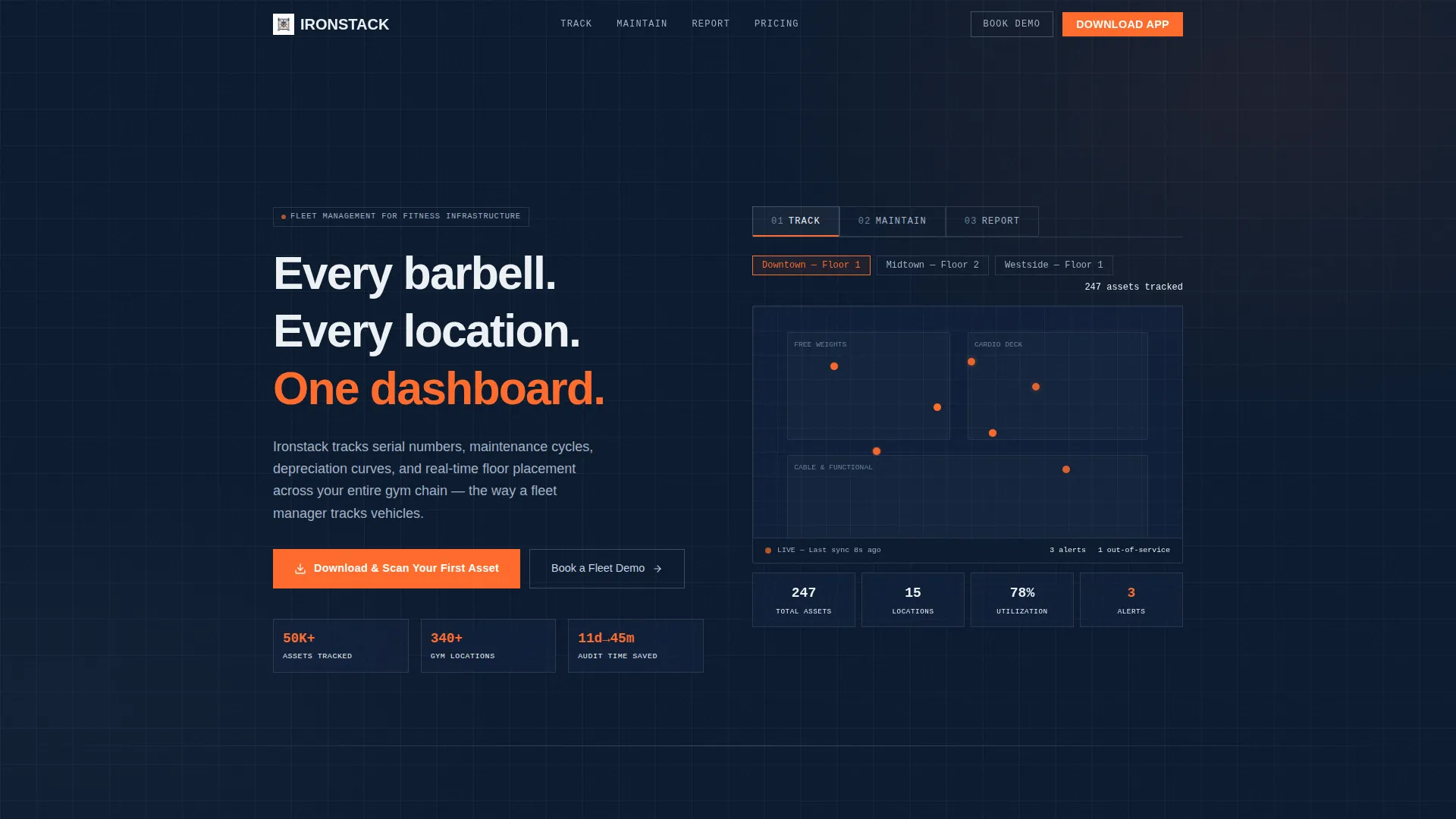
- A Feature Tab Switcher header with three clickable views: Track, Maintain, and Report
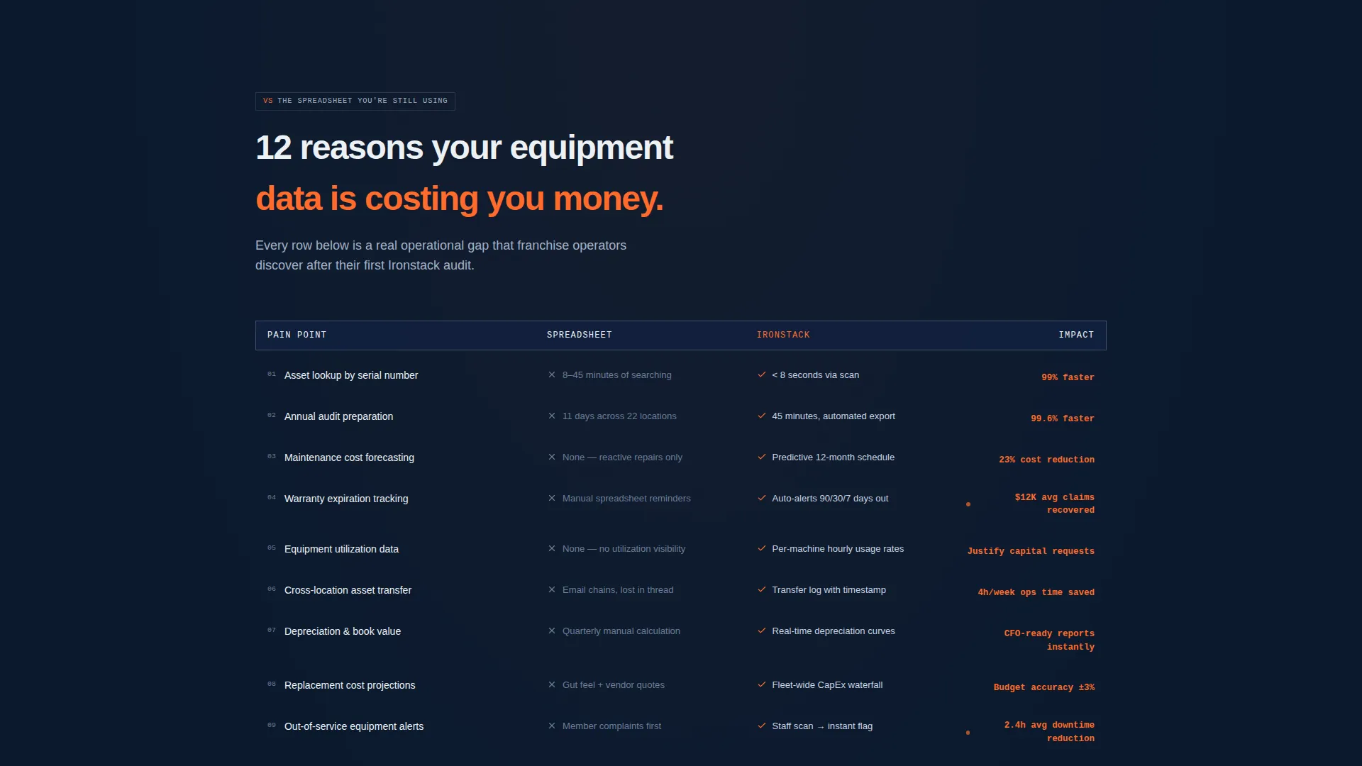
- A twelve-point comparison table contrasting spreadsheet tracking against the platform
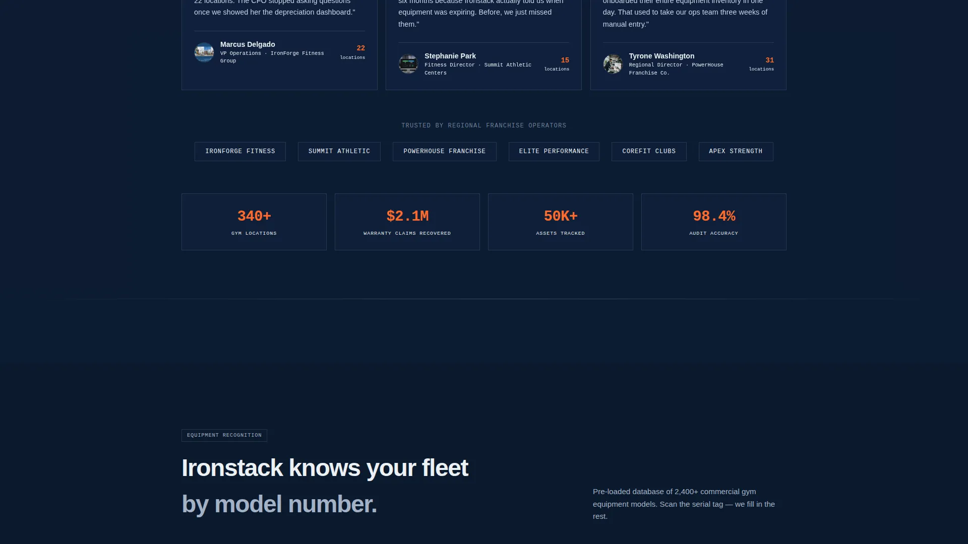
- A scrolling equipment-type directory and social proof section with operator quotes
- Primary and secondary calls to action including a sticky mobile call to action bar and a QR code for desktop
Feature list
This template includes purpose-built components that match the operational reality of multi-site gym management.
Three-Tab Hero Switcher
The header features three tabs labeled Track, Maintain, and Report. Each tab swaps the hero content below it. Track shows a live asset map with equipment pins across a multi-site floor plan. Maintain reveals a maintenance calendar with overdue service alerts. Report displays a depreciation waterfall chart with replacement cost projections.
Twelve-Point Comparison Table
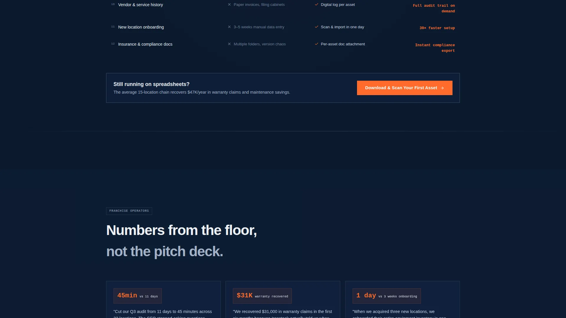
A structured table directly compares spreadsheet-based tracking to the platform across twelve real operational pain points. Metrics include asset lookup time, audit preparation hours, maintenance cost forecasting, and warranty expiration alerts. Concrete time-saved figures sit beside each row to make the value case tangible.
Social Proof Section
Franchise operators provide quoted testimonials with specific numbers attached. One example: "Cut our Q3 audit from 11 days to 45 minutes across 22 locations." This kind of specificity builds credibility with operations-minded buyers who are skeptical of vague claims.
Scrolling Equipment Directory
A scrolling section lists equipment types the platform recognizes by model number, from heavy racks to cardio machines. Each scroll section is designed to feel like another door opening on a facility tour, reinforcing the platform's depth of coverage.
App Download call to action System
The primary call to action reads "Download and Scan Your First Asset" and appears after the comparison table. A QR code sits beside desktop calls to action linking to App Store and Google Play. A sticky bottom bar on mobile keeps the download prompt visible throughout the scroll.
Secondary Enterprise Path
A "Book a Fleet Demo" option targets enterprise operators managing fifty or more locations. This secondary call to action sits alongside the primary download prompt, capturing high-value leads without disrupting the main conversion flow.
Page sections overview
| Section | Purpose |
|---|---|
| Feature Tab Switcher | Introduces platform through three interactive hero views |
| Comparison Table | Quantifies pain of spreadsheet tracking versus the app |
| Social Proof | Builds trust with specific operator-cited results |
| Equipment Directory | Shows depth of equipment recognition by model |
| Primary call to action Block | Drives app download with QR code and store links |
| Sticky Mobile Bar | Keeps download call to action visible throughout mobile scroll |
| Enterprise Demo call to action | Captures fleet-scale operators for a guided demo |
Design & branding system
The visual identity follows a Directory and Discovery theme built around a Midnight Blue color system. The palette feels like a commercial gym after hours, serious and infrastructure-grade rather than lifestyle-driven.
- Deep gym-floor navy (#0B1A2E) as the primary background tone
- Brushed steel gray (#A3B1C6) and scoreboard white (#EDF1F5) for text and surface layers
- High-visibility safety orange (#FF6B2B) reserved exclusively for calls to action and alert badges
Mobile & speed optimization
The layout is structured to perform cleanly on mobile without sacrificing the density of information that operations-focused buyers expect. The sticky call to action bar keeps the app download prompt accessible at all times on smaller screens.
- Sticky bottom bar locks the primary call to action in place during mobile scroll
- Tab switcher and comparison table are built to remain readable on narrow viewports
- QR code placement is handled for desktop while the mobile flow routes directly to store links
How this template helps you convert
The page is structured to move a skeptical operations buyer from curiosity to commitment. Every section earns the next click by making the cost of inaction feel concrete.
- The comparison table forces a direct reckoning with the inefficiency of spreadsheet tracking, using specific metrics like audit hours and lookup times to make the pain quantifiable.
- Operator testimonials with real numbers follow immediately, replacing doubt with evidence from peers in the same industry.
- The app download call to action appears at the moment of peak conviction, supported by a QR code on desktop and a persistent sticky bar on mobile, removing any friction between decision and action.
Other information about this template
This template is categorized under Fitness and Gym Software within the broader Technology category. It is designed specifically for the gym asset management niche, where buyers tend to be detail-oriented and data-driven.
- The Launch Energy creative direction drives scroll momentum with escalating proof and a countdown-style sense of urgency
- The template style is a Comparison Table layout, making it well suited for platforms competing against legacy spreadsheet workflows
- The page type is a single-page landing page, not a multi-page site, so all conversion elements are sequenced within one continuous scroll
- The header concept is a Feature Tab Switcher, a component that lets prospects self-select the platform feature most relevant to their current pain point
Theme
Directory & Discovery
Creative direction
Launch Energy
Color system
Midnight Blue
Style
Comparison Table
Direction
App Download
Page Sections
Three-tab Hero Switcher
Twelve-point Comparison Table
Operator Social Proof Section
Scrolling Equipment Directory
App Download Call to Action System
Enterprise Demo Pathway
Related questions
Who is this landing page template designed for?
What does the comparison table section include?
How does the call to action system work on mobile and desktop?
Can this template support enterprise gym operators?
What visual style and color system does this template use?



