Services Directory Landing Page Template - It
A hub-and-spoke landing page built for IT services directories and listing sites. It connects businesses to vetted providers across five categories: Managed Services, Cloud, Security, Dev, and Fractional Leadership. A kinetic logo ribbon, anchor navigation, side-by-side comparison cards, and a "Compare My Top 3" drawer turn vendor research chaos into one clear, auditable next step.
by Rocket studio
Quick summary
This is a single-page, anchor-navigated landing page template designed for IT services directories. It features a kinetic dual-direction logo ribbon, five category spoke sections with versus comparison cards, an open comparison framework, social proof counters, and a conversion drawer. The design runs on a void-black canvas with iridescent violet and cyan accents.
Who this template is for
This template is built for teams who run or are launching an IT services directory or vendor listing platform. It suits anyone who needs to present multiple provider categories clearly while driving a structured comparison action from visitors.
- Founders and product teams building an IT services marketplace or vendor directory
- Procurement consultants creating auditable shortlists for business clients
- Operators managing a curated listing site across managed services, cloud, security, development, or fractional leadership categories
What problem this template solves
Vendor research is broken. Buyers open dozens of tabs, build unwieldy spreadsheets, and still feel uncertain by the time a decision is due. A directory site built on a generic template makes that problem worse, not better. This template is designed to collapse that chaos into a single, structured page.
- Buyers lose hours comparing providers without a shared framework or standard dimensions
- Directory sites without clear conversion paths generate email leads but not qualified decisions
- Visitors leave before acting because the path from browsing to shortlisting is never obvious
What you get with this template
You get a complete, single-page hub-and-spoke layout with five anchor-linked category spokes, each structured for comparison-first conversion. Every section is built to move the visitor from curiosity to a concrete next step, with two conversion paths built in from the start.
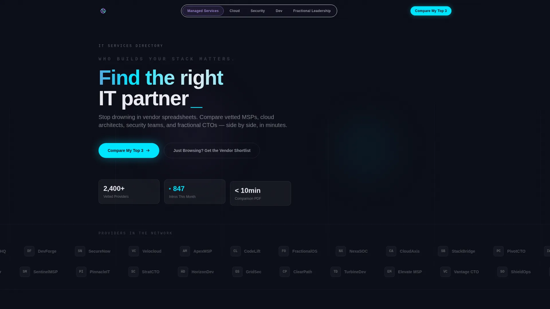
- A hero section with a kinetic dual-direction logo ribbon, anchor navigation pill bar, and a floating statistics strip
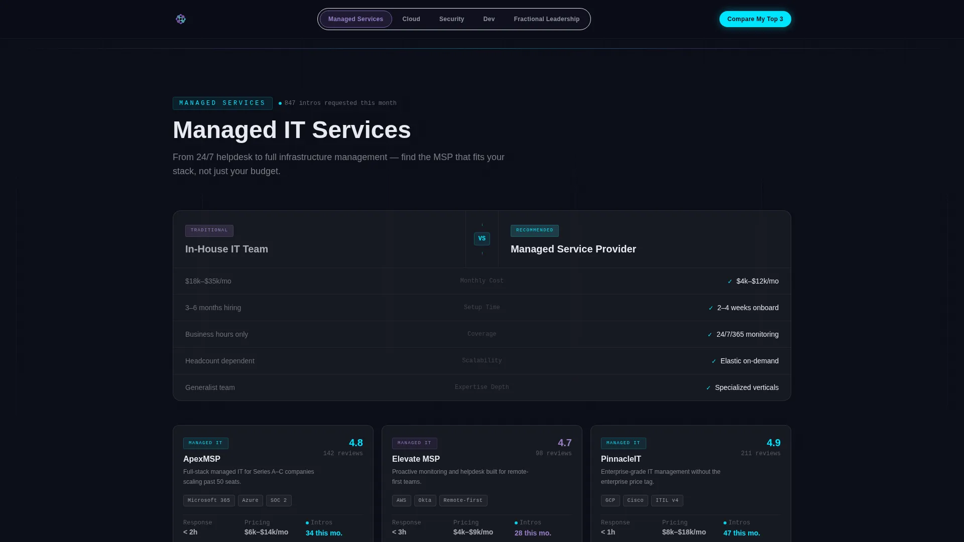
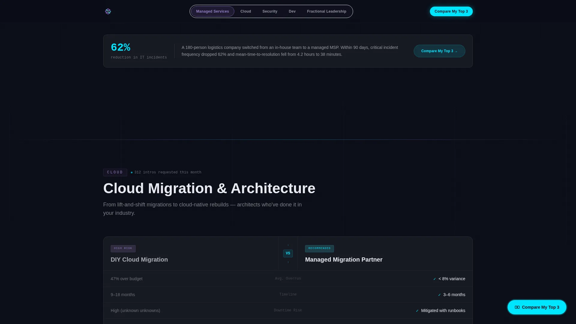
- Five spoke sections, each opening with a bold in-house versus managed comparison card, followed by case study metrics and a category filter
- A "Compare My Top 3" floating drawer, a secondary email-capture path, and a linear single-row footer
Feature list
This template includes purpose-built components designed for IT services directories. Each one maps directly to a specific stage of the visitor's decision journey.
Kinetic Dual-Direction Logo Ribbon
A horizontal header ribbon scrolls provider logos in two opposing directions at different speeds. This creates a parallax depth effect. On hover, each logo blooms from monochrome pearl into full iridescent color and surfaces a glassmorphism tooltip showing category, rating, and response time.
Anchor Navigation Pill Bar
A fixed pill bar sits below the header and links directly to each of the five spoke sections: Managed Services, Cloud, Security, Dev, and Fractional Leadership. Each pill pulses once with electric cyan on page load, then remains fixed as the visitor scrolls.
Versus Comparison Spoke Cards
Every spoke section opens with a split comparison card. It places two options side by side, for example an in-house security operations center versus a managed one, with metrics, cost ranges, and deployment timelines rendered clearly for fast decision-making.
Compare My Top 3 Conversion Drawer
A lightweight drawer activates when the visitor clicks the primary call-to-action button. The visitor selects up to three providers from their browsed categories, then enters company size, primary need, and email address to receive a side-by-side comparison document within ten minutes.
Live Social Proof Counters
Each spoke section includes a live counter showing how many businesses requested provider introductions that month. Anonymous case study metrics and response time data appear alongside testimonial cards to reinforce credibility without relying on static copy.
Secondary Email Capture Path
A second conversion path, labeled "Just Browsing? Get the Vendor Shortlist," captures email-only leads. Subscribers receive a weekly curated digest. This path runs parallel to the primary drawer and ensures the page converts visitors at different levels of buying intent.
Page sections overview
| Section | Purpose |
|---|---|
| Hero with Ribbon | Introduces the directory with a kinetic logo bar, headline, anchor nav pills, and a floating stats strip |
| Managed Services Spoke | Compares in-house versus managed service providers with metrics and a category intro request counter |
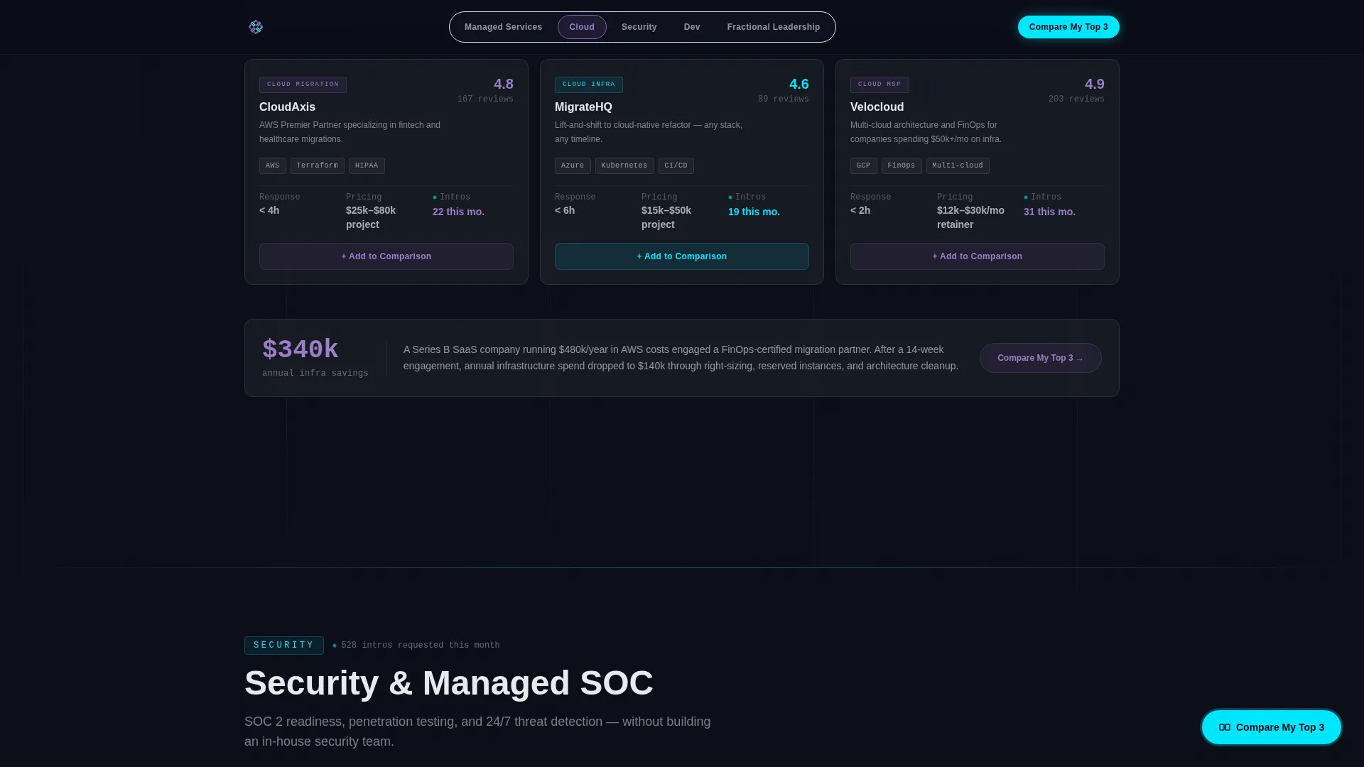
| Cloud Spoke | Surfaces cloud migration architects and stack compatibility details in a versus card format |
| Security Spoke | Contrasts in-house and managed security operations center options with cost and timeline data |
| Dev Spoke | Lists vetted development providers with anonymized case study metrics and comparison anchors |
| Fractional Leadership Spoke | Presents fractional chief technology officer options for Series A and scaling companies |
| How It Works | Shows the open comparison framework and the exact dimensions measured in the PDF output |
| Social Proof Strip | Live intro counters, case study metrics, and testimonial cards in one consolidated section |
| Compare My Top 3 | Floating call-to-action drawer with provider selection, company inputs, and email capture |
| Email Digest Capture | Secondary opt-in for visitors not ready to compare, delivering a weekly vendor shortlist |
| Footer | Linear single-row footer with standard navigation and contact links |
Design & branding system
The visual identity runs on a dark terminal aesthetic. The palette feels precise and directional rather than decorative. Each color carries a functional role and shifts naturally as the visitor interacts with the page.
- Void black (#0B0D17) forms the primary canvas, holographic violet (#7B5EA7) marks active navigation states and category highlights, electric cyan (#00E5FF) activates on hover interactions and data accents, and soft pearl (#E8EAF0) covers body text and card surfaces
- Typography uses Manrope for body and heading text and JetBrains Mono for monospace data accents, reinforcing the terminal aesthetic without sacrificing readability
- Glassmorphism card surfaces appear on logo tooltips and comparison drawers, keeping depth visible against the dark background
Mobile & speed optimization
The template is designed desktop-first, reflecting the reality that procurement leads and ops managers most often make vendor decisions at a desk. The layout is responsive and adapts cleanly to smaller screens.
- Animations use scroll-linked reveals and CSS transforms only, keeping the experience smooth without relying on heavy third-party libraries
- Intersection Observer drives section reveals, so animations trigger only when elements enter the viewport rather than loading all at once
- The kinetic logo ribbon, floating button, and hover effects are all built with CSS-based techniques to keep the interaction layer lightweight
How this template helps you convert
The entire page is structured around reducing friction at every decision point. Visitors are never left wondering what to do next, because the next step is always visible and always specific.
- The floating "Compare My Top 3" button appears after the second scroll depth and stays pinned throughout the rest of the page, so the primary conversion action is never more than one click away regardless of which spoke section the visitor is reading
- The comparison framework is shown openly before the visitor submits anything, so the gated PDF feels like a saved and formatted version of work the visitor has already seen, not a hidden payoff behind a form
- The secondary "Just Browsing" email path captures visitors who are not ready to compare providers today, turning undecided browsers into a qualified nurture audience without requiring a second page or a separate campaign
Other information about this template
This template is part of the "It" series, designed around the Startup Velocity theme and the AI Iridescent color system. It pairs the Launch Energy creative direction with a Comparison/Versus landing page structure and a Logo Bar header concept, making it a strong fit for technology-focused directory and marketplace use cases.
- The template style is Hub and Spoke with Anchor Navigation, suited for platforms that present multiple service categories under one branded directory experience
- The intersection match is drawn from the Technology category, IT Services Digital Presence subcategory, and IT Services Directory and Listing Site niche
- The footer follows Pattern 1, a linear single-row layout that keeps the bottom of the page clean and consistent with the terminal aesthetic running through the rest of the design
Theme
Startup Velocity
Creative direction
Launch Energy
Color system
AI Iridescent
Style
Hub & Spoke (Anchor Nav)
Direction
Comparison/Versus
Page Sections
Kinetic Dual-direction Logo Ribbon
Fixed Anchor Navigation Pill Bar
Versus Comparison Spoke Cards
Compare My Top 3 Conversion Drawer
Live Intro Request Counters
Secondary Email Capture Opt-in
Related questions
Can I customize the five spoke sections to match my own service categories?
How does the Compare My Top 3 drawer work?
Is the template usable if my provider network is still growing?
Does the template include two separate conversion paths?
What device sizes does this template support?



