Dynamic Travel Thank You Email Landing Page
The Itinerary landing page template turns a standard post-booking confirmation email into a dynamic travel document. Built on a Data Command visual theme with a Slate and Sky color system, it showcases live-data callouts, interactive email previews, and scroll-driven benchmark charts. It is designed to help travel email platforms demonstrate real value to potential buyers and decision-makers.
by Rocket studio
Quick summary
The Itinerary template is a scroll-reveal landing page built for travel email platforms. It demonstrates how a post-booking confirmation email can evolve into a living travel document. The page uses a Data Command visual theme, industry-report scroll storytelling, and a persistent comparison panel to move visitors from curiosity to action.
Who this template is for
This template is built for teams that send transactional travel emails and want to show prospects exactly what their platform can do. It speaks to product marketers, growth teams, and email strategists in the travel technology space.
- Travel email platform teams looking to convert prospects through live product demos
- Email marketing managers at airlines, hotels, or booking platforms who want to pitch dynamic confirmation emails internally
- Solo founders or product leads who need a polished landing page to generate demo requests and benchmark report leads
What problem this template solves
Generic booking confirmation emails leave revenue on the table. Plain-text "thanks for purchasing" messages miss every chance to upsell, inform, or re-engage the traveler before they even reach the airport. This template addresses that gap head-on.
- Visitors rarely understand what a dynamic confirmation email looks like until they see a working example; the Feature Tab Switcher solves that instantly
- Most landing pages tell prospects what a product does rather than proving it; this template uses benchmarked data and a split-panel comparison to make the cost of inaction visible
- Capturing both demo-ready buyers and research-phase visitors typically requires two separate pages; this template handles both with a primary call to action and a gated secondary download path
What you get with this template
You get a single, section-led landing page that builds its argument progressively as the visitor scrolls. Every section is designed to do specific persuasive work, from the inbox simulation at the top to the qualifying lead form at the bottom.
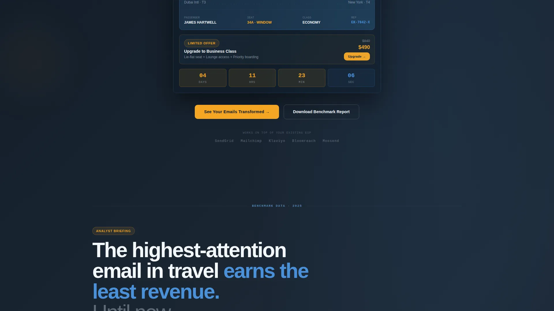
- A pixel-perfect simulated inbox header with three switchable email previews showing how one confirmation email changes across the traveler's journey
- Scroll-triggered data sections featuring open-rate comparisons, revenue-per-email charts, and click-through heatmaps that appear as the visitor reaches each block
- Two distinct conversion paths: a primary demo-request form and a secondary gated benchmark report download, each targeting a different stage of buyer readiness
Feature list
This section covers the core built-in capabilities delivered by the template as described in the source brief.
Feature Tab Switcher Header
The header opens with three clickable tabs labeled "Booking Confirmed," "Pre-Trip Intel," and "Live Journey." Each tab renders a full-width email preview inside a simulated inbox. Switching tabs morphs the email content in real time, showing embedded weather widgets, countdown timers, and interactive map pins within the inbox chrome.
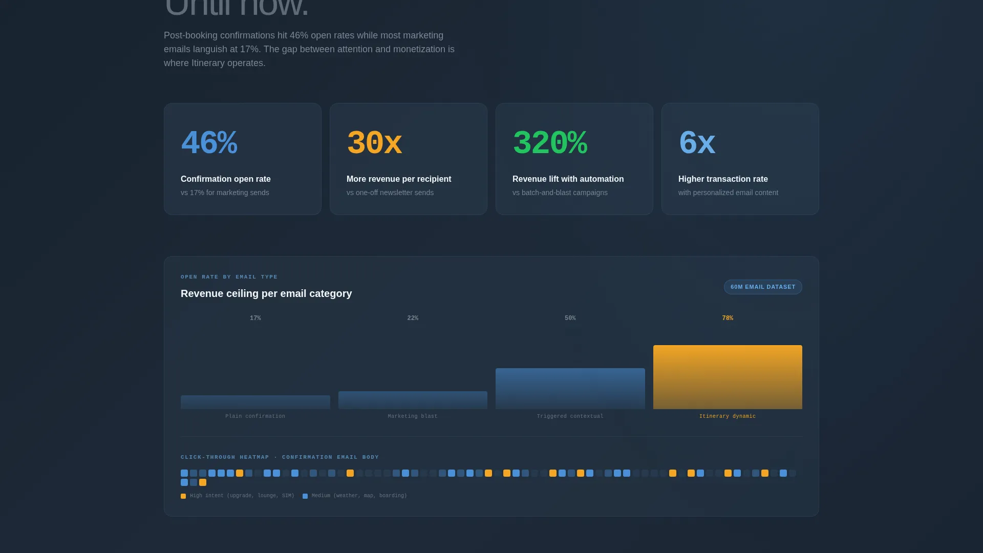
Scroll Reveal Data Sections
As the visitor scrolls, benchmark data materializes section by section. Open-rate comparisons appear first, followed by revenue-per-email charts, then click-through heatmaps. The progressive reveal creates an escalating argument that builds credibility with each new data point.
Persistent Split-Panel Comparison
A pinned side-by-side section holds a plain-text generic confirmation on one side and the platform's dynamic version on the other. Annotation callouts highlight each missed revenue opportunity in the static version, making the contrast impossible to ignore.
Dual Conversion Path Forms
The primary call to action, "See Your Emails Transformed," leads to a three-field form asking for current email service provider, monthly email volume, and work email. A secondary path offers the benchmark report gated behind email-only capture, qualifying two different audience segments without a second page.
Data Command Visual Theme
The entire page uses a cockpit-inspired Slate and Sky color system. Signal amber is reserved exclusively for live-data callouts and call-to-action pulses, so every color communicates status rather than decoration.
Case Study Section with Named Partners
After the initial metrics sections, a dedicated case study block features named airline and hotel partners with specific dollar figures. This grounds the abstract benchmark data in real outcomes and adds authority to the platform's claims.
Page sections overview
| Section | Purpose |
|---|---|
| Tab Switcher Header | Simulate inbox and preview three dynamic email states |
| Inbox Email Preview | Show richly designed confirmation with embedded live widgets |
| Benchmark Open Rates | Present open-rate data to establish engagement credibility |
| Revenue Per Email | Visualize revenue uplift with scrollable chart reveal |
| Click-Through Heatmaps | Display interaction patterns to support conversion argument |
| Case Study Block | Feature named partners and specific revenue dollar figures |
| Split-Panel Comparison | Pin generic versus dynamic email with annotation callouts |
| Primary call to action Form | Qualify and capture demo-ready prospects with three fields |
| Benchmark Report Gate | Capture research-phase visitors with email-only download form |
Design & branding system
The design follows a Data Command theme that feels like a cockpit instrument panel at cruising altitude. Every color choice is functional, conveying information status rather than serving as visual decoration.
- Deep terminal slate (#1E2A38) forms the primary background, giving the page a calm, information-dense atmosphere that suits data-heavy sections
- Cloud-altitude white (#F4F7FA) handles body text and user interface chrome, while horizon blue (#4A90D9) anchors interactive elements and navigational cues
- Signal amber (#F5A623) appears only on live-data callouts and call-to-action pulses, preserving its visual urgency for the moments that matter most
Mobile & speed optimization
The template is built as a responsive layout designed to work cleanly across screen sizes. The simulated inbox and tab switcher adapt to mobile viewports so the core demonstration still lands on a smaller screen.
- The three-tab email preview collapses gracefully on mobile, keeping the switching interaction intact without requiring horizontal scrolling
- Scroll-reveal data sections are structured to trigger at appropriate viewport positions on both desktop and mobile, maintaining the progressive storytelling effect
How this template helps you convert
This landing page is structured to move visitors through a deliberate persuasion arc. It earns trust before it asks for anything, using proof first and calls to action second.
- The inbox simulation at the top immediately shows rather than tells, letting visitors experience the product concept before reading a single line of marketing copy
- Progressive data reveals escalate social proof across multiple sections, so by the time a visitor reaches the comparison panel they have already absorbed open rates, revenue charts, and a named case study
- The dual-path conversion setup means no visitor leaves empty-handed: demo-ready prospects fill the three-field form, while earlier-stage visitors trade an email address for the benchmark report
Other information about this template
This template is well suited for travel technology companies operating in the transactional email space, including platforms that serve airlines, hotel chains, and online travel agencies. It is specifically designed to attract three audience types: solo backpackers who rely on mobile confirmation threads, executive assistants managing multi-timezone itineraries, and honeymooners who archive every booking detail.
- The template style is Scroll Reveal (Progressive), meaning content sections animate into view as the visitor reaches them, keeping attention high throughout the page
- The creative direction is Industry Report, which means the page builds its case like a data briefing rather than a traditional product pitch
- The landing page direction is Comparison/Versus, making the split-panel section a structural centerpiece rather than an optional add-on
- The header concept is a Feature Tab Switcher, a component that doubles as both a navigation aid and a live product demonstration


Theme
Data Command
Creative direction
Industry Report
Color system
Slate & Sky
Style
Scroll Reveal (Progressive)
Direction
Comparison/Versus
Page Sections
Feature Tab Switcher with Live Inbox Simulation
Scroll-triggered Benchmark Data Reveals
Persistent Split-panel Comparison
Dual-path Lead Capture Forms
Data Command Color System
Named Case Study Section
Related questions
Who is the primary audience for this landing page template?
What does the Feature Tab Switcher show visitors?
How does the split-panel comparison section work?
Can this template capture two different types of leads at once?
Is this a single-page template or a multi-page site?


