Tour Booking Comparison Table Landing Page
The Itinerary landing page template is built for tour and activity booking professionals who need to showcase a powerful scheduling dashboard. With a Data Command visual theme, comparison table layout, and a lead-generation flow built around a demo request form, this template turns evaluation into action for travel agents, retreat planners, and destination marketers.
by Rocket studio
Quick summary
Itinerary is a single-page, comparison-table landing page template for tour and activity booking platforms. It presents a dense, data-forward dashboard preview, walks prospects through feature-by-feature comparisons against legacy tools, and drives qualified leads through a focused three-field demo request form.
Who this template is for
This template is built for teams that sell scheduling and booking software to travel professionals. It speaks directly to buyers who live inside complex itineraries every day and need hard evidence before they commit to a new tool.
- Independent travel agents who assemble bespoke, multi-day itineraries for clients such as honeymooners
- Corporate retreat planners coordinating dozens of attendees across multiple cities
- Destination marketing organizations benchmarking operator performance across a region
What problem this template solves
Managing tour bookings across spreadsheets, email chains, and disconnected portals creates slow, error-prone workflows. Prospects arriving at a booking platform page often struggle to see why switching is worth it. This template closes that gap with head-to-head proof.
- Buyers cannot easily compare real-time availability syncing and dynamic pricing against tools they already use
- Long-form feature pages bury the differentiators that matter most to analytical buyers
- Generic demo request forms attract unqualified leads and waste sales team time
What you get with this template
You get a fully structured, single-page layout built around a feature matrix creative direction. Every section is designed to keep evaluation momentum running from the first scroll to the demo request.
- A full-width dashboard preview header with a parallax effect and a self-typing headline in the app's search bar
- Multiple comparison tables pitting the app against spreadsheets, email chains, and legacy booking portals
- A three-field lead generation form and a secondary self-serve sandbox link for prospects who prefer to explore first
Feature list
This template is built around specific, prompt-defined components. Each one earns its place by moving a skeptical buyer one step closer to requesting a demo.
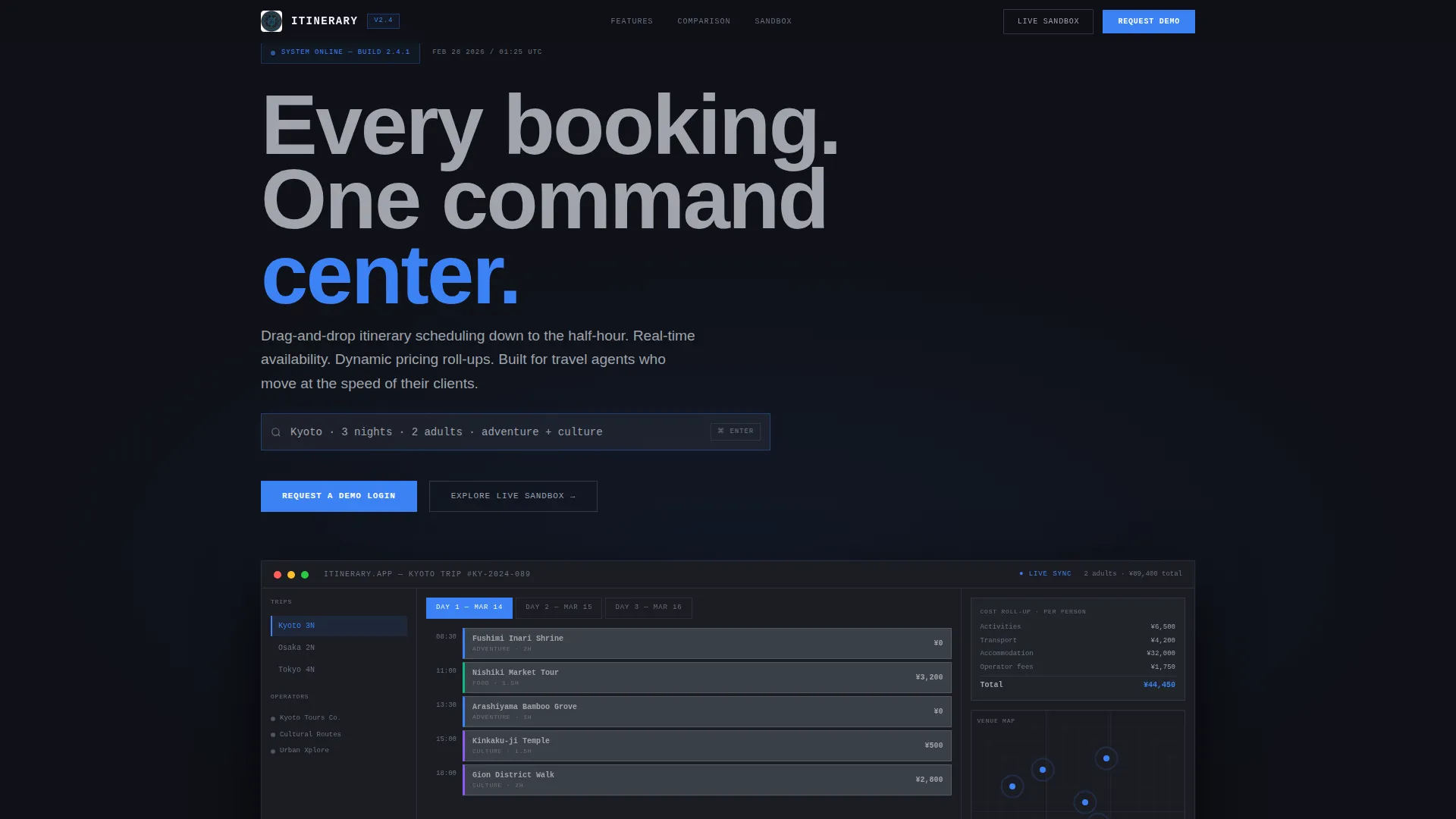
Full-Width Dashboard Header
The header renders a pixel-accurate screenshot of the itinerary builder mid-session. A three-day Kyoto trip is visible in calendar-rail view, with activity cards snapped into time slots, a live pricing column, and a small map showing pulsing venue pins. A subtle parallax effect separates the dashboard from its dark background, making it feel like a monitor floating above the desk.
Self-Typing Search Bar Headline
The page headline types itself directly into the app's search bar: "Kyoto · 3 nights · 2 adults · adventure + culture." This interaction reinforces the product's core promise without a single word of sales copy. It anchors the visitor inside the experience before they read anything else.
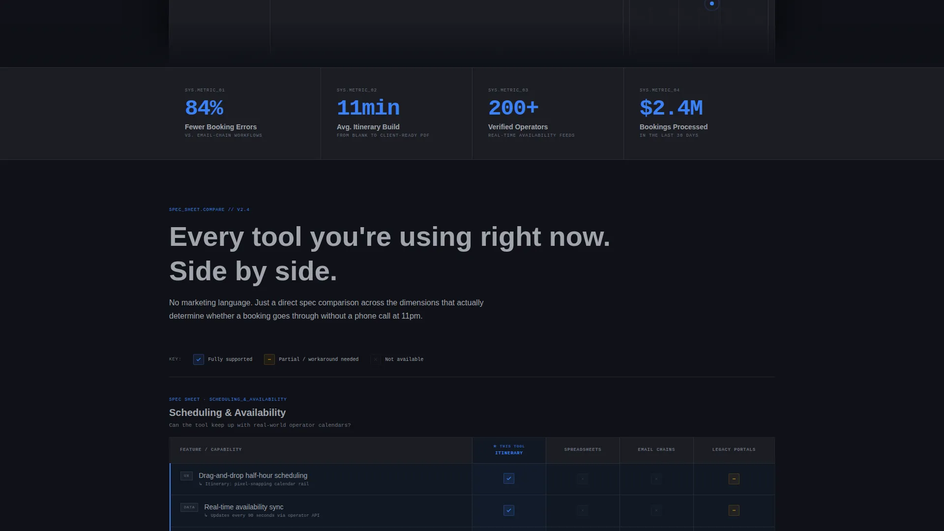
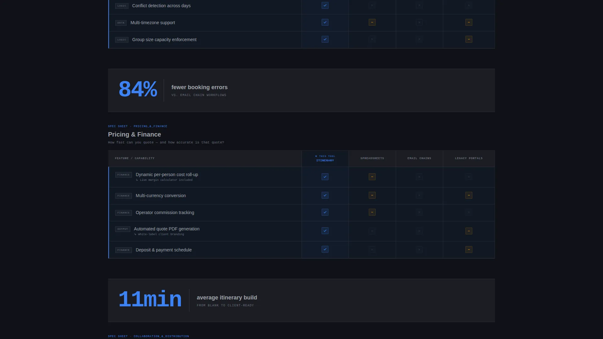
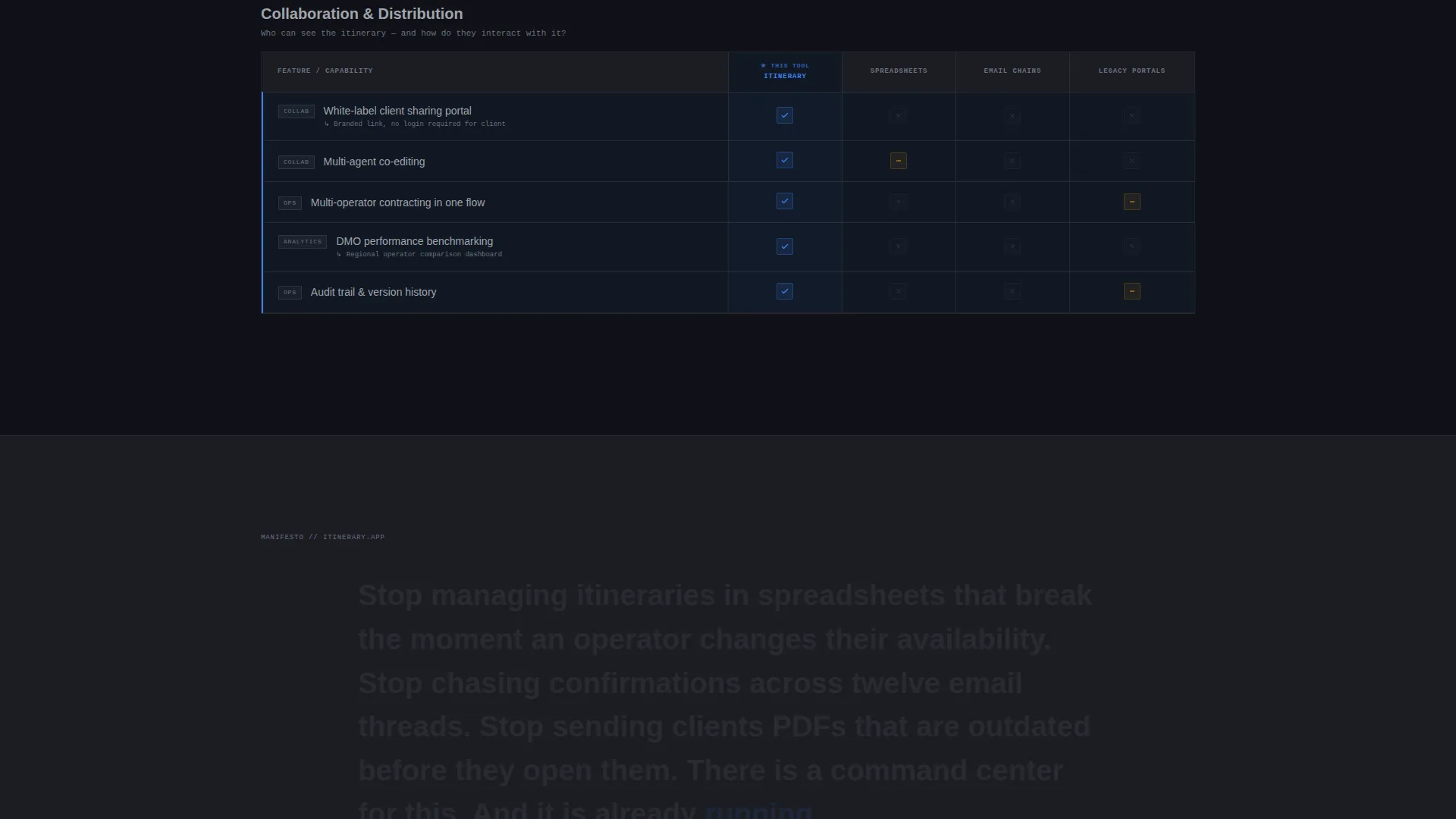
Feature Matrix Comparison Tables
Each scroll section presents a structured comparison table. Rows measure the app against spreadsheets, email chains, and legacy booking portals across dimensions like real-time availability sync, dynamic pricing roll-ups, multi-operator contracting, and white-label client sharing. Rows highlight in electric blue as they enter the viewport, drawing attention to the app's advantages at a glance.
Instrument-Reading Stat Callouts
Between comparison tables, single-stat callouts appear like instrument readings. Examples include "84% fewer booking errors" and "11-minute average itinerary build." These data points break up the tables and sustain analytical momentum so the visitor stays in evaluation mode throughout the scroll.
Anchored Demo Request Form
The primary call to action reads "Request a Demo Login" and appears both anchored in the top navigation bar and repeated after the final comparison table. The form collects work email first to qualify the lead, then monthly booking volume via a dropdown, then a free-text field asking for the prospect's biggest itinerary challenge.
Self-Serve Sandbox Entry Path
A secondary call to action labeled "Explore the Live Sandbox" gives impatient prospects a way to touch the dashboard before speaking to sales. The link opens a limited interactive demo and captures the visitor's email on entry, creating a second qualified lead channel without adding friction to the primary form.
Page sections overview
| Section | Purpose |
|---|---|
| Dashboard Preview Header | Show the app in live use and set the data-command tone |
| Self-Typing Headline | Immerse the visitor in the product experience immediately |
| Comparison Table: Scheduling | Contrast drag-and-drop scheduling against spreadsheet workflows |
| Stat Callout Block | Reinforce key performance figures between table sections |
| Comparison Table: Pricing | Highlight dynamic pricing roll-up advantages over legacy portals |
| Stat Callout Block | Sustain analytical momentum with a second instrument-style reading |
| Comparison Table: Contracting | Demonstrate multi-operator and white-label sharing superiority |
| Demo Request Form | Capture qualified leads with a focused three-field form |
| Sandbox call to action Link | Provide a self-serve exploration path for hands-on prospects |
Design & branding system
The visual identity follows a Data Command theme using a Monochrome Steel color system. The palette deliberately removes warmth so that data and highlighted states become the only sources of visual life on the page.
- Carbon chassis black (#1B1D23) and brushed gunmetal (#3A3F47) form the primary backgrounds and surface layers
- Cool instrument-panel gray (#A0A4AB) handles secondary text, borders, and inactive interface elements
- Electric blue (#3B82F6) is reserved exclusively for active states, selected comparison rows, primary buttons, and viewport-triggered row highlights
Mobile & speed optimization
The template is structured with a lean, single-page layout that keeps load weight low. The dense comparison tables are designed to reflow cleanly on smaller screens without losing legibility.
- The parallax header is implemented with a lightweight separation effect that avoids heavy scroll libraries
- Comparison tables use horizontal scroll containers on narrow viewports so column alignment stays intact
- Stat callout blocks collapse to full-width single-line readings on mobile, preserving the instrument-panel rhythm
How this template helps you convert
The page is engineered around one outcome: a qualified demo request. Every section earns its place by reducing doubt, building analytical trust, and lowering the friction to act.
- The dashboard header and self-typing headline create immediate product credibility before any claim is made in text, making the visitor feel informed rather than sold to.
- The comparison tables and stat callouts give data-driven buyers the evidence they need to justify a conversation with sales, cutting the time between first visit and form submission.
- The dual call-to-action structure (demo request form plus sandbox link) captures both decision-ready buyers and explorers, so no qualified prospect leaves the page empty-handed.
Other information about this template
This template fits squarely in the technology category under industry mobile apps, specifically the tour and activity booking app niche. It is designed as a single landing page with a comparison table template style and a lead generation direction.
- The template theme is Data Command with a Monochrome Steel color system, making it a strong fit for platforms positioning themselves as professional-grade booking infrastructure
- The header concept is a Dashboard Preview, a format well suited to software products where showing the interface is more persuasive than describing it
- The creative direction is a Feature Matrix, ideal for buyers who arrive already using a competing tool and need structured side-by-side evidence to justify switching
- The intersection match score for this template is 13, reflecting a tight alignment between the technology category, the industry mobile apps subcategory, and the tour and activity booking niche
Theme
Data Command
Creative direction
Feature Matrix
Color system
Monochrome Steel
Style
Comparison Table
Direction
Lead Generation
Page Sections
Full-width Dashboard Preview Header
Self-typing Search Bar Headline
Feature Matrix Comparison Tables
Instrument-reading Stat Callouts
Anchored Three-field Demo Form
Self-serve Sandbox Call to Action Path
Related questions
Who is this landing page template designed for?
Can I adapt the comparison tables for a different product category?
What makes the three-field lead generation form effective?
Does the template include the sandbox demo functionality?
Is this template suitable for a software product outside the travel industry?


