Itinerary - Powerful Travel Booking Landing Page Template
Itinerary is a single-page comparison landing page template built for corporate travel booking software. It pairs a live-stats header with a sticky feature matrix table, a two-step savings calculator, and a violet-on-void visual identity. The design is built to make switching feel inevitable before a visitor reaches the bottom of the page.
by Rocket studio
Quick summary
Itinerary is a high-impact comparison landing page template for corporate travel booking platforms. It opens with a live stats dashboard, drops into a sticky feature matrix, and closes with a personalized savings calculator. Every visual choice, void black backgrounds, electric violet highlights, and flip-counter animations, is engineered to make the case before a visitor finishes scrolling.
Who this template is for
This template is built for travel booking software companies that need to convert mid-market corporate buyers. If your product consolidates flights, hotels, and ground transport into one workflow, this page gives you the right arena to prove it.
- Operations directors and corporate travel managers evaluating platforms to replace multi-portal expense workflows
- Travel management companies that handle dozens of corporate accounts and need a fast, credible sales surface
- Executive assistants and procurement teams who need to trust a platform before committing to it
What problem this template solves
Corporate travel software buyers are skeptical. They have seen vendor decks before, and they don't trust claims without evidence. This template sidesteps that skepticism entirely by making the comparison do the convincing.
- Buyers struggle to compare travel platforms without a clear side-by-side view of real feature gaps
- Generic hero-image landing pages don't communicate speed, scale, or operational advantage for software buyers
- Visitors leave without converting because no single touchpoint shows them what they would actually save
What you get with this template
You get a single-page layout designed around one goal: making the feature gap between your platform and legacy competitors impossible to ignore. Every section serves the comparison narrative.
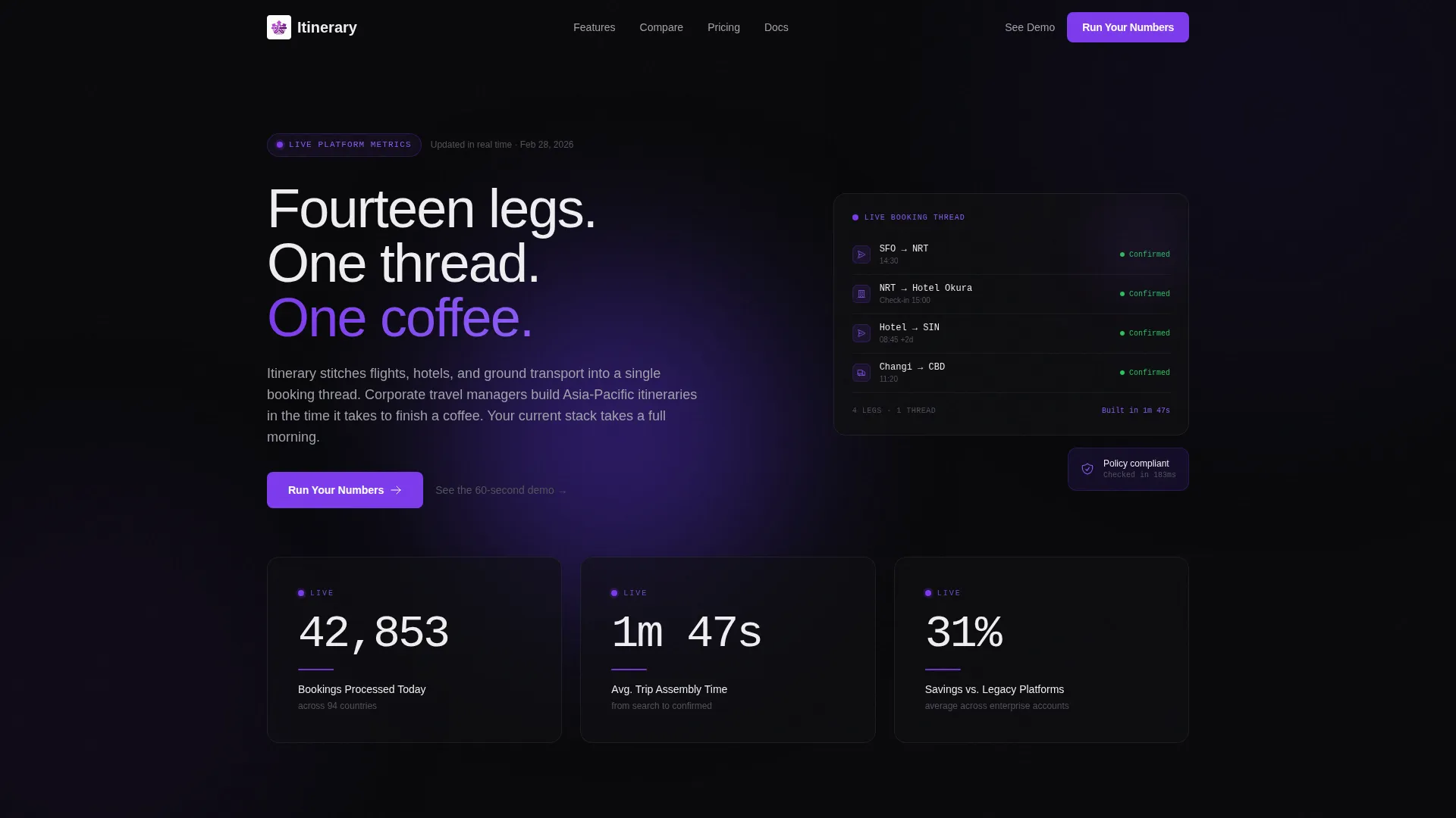
- A Stats/Metrics header with three animated flip counters showing live-style operational numbers
- A sticky comparison table with expandable feature rows and a two-step ROI calculator
- A Dynamic Motion visual system built on void black, interstellar purple, and electric violet
Feature list
This template ships with a focused set of built-in components. Each one is purpose-built for the comparison-and-conversion flow described below.
Animated Stats Header
Three oversized counters display key operational metrics, bookings processed, average trip assembly time, and savings versus legacy platforms. Each digit cycles with a departures-board flip animation, set in a monospaced typeface against void black with violet underlines pulsing beneath. The data leads the page as the visual proof point, with no hero image required.
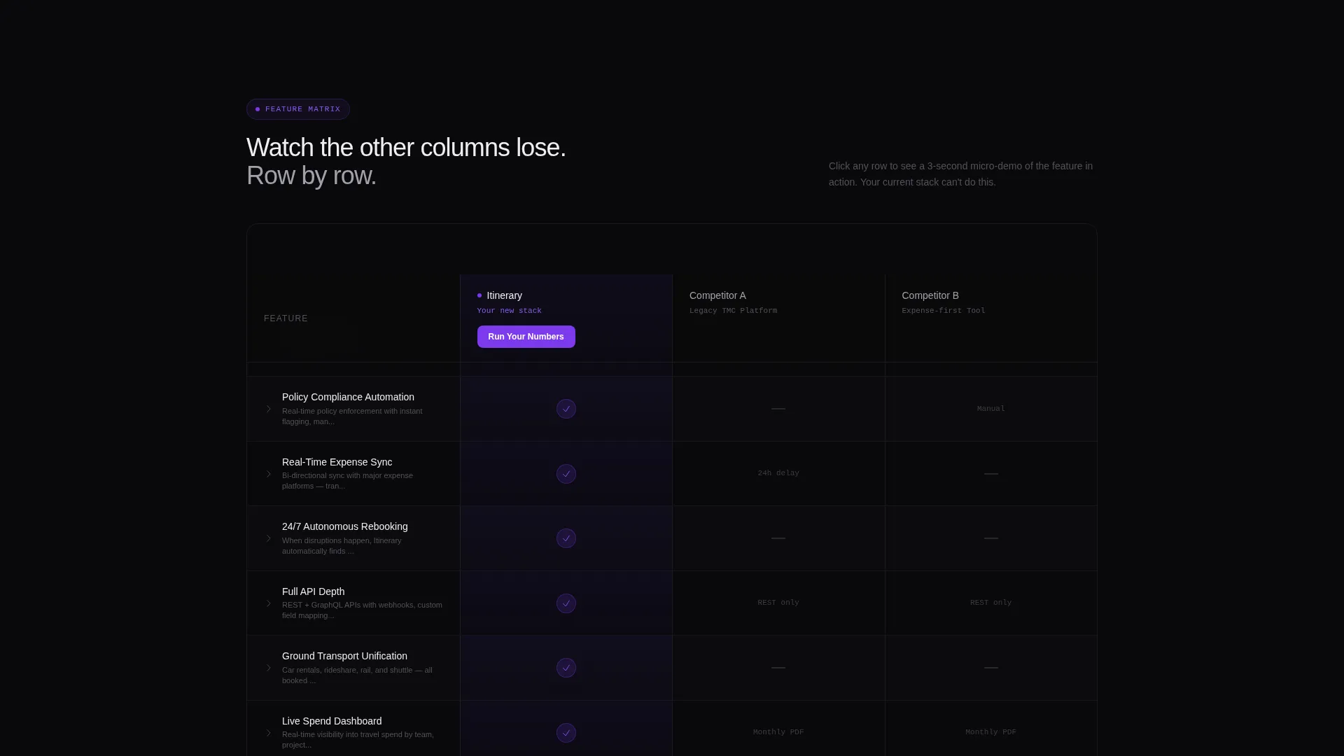
Sticky Comparison Table
The feature matrix locks into view as the visitor scrolls. It places your platform against two anonymized legacy competitors across rows covering multi-leg booking, policy compliance automation, real-time expense sync, 24/7 rebooking support, and application programming interface (API) depth. Checkmarks glow violet; competitor gaps render in muted gray, making every advantage visible at a glance.
Expandable Feature Row Micro-Demos
Each row in the comparison table expands on click to reveal a three-second looping animation of the feature in action inside the product interface. Visitors don't just read about a capability, they watch it work, then watch the competitor column stay empty.
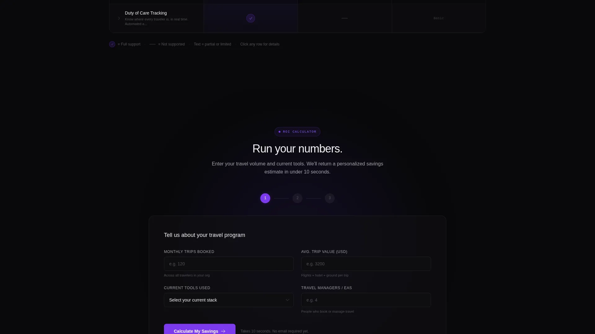
Two-Step Savings Calculator
The primary call to action opens a two-step calculator. First, the visitor enters monthly trip volume and selects their current tools from a named-competitor dropdown. Second, the page returns a personalized savings estimate and time-saved projection, then asks for a work email to unlock a full benchmark report.
Pinned and Repeated call to action Layout
The "Run Your Numbers" call to action appears both pinned inside the table header and repeated at the bottom of the page. A secondary text link, "See the Live Demo," leads into a sixty-second product walkthrough. The dual-path structure captures visitors at two different decision points.
Dynamic Motion Visual System
Every interactive element, toggle switches, checkmarks, hover states, and the primary call to action button, fires in electric violet (#7C3AED). Comparison columns alternate between void black (#09090B) and interstellar purple (#2D1B69). The result is a visual rhythm that pulls the eye down the page and signals action at every decision point.
Page sections overview
| Section | Purpose |
|---|---|
| Stats/Metrics Header | Opens with animated flip counters showing live operational scale |
| Sticky Comparison Table | Locks into view and runs the head-to-head feature confrontation |
| Expandable Row Demos | Shows each feature in action with a three-second looping animation |
| Savings Calculator Step One | Captures trip volume and current tool selection from the visitor |
| Savings Calculator Step Two | Returns personalized savings estimate and prompts for work email |
| Bottom call to action Block | Repeats the primary call to action and the secondary demo link |
Design & branding system
The visual identity uses a Void & Violet color system that feels like an airport terminal at midnight, dark glass, glowing wayfinding strips, and the violet hum of backlit signage. The Dynamic Motion theme governs how every interactive element behaves.
- Color palette: void black (#09090B) for backgrounds, deep interstellar purple (#2D1B69) for alternating columns, electric violet (#7C3AED) for all active states, hover pulses, and interactive elements, and cool starfield white (#EEEEF0) for text and table borders
- Typography: monospaced typeface for counter digits in the stats header; the flip animation on each digit reinforces the departures-board metaphor throughout the page
- Motion and interaction: violet fires on every interactive trigger, toggles, checkmarks, call to action buttons, making the accent color the consistent visual signal for action
Mobile & speed optimization
The template is structured for a responsive single-column flow on smaller screens, keeping the comparison table and calculator usable without horizontal scrolling. The Dynamic Motion elements are scoped to keep the experience functional on touch devices.
- The sticky comparison table adapts to a scrollable horizontal layout on mobile viewports, preserving the side-by-side structure
- Flip counter animations and row-expansion interactions are designed to remain legible at smaller sizes without cluttering the viewport
- The two-step calculator flow compresses cleanly into a stacked input layout on narrow screens
How this template helps you convert
This page is built around the insight that corporate buyers convert when they feel they have already decided. The layout earns that feeling through a layered sequence of proof, comparison, and personalization.
- The stats header establishes immediate credibility with operational numbers that legacy platforms cannot match, framing the comparison before it begins
- The sticky feature matrix runs the head-to-head proof row by row, making the competitor gaps visible and cumulative so that switching feels logical rather than risky
- The two-step calculator personalizes the outcome for each visitor, turning an abstract advantage into a specific number tied to their own trip volume before the email ask arrives
Other information about this template
This template was designed specifically for the travel booking software category, where buyers evaluate platforms on operational efficiency and total cost of ownership rather than aesthetics alone. The comparison table format suits software-as-a-service (SaaS) products that compete against established legacy tools in the corporate travel management space.
- The template supports a corporate travel booking platform positioning that emphasizes multi-leg itinerary assembly, policy compliance, and expense reconciliation in one workflow
- The anonymized competitor columns in the feature matrix allow the template to be adapted for any competitive set without redesigning the table structure
- The benchmark report email gate at the end of the calculator flow creates a lead capture moment that feels earned rather than forced, because the visitor has already seen a personalized result
Theme
Dynamic Motion
Creative direction
Feature Matrix
Color system
Void & Violet
Style
Comparison Table
Direction
Comparison/Versus
Page Sections
Animated Flip-counter Stats Header
Sticky Feature Comparison Table
Expandable Row Micro-demos
Two-step ROI Savings Calculator
Dual-path Call to Action Architecture
Void & Violet Dynamic Motion System
Related questions
Who is this landing page template designed for?
Can I adapt the comparison table to my own competitors?
How does the savings calculator work inside the template?
What makes this template different from a standard SaaS landing page?
Is this template suitable for a travel management company as well as a software vendor?



