Travel CRM Landing Page Template with Scroll Animations
Itinerary is a scroll-reveal travel CRM landing page template built for independent travel advisors and boutique agencies. It combines a Feature Tab Switcher header, fluid morph animations, and an interactive explorer layout to demonstrate pipeline management, client profiles, and commission tracking, guiding visitors from curiosity to a free trial click.
by Rocket studio
Quick summary
Itinerary is a single-page travel CRM landing page template designed around motion, interactivity, and progressive discovery. It showcases pipeline management, client profile depth, and commission tracking through animated tab switching and scroll-activated sequences. The goal is simple: let visitors touch the product before they ever click "Start Your Free Trial."
Who this template is for
This template is built for travel professionals who manage complexity every day. It speaks directly to the people who live inside booking systems, client inboxes, and supplier portals simultaneously.
- Independent travel advisors juggling sixty or more active trips at once
- Boutique agency owners who need pipeline visibility across multiple consultants
- Host agency networks looking to standardize workflows without limiting individual creativity
What problem this template solves
Most travel advisors operate across a tangle of disconnected tools. Client preferences live in one place, booking histories in another, supplier contracts somewhere else entirely. This template addresses that fragmentation head-on.
- Replaces the scattered multi-tab browsing habit with a single, unified dashboard presentation
- Shows prospects how disjointed workflows create lost commissions and missed follow-ups
- Demonstrates a clear alternative before asking visitors to commit to anything
What you get with this template
You get a fully structured, scroll-reveal landing page that builds its case section by section. Every element is designed to earn trust through demonstration rather than description.
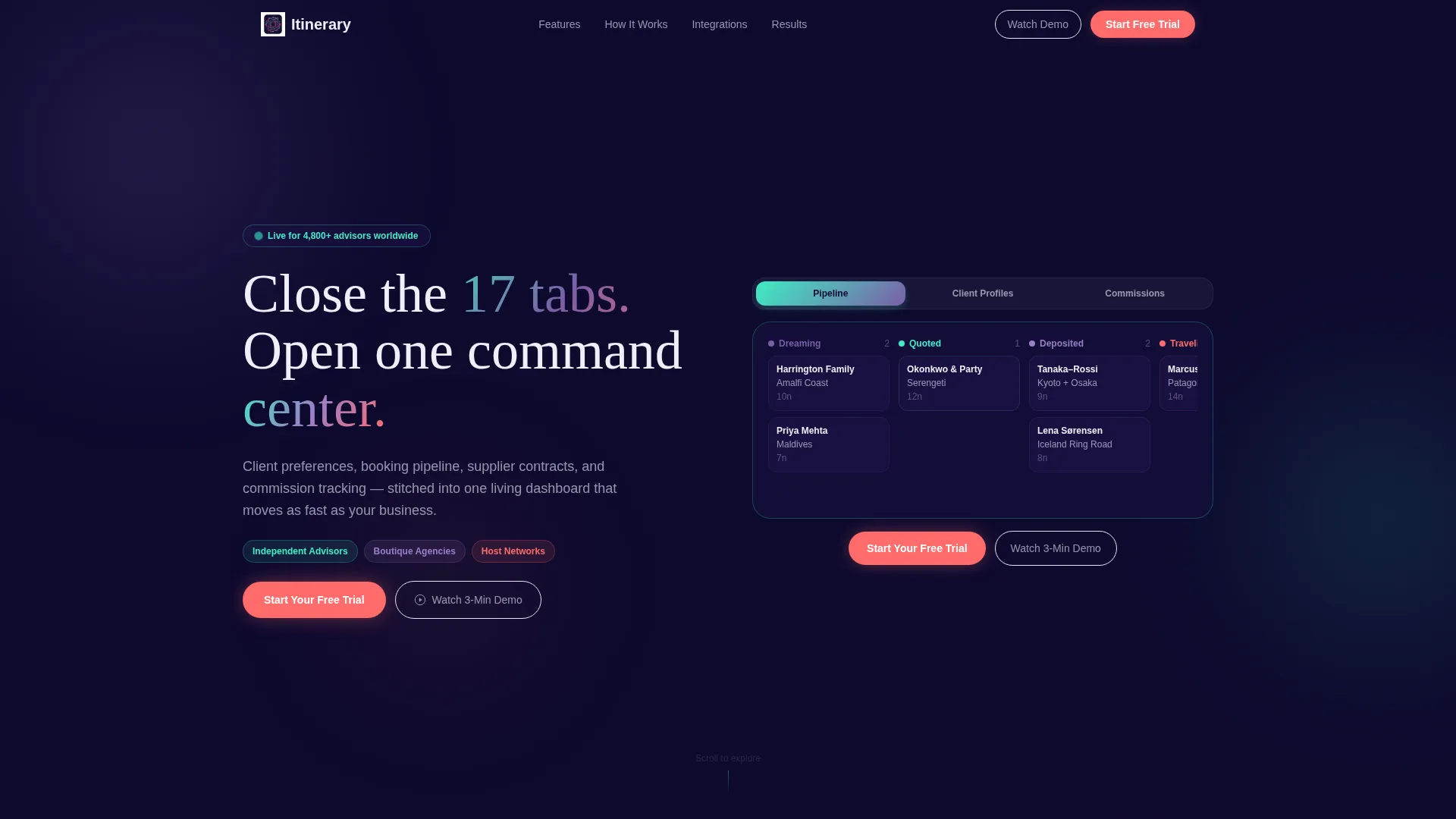
- A Feature Tab Switcher header with three interactive views: Pipeline, Client Profiles, and Commissions
- A scroll-activated workflow animation showing a lead moving from email to commission log in one continuous sequence
- A fixed hot coral call-to-action bar and a ghost-button secondary call to action, both wired for click-through to a signup page
Feature list
This template ships with a set of purpose-built interactive components. Each one is designed to make the product feel real before a visitor signs up.
Feature Tab Switcher Header
Three clickable tabs sit above a stylized product screenshot. Selecting "Pipeline" reveals a Kanban board, "Client Profiles" shows a rich contact card, and "Commissions" displays a waterfall earnings chart. Each tab transition uses a fluid morph animation where elements slide, scale, and recolor rather than cutting abruptly.
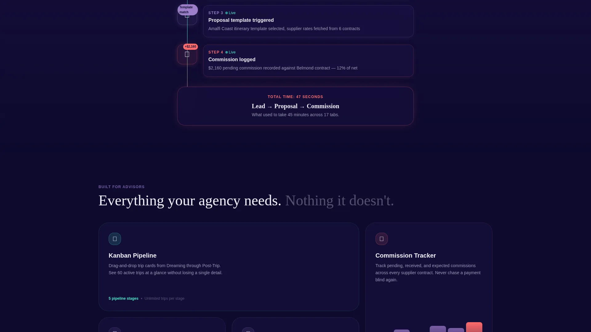
Scroll-Activated Workflow Animation
As the visitor scrolls, a choreographed sequence plays out: a lead arrives via email, auto-populates a client card, triggers a proposal template, and logs a commission entry. The animation runs in one continuous flow, showing the full CRM cycle without requiring any clicks.
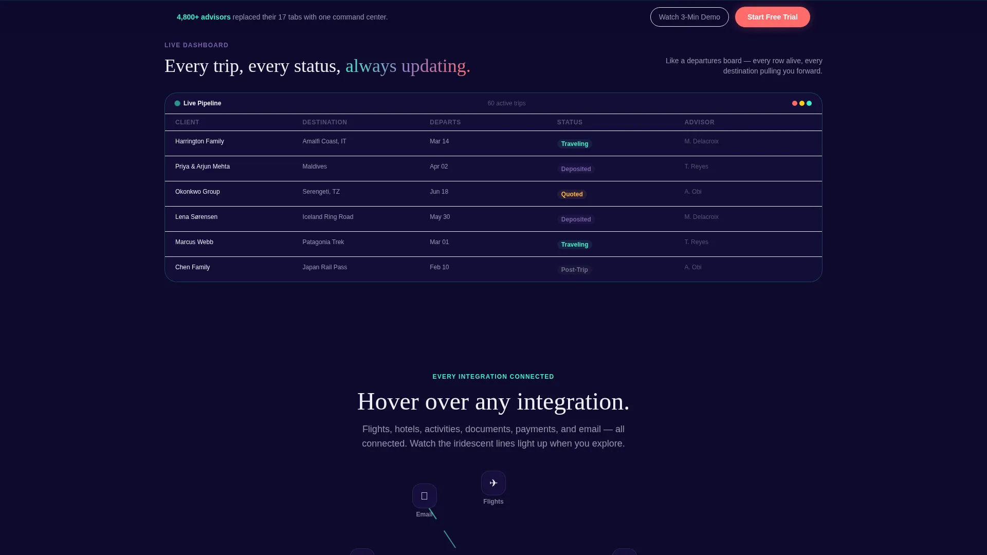
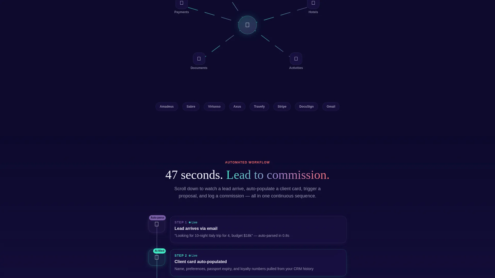
Interactive Itinerary Explorer
Hovering over a sample itinerary lights up each integration point, flights, hotels, activities, and documents, with iridescent connection lines. This section turns passive reading into active exploration and communicates product depth through visual metaphor.
Progressive Scroll Reveal Layout
The page unfolds in deliberate stages, moving visitors from "what is this" to "how does it work" to "what would my agency look like inside it." Each section feels like pulling back a curtain, with micro-interactions that reward curiosity along the way.
Persistent call to action Bar
The primary "Start Your Free Trial" button appears first inside the header and then fixes to the bottom of the viewport after the first scroll. This keeps the conversion action visible throughout the entire page journey without interrupting the reading experience.
Micro-Interaction Layer
Cards tilt on hover, numbers count up on entry, and supplier logos orbit a central hub diagram. These small details accumulate into a sense of product sophistication that no static screenshot could convey.
Page sections overview
| Section | Purpose |
|---|---|
| Header Tab Switcher | Introduces pipeline, client profiles, and commissions via interactive tabs |
| Itinerary Explorer | Hover-activated integration map showing flights, hotels, and documents |
| Workflow Animation | Scroll-triggered sequence from lead arrival to commission log |
| Supplier Hub Diagram | Orbiting logo cluster illustrating supplier network connections |
| Fixed call to action Bar | Persistent trial button anchored to the viewport bottom after first scroll |
Design & branding system
The visual identity uses an AI Iridescent color system built on four deliberate tones. The palette feels like light refracting through a prism onto a dark surface at midnight, digital and luminous, but never cold.
- Deep space indigo (#1B1145) as the primary background, shifting violet (#7B5EA7) for user interface layering, and holographic teal (#3EEDC4) for highlights and connection lines
- Hot coral (#FF6B6B) reserved exclusively for calls to action and notification accents, ensuring those elements always draw the eye
- A Dynamic Motion theme governs all transitions: fluid morph animations, scroll-triggered reveals, and hover-state tilts that make the interface feel alive and breathing
Mobile & speed optimization
The template is structured for a clean mobile experience. The scroll-reveal sequencing and tab-switching interactions are built to translate across screen sizes without losing their impact.
- Scroll-activated animations are layered progressively so content remains readable even if motion is reduced on smaller devices
- The fixed call to action bar adapts to mobile viewport dimensions, keeping the trial button accessible throughout the scroll journey
- Interactive elements such as the itinerary explorer and workflow animation are designed to remain functional on touch-based devices
How this template helps you convert
This template treats conversion as a journey, not a demand. It earns the click by letting visitors experience the product before asking for anything in return.
- The interactive tab switcher and scroll animations let visitors touch the product directly, so the free trial feels like a continuation of what they were already doing rather than a cold commitment.
- The two-call to action structure separates ready buyers from curious ones: "Start Your Free Trial" captures intent immediately, while "Watch the 3-Minute Demo" keeps hesitant visitors engaged and moving forward.
Other information about this template
This template sits at the intersection of travel software and modern SaaS landing page design. It is built specifically for the travel CRM niche, where the product itself is complex and the buyer needs to feel it before they trust it.
- The no-form page design keeps friction low: the click-through lands on a separate signup page asking only for name, email, and agency size
- Template style is Scroll Reveal (Progressive) with an Interactive Explorer creative direction, making it well-suited for software products that benefit from guided demonstrations
- The Dynamic Motion theme and AI Iridescent color system position the product as modern and forward-thinking without sacrificing usability
Theme
Dynamic Motion
Creative direction
Interactive Explorer
Color system
AI Iridescent
Style
Scroll Reveal (Progressive)
Direction
Click-Through
Page Sections
Feature Tab Switcher with Morph Animations
Scroll-triggered Workflow Sequence
Interactive Itinerary Explorer
Persistent Dual-cta Structure
Supplier Hub Orbit Diagram
Micro-interaction Layer
Related questions
Who is this landing page template designed for?
Does this template include a contact or signup form?
Can I customize the tab switcher to show my own product screenshots?
How do the scroll animations work in this template?
Is this template suitable for a travel agency not selling CRM software?


