Travel Client Management Landing Page Template
The Itinerary landing page template is built for travel advisors and boutique agency owners who need a single, organized view of every client trip. Using a bento grid layout with a Dynamic Motion theme and a Midnight Blue color system, it showcases a travel client management platform with hard-hitting industry stats, interactive demo elements, and a clear app download call to action.
by Rocket studio
Quick summary
Itinerary is a bento grid landing page template designed for a travel client management platform. It uses a Dynamic Motion theme, a deep Midnight Blue palette, and an Industry Report creative direction. Every section pairs a real advisor pain point with the product feature that solves it, building trust through data before driving visitors toward an app download.
Who this template is for
This template is built for travel professionals who manage complexity daily and need a landing page that speaks directly to that reality. It is not a generic software template. Every visual and copy decision targets people who live inside itineraries for a living.
- Independent travel advisors managing many active client itineraries at once
- Boutique agency owners who still rely on spreadsheets to track supplier commissions
- Consortium members who need reporting tools that demonstrate volume to preferred partners
What problem this template solves
Travel advisors lose meaningful time each week to tasks that a well-designed platform could handle automatically. The problem is not a lack of effort. It is a lack of a single, organized workspace where client data, supplier details, and booking confirmations live together. This template communicates that problem clearly and shows the solution inside the same scroll.
- Scattered booking confirmations and client preferences that live in separate tools or inboxes
- Manual itinerary formatting that consumes hours every week without adding client value
- No consolidated view of supplier margins, commissions, or agency-wide performance data
What you get with this template
You get a fully structured, single-page bento grid layout ready to represent a travel client management platform. The template delivers a cohesive visual system, a logical content flow, and purpose-built sections that move a visitor from skepticism to confident action.
- A full-width product screenshot header showing a live dashboard mid-workflow with client profiles, itinerary timelines, and supplier margin data
- A scrollable bento grid body using Industry Report creative direction, pairing hard statistics with product feature snippets
- An app download section with primary call-to-action copy, paired app badge placement, an email capture field, and an embedded interactive demo cell
Feature list
This template bundles several purposeful design and structural choices that work together to support a high-trust, conversion-focused landing page for a travel software product.
Dynamic Motion Bento Grid Layout
The page is built on a bento grid structure where cards slide, stack, and reorder as the visitor scrolls. This mirrors the feel of a departure board updating in real time, which reinforces the platform's core promise of live, responsive data.
Product Screenshot Hero Header
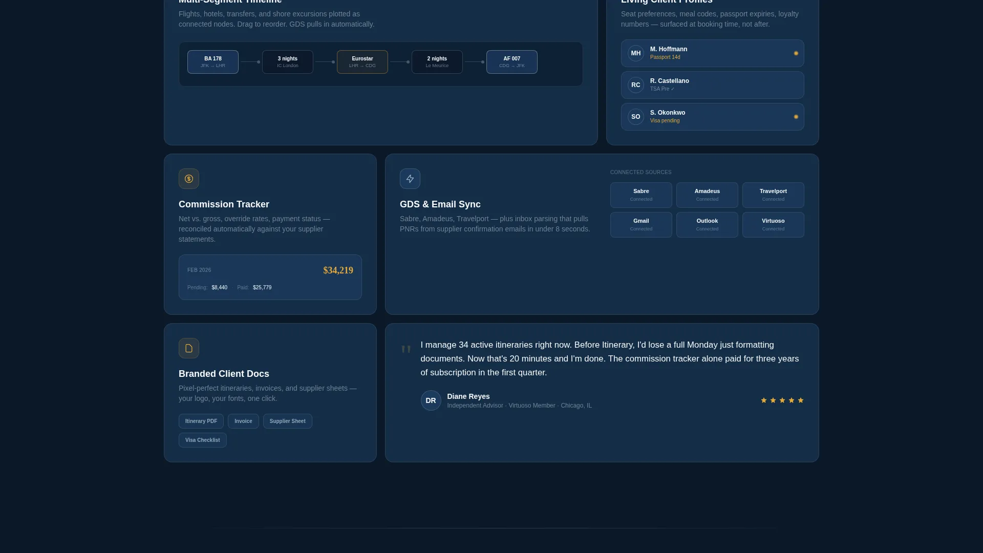
The header features a full-width, pixel-crisp dashboard screenshot set on a slight Z-axis rotation with a soft parallax shadow. The screenshot shows a client profile with a passport expiry flagged in amber, a multi-segment itinerary timeline, and a supplier margin summary, giving visitors an immediate, honest view of the product.
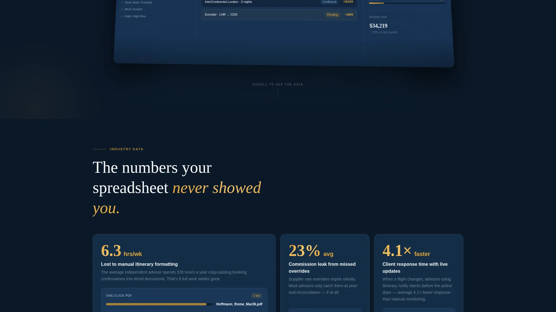
Industry Report Data Cards
Each bento cell pairs a quantified advisor pain point with a corresponding product feature. For example, a card surfaces the stat that the average advisor loses 6.3 hours per week to manual itinerary formatting, then shows the one-click PDF generation feature directly beside it. This format feels more like reading a white paper than browsing a feature list.
Interactive Demo Embed Cell
The final bento cell contains a miniature working itinerary builder. Visitors can drag sample flight segments onto a timeline to feel the product's responsiveness firsthand. When they reach the demo's limit, a prompt invites them to download the full app, turning curiosity into conversion intent.
App Download Call-to-Action Section
The primary call to action reads "Download and Start Free" with paired app store badge placements. A secondary path offers a single email field labeled "Or send yourself the link" for desktop visitors who plan to install later. Both paths keep the conversion funnel tight and frictionless.
Midnight Blue Visual System
The template applies a deliberate five-color palette across every card, background, and accent. Navy dominates structural surfaces, silver separates grid cells, white carries body text, and notification amber fires only on calls to action and live-data highlights. The result is a page that guides the eye without visual noise.
Page sections overview
| Section | Purpose |
|---|---|
| Hero Header | Displays full-width dashboard screenshot with headline |
| Stats Data Cards | Pairs advisor pain-point statistics with product features |
| Productivity Metrics Row | Escalates from individual time-loss data to agency insights |
| Agency Analytics Grid | Presents agency-wide performance data in bento cells |
| Consortium Reporting Cell | Shows volume reporting capability for consortium members |
| Interactive Demo Cell | Lets visitors drag flight segments and try the builder |
| App Download Section | Drives download with call to action, app badges, and email capture |
Design & branding system
The template's visual identity is governed by a Midnight Blue color system that evokes the atmosphere of looking out a business-class window at cruising altitude. The palette is precise and purposeful, with each color assigned a specific role across the layout.
- Deep terminal navy (#0B1929) and stratospheric blue (#1B3A5C) dominate card backgrounds and structural surfaces
- Cloud-layer silver (#C9D6DF) separates grid cells, and boarding-pass white (#F7F9FB) carries all body text
- Notification amber (#E8A838) appears exclusively on calls to action, live-data accents, and flagged dashboard elements like passport expiry alerts
Mobile & speed optimization
The bento grid layout is structured to adapt across screen sizes so the Dynamic Motion theme and card interactions remain coherent on smaller displays. The interactive demo cell and parallax header are designed with responsive behavior in mind.
- Card grid reflows gracefully from multi-column desktop layouts to single-column mobile stacks
- The product screenshot hero scales and repositions so the dashboard detail remains readable on smaller screens
- The app download section keeps both badge placements and the email capture field visible and tappable at mobile viewport widths
How this template helps you convert
This template earns the download by building trust through evidence before asking for any action. The scroll is structured so visitors arrive at the call to action already convinced by data and a hands-on interaction.
- The Industry Report bento grid leads with quantified pain points that advisors recognize from their own workday, creating immediate relevance and credibility before any product feature is introduced.
- The interactive demo cell lets visitors physically experience the product's responsiveness, shifting their confidence from "this looks useful" to "I can already use this," which makes the final download prompt feel like a natural next step rather than a sales ask.
Other information about this template
This template is part of a broader library of professionally designed landing page templates for software and platform products. It is well-suited for travel technology launches, app marketing campaigns, and agency-facing product pages.
- The template is built as a single-page bento grid landing page, making it straightforward to publish, test, and iterate without managing multiple page files
- The Dynamic Motion theme and departure-board card animation concept can support a range of travel software brands, from solo advisor tools to multi-seat agency platforms
- The color system and layout structure are fully editable, so teams can adapt the Midnight Blue defaults to match an existing brand identity while keeping the grid and motion framework intact


Theme
Dynamic Motion
Creative direction
Industry Report
Color system
Midnight Blue
Style
Bento Grid
Direction
App Download
Page Sections
Dynamic Motion Bento Grid
Product Screenshot Hero
Industry Report Data Cards
Interactive Demo Embed
App Download Call to Action Section
Midnight Blue Color System
Related questions
Who is this landing page template designed for?
Can I customize the colors and copy in this template?
Does the template include the interactive demo functionality?
What call-to-action options does this template include?
Is this template suitable for a travel software product launch?


