Jetlag - Highconverting Travel Landing Page Template
Jetlag is a split-screen landing page template built for travel startups that want to turn their welcome email into a first booking. It pairs a live email comparison preview with a Problem-to-Solution scroll arc, Electric Indigo visual identity, and two conversion-focused calls to action, making it one of the sharpest tools a travel email platform can put in front of early-stage buyers.
by Rocket studio
Quick summary
Jetlag is a single-page, split-screen landing page template designed for travel welcome email platforms. It uses a live email comparison header, a Problem-to-Solution scroll narrative, and a neon-charged Electric Indigo color system to show visitors exactly why their current welcome email is underperforming, and what a better one looks like in real time.
Who this template is for
This template speaks directly to founders and growth leads who run travel platforms and already understand the value of a great welcome email. They know that first message gets read more than any other, and they are tired of wasting it.
- Seed-stage travel startup founders who need a high-converting landing page fast
- Boutique online travel agency (OTA) operators and hostel network growth leads
- Email platform builders targeting the travel vertical who need a persuasive front door
What problem this template solves
Most travel welcome emails look identical. Generic subject lines, stock sunset photography, and a limp "Thanks for signing up" body copy leave real conversion potential on the table. This template frames that gap as a problem the visitor already owns.
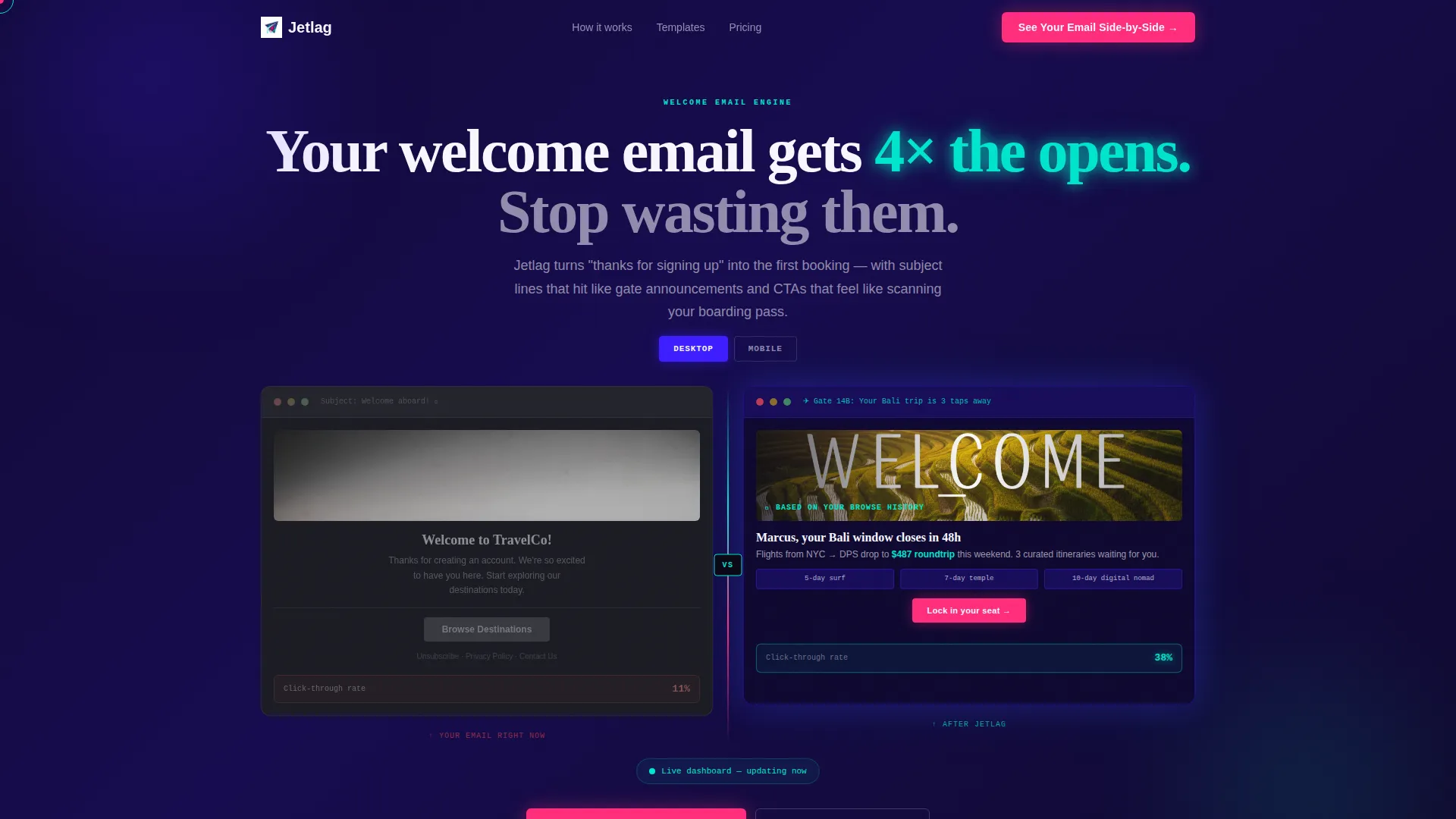
- Visitors recognize their own underperforming welcome email in the left-column "before" mockup
- The side-by-side structure makes the performance gap impossible to ignore
- The scroll arc keeps the reader moving toward a clear, committed action
What you get with this template
You get a fully structured, single-page landing page built around a 50/50 split-screen layout. Every section is designed to contrast mediocre email practice against a smarter, higher-converting approach.
- An interactive email preview header with toggle between mobile and desktop renders
- A Problem-to-Solution scroll arc with animating metrics and grayscale-to-color contrast effect
- Two conversion entry points: a two-field audit form and a free template download
Feature list
This template includes the core building blocks needed to position a travel email platform credibly and convert visitors with confidence.
Interactive Split-Screen Email Preview
The header divides the viewport down the center. The left side shows a generic travel welcome email with faded metrics. The right side shows the same brand's email rebuilt with dynamic imagery, personalized itinerary blocks, and a click-through rate glowing in cyan at 38 percent. Visitors can toggle between mobile and desktop renders directly in the header.
Animated Metric Callouts
As the visitor lands on the header, the metrics on the right side animate upward as if a live dashboard is updating. This creates an immediate impression of real performance data, reinforcing the platform's value before a single word of body copy is read.
Problem-to-Solution Scroll Arc
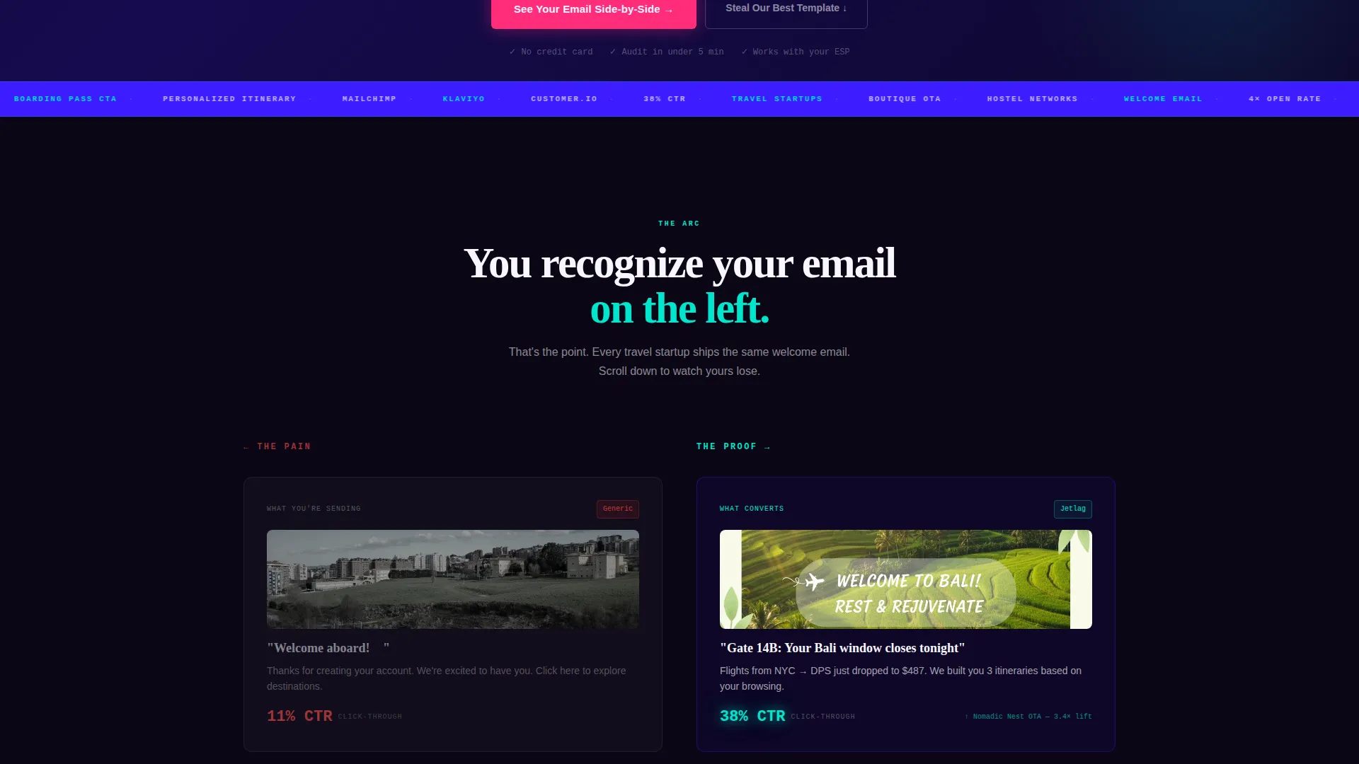
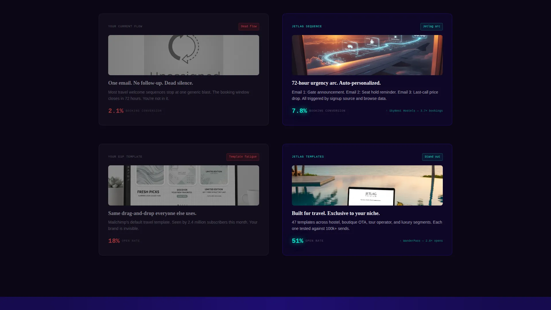
The left column stays locked on pain points as the visitor scrolls: abandoned signups, dead welcome flows, and screenshots of identical "Welcome to TravelCo" emails. The right column escalates with proof at each checkpoint. The left side gradually fades to grayscale while the right saturates with color, making the contrast visceral and hard to ignore.
Comparison/Versus Conversion Flow
The primary call to action, "See Your Email Side-by-Side," triggers a two-field form collecting the visitor's company URL and current email service provider. The platform then generates a live audit comparing their welcome email against an optimized version, delivered to their inbox within minutes.
Secondary Free Template Offer
A lower-commitment call to action, "Steal Our Best Template," offers a free Figma or HTML download in exchange for an email address. This gives high-volume, lower-intent visitors a reason to convert while feeding the top of the funnel.
Integration Logo Strip
The right column of the scroll arc includes integration logos for popular email service providers, adding social proof and signaling compatibility with tools the visitor already uses.
Page sections overview
| Section | Purpose |
|---|---|
| Interactive Preview Header | Shows before/after email comparison with live metric animation and device toggle |
| Problem Column Left | Anchors the pain: abandoned signups, dead flows, identical welcome emails |
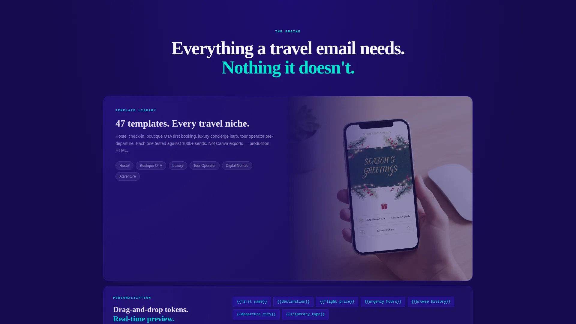
| Solution Column Right | Escalates proof with template library, personalization tokens, and A/B results |
| Integration Logo Strip | Displays email service provider logos to signal platform compatibility |
| Primary call to action Form | Two-field form capturing company URL and current provider for live email audit |
| Secondary call to action Block | Free Figma/HTML template download in exchange for an email address |
Design & branding system
The Electric Indigo color system drives every visual decision on this page. It feels electric and intentional, not decorative. Each color in the palette has a specific job.
- Deep terminal indigo (#3D1DFF) dominates backgrounds and section divides, giving the page a bold, high-contrast foundation
- Radar-screen cyan (#00E5CC) marks metric callouts and data points on the solution side, signaling performance and progress
- Hot-signal magenta (#FF2D7B) appears exclusively on calls to action and conversion moments, reserving its intensity for the moments that matter most
- High-altitude white (#F8F7FF) provides breathing room inside the email preview panels so the mockups feel clean and readable
Mobile & speed optimization
The template is structured for responsive rendering across screen sizes. The split-screen layout adapts fluidly so the comparison narrative stays intact on smaller viewports.
- The device toggle in the header lets visitors switch between mobile and desktop email renders without leaving the page
- The left-to-right contrast arc is preserved on mobile so the grayscale-to-color effect still reads clearly on narrower screens
How this template helps you convert
Every design and copy decision in this template is built to move a skeptical travel founder from recognition to action without breaking trust.
- The before/after header creates immediate self-recognition. The visitor sees their own email problem in the left panel before reading a single claim, making the pitch feel personal rather than promotional.
- The scroll arc builds commitment gradually. Each checkpoint tightens the contrast between the generic and the optimized, so by the time the visitor reaches the call to action, they have already emotionally bought into the gap.
- The dual call-to-action structure captures visitors at different commitment levels. The audit form converts high-intent buyers. The free template download converts everyone else.
Other information about this template
This template was designed specifically for the travel email niche, where welcome messages consistently outperform all other campaign types. The brief notes that welcome emails receive approximately four times the open rate of standard campaign sends, making the landing page's core argument both credible and urgent.
- The "Startup Velocity" theme reflects the pace and ambition of seed-stage and early-growth travel platforms
- The Comparison/Versus layout direction is especially effective for email platforms because the product benefit is inherently visual and side-by-side proof lands faster than written claims
- The template supports integration logo placement for Mailchimp, Klaviyo, and Customer.io as described in the source brief
- The Figma and HTML download option for the secondary call to action means the template can support both design-led and developer-led teams
- The neon palette inspired by a Shibuya street aesthetic gives the page a distinctive visual voice that stands out in the travel technology space
Theme
Startup Velocity
Creative direction
Problem→Solution Arc
Color system
Electric Indigo
Style
Split Screen (50/50)
Direction
Comparison/Versus
Page Sections
Interactive Split-screen Email Preview
Animated Metric Callouts
Problem-to-solution Scroll Arc
Comparison/versus Call to Action Form
Secondary Free Template Download
Integration Logo Strip
Related questions
Who is this landing page template built for?
What are the two calls to action included in this template?
Can I customize the colors and branding?
Does this template include the email audit tool or just the landing page design?
Why is a split-screen layout used instead of a standard single-column page?



