Joule - Powerful Energy Landing Page Template
Joule is a bold brutalist landing page template built for green energy CRM platforms. It targets solar installers, wind farm operators, and battery storage companies that need a single pipeline view from first lead to grid connection. A dark, data-heavy design with electric accent colors turns raw operational chaos into one commanding screen.
by Rocket studio
Quick summary
Joule is a single-page landing page template designed for green energy vertical SaaS products. It uses a bold brutalist visual system and a problem-to-solution scroll arc to show CRM software in full, unfiltered detail. The template is built to earn a click into a live demo by showing real dashboard screens at every scroll stop.
Who this template is for
This template was designed for teams building or marketing software that manages the operational complexity of clean energy projects. It speaks directly to the people drowning in data and needing a better system.
- Regional solar sales managers who currently track deals across disconnected spreadsheets
- Operations directors at mid-size wind developers juggling multiple legacy platforms at once
- Clean energy startups that have scaled past their first hundred installations and need full pipeline visibility
What problem this template solves
Energy project pipelines are genuinely complex. Leads, permits, interconnection timelines, and energy output data all live in separate places, and deals fall through the gaps. A generic SaaS landing page template cannot communicate that level of operational weight.
- No dedicated template exists for green energy CRM software with a data-grid interface style
- Lifestyle photography and abstract visuals fail to build trust with operations-focused buyers
- Visitors leave before seeing the product because the page never shows them what they actually need to see
What you get with this template
You get a complete single-page layout that opens with the CRM dashboard itself and walks visitors through a confident problem-to-solution narrative. Every section earns the next click.
- A full-viewport header featuring a real product screenshot with a pipeline view, map, and live energy graph
- A brutalist pain-point grid that cracks open to reveal matching CRM features through cropped dashboard screenshots
- A persistent click-through call to action system anchored to the header and repeated as a fixed bottom bar after the second scroll section
Feature list
Every component in this template was chosen to serve one outcome: turning skeptical operations managers into curious demo clickers.
Full-Viewport Product Screenshot Header
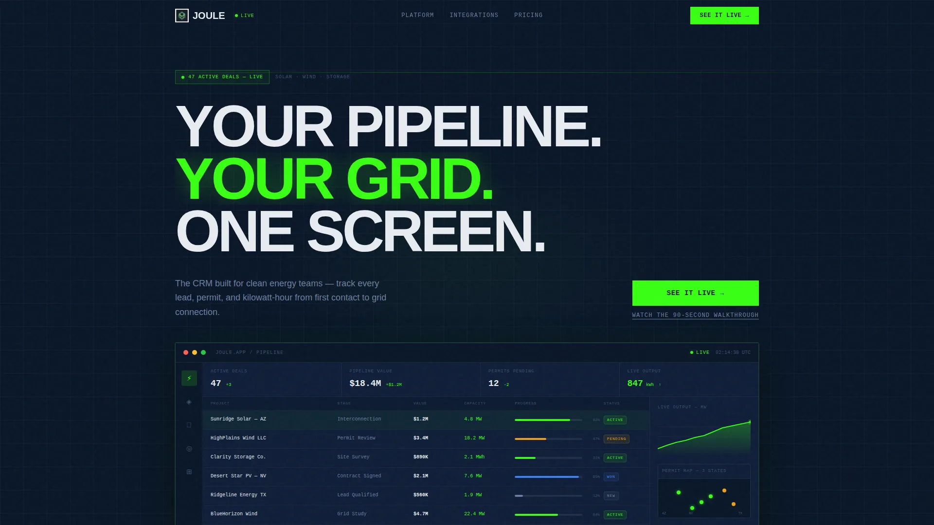
The header fills the entire screen with the CRM dashboard rendered at actual pixel density. It shows 47 active deals in a solar installation pipeline, a permit-status map across three states, and a live energy output graph with the volt green accent line climbing. The headline "Your Pipeline. Your Grid. One Screen." sits above it in a heavy grotesque typeface.
Brutalist Pain-Point Card Grid
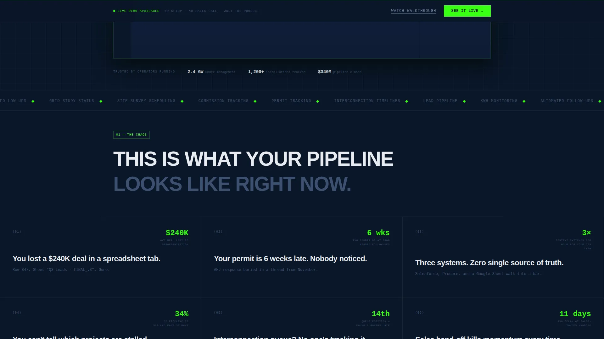
The first scroll section presents a grid of blunt, oversized pain-point statements styled like concrete blocks. Each card names a specific, costly problem in direct language, setting up genuine tension before the solution is revealed.
Problem-to-Solution Scroll Arc
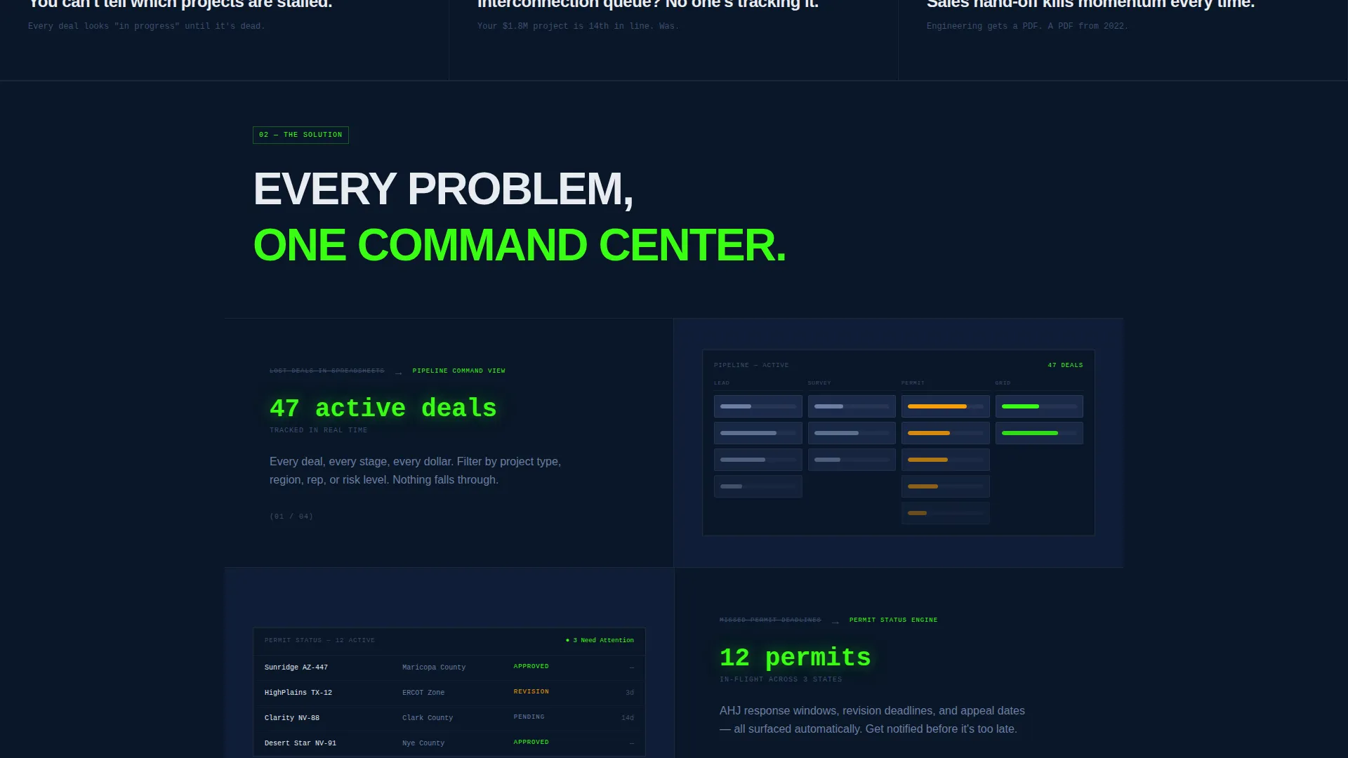
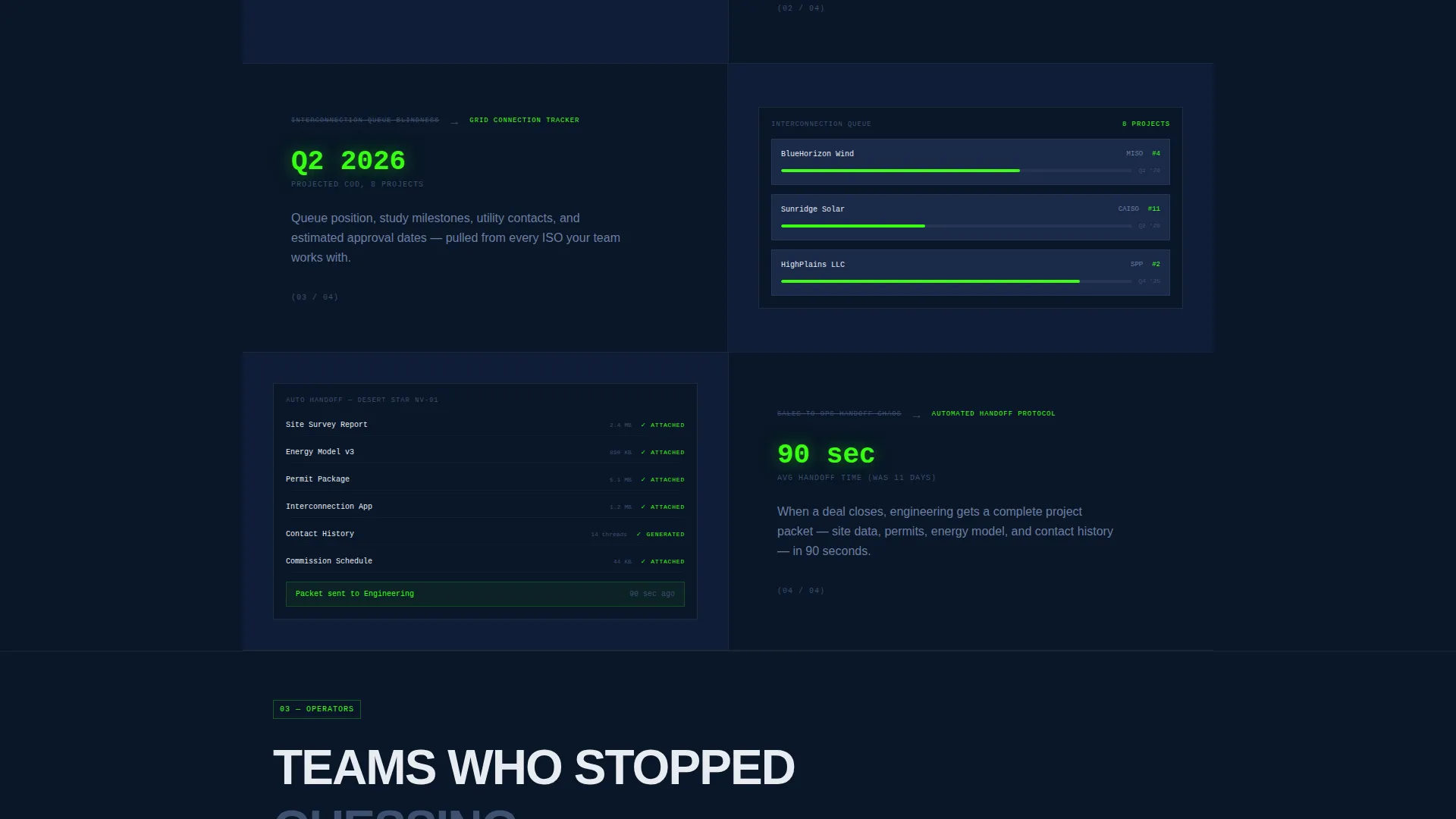
As the visitor scrolls, each pain-point card opens to show the corresponding CRM feature. Permit tracking, automated follow-ups, and interconnection timelines are each demonstrated through cropped dashboard screenshots embedded directly into the grid. The page moves from chaos to control with every section.
Persistent Click-Through call to action System
The primary call to action, "See It Live," appears anchored to the header and returns as a persistent bottom bar after the second scroll section. A secondary text link, "Watch the 90-Second Walkthrough," sits beneath it for visitors who need more time before touching the product.
Dark Control Room Visual Identity
The entire layout uses a midnight blue color system with cold steel blue card surfaces, electric volt green as the sole accent for live data points and active states, and raw white typography that cuts through the dark background. The interface feels like a power grid monitoring station running at full capacity.
Dashboard Screenshot Progression
By the time a visitor reaches the final section, they have seen six real product screens embedded in the page. The final section shows the full dashboard again, now fully understood in context, making the decision to click feel inevitable.
Page sections overview
| Section | Purpose |
|---|---|
| Full-viewport header | Opens with the CRM dashboard screenshot and the primary "See It Live" call to action |
| Pain-point card grid | Presents the operational chaos buyers recognize in blunt, oversized statements |
| Feature reveal grid | Cracks each pain card open to show the matching CRM feature with a cropped screenshot |
| Persistent bottom bar | Keeps the primary call to action visible after the second scroll section without interrupting flow |
| Final dashboard view | Shows the complete product screen again so visitors leave with full product confidence |
Design & branding system
The visual identity is built around a midnight blue color system that communicates authority and operational precision. Every color choice carries meaning, and nothing decorative exists in the layout.
- Deep terminal navy (#0A1628) as the dominant background, cold steel blue (#1B2A4A) for card surfaces and data panels, electric volt green (#39FF14) for all live data and active call to action states, and raw white (#E8ECF1) for all body and headline typography
- Bold brutalist theme with monolithic dark slabs, thick or absent borders, heavy grotesque typefaces, and zero lifestyle photography or abstract illustration
- The volt green accent appears only when something is active or live, giving it urgent visual meaning every time it appears on screen
Mobile & speed optimization
The template layout is designed to translate the control room density of the desktop experience into a focused, readable single-column flow on smaller screens. No functionality is hidden on mobile.
- Dashboard screenshot panels restack vertically so pipeline data remains visible and legible at phone widths
- Pain-point cards and feature reveal blocks collapse into a clean single-column scroll without losing the problem-to-solution tension built into the structure
- The persistent bottom call to action bar adapts to mobile viewports so the "See It Live" action remains accessible throughout the entire scroll
How this template helps you convert
The page earns its click by showing the product repeatedly and honestly before asking for anything. By the time a visitor sees the final dashboard section, curiosity has already become intent.
- The full-viewport product screenshot in the header gives buyers an immediate, unfiltered look at what the CRM dashboard actually looks like, removing the need to imagine the product
- The problem-to-solution arc builds trust by naming specific, costly pain points that real operations managers recognize, then resolving each one with a visible product feature
- The persistent "See It Live" call to action, reinforced by the secondary walkthrough link, gives visitors two low-commitment paths to engage, reducing the friction between page visit and demo click
Other information about this template
This template is built as a single landing page with a section-led scroll flow. It routes all primary traffic to a live interactive demo environment rather than a form submission, which means the page itself carries the full sales weight.
- The template style is Dashboard/Data Grid, making it well suited for any vertical SaaS product built around operational data and pipeline management
- The creative direction follows a Problem-to-Solution Arc, a proven structure for software products that solve complex, multi-step workflows
- The header concept is a Product Screenshot, which is particularly effective for buyers who need to see real interface density before trusting a software claim
- The landing page direction is Click-Through, meaning the page is optimized to route visitors to a demo environment rather than capture a lead directly on the page
- This template falls under the Technology category and Green Energy Vertical SaaS subcategory, making it a strong fit for any clean energy software product targeting operational buyers
Theme
Bold Brutalist
Creative direction
Problem→Solution Arc
Color system
Midnight Blue
Style
Dashboard/Data Grid
Direction
Click-Through
Page Sections
Full-viewport Product Screenshot Header
Brutalist Pain-point Card Grid
Problem-to-solution Scroll Arc
Persistent Click-through Call to Action System
Dark Control Room Visual Identity
Dashboard Screenshot Progression
Related questions
Can I use this template for a non-energy SaaS product?
Does this template include a lead capture form?
How many call to action placements does the template include?
Can I replace the dashboard screenshots with my own product images?
What kind of buyer does this landing page layout work best for?



