Journal — Streamlined Accounting Ledger Landing Page Template
Ledger is a lead generation landing page template built for insurance billing and invoicing platforms. It combines animated comparison tables, a stats-driven header, and a three-step progressive disclosure form to turn skeptical practice managers into qualified leads. The design uses a Slate & Sky color system with Dynamic Motion animations to make every billing pain point feel solvable before the visitor ever clicks.
by Rocket studio
Quick summary
Ledger is a single-page lead generation template designed for insurance billing and invoicing software platforms. It opens with three animating revenue metrics, moves through an animated side-by-side comparison table, and closes with a live claim lifecycle dashboard. A three-step form and a gated PDF download give visitors two clear paths to convert.
Who this template is for
This template is built for billing software companies, revenue cycle management platforms, and healthcare invoicing tools that need to turn qualified traffic into demo requests or audit leads. It speaks directly to the buyers who feel the financial pain of denied claims and aging receivables.
- Practice managers and independent clinic owners who track denied claims and slow payment cycles
- Billing department leads at multi-provider groups managing high monthly claim volumes
- Insurance software founders and product marketers who need a credible, conversion-focused landing page
What problem this template solves
Healthcare billing software is a hard sell. Buyers are skeptical, data-driven, and burned by past tools that promised automation but delivered more manual work. A generic landing page cannot close that trust gap. Ledger solves it by leading with proof rather than promises.
- Potential customers leave before reaching the form because the value case is buried or absent
- Comparison pages lack the visual momentum needed to communicate before-and-after workflow differences
- Two-step opt-in forms ask for commitment before the visitor has seen enough evidence to say yes
What you get with this template
Ledger gives you a fully structured, single-page layout with every section pre-built for insurance billing lead generation. The layout is designed to build financial proof incrementally so that each scroll deepens conviction before any form field appears.
- An animated stats header with three live-counting revenue and performance metrics
- An animated comparison table section contrasting legacy workflows with the platform's automated approach
- A horizontal dashboard preview showing the full claim lifecycle from submission to payment
- A three-step progressive disclosure lead form and a separate gated PDF download module
Feature list
This template includes the following built-in components and design features.
Animating Stats Header
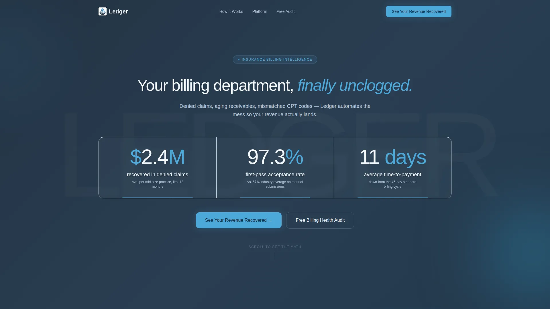
Three oversized counters tick upward like odometers on page load, each digit snapping into place with a subtle motion blur. The metrics displayed are "$2.4M recovered in denied claims," "97.3% first-pass acceptance rate," and "11 days average time-to-payment." A single white headline sits below the counters on a deep charcoal background.
Animated Comparison Table
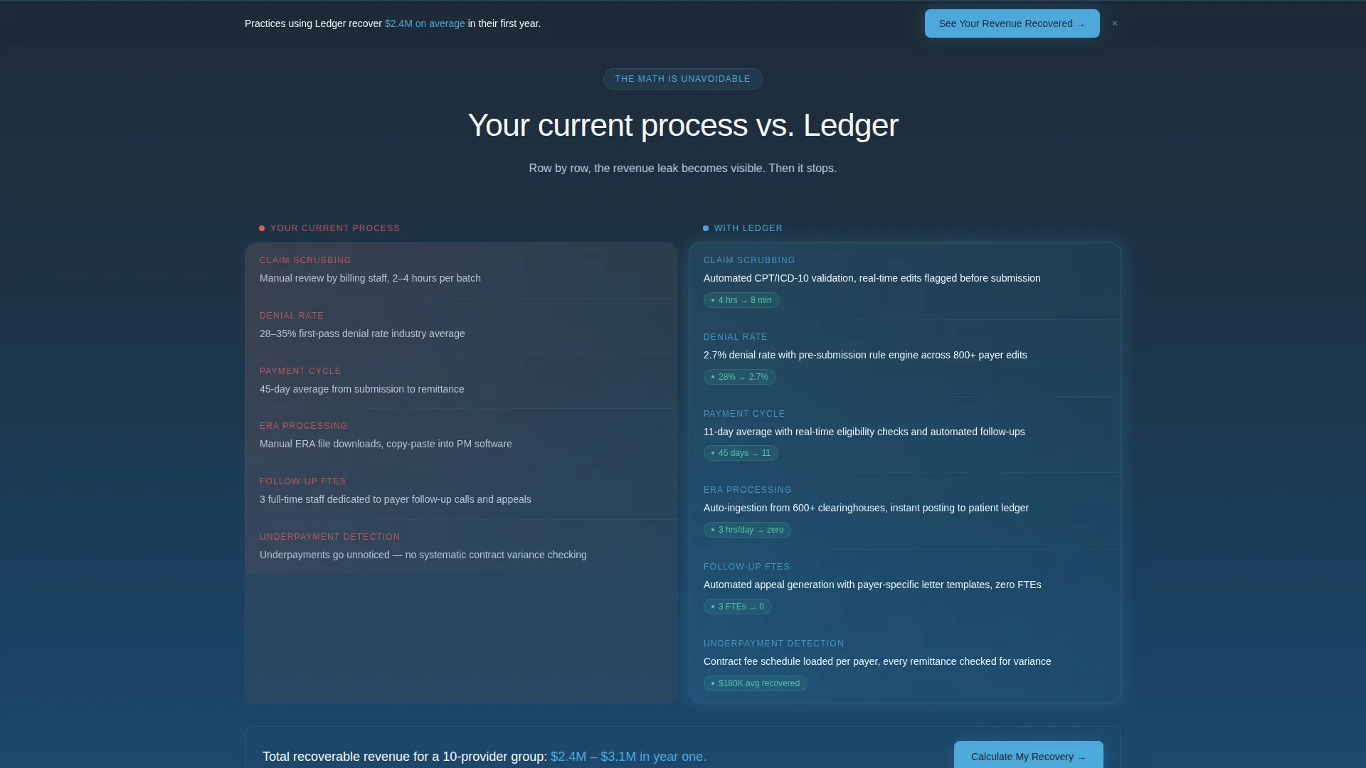
Two side-by-side columns slide in from opposite edges of the screen as the visitor scrolls. The left column shows legacy manual billing steps in muted gunmetal tones. The right column shows the platform's automated workflow highlighted in open-sky blue. Each row animates in like a progress bar filling, covering line items such as manual claim scrubbing versus automated code validation and 45-day payment cycles versus 11-day averages.
Live Claim Lifecycle Dashboard Preview
A horizontally scrolling dashboard preview sits below the comparison section. It shows four claim stages in sequence: submitted, acknowledged, adjudicated, and paid. Each node lights up in order, simulating a real billing workflow and giving visitors a tangible sense of how the platform moves claims through to payment.
Three-Step Progressive Disclosure Form
The primary lead form uses a three-step flow to reduce form abandonment. Step one collects practice size and specialty. Step two asks for monthly claim volume and current clearinghouse. Step three captures name, email, and phone number. This staged approach eases visitors in before requesting personal contact details.
Gated PDF Audit Download
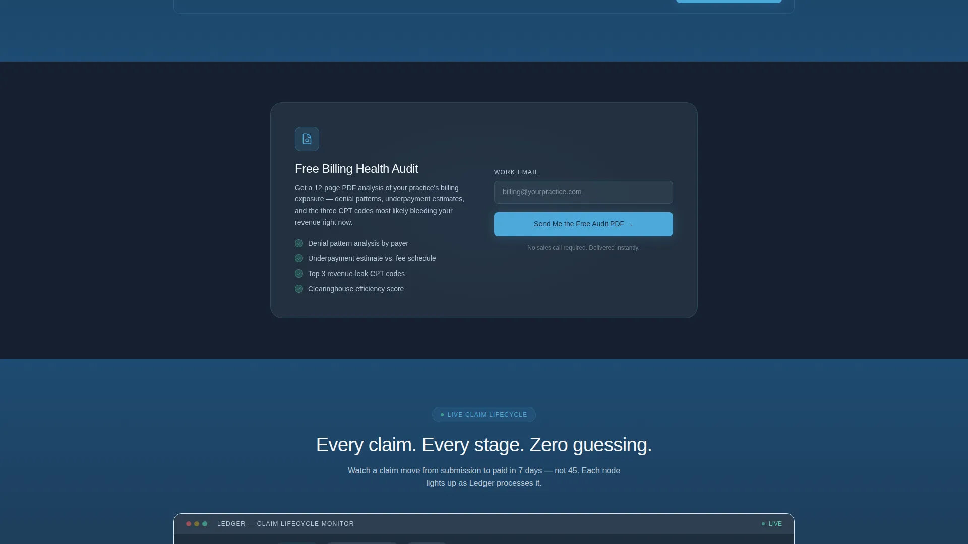
A secondary conversion path sits between the comparison table and the dashboard preview. It offers a free "Billing Health Audit" PDF gated behind a single email field. This module catches visitors who are not yet ready to book a demo but are willing to exchange an email for immediate value.
Sticky Bottom call to action Bar
The primary call-to-action button, labeled "See Your Revenue Recovered," appears anchored below the comparison tables and again as a persistent sticky bar after the dashboard preview loads into view. The sticky bar ensures the primary conversion action is always one tap away regardless of scroll depth.
Page sections overview
| Section | Purpose |
|---|---|
| Animated Stats Header | Opens with three live revenue metrics to establish credibility immediately |
| Platform Tagline Block | Delivers the core value statement below the counters in a single line |
| Comparison Table Section | Contrasts legacy billing workflows with automated platform results row by row |
| Claim Lifecycle Dashboard | Shows the full claim journey from submission to payment in a horizontal scroll |
| Gated PDF Module | Captures email-only leads with a free Billing Health Audit download |
| Primary Lead Form | Converts warm visitors through a three-step progressive disclosure sequence |
| Sticky call to action Bar | Keeps the primary conversion action visible at all scroll depths |
Design & branding system
The Slate & Sky color system gives Ledger its authoritative, data-driven visual identity. Deep charcoal slate dominates the top of the page, creating a grounded, serious tone that matches the financial weight of the subject matter. As the visitor scrolls, open-sky blue gradually takes over, shifting the emotional register from problem to solution.
- Primary background is deep charcoal slate (#1E2A38); card surfaces and table rows use mid-tone gunmetal (#3D4F5F)
- Call-to-action buttons and active highlights use open-sky blue (#4DA8DA); body text and negative space use cirrus white (#F4F7FA)
- The Dynamic Motion theme drives all animations: counter ticks, table row reveals, and dashboard node lighting all follow a Launch Energy pacing that builds visual momentum as the visitor scrolls
Mobile & speed optimization
The template layout is designed with a single-column scroll flow that adapts comparison table columns into stacked rows on smaller screens. Animations are triggered on scroll entry rather than on page load, keeping the initial render lightweight and the experience smooth across devices.
- Comparison table columns stack vertically on mobile so no row data is hidden or cropped
- The sticky call to action bar and the gated PDF module remain fully accessible at mobile viewport widths
- Counter animations and row reveal effects are scoped to their trigger zones to avoid blocking the main content thread
How this template helps you convert
Ledger is structured around a proof-first conversion philosophy. The page earns each micro-commitment before asking for a larger one, which is the right approach for a high-skepticism, high-value software audience.
- The stats header delivers a financial case in three numbers before the visitor reads a single marketing sentence, establishing trust without asking for anything in return.
- The animated comparison table builds on that trust by translating abstract platform benefits into specific, quantified workflow improvements that billing professionals recognize from their own daily pain.
- The two-path conversion system, a three-step demo form and an email-only PDF download, means the page captures leads at two different readiness levels instead of losing the visitor who is not yet ready for a sales conversation.
Other information about this template
Ledger is categorized under Technology, specifically within the Insurance Software and Software-as-a-Service subcategory, targeting the Insurance Billing and Invoicing niche. It is purpose-built as a comparison table landing page and scores a strong intersection match within its category and niche combination.
- The template style is Comparison Table, which is particularly effective for insurance billing platforms that need to quantify the cost of inaction against the value of switching
- The header concept is Stats and Metrics, chosen because revenue cycle buyers respond to hard numbers before narrative copy
- The creative direction follows a Launch Energy principle, meaning visual momentum increases with each scroll section rather than front-loading all content above the fold
- This template is a strong fit for revenue cycle management platforms, medical billing software products, and healthcare invoicing tools launching a new lead generation campaign

Theme
Dynamic Motion
Creative direction
Launch Energy
Color system
Slate & Sky
Style
Comparison Table
Direction
Lead Generation
Page Sections
Animating Stats Header with Live Counters
Side-by-side Animated Comparison Table
Horizontal Claim Lifecycle Dashboard Preview
Three-step Progressive Disclosure Lead Form
Gated PDF Billing Health Audit Module
Sticky Primary Call to Action Bar
Related questions
Can I replace the metrics shown in the stats header with my own data?
How does the comparison table communicate platform value to billing professionals?
What are the two conversion paths included in this template?
Who is the target audience for the Ledger template?
Can sections like the dashboard preview be removed if they do not apply to my product?



