Immersive University Explorer Landing Page Template
The Quad landing page template is a sidebar companion built for public university enrollment marketing. It guides high school juniors, transfer students, and parents through every key question, cost, admissions, programs, and outcomes, using animated data storytelling, interactive calculators, a botanical color system, and a primary call to action that delivers a personalized downloadable roadmap PDF.
by Rocket studio
Quick summary
Quad is a university landing page template designed for public higher education enrollment marketing. It answers the real questions prospective students ask at midnight, cost, admissions odds, available programs, and career outcomes, and rewards their curiosity with a downloadable, personalized roadmap PDF. The page pairs animated data storytelling with a warm botanical palette to make an exciting time feel navigable rather than overwhelming.
Who this template is for
This template is built for university marketing and admissions teams who need a focused, conversion-ready landing page that serves multiple audiences at once. It works equally well for a dedicated enrollment campaign page or as a companion to a broader university website.
- High school juniors comparing many school options and experiencing decision fatigue
- Transfer students who need clear program duration, credit equivalency details, and timeline information
- Parents researching degree value, nursing programs, science tracks, and cost transparency before committing
What problem this template solves
Most university landing pages display a lot of content but do little to help users navigate within the page itself. Visitors who arrive interested but uncertain often leave without taking any action because the page never directly answers their anxious questions. This template solves that by structuring every section around a specific question prospective students actually search for.
- Scattered information across a university website forces visitors to link-hop and lose focus
- Long, undifferentiated forms create friction and lead to abandonment, especially on mobile devices
- Generic pages fail to address cost, admissions odds, and program fit in one focused space
What you get with this template
This landing page template is a complete, section-led page structure ready for a public university enrollment campaign. It comes fully designed with Playful Geometric visuals, a Botanical color system, and high-interactivity components that enable admissions teams to present their institution compellingly.
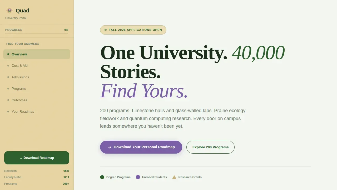
- An animated hero section with a geometric mosaic that assembles on load and counts up live university stats
- A sticky sidebar table of contents that serves as a living guide through every major decision point
- Five focused content sections covering cost, admissions, programs, outcomes, and a gated PDF download form
Feature list
This landing page template includes six core features grounded directly in the project brief. Each one is focused on converting curious visitors into enrolled students.
Animated Data Storytelling Hero
The hero section opens with a geometric mosaic where each shape represents a real university data point. Hexagons display degree program counts, circles represent enrolled students, and triangles stand for research grants funded. The shapes assemble on page load while stats count up in real time, creating an immediate, data-rich first impression for every visitor who lands on the page.
Sticky Sidebar Navigation
The sidebar acts as a living table of contents that follows users as they scroll. Each link in the sidebar corresponds directly to a key question a prospective student has, from cost to admissions to course options. This structure keeps users oriented and encourages users to move from one section to the next without losing their place or needing to scroll back to the top.
Interactive Tuition and Aid Calculator
The cost section answers "Can I afford this?" with a sliding calculator built around geometric bar visuals. Users input variables and watch the aid estimate update in real time. Transparency about program duration and costs is crucial for prospective students making decisions, and this component surfaces that information clearly without requiring visitors to leave the page or sign into a separate site.
Admissions Profile Builder
The admissions section features an interactive builder where users enter their grade point average and test scores and watch a botanical gauge animate from seed to full bloom. This component gives prospective students an immediate, visual sense of their admissions position. It transforms an anxious process into an engaging, personalized experience that encourages users to complete the form and take the next step.
200-Program Explorer with Leaf Network Visual
The programs section maps all 200 course offerings as interconnected leaf networks. Users can explore degree categories ranging from prairie ecology and life sciences to quantum computing and data science. Future students usually know what major they are interested in, so this visual explorer makes it easy to find a relevant program and follow a direct link to more course details without navigating away from the landing page.
Contextual Secondary calls to action and Gated PDF Download
Every answered question on this landing page ends with a next step. The sidebar surfaces contextual calls to action, "Calculate Your Aid" beside cost content, "Request a Visit" beside campus life details. The primary call to action, "Download Your Personal Roadmap," gates a customized PDF guide behind a three-field form: intended major, expected start term, and email address. This multi-step process reduces cognitive load while still capturing strong leads.
Page sections overview
| Section | Purpose |
|---|---|
| Hero Mosaic Stats | Display animated data story and count-up university stats |
| Cost and Aid | Answer affordability questions with a sliding tuition calculator |
| Admissions Builder | Enable prospective students to gauge their admissions profile |
| Programs Explorer | Present 200 course options as a visual leaf network map |
| Outcomes and Testimonials | Show alumni career data, employer partners, and social proof |
| Footer | Complete the page with a single-row linear footer pattern |
Design & branding system
The visual identity follows a Playful Geometric theme set within a Botanical color system. The result feels like a pressed leaf inside a textbook, organic and alive but contained within a structured, serious layout. Typography pairs Fraunces serif display headings with DM Sans body text for a balance of warmth and clarity.
- Deep fern green (#2D5F2D) dominates section headers and data accents; sun-warmed sandstone (#E8D5A3) anchors the sidebar; greenhouse glass white (#F4F7F2) breathes across content panels
- Wildflower violet (#7B5EA7) activates on buttons, progress indicators, and hover states to draw attention to interactive elements
- High-resolution images of campus facilities and geometric hero images reinforce the institution's visual identity throughout the page
Mobile & speed optimization
The landing page is built desktop-first with a sidebar layout, but collapses gracefully for mobile users. The sidebar becomes a top navigation bar on smaller screens, preserving the table-of-contents function without cluttering the mobile view. Mobile optimization is essential for university landing pages because many users access them via mobile devices, often mid-comparison between multiple school pages.
- Interactive components use client-side rendering only where needed, keeping static content lean and fast to load
- Long forms are broken into a focused three-field process to avoid the abandonment that long forms cause on mobile devices
- The responsive design ensures that video content, hero images, and geometric animations scale correctly across screen sizes
How this template helps you convert
An effective landing page has one clear goal: move visitors from curious to committed. This university landing page template is engineered around that single purpose, combining social proof, interactive tools, and a frictionless form process to turn page visits into qualified leads for an admissions team.
- The hero section establishes immediate credibility by displaying live stats and a compelling headline, giving visitors a reason to stay and scroll rather than returning to a competitor's university website.
- Contextual calls to action beside each content section mean every answered question has a natural next step, so users never reach a dead end on the page.
- The gated PDF roadmap captures email leads at the end of a high-value, ungated experience, visitors receive 80% of the value freely before the form appears, which significantly improves completion rates.
Other information about this template
This template is suited for admissions marketing teams, enrollment management companies, and education-focused agency partners creating campaign pages for public university clients. It can also serve as a case study reference or inspiration point for teams building future landing pages in the higher education space.
- The page structure avoids distracting links and keeps visitors focused on the primary goal, which aligns with best practices for university landing page creation
- Student testimonials and alumni success stories are built into the outcomes section as social proof blocks, providing the trust signals that potential students and their families need before taking action
- Video content slots are included in the outcomes section, since video testimonials can provide a more engaging perspective for visitors and deepen the emotional connection that an education landing page needs to earn
- The three-field gated form follows multi-step best practices: short, clear, and focused on capturing only the most useful data without overwhelming users
- Teams can test and refine headlines, hero image choices, and call-to-action copy after publishing to improve conversion rates over time
- The Quad discover your university journey landing page template is available on the template marketplace and can be adapted to promote any public university degree program, from undergraduate courses to graduate-level science and research tracks


Theme
Playful Geometric
Creative direction
Problem→Solution Arc
Color system
Botanical
Style
Sidebar Companion
Direction
Content/Resource
Page Sections
Animated Data Storytelling Hero Section
Sticky Sidebar Table of Contents
Interactive Tuition and Aid Calculator
Botanical Admissions Profile Builder
Program Visual Explorer
Contextual Ctas and Gated PDF Roadmap
Related questions
Who is this landing page template designed for?
Can this template display all program types, including science and graduate courses?
Does the landing page include social proof components?
How does the gated PDF download form work?
Is this a single landing page or a multi-page website?


