Local Veterinary Software Professional Website Template
Kennel is a scroll-reveal landing page template built for veterinary social media management platforms. It pairs a Dashboard Pro visual theme with a Void and Violet color system to present engagement data, content calendars, and practice benchmarks in a way that feels urgent and credible. The design guides practice managers, associate vets, and multi-location groups toward a free audit or benchmark report download.
by Rocket studio
Quick summary
Kennel is a single-page, scroll-reveal landing page template designed for veterinary social media management platforms. It uses progressive content disclosure, animated data visuals, and an Industry Report creative direction to show practice managers exactly where their social presence falls short. Every section builds toward two conversion actions: a free practice audit and a downloadable benchmark report.
Who this template is for
This template is built for teams selling social media tools to veterinary professionals. It speaks directly to the people who feel the pain of inconsistent posting and unanswered reviews.
- Practice managers balancing appointment schedules, Facebook complaints, and content queues all at once
- Associate veterinarians who want their clinical moments, like post-surgery photos or dental cleaning timelapses, published at the right time and in the right format
- Corporate marketing teams overseeing multi-location hospital groups who need unified reporting across many clinics
What problem this template solves
Veterinary practices lose potential clients when their social presence goes quiet or looks amateurish. Generic social media tools do not understand the rhythms of pet health, appointment cycles, or the tone patients expect from a trusted clinic. This template helps a platform communicate that gap clearly and compellingly.
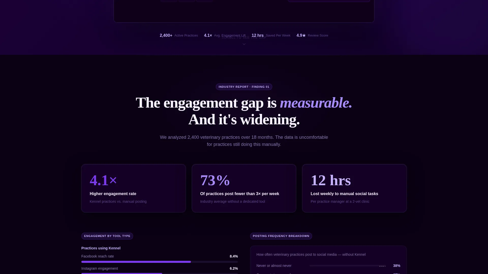
- Practices using generic scheduling tools see lower engagement rates, and this template frames that comparison with data-led visuals
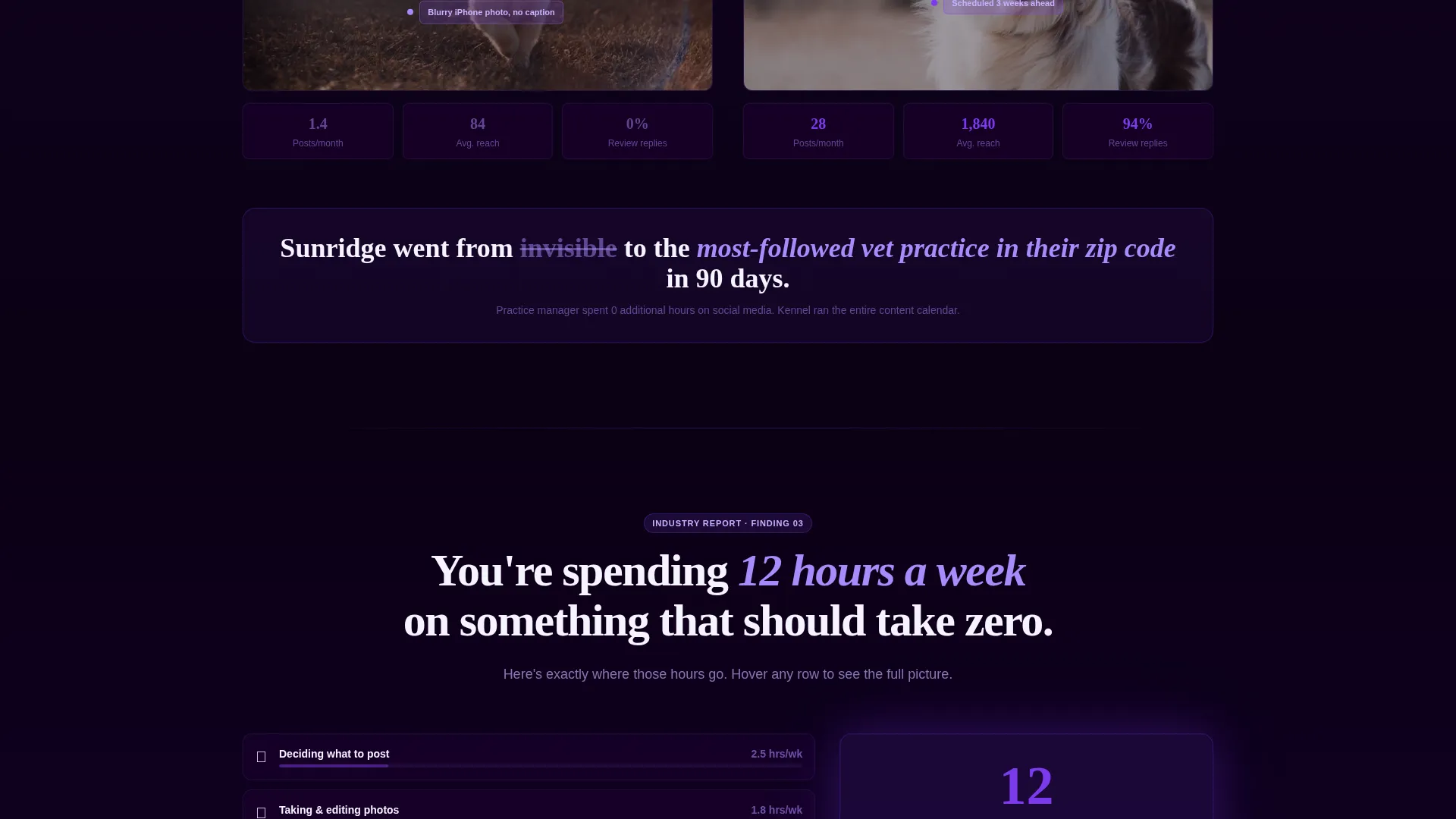
- Practice managers waste hours each week on manual posting and review responses, and the template quantifies that cost in time-spent metrics
- Multi-location groups struggle with inconsistent brand presence, and the template surfaces that problem before asking for any commitment
What you get with this template
You get a fully structured, scroll-reveal landing page that progressively surfaces data findings as the visitor scrolls. Each section is designed to reframe assumptions before presenting a solution.
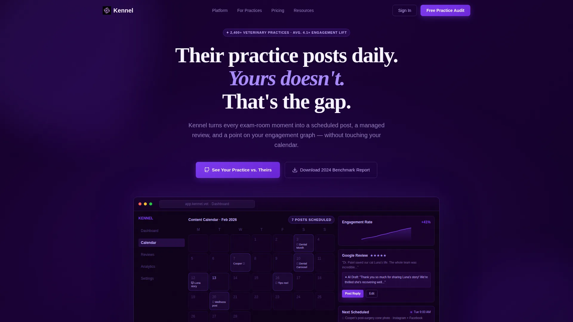
- A pixel-perfect browser frame header showing a live dashboard mid-session, with a populated content calendar, climbing engagement graphs, and a Google review response panel
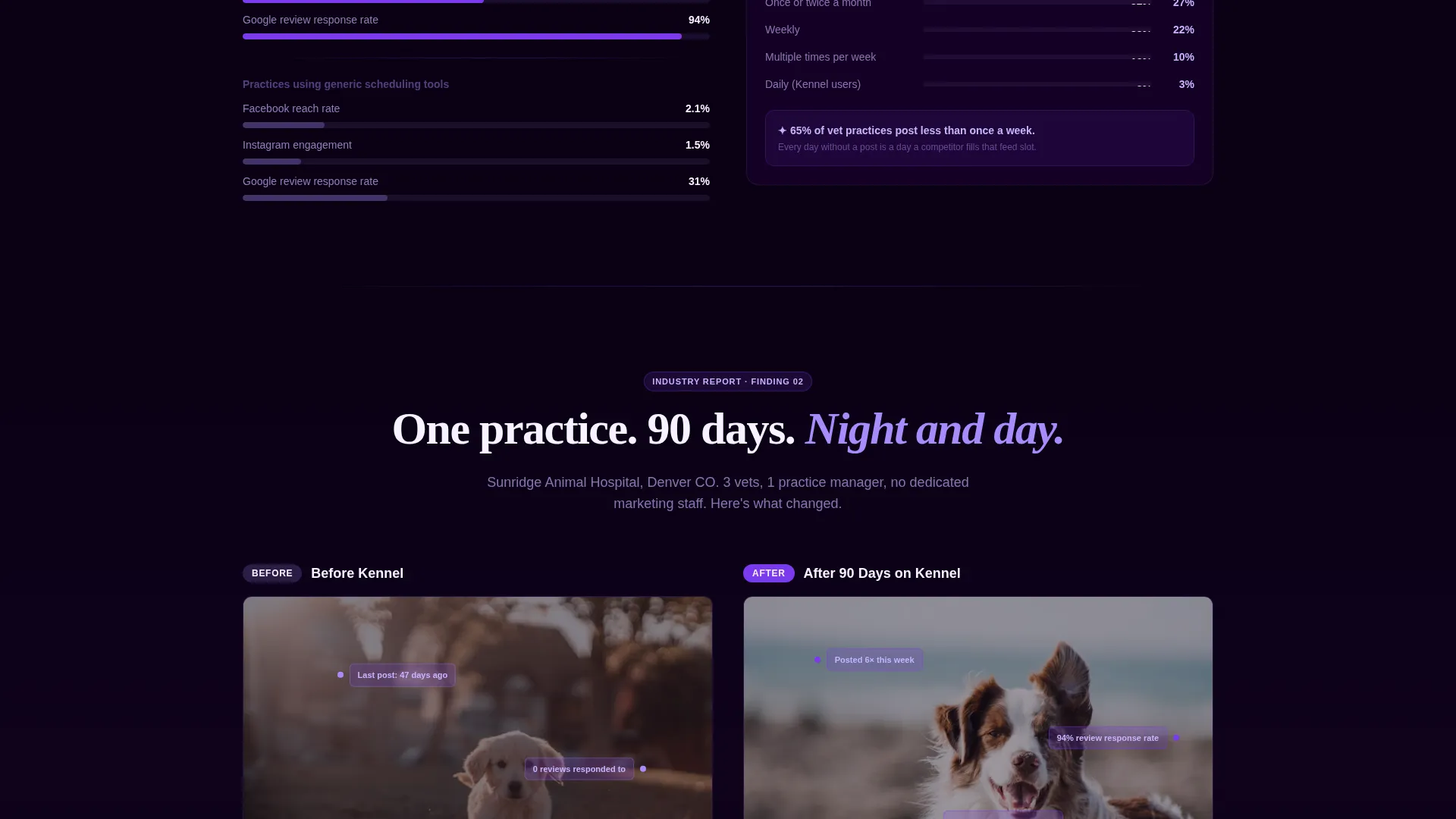
- An Industry Report content flow featuring engagement rate comparisons, before-and-after practice teardowns with annotated screenshots, and time-spent metrics that animate into view on scroll
- Two distinct conversion paths: a free audit form tied to the primary call to action and a gated PDF download for the benchmark report
Feature list
This section outlines the core template capabilities sourced directly from the design brief.
Scroll-Reveal Progressive Disclosure
Each section of the page enters the viewport with a reveal animation. Charts and statistics animate in one at a time, giving each data point dramatic weight and keeping the visitor engaged as they scroll.
Dashboard Product Screenshot Header
The header opens with a browser-frame mockup showing the platform dashboard mid-session. The screenshot includes a populated veterinary content calendar, engagement graphs, and a drafted review response, all presented against a void-black background with violet edge glow.
Comparison and Versus Layout
The page is structured around a head-to-head narrative. Engagement rate comparisons, before-and-after practice social profiles, and time-cost metrics are laid out to make the performance gap unmistakably clear before any call to action appears.
Dual Conversion Path Design
Two conversion actions are built into the page flow. The primary call to action, "See Your Practice versus. Theirs," triggers a short audit form. The secondary path offers a gated PDF benchmark report behind an email capture field.
Animated Data Visualizations
Engagement graphs and time-spent charts animate into view as sections enter the viewport. This progressive chart animation makes each statistic feel like a new discovery rather than a static table.
Industry Report Creative Direction
The page reads like a data report the visitor cannot put down. Each scroll reveal surfaces a new finding, from generic tool engagement rates to annotated before-and-after screenshots, building a case that grows stronger with every section.
Page sections overview
| Section | Purpose |
|---|---|
| Header with screenshot | Opens with dashboard mockup and headline to establish the performance gap immediately |
| Engagement rate comparison | Shows average engagement data for practices on generic tools versus this platform |
| Before and after teardown | Displays annotated screenshots of a real practice social profile before and after onboarding |
| Time-spent metrics | Quantifies hours lost per week to manual posting and review management |
| Primary audit call to action | Presents the "See Your Practice versus. Theirs" form to capture practice details |
| Benchmark report download | Offers the gated PDF for email capture as a secondary conversion path |
Design & branding system
The visual identity follows a Dashboard Pro theme built around the Void and Violet color system. The palette is designed to feel like a mission control screen glowing in a dark room, precise and addictive to watch.
- Deep void black (#0B0014) forms the primary background, electric violet (#7C3AED) marks interactive elements and data highlights, muted orchid (#A78BFA) handles secondary text and graph lines, and clinical white (#F5F3FF) covers card surfaces and metric readouts
- Every violet pulse on screen signals a new engagement event, reinforcing the platform's core promise through the visual design itself
- The browser-frame header sits on the void-black canvas with a faint violet edge glow, making the dashboard screenshot feel like the only light source in the room
Mobile & speed optimization
The scroll-reveal structure and chart animations are designed to work within a single-page layout that can be adapted for mobile viewports. The template's progressive disclosure approach means content loads in logical, section-by-section order.
- Animated charts and data sections are structured to enter the viewport individually, keeping the reading flow clean on smaller screens
- The dual conversion path layout stacks cleanly so both the audit form and the report download remain accessible without horizontal scrolling
- Card surfaces in clinical white against the void-black background maintain strong visual contrast across display sizes
How this template helps you convert
The page is engineered to earn the click before it asks for one. By the time a visitor reaches either call to action, they have already seen their own practice's position reflected in the data.
- The Industry Report scroll flow builds a data case section by section, making the visitor feel informed and exposed to the gap before the audit form ever appears.
- The primary call to action is framed as a diagnostic tool rather than a sales ask, which lowers resistance. Visitors enter their practice name, primary platform, and posting frequency to receive a personalized comparison.
- The secondary conversion path offers tangible value through the downloadable benchmark report, capturing email addresses from visitors who are not ready to book a demo but are genuinely curious about the data.
Other information about this template
This template is part of a broader set of niche-specific landing page templates built for software platforms targeting specialized professional audiences. A few additional details worth knowing before you customize it.
- The template style is Scroll Reveal (Progressive), meaning section animations are triggered by viewport entry rather than page load, giving each data reveal its own moment
- The creative direction is Industry Report, which means the copy and layout framework are already structured around data findings, comparisons, and annotated evidence rather than generic feature lists
- The header concept is Product Screenshot, so the template is designed to showcase an actual platform dashboard as its hero visual rather than an illustration or abstract graphic
- The landing page direction is Comparison and Versus, positioning the product against the status quo rather than against a named competitor
Theme
Dashboard Pro
Creative direction
Industry Report
Color system
Void & Violet
Style
Scroll Reveal (Progressive)
Direction
Comparison/Versus
Page Sections
Scroll-reveal Progressive Disclosure
Dashboard Product Screenshot Header
Comparison and Versus Page Structure
Dual Conversion Path Layout
Animated Data Visualization Sections
Industry Report Creative Framework
Related questions
What type of business is this landing page template designed for?
Can I customize the dashboard screenshot in the header?
How do the two conversion paths work together?
Is the scroll-reveal animation included in the template structure?
Do I need design experience to use this template?



