Specialist Micro-SaaS & Developer Tools Reviews & Social Proof Website Template
Kern is a bold brutalist landing page template built for a font pairing tool. It uses a scroll-reveal structure to walk visitors from typographic chaos to confident, evidence-based pairings. The Carbon Fiber color system, live dashboard preview header, and freemium conversion flow make it a sharp, high-authority starting point for any typography micro-SaaS product.
by Rocket studio
Quick summary
Kern is a single-page, scroll-reveal landing page template designed for a font pairing tool. It moves visitors through a tight problem-to-solution arc, reveals features one at a time, and converts on a freemium model. The brutalist Carbon Fiber visual identity gives the page the weight and authority the tool's audience expects.
Who this template is for
This template is built for founders and designers who are shipping a typography tool and need a landing page that speaks directly to a technically literate audience. It suits teams who want a high-impact first impression without spending days in a design tool.
- Brand designers and creative directors who need to communicate typographic precision quickly
- Junior developers who want a polished, credible product page for a micro-SaaS tool
- Solo founders building a font pairing or design utility and launching on a freemium model
What problem this template solves
Typography tool landing pages often look generic. They fail to demonstrate the product's logic, skip the emotional pain point entirely, and bury the call to action behind too much explanation. Kern solves this with a structured narrative and a conversion flow designed around one clear first action.
- Visitors arrive without context; the dashboard preview header immediately shows the tool mid-use
- The problem section makes the time-cost of font selection visceral before any feature is mentioned
- Feature reveals stay focused; each one lands before the next appears, so the page never overwhelms
What you get with this template
You get a complete, single-page scroll-reveal layout with every section pre-structured and ready to customize. The design system is fully defined, the copy placeholders match the visual hierarchy, and the conversion logic is already wired into the scroll sequence.
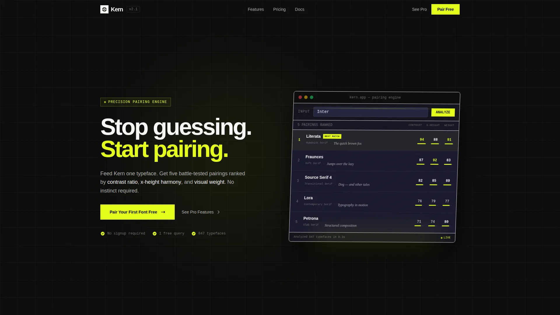
- A live dashboard preview header showing the pairing interface with five ranked specimen cards
- A problem-to-solution scroll arc with a stat callout, visual contrast moment, and progressive feature reveals
- A freemium conversion layer with a primary call to action, a sticky bar trigger, and a secondary upgrade path
Feature list
This template includes a focused set of purpose-built components. Each one serves the product narrative and the conversion goal directly.
Live Dashboard Preview Header
The header renders a pixel-accurate isometric screenshot of the pairing interface mid-use. It shows one typeface entered and five ranked pairings returned, each in a specimen card with contrast scores, weight maps, and a short paragraph preview. The tilt and crisp glyph detail signal product quality before the visitor reads a single word.
Progressive Scroll Reveal Structure
Sections enter the viewport one at a time as the user scrolls. Each feature reveal waits for the previous section to settle before appearing. This pacing builds tension and keeps the page feeling focused rather than crowded.
Problem Section with Stat Callout
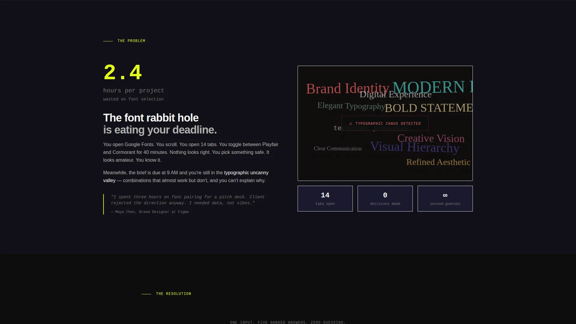
The first content section uses a chaotic wall of mismatched type combinations as a visual. A single data point anchors the pain: designers spend 2.4 hours per project on font selection. The contrast with the clean pairing that follows is immediate and deliberate.
Feature Reveal Panels
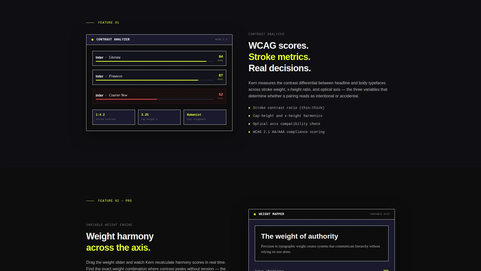
Three dedicated sections progressively disclose the contrast analyzer, the variable weight slider, and the export-to-CSS panel. Each panel enters only after the prior one settles, building a layered case for the tool without cluttering the layout.
Freemium Conversion Layer
The primary call to action reads "Pair Your First Font Free" and appears below the header. It reappears as a sticky bar after the third scroll reveal. Clicking it drops the visitor into a live pairing interface with one free query. A minimal modal then asks for email only.
Secondary Upgrade Path
A "See Pro Features" text link anchors to the variable weight and design system export sections. This seeds the upgrade intent before the visitor reaches any paywall or usage limit.
Page sections overview
| Section | Purpose |
|---|---|
| Header Dashboard Preview | Show the tool live, establish authority immediately |
| Headline Block | Deliver the core value proposition at 80px |
| Problem Reveal | Surface the 2.4-hour pain point visually |
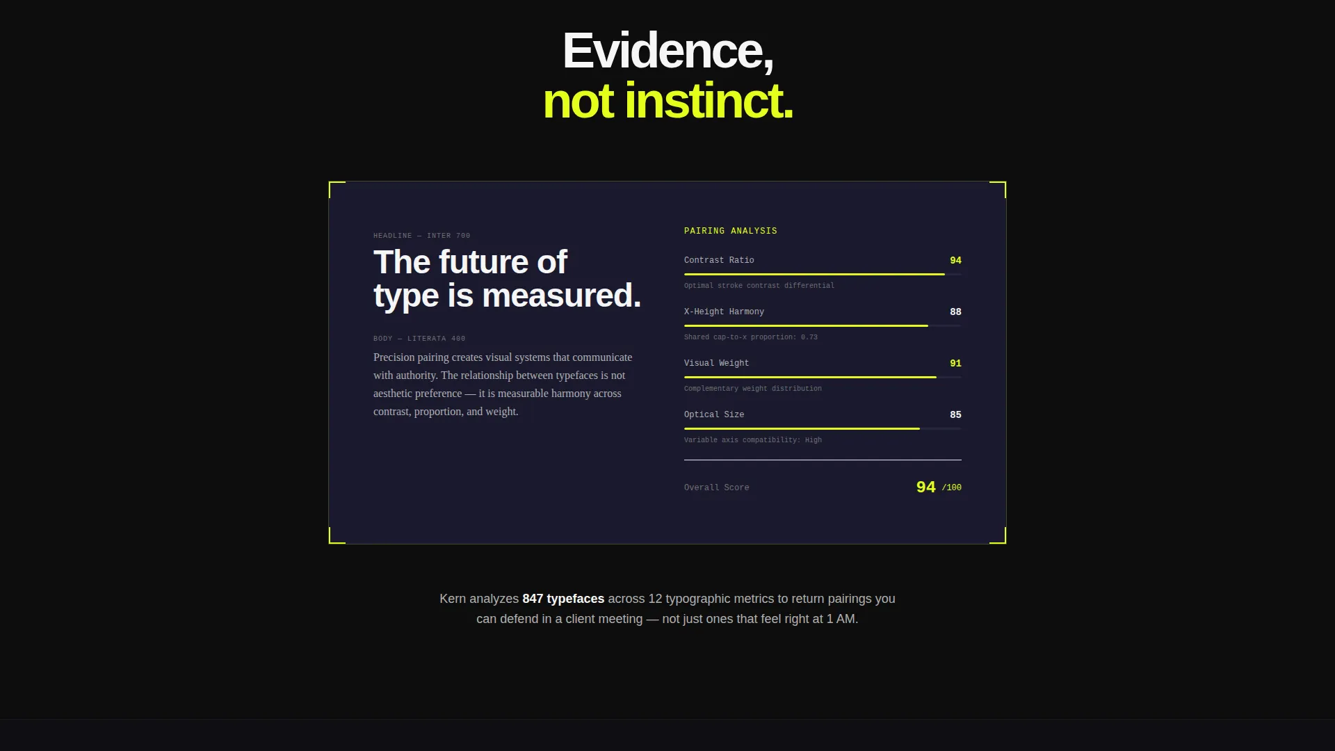
| Solution Contrast Moment | Strip chaos away, show one clean pairing |
| Contrast Analyzer Reveal | Introduce the first core feature |
| Variable Weight Slider | Demonstrate precision typographic control |
| Export to CSS Panel | Show the practical output designers and developers need |
| Sticky call to action Bar | Re-engage scrollers after the third reveal |
| Freemium Modal Trigger | Capture email after the first free query loads |
Design & branding system
The Carbon Fiber color system gives the page an engineered, cockpit-like feel. Every surface is intentional. Nothing is decorative. The palette works together to direct attention exactly where the conversion logic needs it.
- Matte black (#0D0D0D) dominates as the page ground; woven graphite (#1A1A2E) surfaces card areas
- Exposed aluminum (#B0B0B0) carries body text with enough contrast to stay readable without softening the severity
- Electric arc yellow (#E4FF1A) fires across calls to action and active interface states, making every conversion trigger unmissable
Mobile & speed optimization
The scroll-reveal sequence and isometric header are built to translate cleanly across screen sizes. The layout adapts without losing the visual tension that defines the page's character.
- The isometric dashboard preview scales down gracefully, keeping specimen card detail legible on smaller screens
- Scroll reveal timing is calibrated so progressive section entry feels intentional rather than slow on mobile
- The sticky call to action bar remains accessible at all scroll depths without obscuring content on narrow viewports
How this template helps you convert
Every design and copy decision in this template is oriented toward one outcome: getting a visitor into the tool with as little friction as possible.
- The freemium call to action appears twice in the natural scroll path, once below the header and once as a sticky bar, so the invitation to act is always visible without being aggressive.
- The one-click entry into a live pairing interface removes the signup barrier entirely at the top of the funnel, and the email capture only appears after the visitor has already seen the tool work.
- The secondary "See Pro Features" link lets upgrade-ready visitors self-select into the paid tier narrative before they hit any usage limit, warming the conversion intent early.
Other information about this template
Kern is built for the intersection of design tooling and micro-SaaS, a space where credibility is everything and first impressions are made in seconds. The template style is scroll reveal (progressive), which means each section is a deliberate act of disclosure rather than a wall of information. The Bold Brutalist theme and Carbon Fiber palette are rare in the font pairing tool category, which makes the page stand out immediately in a market where most competitors default to minimal white layouts. The freemium and trial model is native to the conversion structure, so the template does not need to be retrofitted for that business model.
- Template style: Scroll Reveal (Progressive), single-page layout
- Theme: Bold Brutalist with a Carbon Fiber color system
- Conversion model: Freemium and trial, with a one-click entry point and email-only capture
- Category fit: Technology, Micro-SaaS and Developer Tools, Font Pairing Tool niche
Theme
Bold Brutalist
Creative direction
Problem→Solution Arc
Color system
Carbon Fiber
Style
Scroll Reveal (Progressive)
Direction
Freemium/Trial
Page Sections
Live Dashboard Preview Header
Progressive Scroll Reveal Layout
Problem Section with Stat Callout
Feature Reveal Panels
Freemium Conversion Layer
Secondary Pro Upgrade Path
Related questions
Who is this landing page template designed for?
Can I use this template for a freemium product without redesigning the conversion flow?
Does the scroll reveal structure work on mobile devices?
How many sections does this template include?
Can I change the color palette or typography to match my brand?



