Motion Design Course Landing Page Template
Keyframe is a hub-and-spoke landing page template built for motion design and After Effects online courses. It opens with an institutional logo bar, runs visitors through a three-question personalization quiz, and then reorders every spoke section to match their answers. The result is a page that feels like a consultation, not a brochure, earning the email lead naturally through a custom syllabus download.
by Rocket studio
Quick summary
Keyframe is a single-page, anchor-nav template designed for After Effects and motion graphics course creators. It combines a trust-building logo bar, a live personalization quiz, and a five-spoke curriculum structure to guide each visitor toward a custom syllabus download. The layout earns conversions by feeling relevant before it asks for anything.
Who this template is for
This template is built for educators and course creators who teach motion design and animation. It is equally useful for solo instructors, design schools, and training studios who need a high-credibility landing page that qualifies and converts visitors at the same time.
- Motion design instructors selling After Effects or animation courses online
- Freelance designers and studios packaging their skills into a structured curriculum product
- Marketing and education teams launching a motion graphics training program for creative professionals
What problem this template solves
Most online course landing pages treat every visitor the same. They list modules, show a testimonial block, and push a single call to action. Visitors who are junior designers have different priorities than freelancers losing client bids, and both groups differ from marketing creatives told to "make it move" with no training budget. A generic page fails all three.
- Visitors leave without engaging because the page never speaks directly to their situation
- Course creators lose qualified leads because there is no natural, low-friction way to capture emails before asking for a purchase
- Without structured authority signals, even a strong curriculum looks like any other self-hosted course
What you get with this template
You get a fully structured, single-page layout with an anchor navigation system linking five distinct spoke sections. Every visual and functional decision in the template is designed to reflect a premium, focused learning environment.
- A three-question interactive quiz that reorders hub sections based on each visitor's profile
- A primary call-to-action flow built around a personalized syllabus download, gated by first name and email only
- Secondary conversion touchpoints inside each spoke, including a shortcuts reference sheet, a gated sample lesson, and an embeddable curriculum calendar
Feature list
This template is built around a small number of high-impact features, each one tied directly to how motion design course buyers actually browse and decide.
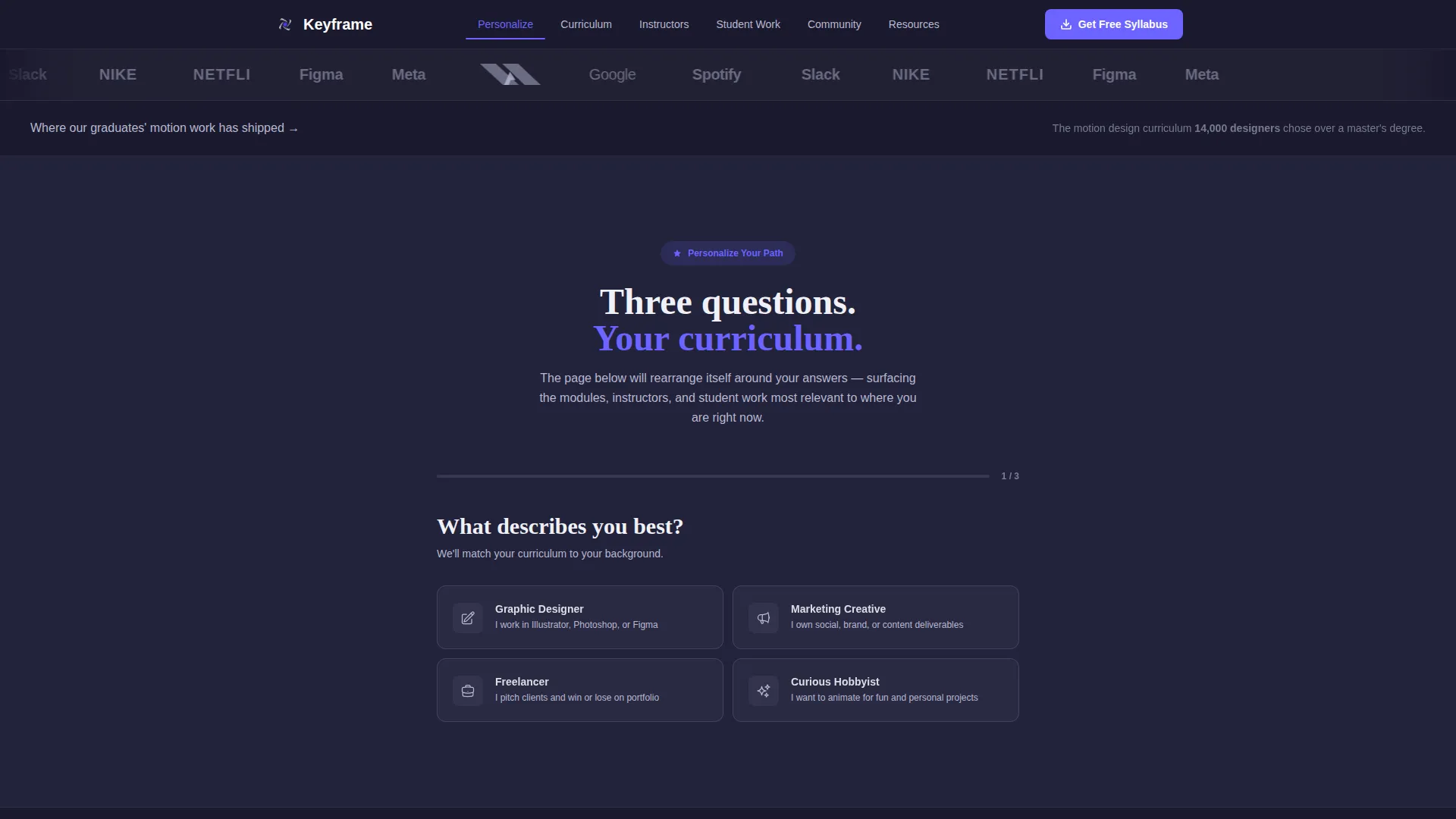
Institutional Logo Bar Header
The header opens with a horizontal ribbon of recognizable brand logos captioned with proof-of-outcome copy. There is no hero image and no video reel. Authority is established immediately through institutional recognition, before a single line of curriculum copy appears.
Three-Question Personalization Quiz
Directly beneath the header, a short interactive assessment asks visitors three questions about their role, their animation goals, and their available study hours. The answers dynamically reorder the five hub sections below, so each visitor sees the most relevant spoke content first. No two visitors scroll the same sequence.
Anchor Navigation Hub Structure
Five named spoke sections, Curriculum, Instructors, Student Work, Community, and Resources, are accessible via a persistent anchor navigation bar. The quiz reorders these sections per visitor, but the nav always reflects the current order, keeping orientation clear as the page deepens.
Personalized Syllabus Download call to action
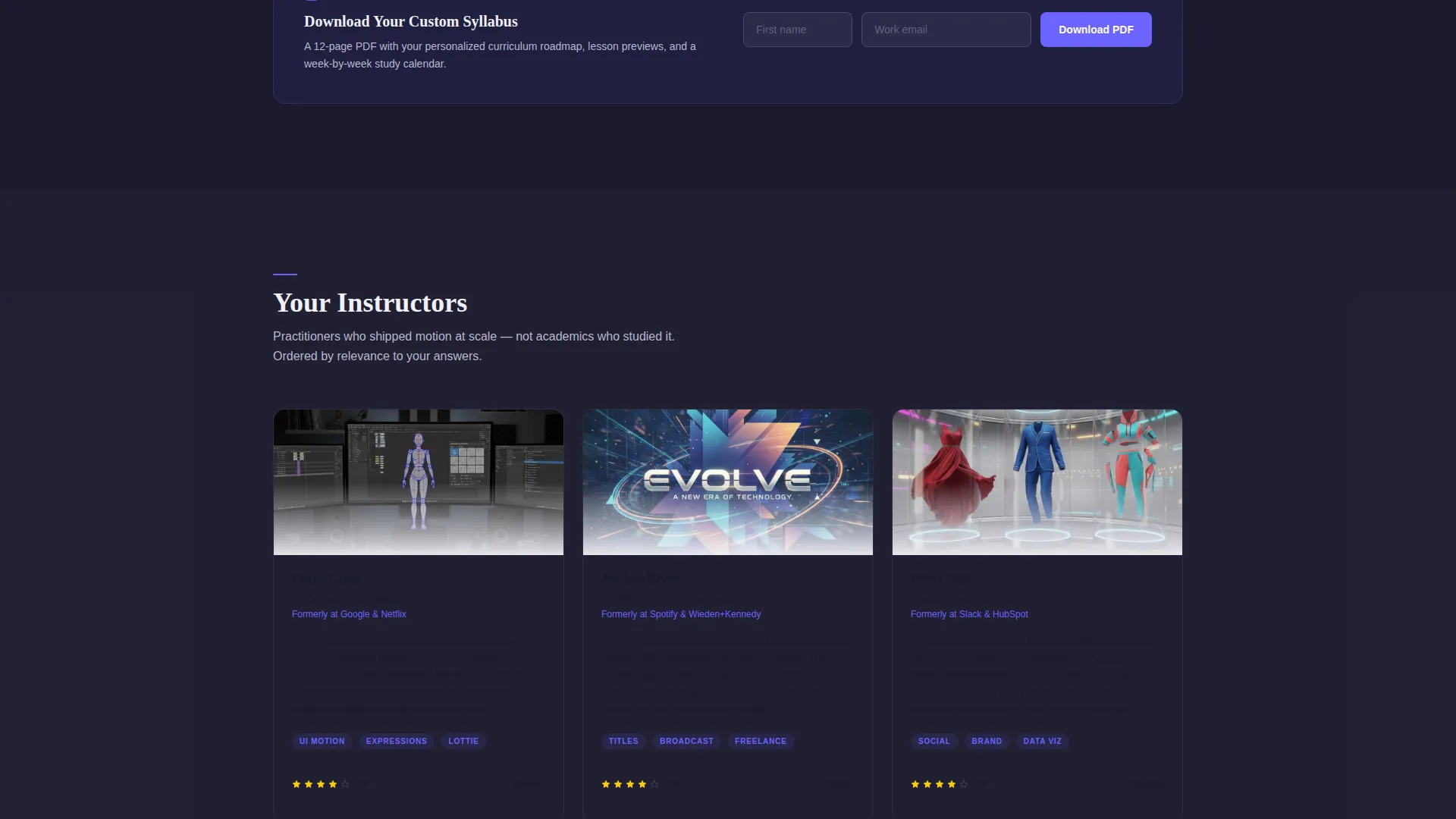
After the quiz runs, the primary call to action surfaces as "Download Your Custom Syllabus." It asks only for a first name and email address. The framing positions the download as the natural next artifact from the quiz consultation, not as a lead capture gate.
In-Spoke Secondary Conversion Paths
Each spoke section contains its own lightweight conversion offer. These include a downloadable After Effects shortcuts reference sheet, a free sample lesson video gated behind an email field, and an embeddable curriculum calendar. Visitors who are not ready for the main call to action can still engage and convert.
Electric Indigo Visual Identity System
The color system uses deep workspace charcoal for the header and footer, electric indigo on all interactive states and active navigation indicators, cool slate for body text, and bright titanium white on card surfaces. The palette signals a premium, focused interface where every accent color marks something actionable.
Page sections overview
| Section | Purpose |
|---|---|
| Logo Bar Header | Establishes institutional credibility before course copy begins |
| Tagline Statement | Anchors authority with a single restrained typography line |
| Personalization Quiz | Qualifies visitor role and reorders hub content dynamically |
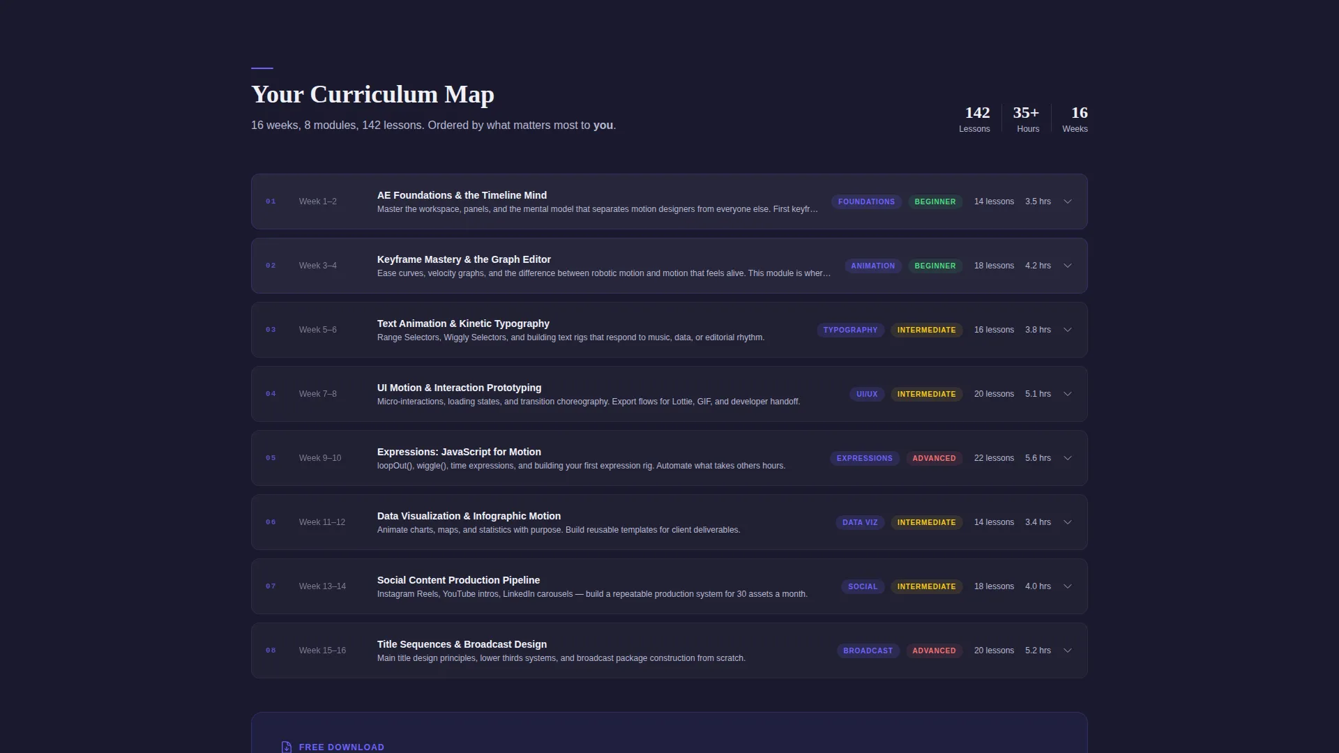
| Curriculum Spoke | Displays the personalized course map matched to quiz answers |
| Instructors Spoke | Surfaces the matching instructor biography based on quiz profile |
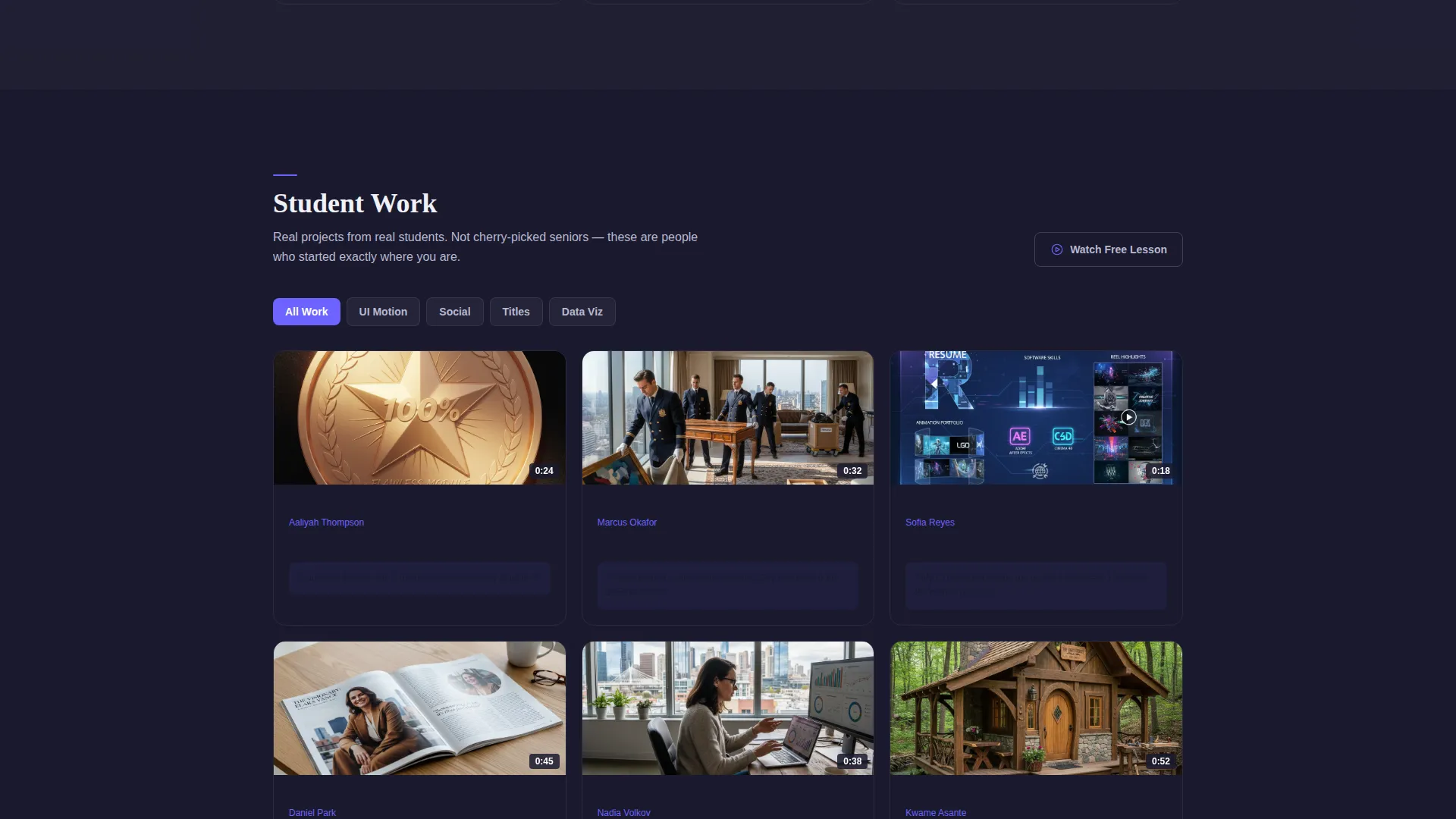
| Student Work Spoke | Shows a filtered showcase of graduate motion work |
| Community Spoke | Presents peer learning and cohort context for the course |
| Resources Spoke | Hosts cheat sheets, sample lesson, and curriculum calendar |
| Syllabus Download call to action | Converts quiz engagement into a named email lead |
Design & branding system
The visual identity follows an Institutional Authority theme. The palette is precise and intentional, built to feel like a premium creative tool rather than a generic course page.
- Deep workspace charcoal (#1A1A2E) anchors the header and footer, grounding the page with weight and focus
- Electric indigo (#6C63FF) appears only on buttons, active anchor nav indicators, and progress bars, keeping interactive states visually distinct
- Cool slate (#B8B8D1) handles body text and secondary labels, while bright titanium white (#F0F0F7) lifts card surfaces above subtle gray section dividers
Mobile & speed optimization
The hub-and-spoke layout is structured to remain fully navigable on smaller screens. The anchor navigation bar adapts so visitors can jump between spokes without losing their place, even when the quiz has reordered the section sequence.
- White card surfaces and clear section dividers maintain legibility as content stacks vertically on mobile viewports
- Lightweight form fields for the syllabus download and in-spoke calls to action keep the page functional without adding visual clutter on smaller screens
How this template helps you convert
The conversion architecture in this template is layered deliberately. Each layer earns more trust before asking for more from the visitor.
- The logo bar and tagline line establish authority in the first viewport, giving visitors an immediate reason to keep reading rather than bouncing.
- The personalization quiz transforms a passive scroll into an active conversation, making the subsequent syllabus download feel like a logical outcome rather than an interruption.
- In-spoke secondary offers give hesitant visitors a lower-commitment entry point, collecting email leads from people who are not yet ready for the full syllabus call to action.
Other information about this template
This template was designed specifically for the motion design and After Effects education market. It suits instructors building a standalone course hub as much as studios offering structured internal training pages.
- The template style is Hub and Spoke with Anchor Navigation, meaning sections are modular and can be prioritized or reordered to match different audience segments
- The creative direction is Quiz and Personalize, a pattern well suited to courses with multiple learner personas, such as motion graphics for user interface designers versus motion graphics for social media marketers
- The page type is a single landing page, making it straightforward to publish and maintain without a multi-page site structure
- The content direction is built around a resource download, which typically produces stronger lead quality than a direct purchase call to action for mid-to-high-consideration course products
Theme
Institutional Authority
Creative direction
Quiz & Personalize
Color system
Electric Indigo
Style
Hub & Spoke (Anchor Nav)
Direction
Content/Resource
Page Sections
Institutional Logo Bar Header
Three-question Personalization Quiz
Anchor Navigation Hub Structure
Personalized Syllabus Download Call to Action
In-spoke Secondary Conversion Paths
Electric Indigo Visual Identity System
Related questions
Can I change the quiz questions to match my specific course topics?
Do I need to offer a real syllabus PDF to use this template?
How many spoke sections does this template include?
Is this template suitable for a course that covers more than just After Effects?
What is the primary call to action in this template?



