Physical Education Education Booking Website Template
Kinetic is a modular card-grid landing page built for physical education tutoring services. It guides A-level and GCSE students, parents, and PE teachers through a clear five-stage tutoring journey, from diagnostic assessment to final revision intensive, while capturing leads through a focused booking form and a secondary revision checklist download.
by Rocket studio
Quick summary
Kinetic is a Corporate Precision landing page template designed for PE tutoring services. It maps the full tutoring journey across a modular card grid, presents a bold centered headline, and drives lead generation through a primary booking form and a secondary checklist offer. Everything is laid out with the calm clarity of a well-organised revision binder.
Who this template is for
This template is built for anyone running or launching a physical education tutoring service that targets examined students. It speaks equally well to solo tutors and small tutoring businesses preparing for peak exam season.
- PE tutors targeting A-level and GCSE students studying AQA, OCR, or Edexcel syllabi
- Tutoring businesses looking to convert late-night parent searches into booked assessments
- PE teachers or education professionals launching structured extra-support programmes
What problem this template solves
Students preparing for sport science and physical education exams often struggle to find focused, exam-board-specific support online. The tutoring services that provide it rarely have a page that communicates their process clearly enough to win a parent's trust at 11 p.m.
- No clear explanation of how the tutoring journey works from start to finish
- Generic service pages that fail to address specific exam boards or grade targets
- Weak lead capture that loses visitors who are not yet ready to book
What you get with this template
You get a single-page layout that takes every visitor from first impression to form submission without confusion. The structure is step-by-step, the design is distraction-free, and every section earns its place.
- A giant centered headline section with a bold typographic statement and exam-board subline
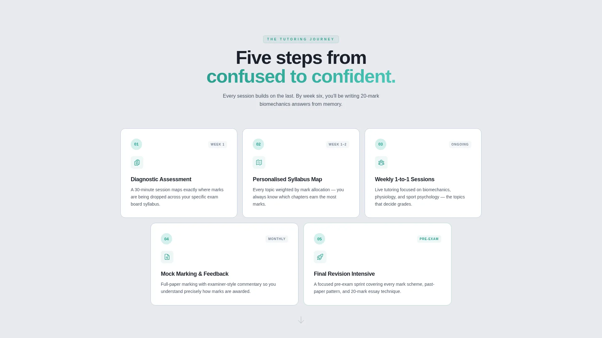
- A five-stage modular card grid covering diagnostic, syllabus mapping, sessions, mock marking, and revision intensive
- Two lead-capture touchpoints: a primary booking form and a secondary revision checklist download
Feature list
This template includes a focused set of design and structural features drawn directly from its brief. Each one is built to serve the tutoring context and the lead-generation goal.
Giant Headline Centered Header
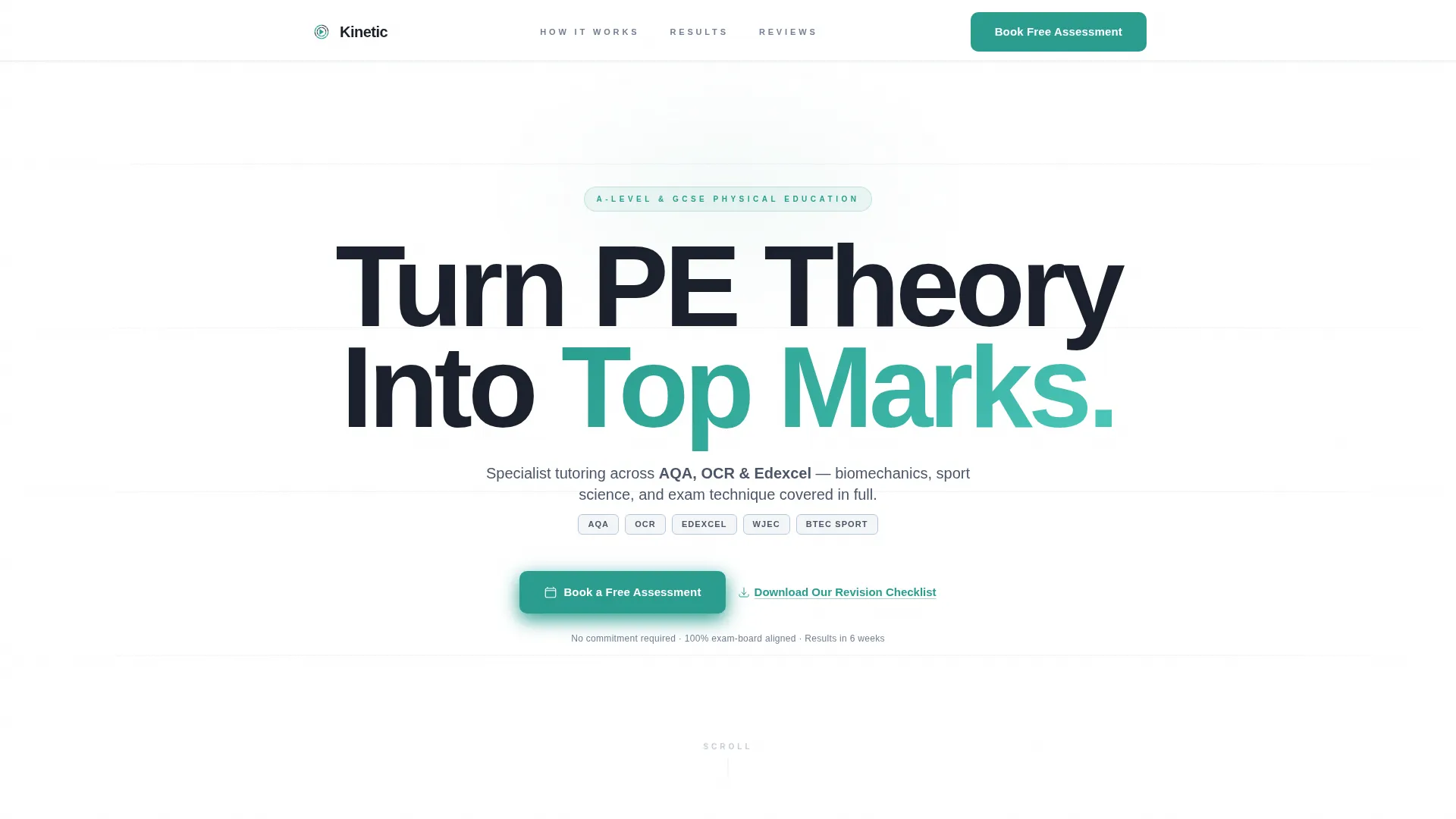
The header fills the viewport with a single heavyweight typographic statement. No image, no illustration, just the headline "Turn PE Theory Into Top Marks" set in a tracked-out sans-serif, with a subline naming the exam boards and levels covered. The confidence of the type alone signals authority.
Five-Stage Card Grid
Each card in the modular grid represents one stage of the tutoring journey. The cards contain a single icon, a short heading, and two lines of copy. The grid tightens from three columns to one as the user scrolls, funnelling attention naturally toward the call to action.
Scroll-Triggered Card Reveal
Cards appear with a subtle upward motion as the visitor scrolls. This gives the page a sense of progressive disclosure, reinforcing the step-by-step study planner feel without visual overload.
Primary Lead Capture Form
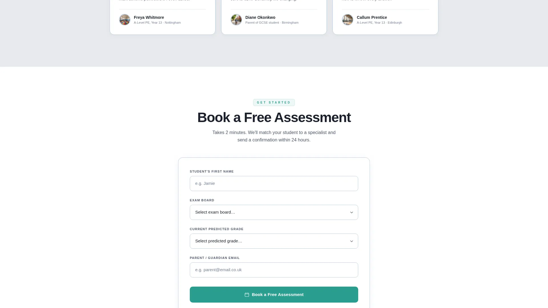
The booking form collects student first name, exam board selection via dropdown, current predicted grade, and parent email, in that order. Starting with the easiest field reduces form abandonment and keeps the process feeling approachable.
Secondary Checklist Download
A text link below the main call to action offers a free revision checklist download. It captures an email from visitors who are not yet ready to book, expanding the lead pool without cluttering the page.
Dual Call-to-Action Placement
The primary "Book a Free Assessment" button appears twice: once beneath the header subline, and again pinned after the final card. This dual placement keeps the next step visible throughout the scroll journey.
Page sections overview
| Section | Purpose |
|---|---|
| Giant Headline Header | Establishes authority and names exam boards covered |
| Diagnostic Assessment Card | Opens the tutoring journey at stage one |
| Syllabus Map Card | Shows how content is personalised per student |
| Weekly Sessions Card | Communicates the one-to-one teaching structure |
| Mock Marking Card | Highlights examiner-style feedback as a key differentiator |
| Revision Intensive Card | Closes the journey with a pre-exam confidence stage |
| Primary Booking Form | Captures warm leads ready to book a free assessment |
| Checklist Download Link | Captures cooler leads via a low-commitment email exchange |
Design & branding system
The visual identity follows a Corporate Precision theme using a Soft Mist colour palette. The result feels like a clean whiteboard in a quiet classroom, ordered, calm, and completely free of visual noise.
- Background in pale fog gray (#E8EAED), body text in cool slate (#4A5568), and card borders in whisper blue (#B8C9DC)
- A single decisive teal (#2A9D8F) is reserved for buttons and progress indicators, making every action point immediately visible
- Heavy tracked-out sans-serif typography for headings creates typographic authority without relying on imagery
Mobile & speed optimization
The card grid is fully responsive and adapts cleanly across screen sizes. The layout shifts from a three-column grid to a single focused column on smaller screens, maintaining the step-by-step reading flow regardless of device.
- Three-column card grid collapses to a single column on mobile for a focused, linear scroll
- Minimal asset use across the header and cards keeps the page visually light and fast to load
- Pinned call-to-action placement remains effective on both desktop and mobile viewports
How this template helps you convert
Every structural decision in this template serves lead generation. The layout removes friction at each step so that a parent searching late at night can move from landing on the page to submitting the form without hesitation.
- The form field order starts with student first name, the easiest field, reducing drop-off before the parent reaches the email field
- The dual placement of "Book a Free Assessment" keeps the primary action visible at the top and bottom of the page, so no scroll position leaves the visitor without a clear next step
- The checklist download acts as a second conversion path, capturing emails from visitors who need more time before committing to a session
Other information about this template
This template is well-suited for the physical education tutoring niche and fits naturally into the broader education and training category. It is designed as a standalone landing page, not a multi-page website.
- The template is built around the A-level and GCSE physical education market, with explicit references to AQA, OCR, and Edexcel exam boards in the subline and form dropdown
- The step-by-step card structure makes the tutoring process transparent, which helps build trust with parents who are comparing services
- The template name is Kinetic, and it is available as part of a modular landing page template collection on the platform
Theme
Corporate Precision
Creative direction
Step-by-Step Guide
Color system
Soft Mist
Style
Card Grid (Modular)
Direction
Lead Generation
Page Sections
Giant Centered Headline Header
Five-stage Modular Card Grid
Scroll-triggered Card Reveal
Progressive Grid Column Layout
Structured Lead Capture Form
Dual Call-to-action Placement
Related questions
Who is this landing page template designed for?
Can I edit the exam board options in the booking form?
Does this template include more than one call to action?
What does the card grid section include?
Is this a single landing page or a full website?



