Unified Data Platform Landing Page Template
Lakehouse is a scroll-reveal landing page template built for unified data platform tools and frameworks. It combines a dark glass panel header, animated benchmark tables, a self-assembling architecture diagram, and a terminal-style install call to action. The Void and Violet visual system gives it the feel of a live engineering interface, not a marketing brochure.
by Rocket studio
Quick summary
Lakehouse is a single-page, scroll-reveal template designed for data lakehouse tools and frameworks. It opens with three frosted-glass panels showing live data abstractions, then walks visitors through benchmarks, architecture, and adoption proof before delivering a terminal-style install command. The result feels less like a product page and more like a technical brief that earns every click.
Who this template is for
This template is built for teams shipping data infrastructure products that need to speak directly to a technical audience. It works best when the product bridges raw storage and structured analytics in a single runtime.
- Platform engineers who maintain Spark job configurations and ingestion pipelines
- Analytics leads tired of keeping parallel pipeline stacks in sync
- Chief Technology Officers evaluating unified data platform frameworks for their engineering teams
What problem this template solves
Most data tool landing pages try to explain a complex, layered product with a stock hero image and three bullet points. That approach loses the engineers who actually make the buying decision. This template is built around the opposite logic: show proof first, then ask for the install.
- Visitors see benchmark data and architecture diagrams before they reach any call to action
- The progressive scroll structure reveals each finding in sequence, so nothing feels like noise
- The terminal-style call to action block removes friction at the moment of decision by surfacing the exact install command
What you get with this template
You get a fully structured, single-page layout that doubles as a technical product brief and a conversion-focused landing page. Every section is designed to carry weight on its own while building toward the install prompt at the bottom.
- A Dark Glass Panels header with three translucent, parallax-tilted panels showing streaming ingestion logs, a live schema tree, and a materializing query result
- An animated benchmark comparison table, a layer-by-layer architecture diagram with scroll-triggered assembly, and an adoption metrics section with filterable ecosystem logos
- A terminal-style call to action block with a one-click copy command, operating system toggle buttons for macOS, Linux, and Docker, and a secondary sandbox path via GitHub OAuth
Feature list
This template is built around a clear set of prompt-defined components. Each one serves a specific role in the persuasion sequence.
Dark Glass Panel Header
Three translucent, frosted-glass rectangles float against the void black background, each tilted at a slight parallax angle. The left panel shows a streaming ingestion log with ticking timestamps, the center displays an expanding schema tree, and the right renders a query result appearing row by row. A violet refraction runs along each glass edge. No stock photography is used; the interface is the visual.
Scroll-Triggered Benchmark Table
A benchmark comparison table animates column by column as the visitor scrolls into view. It shows query latency figures set against legacy stack configurations, giving engineers immediate, concrete proof before any marketing language appears.
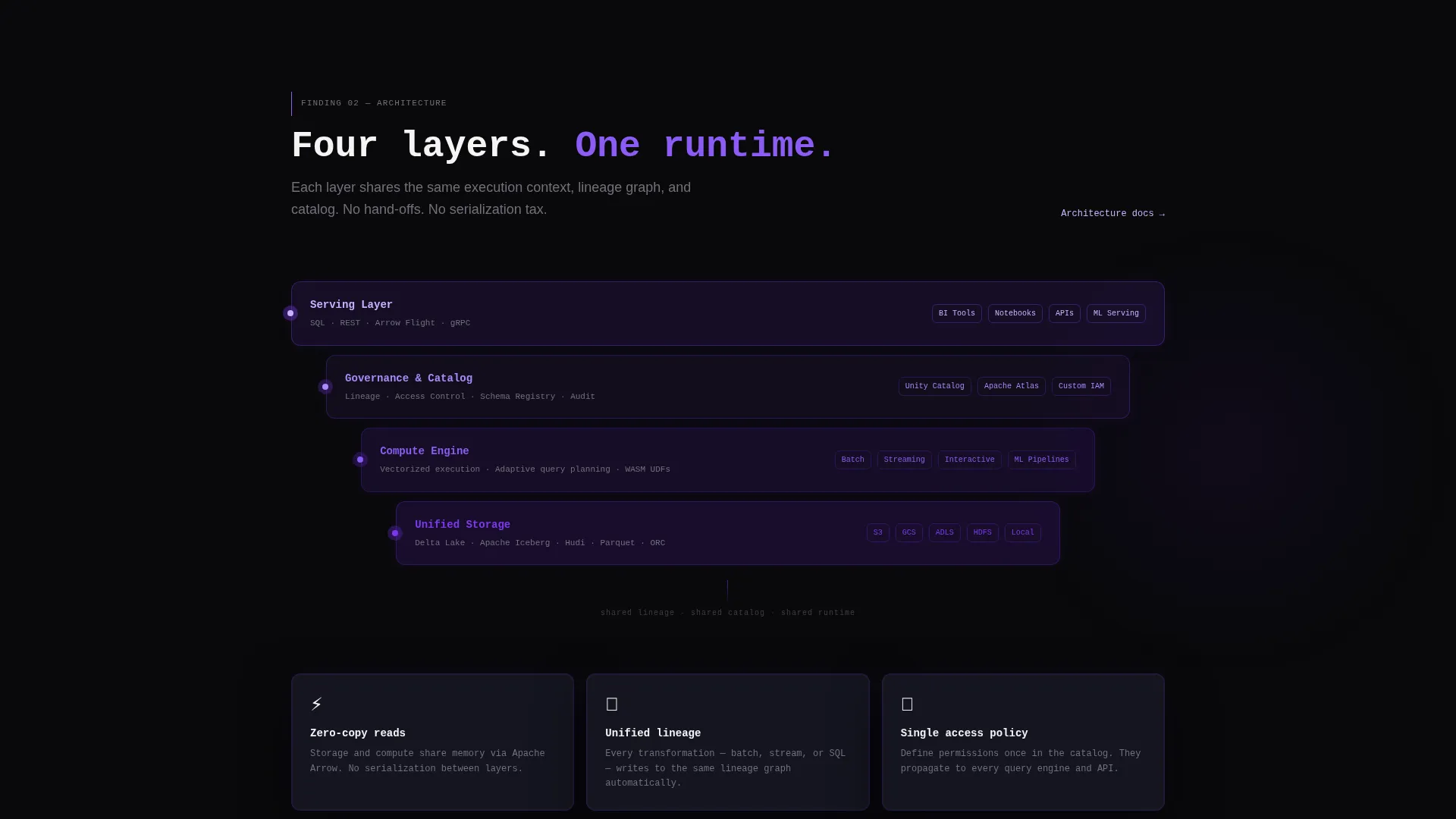
Self-Assembling Architecture Diagram
As the visitor scrolls, a layered architecture diagram builds itself on screen. Each layer, covering storage, compute, governance, and serving, snaps into place with a violet pulse. The animation follows the scroll cadence rather than auto-playing, keeping the visitor in control.
Adoption Metrics and Ecosystem Directory
An adoption metrics section materializes like entries in a discovery directory. Ecosystem logos appear progressively and can be filtered by industry vertical, giving visitors a sense of the framework's real-world reach without requiring them to leave the page.
Terminal-Style Install call to action Block
The primary call to action is a styled code block displaying a ready-to-copy install command. Visitors can toggle between macOS, Linux, and Docker variants. A one-click clipboard copy removes any manual friction. A secondary path links to a browser-based sandbox that requires only a GitHub OAuth login.
Monospace Headline and Inline Code Styling
The page uses a monospace typeface for the main headline and inline code highlights throughout the body. The phosphor lilac color is applied to code elements and active navigation states, reinforcing the engineering aesthetic consistently across the page.
Page sections overview
| Section | Purpose |
|---|---|
| Glass Panel Header | Opens with live data abstractions in three frosted-glass panels |
| Monospace Headline | Sets the single-line product positioning statement |
| Benchmark Comparison Table | Delivers scroll-triggered latency proof against legacy stacks |
| Architecture Diagram | Assembles layer by layer to show the full platform structure |
| Adoption Metrics Directory | Shows ecosystem reach with filterable industry vertical logos |
| Terminal Install call to action | Presents the copy-ready install command with OS toggles |
| Sandbox Secondary call to action | Offers a GitHub OAuth path to the browser-based playground |
Design & branding system
The visual identity follows a Directory and Discovery theme built on the Void and Violet color system. The palette is engineered to feel like a live monitor in a dark room, where the interface itself is the only light source.
- Core colors: absolute void black (#09090B) for the base, deep interstellar violet (#7C3AED) for accents and pulse effects, muted graphite (#1E1E2E) for card surfaces and panel backgrounds, and phosphor lilac (#C4B5FD) for hover states, inline code highlights, and active navigation
- Typography: monospace typeface for the headline and code elements, reinforcing the terminal aesthetic throughout
- The frosted-glass panels carry a faint violet refraction at their edges, and the scroll-triggered violet pulses on the architecture diagram connect the motion system to the color system
Mobile & speed optimization
The template is designed with a progressive scroll reveal structure, meaning each section loads its animation on entry rather than all at once. This approach keeps the page feeling responsive even on content-heavy sequences like the architecture diagram assembly.
- Scroll-triggered animations activate per section, reducing the rendering load at initial page open
- The OS toggle buttons and clipboard copy block are touch-friendly interaction targets suited to mobile viewports
- The filterable ecosystem logo grid is structured for graceful reflow on smaller screens
How this template helps you convert
The conversion strategy in this template is sequenced deliberately. Proof arrives before the ask, so visitors reach the install block already convinced.
- The benchmark table and architecture diagram front-load credibility, meaning visitors understand the product's technical depth before they see a single call to action
- The terminal call to action block removes every barrier at the decision point: the command is pre-written, the OS variant is selectable, and the clipboard copy is one tap away
- The sandbox secondary path gives hesitant visitors a low-commitment next step, capturing engineers who want to explore before they install
Other information about this template
This template sits at the intersection of data lakehouse technology and technical product marketing. It is built specifically for the data lakehouse tool and framework niche, where the audience is skeptical of marketing language and responsive to concrete evidence.
- The Industry Report creative direction means each scroll section presents a finding, not a feature pitch, which matches how platform engineers actually evaluate tools
- The template style is Scroll Reveal, meaning sections appear progressively rather than loading all at once, which suits long-form technical storytelling
- The header concept, Dark Glass Panels, is a deliberate choice for data lakehouse technology products where the data itself is more compelling than any illustration
- The App Download landing page direction makes this template suitable for open-source frameworks, command-line tools, and developer-first products where the install command is the conversion event


Theme
Directory & Discovery
Creative direction
Industry Report
Color system
Void & Violet
Style
Scroll Reveal (Progressive)
Direction
App Download
Page Sections
Dark Glass Panel Header
Scroll-triggered Benchmark Table
Self-assembling Architecture Diagram
Filterable Adoption Metrics Section
Terminal-style Install Call to Action Block
Monospace Typography and Inline Code Highlights
Related questions
What type of product is this template built for?
Can I adapt the benchmark table to show my own data?
What is the secondary call to action path used for?
Do I need design experience to customize this template?
Is the OS toggle in the install block functional out of the box?


