Data Lakehouse Managed Service Landing Page Template
Lakehouse is a bold brutalist landing page template built for managed data lakehouse services. It opens with a live cost estimator that calculates projected savings in real time, then walks visitors through a scroll-driven transformation from infrastructure chaos to unified governance. The design is raw, functional, and built to convert data leaders who are tired of runaway cloud spend.
by Rocket studio
Quick summary
Lakehouse is a single-page template designed for managed data lakehouse services. It combines a real-time cost estimator hero, a problem-to-solution scroll arc, and a two-column comparison report into one conversion-focused layout. The bold brutalist design uses deep slate, poured-concrete gray, and open-sky blue to signal precision and control from the first second.
Who this template is for
This template is built for teams that sell managed data infrastructure services to technical and financial decision-makers. It speaks directly to the people sitting across the table when a cloud bill arrives and nobody can explain the number.
- VP-level data leaders at mid-market companies carrying unexplained cloud spend every month
- Platform engineers who manage Spark job failures and fragmented data pipelines
- Chief Financial Officers reviewing analytics budgets that grow without clear justification
What problem this template solves
Most infrastructure service pages lead with diagrams and documentation. They make the visitor do the work of understanding the cost gap. This template flips that. It puts the cost gap front and center and makes it undeniable before asking for anything in return.
- Visitors leave before the value is clear because the hero section asks for effort instead of delivering insight
- Sales cycles stall because prospects never see a concrete comparison between their current stack and a better alternative
- Generic page layouts fail to communicate the operational precision that a managed lakehouse service actually delivers
What you get with this template
You get a fully structured landing page layout built around a calculator-first conversion flow. Every section is designed to reduce friction and build conviction as the visitor scrolls.
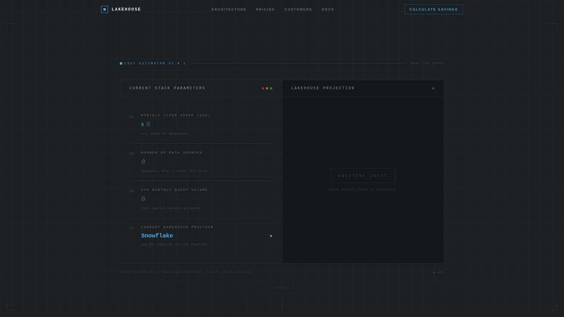
- A live cost estimator module styled as a terminal-prompt calculator with real-time output, a savings percentage bar, and an annual reclaim figure
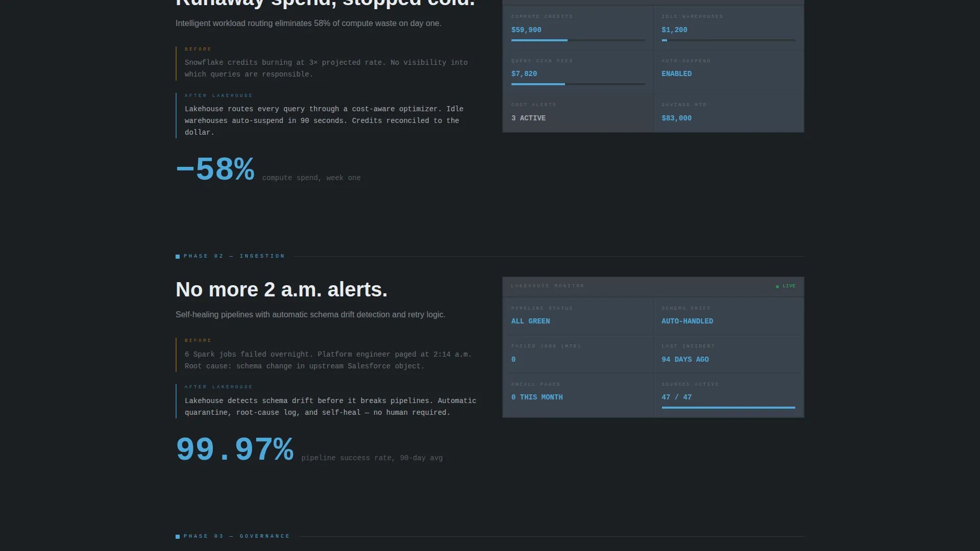
- A scroll-driven data grid sequence that visually transforms from a cluttered, warning-state dashboard to a clean, green-status monitoring view
- A two-column comparison report pre-populated from calculator inputs, with line-item breakdowns for compute, storage, engineering hours, and incident response
Feature list
This section covers the core functional components built into the template layout.
Live Cost Estimator Hero
The header is a brutalist calculator module centered in the viewport. Input fields styled as terminal prompts accept current monthly cloud spend, number of data sources, average query volume, and warehouse provider. The real-time output panel renders projected savings in oversized monospaced type alongside a sky-blue percentage reduction bar and an annual reclaim figure.
Scroll-Driven Problem-to-Solution Arc
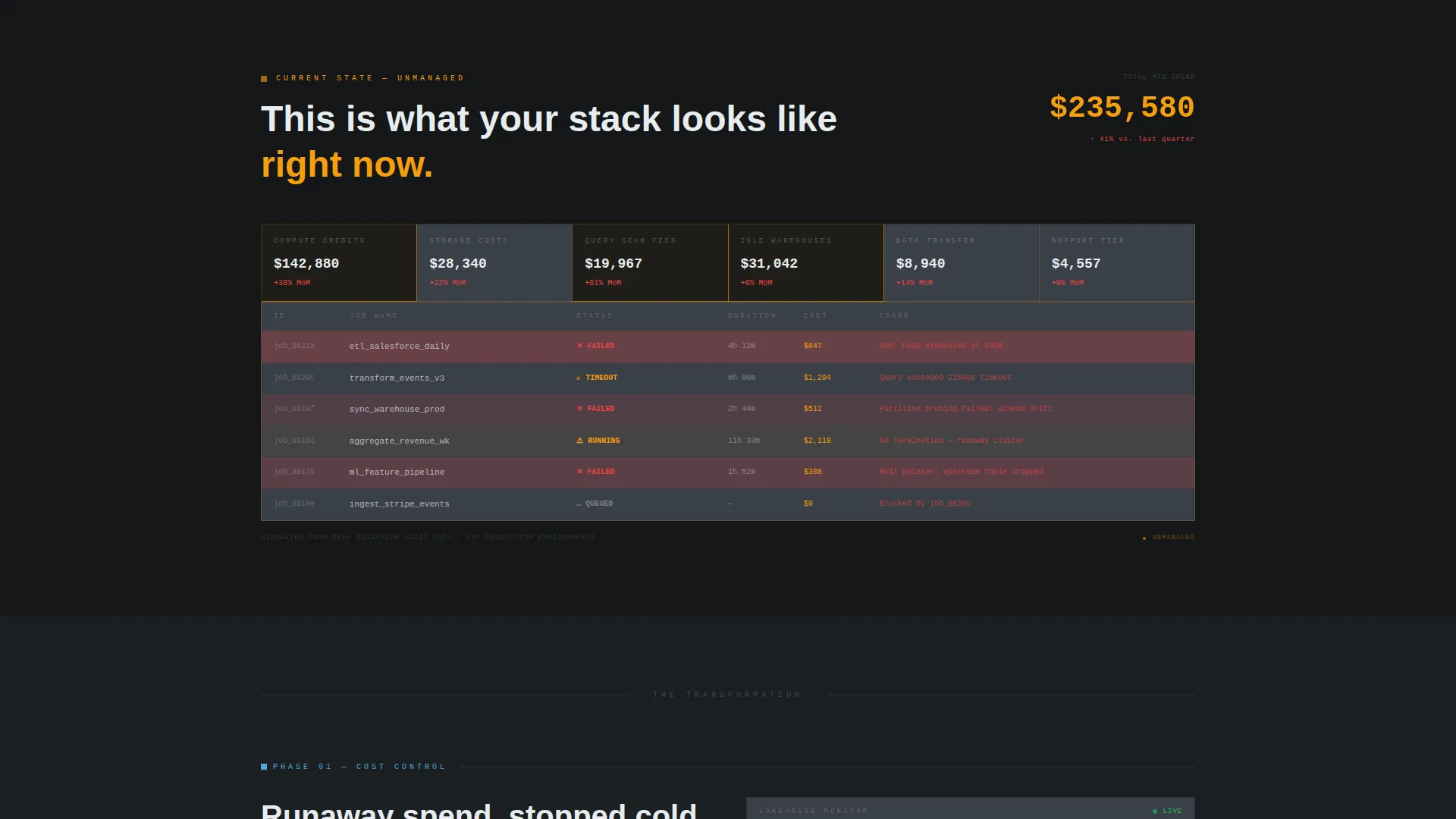
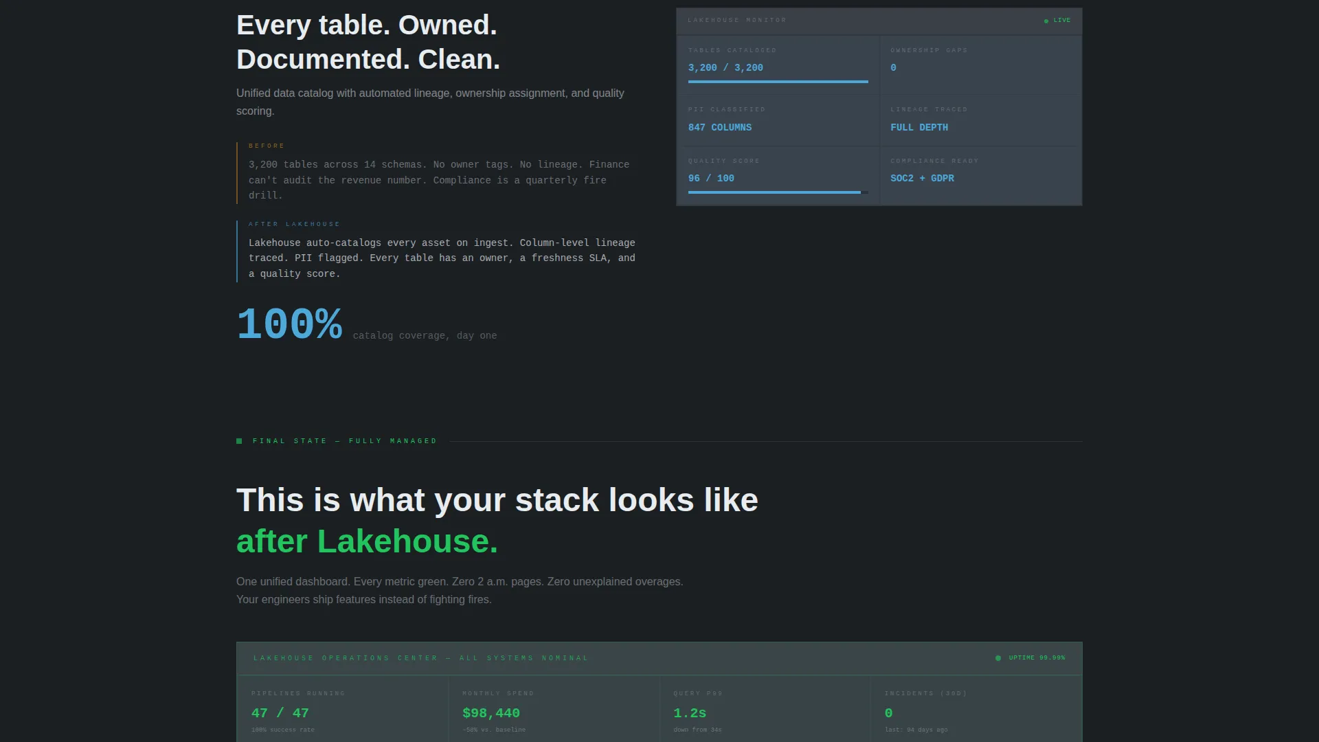
The page descends from chaos to control as the visitor scrolls. A simulated problem dashboard rendered in warning amber and concrete gray shows runaway costs, failed jobs, ungoverned tables, and duplicate pipelines. Each subsequent section strips one layer of dysfunction away, transitioning grid cells from cluttered amber to calm sky blue, ending in a single serene monitoring dashboard showing green status across every metric.
Two-Column Comparison Report
The primary call to action opens a side-by-side comparison report pre-populated with the visitor's calculator inputs. The left column shows their current state. The right column shows the managed lakehouse projection. Line-item rows cover compute, storage, engineering hours, and incident response so the cost gap is specific and impossible to dismiss.
Persistent Comparison Call to Action Bar
After the visitor scrolls past the first section, a sticky bottom bar carries the primary call to action throughout the rest of the page. This ensures the conversion prompt is always one click away without interrupting the scroll narrative.
Data Grid Transition Design
The grid cells themselves are functional design elements. They begin dense and alarming, filled with failure signals, then gradually clear as the visitor moves through each solution section. The visual transformation performs the product story without a single word of explanation needed.
Bold Brutalist Visual System
The layout uses a strict four-color palette anchored by deep gunmetal slate for backgrounds and poured-concrete gray for card surfaces. Open-sky blue appears only on interactive elements and live data points. Chalk white handles all typography. Borders are 1px solid and structural throughout, reinforcing the sense that every element has a purpose.
Page sections overview
| Section | Purpose |
|---|---|
| Cost Estimator Hero | Delivers real-time savings output and anchors the primary call to action |
| Problem Data Grid | Visualizes infrastructure dysfunction in warning amber to establish the stakes |
| Cost Optimization Section | Replaces the spend chaos chart with a governed cost breakdown |
| Automated Ingestion Section | Swaps failure logs for a clean automated pipeline status view |
| Unified Governance Section | Replaces scattered catalog errors with a structured data governance view |
| Monitoring Dashboard | Presents green-status metrics across every operational indicator |
| Comparison Report Panel | Side-by-side current stack versus managed lakehouse with line-item detail |
| Persistent call to action Bar | Keeps the comparison call to action visible after the first scroll |
| Architecture Review Footer | Houses the secondary call to action for visitors ready to speak with the team |
Design & branding system
The visual identity is built around a bold brutalist aesthetic that treats function as the only decoration. The palette is intentionally heavy and unapologetic. Accent color is used once and precisely, so it always means something.
- Deep gunmetal slate (#1B1F23) for primary backgrounds, poured-concrete gray (#3A3F47) for card surfaces and grid cells, open-sky blue (#4DA8DA) for all interactive elements and live data indicators, and chalk white (#E8ECEF) for all body and heading typography
- All borders are 1px solid and structural, never decorative, reinforcing the sense that the layout is engineered rather than styled
- No stock photography, no illustration, and no decorative graphic elements anywhere on the page
Mobile & speed optimization
The template is designed to carry its dense data grid layout across screen sizes without losing the visual logic of the scroll arc. Structural elements scale to remain readable and functional on smaller viewports.
- The calculator module adapts its input and output panels for vertical stacking on mobile screens so the estimator remains the first thing a visitor interacts with
- Grid cells and data transition sections reflow into single-column layouts on narrower screens while preserving the amber-to-blue color progression that drives the narrative
How this template helps you convert
The template is built around a specific conversion philosophy: earn the click by making the cost gap undeniable before asking for contact information. Every structural decision supports that sequence.
- The calculator runs the math for the visitor immediately, delivering a projected savings figure in the hero section before any scroll is required, which removes the most common reason a prospect bounces from an infrastructure service page
- The scroll arc builds conviction section by section, so by the time the visitor reaches the comparison report call to action, they have already watched their own operational problems get resolved visually
Other information about this template
This template is specifically designed for the data lakehouse managed service category within the broader data infrastructure technology market. It is a strong fit for teams positioning a lakehouse platform as an alternative to standalone data warehouse or data lake setups.
- The warehouse provider dropdown in the calculator includes Snowflake, Databricks, Redshift, and BigQuery as selectable options, which speaks directly to the buying context of prospects already committed to one of those platforms
- The template style is classified as a dashboard and data grid layout, making it especially effective for services where the product itself is a monitoring and orchestration interface
- The two-column comparison report is pre-populated from calculator inputs, reducing the perceived effort of evaluation and making the transition from visitor to qualified lead feel earned rather than forced
Theme
Bold Brutalist
Creative direction
Problem→Solution Arc
Color system
Slate & Sky
Style
Dashboard/Data Grid
Direction
Comparison/Versus
Page Sections
Live Cost Estimator with Real-time Output
Scroll-driven Problem-to-solution Arc
Two-column Comparison Report
Persistent Bottom Call to Action Bar
Bold Brutalist Data Grid Design
Architecture Review Secondary Call to Action
Related questions
Who is this landing page template designed for?
Can I change the warehouse provider options in the calculator dropdown?
Does this template include the comparison report as a built-in section?
What makes this template different from a standard SaaS landing page template?
Is the bold brutalist design easy to adapt to an existing brand?



