Unified Data Platform Landing Page Template
The Lakehouse landing page template is built for open-source data platform projects that need to prove their case fast. It combines a brutalist comparison table, benchmark visualizations, and a two-step lead capture form into one high-impact, single-page layout. The dark glassmorphic design and research-report tone position your project as the credible, technical alternative to legacy warehouse stacks.
by Rocket studio
Quick summary
This is a single-page landing page template designed for open-source data lakehouse projects. It leads with a benchmark-driven comparison table, backs it with SVG bar charts, and closes with an architecture diagram. The layout is built around lead generation through a two-step email form and a secondary GitHub call-to-action path.
Who this template is for
This template is built for technical teams and open-source maintainers who need to communicate a data platform's value to a skeptical, data-literate audience. It skips the marketing fluff and speaks directly in numbers, architecture diagrams, and honest capability comparisons.
- Platform engineers and data architects evaluating alternatives to their current stack
- Engineering leads and open-source project maintainers launching or promoting a data lakehouse product
- Developer-focused teams that need a lead generation page without sacrificing technical credibility
What problem this template solves
Teams building unified data platforms often struggle to explain their product's advantages without relying on vague claims. Visitors who are already deep in the problem space need structured evidence, not slogans. This template gives you a page that reads like a research brief and earns trust scroll by scroll.
- No clear way to show side-by-side capability differences against warehouse-only and lake-only architectures
- Lead capture forms that feel mismatched with a technical audience expecting real data before giving up their email
- Fragmented page layouts that bury the benchmark evidence visitors need to act
What you get with this template
The template delivers a complete, single-page layout structured around three escalating evidence sections. Each section is self-contained but feeds the next, guiding the visitor from comparison to proof to architecture without losing momentum.
- A full brutalist comparison table covering twelve evaluation dimensions across four architecture types
- Two conversion touchpoints: a sticky bottom bar and an inline call-to-action, both tied to a two-step lead form
- SVG benchmark bar charts, a frosted glass architecture diagram card, and a blinking cursor hero headline
Feature list
This template packs several carefully designed components that serve both visual impact and conversion logic. Each one is grounded in the brief and built for a technical audience.
Twelve-Dimension Comparison Table
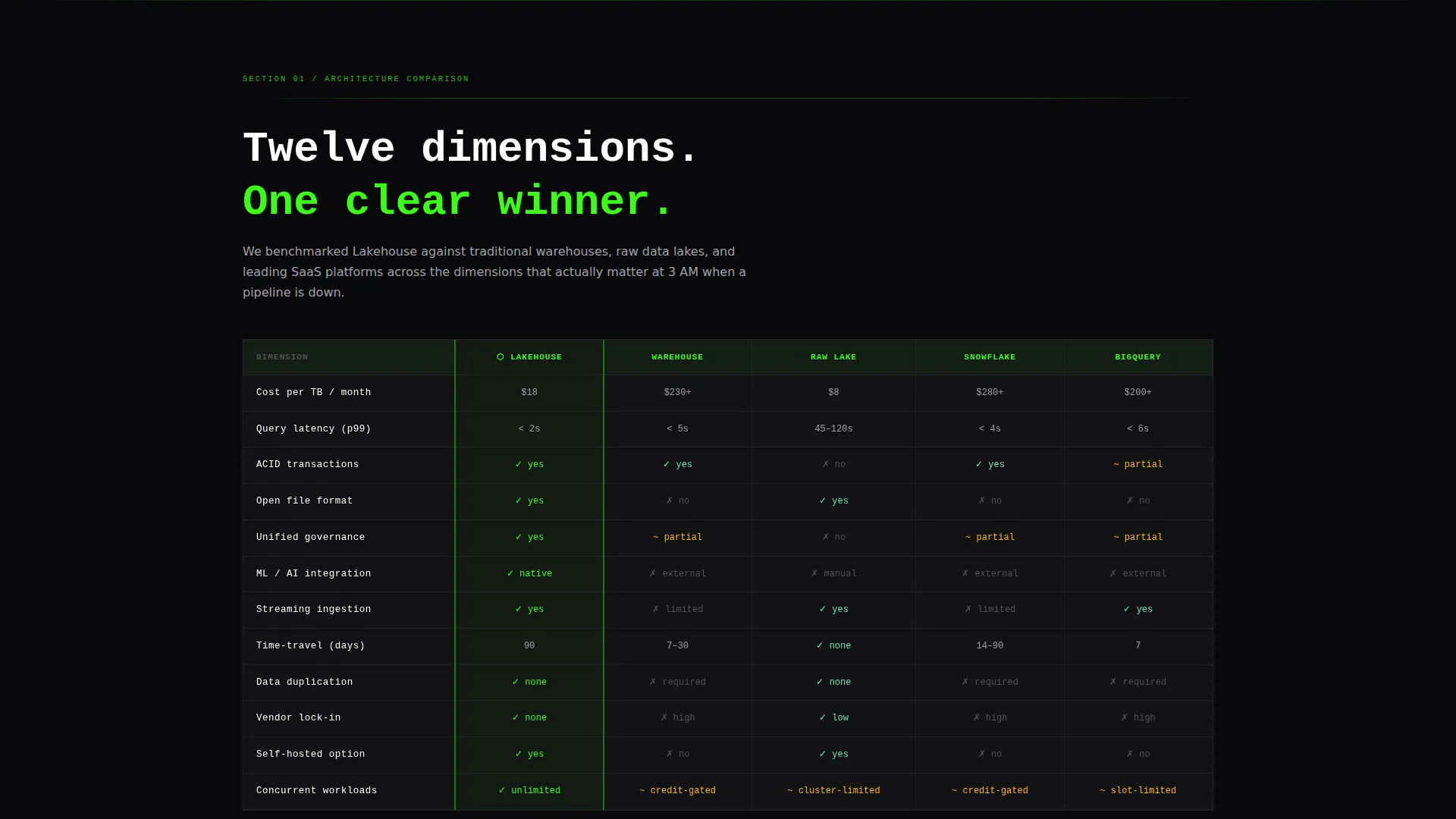
The comparison table benchmarks the lakehouse architecture against a traditional warehouse, a traditional data lake, and leading software-as-a-service platforms. It covers twelve dimensions including cost per terabyte, query latency, ACID transaction support, open format compatibility, governance, and machine learning integration. The table is the anchor of section one and the first hard-evidence payoff after the hero.
Two-Step Lead Capture Form
The form opens with a single work email field and instant validation. After submission, a second step reveals company name, a role dropdown with four options, and a multi-select field for current stack technologies. This progressive disclosure reduces friction at the first touch and qualifies leads at the second step.
Sticky Bottom Conversion Bar
A sticky bar appears after the visitor scrolls past forty percent of the page. It carries the primary call-to-action in signal amber and stays visible without interrupting reading flow. It disappears on the hero and reappears consistently through the benchmark and architecture sections.
SVG Benchmark Bar Charts
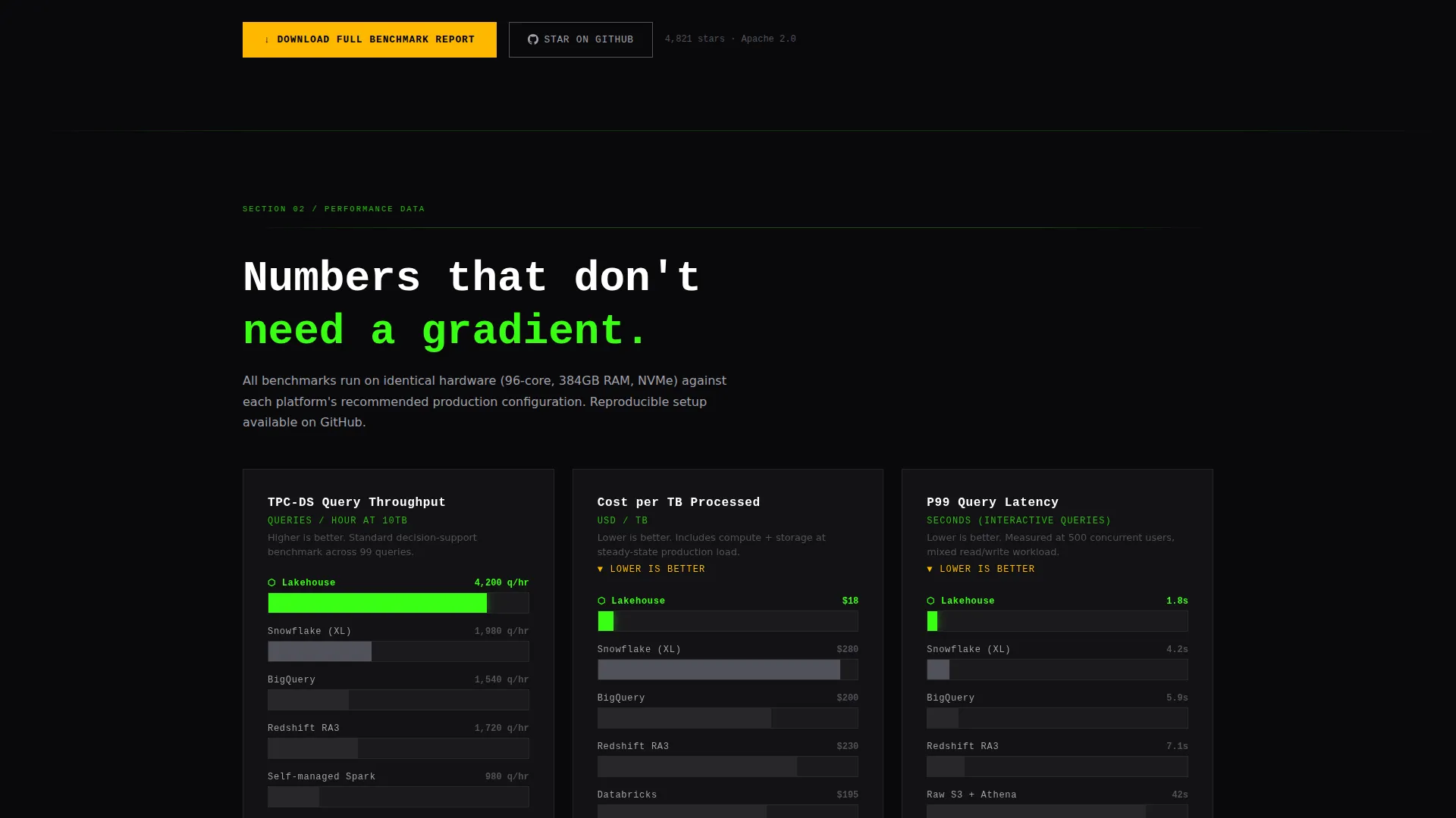
Section two presents benchmark data as stark, flat SVG bar charts on a pure black background. No gradients, no three-dimensional styling. The visual treatment reinforces the industry-report creative direction and keeps the data readable against the dark field.
Frosted Glass Architecture Diagram
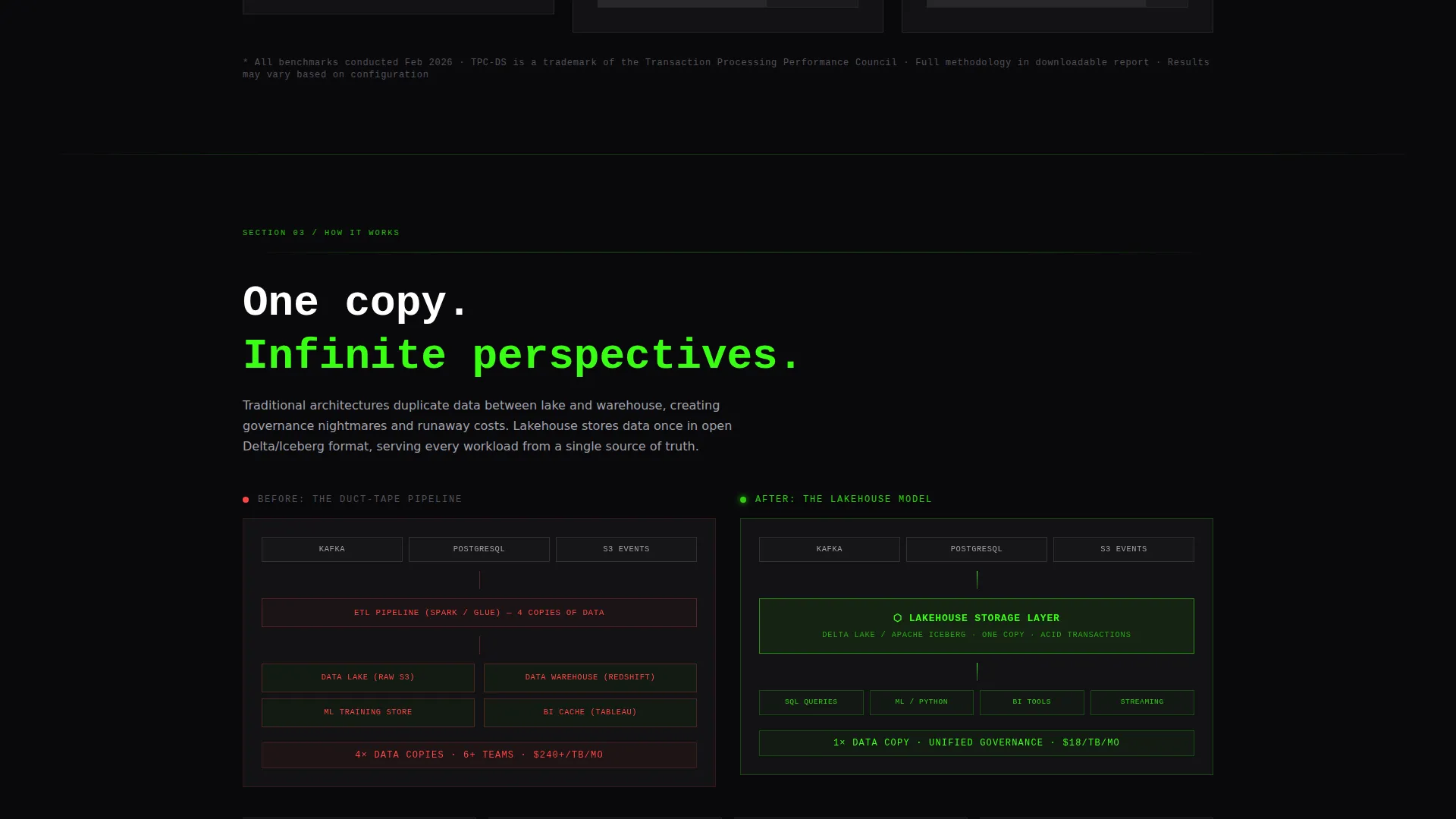
Section three displays a single-copy architecture model on a translucent glass card with a blurred backdrop. The diagram communicates the unified query, storage, and governance model in one visual without requiring a deep technical explanation in the body copy.
Ghost-Bordered Secondary Call-to-Action
A borderless ghost button labeled for a GitHub star action sits beside every primary call-to-action. It catches visitors who are not ready to share their email but will signal interest with a lower-commitment click. This secondary path runs parallel to the lead form without competing visually.
Page sections overview
| Section | Purpose |
|---|---|
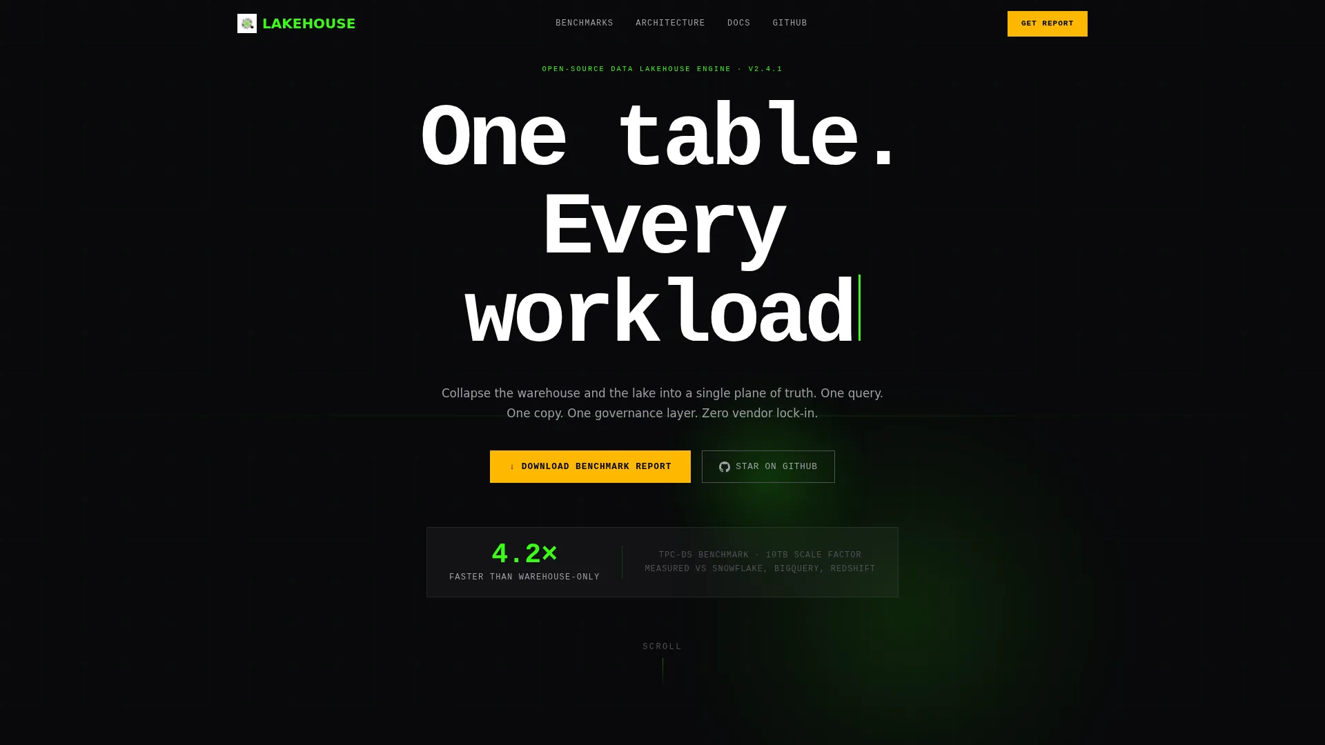
| Hero Header | Anchors the value claim with a monospaced headline, phosphor glow, and a single benchmark stat |
| Comparison Table | Benchmarks four architecture types across twelve evaluation dimensions |
| Benchmark Charts | Presents performance data as flat SVG bar charts with no decorative styling |
| Architecture Diagram | Shows the single-copy model on a frosted glass card |
| Lead Capture Form | Collects qualified leads through a two-step progressive form |
| Sticky call to action Bar | Keeps the primary conversion action visible after forty percent scroll depth |
Design & branding system
The template uses a Bold Brutalist theme executed through a glassmorphic color system. The result feels like a terminal window floating inside a glass structure at midnight: stark, precise, and alive with quiet tension.
- Color palette: void black (#09090B) for backgrounds, phosphor green (#39FF14) for accents and glows, cool gray (#A1A1AA) for body text, frosted glass white (#FFFFFF at eight percent opacity) for card surfaces, and signal amber (#FFB800) reserved for calls-to-action and alert states
- Typography: oversized, raw monospaced type for headlines; section dividers are single-pixel phosphor lines; no hero image or illustration in the header
- Motion: a slow radial glow pulse behind the headline and a blinking cursor after the period give the page a sense of idle readiness
Mobile & speed optimization
The layout is designed to translate the dense, data-heavy content into a readable single-column flow on smaller screens. The sticky bar and two-step form are structured to work within compact viewports without losing their sequential logic.
- The comparison table, benchmark charts, and architecture diagram card are each contained in full-width blocks that reflow cleanly on mobile breakpoints
- The sticky bottom bar and inline call-to-action placements are positioned to remain tappable and legible on touch devices
How this template helps you convert
The page treats conversion as a logical outcome of escalating evidence rather than a design trick. Every section earns the next, and both conversion paths are introduced only after the visitor has seen the data.
- The comparison table and benchmark charts deliver hard evidence before any form appears, so visitors arrive at the call-to-action already persuaded rather than interrupted
- The two-step form reduces the entry barrier with a single email field first, then qualifies the lead in a second step only after the visitor has opted in
- The ghost-bordered GitHub button runs as a parallel conversion path, capturing intent from visitors who are not yet ready to share their contact details
Other information about this template
This template is suited for any open-source data platform project positioning itself against proprietary or legacy stacks. The industry-report creative direction makes it equally useful for internal champion pages, conference landing pages, and project documentation portals. The color system and monospaced typography can be adapted to match a project's own brand tokens with minimal rework.
- The template style is a comparison table layout, making it a strong fit for projects that need to communicate technical superiority through structured, side-by-side evidence
- The lead generation direction and two-step form make it compatible with standard marketing automation workflows that accept a work email as the primary lead identifier
- The ghost call to action pattern is designed for open-source communities where GitHub stars and repository traffic are meaningful signals alongside formal lead capture
Theme
Bold Brutalist
Creative direction
Industry Report
Color system
Glassmorphic
Style
Comparison Table
Direction
Lead Generation
Page Sections
Twelve-dimension Comparison Table
Two-step Lead Capture Form
Sticky Bottom Conversion Bar
SVG Benchmark Bar Charts
Frosted Glass Architecture Diagram
Ghost-bordered Secondary Call to Action
Related questions
Can I adapt the comparison table to cover different evaluation dimensions?
Does the two-step form connect to a specific backend or form service?
Is the sticky bottom bar always visible while scrolling?
Who is the role dropdown in the second form step designed for?
Can the ghost GitHub button link to a different destination?



