Online Skill Courses Specialist Professional Website Template
The Cohort beginner app development course landing page template is built for iOS instructors who want to convert curious beginners into enrolled students. It uses a zigzag frequently asked question-driven layout, an Electric Indigo color system, and a split-viewport hero section to answer every fear before asking for an email. The primary call to action is "Start Week One Free."
by Rocket studio
Quick summary
This landing page template is designed for a cohort-based iOS development course aimed at complete beginners. It pairs a late-night code-editor visual identity with a frequently asked question-driven zigzag layout that answers real student fears as visitors scroll. Every element on the page works to build trust, deliver engaging content, and move visitors toward the "Start Week One Free" call to action.
Who this template is for
This template is made for course creators who teach beginner-level app development in a structured cohort format. It works especially well when your students are career-switchers, hobbyist coders, or designers who want to build their own apps without a computer science background.
- iOS and Swift instructors running live, cohort-based courses with weekly sessions
- Educators targeting beginners who feel anxious about Mac setup, Swift syntax, or the App Store process
- Course creators who want to launch a visually appealing, conversion-ready landing page without building from scratch
What problem this template solves
Beginners carry a lot of fear before they sign up for a technical course. Setup anxiety, imposter syndrome, and uncertainty about the course outline all create friction on a landing page. This template is designed to dissolve that friction before it stops a visitor from enrolling.
- Visitors leave course pages when objections go unanswered; this layout surfaces each fear as a real student question and answers it directly
- Most generic templates lack the warm, community-first tone that cohort-based learners respond to
- Building a good course landing page from scratch takes time a course creator rarely has
What you get with this template
You get a fully structured, single-page layout that covers all the benefits of a well-designed course landing page. Every section is ready to fill with your own course material, instructor details, testimonials, and calls to action.
- A split-viewport hero section with space for a SwiftUI preview canvas, a looping video, and a bold outcome-focused headline
- A zigzag frequently asked question section flow covering setup, language difficulty, pacing, and App Store submission
- An email capture form with a Mac or setup-help toggle, three downloadable PDF resource slots, a testimonials section, and a linear footer
Feature list
This template ships with a focused set of components built around one goal: helping potential students feel ready to begin.
Split-Viewport Hero Section
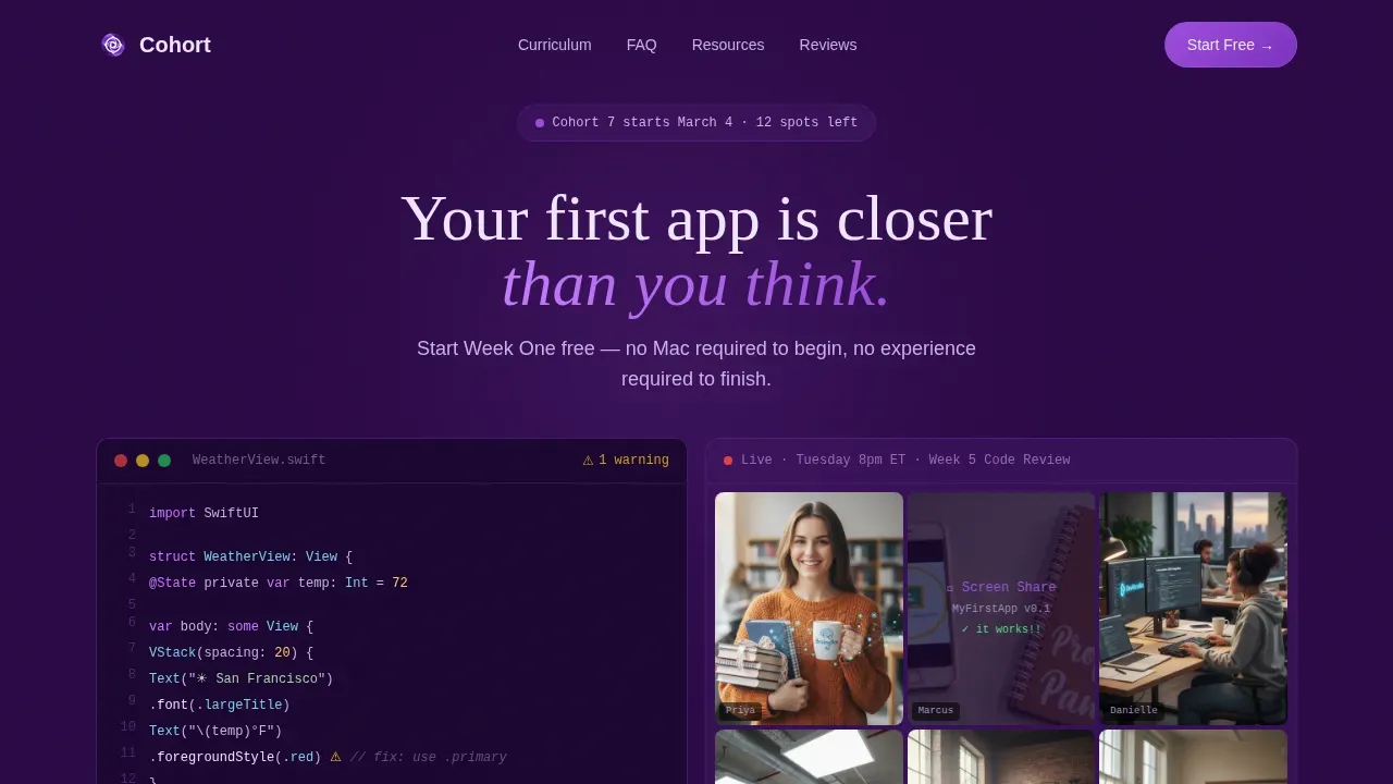
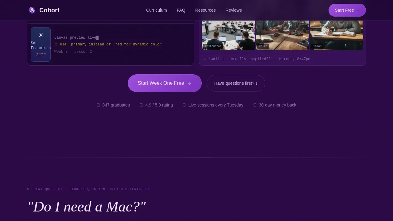
The hero section opens with a two-panel layout. The left panel displays a real SwiftUI preview canvas with visible code and a simulator. The right panel holds a short looping video of a live cohort Zoom session. A fade-in headline reads "Your first app is closer than you think. Start Week One Free," placing the outcome front and center for every visitor who lands on the page.
frequently asked question-Driven Zigzag Layout
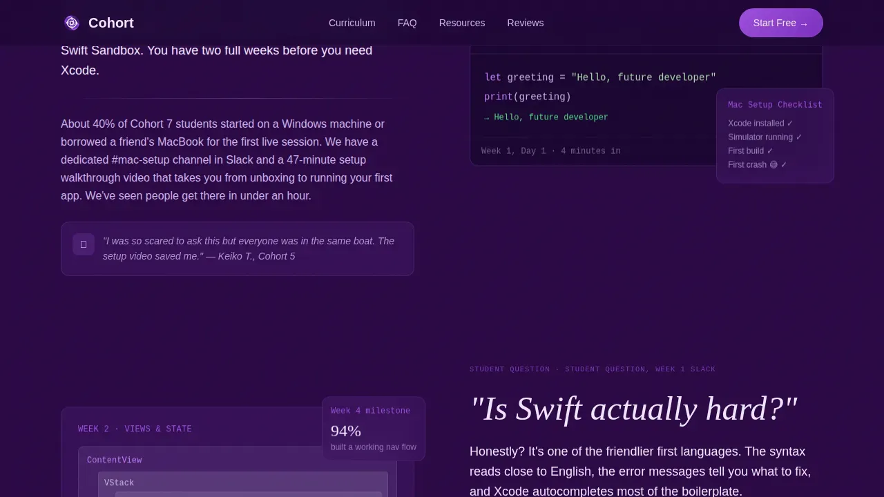
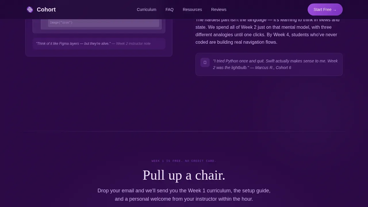
Each zigzag block opens with a large, handwritten-style student question: "Do I need a Mac?", "Is Swift actually hard?", "What if I fall behind?", and "How do I actually submit to the App Store?" The alternating panels answer each question using short instructor video clips, Slack screenshot slots, and a one-paragraph response written in a warm, direct tone. The scroll itself previews the course outline and mirrors the student's growing confidence.
Email Capture with Setup Toggle
The primary call-to-action form appears after the first two frequently asked question sections. It asks only for an email address and a single toggle: "I have a Mac" or "I need setup help first." This low-friction form design reduces hesitation and helps the course creator segment leads from the moment of sign-up without overwhelming new visitors.
Free PDF Resource Section
Below the primary form, a secondary resource section offers three downloadable cheat sheets: SwiftUI layout basics, Xcode shortcuts, and an App Store submission checklist. Each download is gated behind the same email capture form, so the page generates leads from visitors who are not yet ready to commit to the full paid course.
Testimonials Section
A dedicated testimonials section displays student stories with photo slots and written quotes. Student testimonials in video format can also be placed here to showcase past students' progress and motivate new learners. Positive testimonials displayed at this point in the scroll reinforce the social proof established earlier in the page and push hesitant visitors toward the finish line.
Staggered Scroll Animation System
The template includes high-animation scroll reveals, floating elements, and a shimmer effect system. Staggered reveals guide the eye from one section to the next, keeping users engaged as they move through the page. This is incredibly important for combating dwindling attention spans on long-form course landing pages.
Page sections overview
| Section | Purpose |
|---|---|
| Split-Viewport Hero | Introduce the course and the primary "Start Week One Free" call to action |
| frequently asked question Zigzag: Mac Setup | Answer setup anxiety with a direct response and instructor video slot |
| frequently asked question Zigzag: Swift Difficulty | Dissolve language fear with a conversational panel and Slack screenshot |
| Email Capture Form | Collect leads with a low-friction email form and Mac toggle |
| frequently asked question Zigzag: Pacing + Submission | Address commitment fears and App Store confidence as the scroll deepens |
| Free PDF Resources | Offer three gated cheat sheets to capture additional leads |
| Testimonials | Display student stories and social proof to build trust |
| Footer | Close the page with a linear pattern and supporting navigation |
Design & branding system
The visual identity follows a Community Hearth theme expressed through an Electric Indigo color system. The palette is designed to feel like a code editor at 1 a.m. with a desk lamp on: focused and electric but warm and welcoming.
- Colors: deep nightscreen indigo (#2A0845) as the primary background, warm terminal glow (#7B5EA7) on section dividers and secondary text, bright electric violet (#9D4EDD) on buttons and interactive highlights, and soft hearthlight (#F0E6FF) for card surfaces and body text
- Typography: Fraunces serif headings give a handwritten, human feel to the large frequently asked question questions, while DM Sans handles all body text with clean, readable clarity
- The overall aesthetic creates a professional appearance that feels personal and community-driven rather than cold or corporate
Mobile & speed optimization
This template is built with a mobile-first priority, which is essential because many of its target students are coding on lunch breaks or checking course pages from their phones. A course landing page that does not work well on mobile loses a significant portion of its audience before they ever read the first lesson description.
- The layout adapts to small screens so that the zigzag sections, email form, and video slots remain clear and tappable
- Server Components handle static sections while Client Components manage the interactive frequently asked question panels, Mac toggle, and email form, keeping the page responsive without sacrificing interactivity
How this template helps you convert
A good course landing page functions as both a persuasive marketing tool and an informative roadmap for students. This template is engineered to convert visitors into enrolled learners by removing fear at every scroll point.
- The frequently asked question-first structure answers every real objection before the email form appears, so by the time users reach the call-to-action, they already feel like they belong in the cohort. A sticky call-to-action button keeps the enrollment option visible as visitors scroll through multiple ctas placed at natural decision points.
- Social proof through student testimonials, Slack screenshots, and cohort video moments is woven through different sections of the page rather than isolated in one block, making trust a constant presence rather than an afterthought.
- The free PDF downloads create a secondary conversion path for visitors who are not ready to commit, capturing their email so the course creator can continue to nurture those leads after the visit.
Other information about this template
This template draws on best practices from across course landing page examples in the EdTech space. It is especially well-suited for instructors who want to start building a landing page that does the persuasive hard work without requiring design or development knowledge.
- Cohort-based learning boosts learner completion rates because students move through lessons at the same time, creating accountability and a sense of community; this template reflects that energy in its tone and layout
- The page can be used for a paid course with no pricing displayed in the free trial flow, keeping the entry point low-friction while the value of the full course is communicated through course material previews and social proof
- Course creators can customize the color system, typography, section copy, and PDF resource slots to fit their own brand, making it straightforward to create a course landing page that feels unique
- Tools like Carrd offer low-cost options for single-page course sites, while Eduma, a top-rated education theme powered by LearnPress, is ideal for instructors who need built-in Learning Management System features; this template sits between those options as a purpose-built, design-forward starting point
- The average conversion rate for course landing pages is around 13 percent, which is higher than most general landing pages; this template is structured to reach that benchmark by combining a compelling hero section, embedded social proof, multiple calls to action, and a sneak peek at the first lesson experience through the frequently asked question scroll flow
- Inspiration for the frequently asked question-driven creative direction comes from the idea that the scroll itself is a curriculum preview; each question a visitor reads increases their knowledge of the course and their confidence in their own ability to complete it
Theme
Community Hearth
Creative direction
FAQ-Driven
Color system
Electric Indigo
Style
Zigzag/Alternating
Direction
Content/Resource
Page Sections
Split-viewport Hero with Live Course Preview
Faq-driven Zigzag Section Flow
Low-friction Email Capture with Toggle
Gated Free PDF Resource Section
Student Testimonials with Media Slots
Staggered Animation and Shimmer System
Related questions
Can I use this template without design experience?
Does this template support a free trial call to action?
Is the frequently asked question section easy to update with my own student questions?
How does the template handle visitors who are not ready to buy?
Can I adapt this template for a self-paced course instead of a cohort?



