Launchpad - Electric Ecommerce Landing Page Template
Launchpad is a split-screen landing page template built for e-commerce training platforms. It pairs live-styled revenue metrics with bold student proof to create immediate trust. The Tech Glass visual identity, Launch Energy pacing, and neon green call-to-action buttons work together to move skeptical visitors toward a free training registration without a form on the page.
by Rocket studio
Quick summary
Launchpad is a single-page, click-through landing page template designed for digital academies in the e-commerce training space. It uses a 50/50 split-screen layout, a Tech Glass visual identity, and a Launch Energy scroll rhythm to build excitement from the first headline to the final call to action. Every section stacks proof before asking for a click.
Who this template is for
This template is built for educators and course creators who teach people how to build and grow online stores. It suits platforms that need to convert cold traffic into free training sign-ups without putting a form on the page itself.
- Digital academies teaching product sourcing, store building, paid traffic, and email retention
- E-commerce coaches targeting side-hustlers, stay-at-home parents, and first-time store owners
- Course creators who want a high-energy, visually striking page that earns the click before asking for anything
What problem this template solves
Most training platform pages either look generic or front-load their ask before earning trust. Visitors arrive skeptical, especially those who have already spent money on ads or courses that did not deliver. This template solves that trust gap by stacking undeniable student results before any call to action appears.
- It removes the on-page form barrier by routing visitors to a separate registration screen
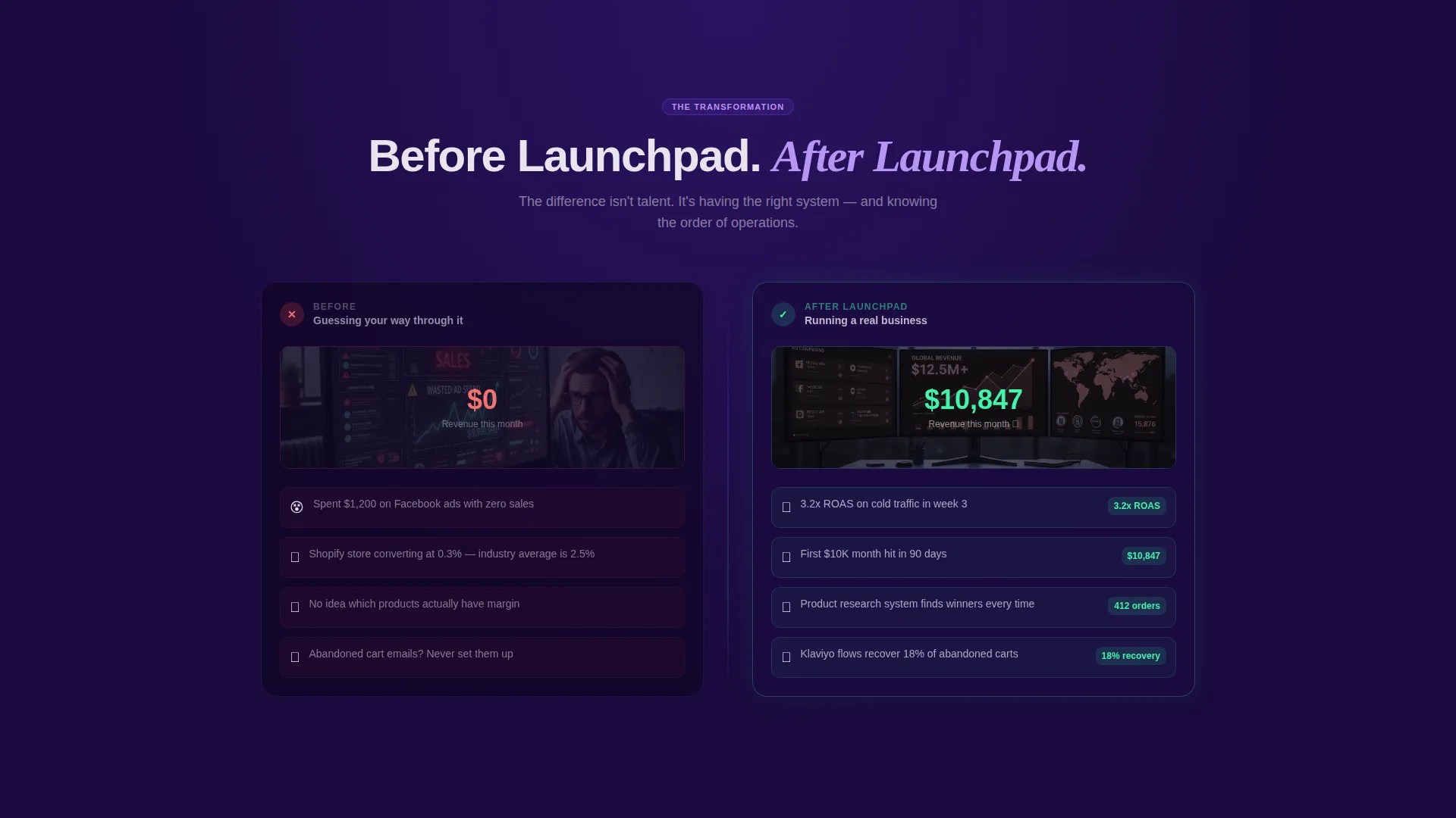
- It addresses visitor hesitation by showing "before and after" proof sections that escalate in stakes
- It gives creators a page that feels alive and urgent rather than static and corporate
What you get with this template
You get a fully structured, single-page landing page layout with a split-screen design system and a clear click-through conversion path. Every section is pre-built and purpose-driven, so you can focus on filling in your own results and story.
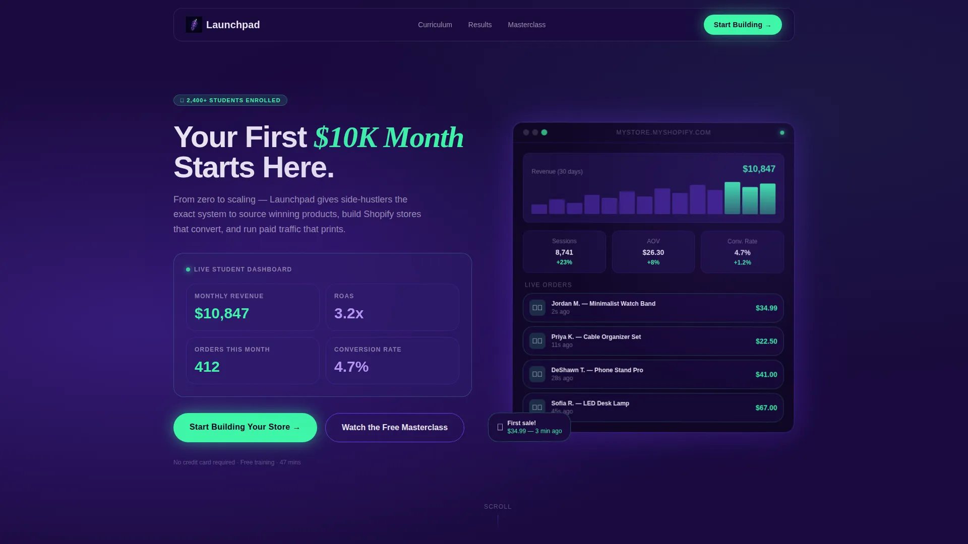
- A bold split-screen header with a live-styled metrics card and a glowing isometric dashboard mockup
- A scroll-driven narrative structure that moves from student "before" states to "after" results across alternating panel sides
- Two distinct call-to-action treatments: a primary neon green button and a secondary ghost button for mid-page visitors who need more proof
Feature list
This section walks through the core built-in components that make Launchpad work as a conversion-focused landing page.
Split-Screen Header with Live-Styled Metrics Card
The header divides into two equal panels. The left side features a bold headline over a frosted glass card displaying live-styled metrics: monthly revenue, return on ad spend, order count, and conversion rate. Each number uses a subtle counting animation to feel active rather than static. The right side shows a glowing isometric mockup of an order dashboard with notification stacking and violet ambient light.
Launch Energy Scroll Narrative
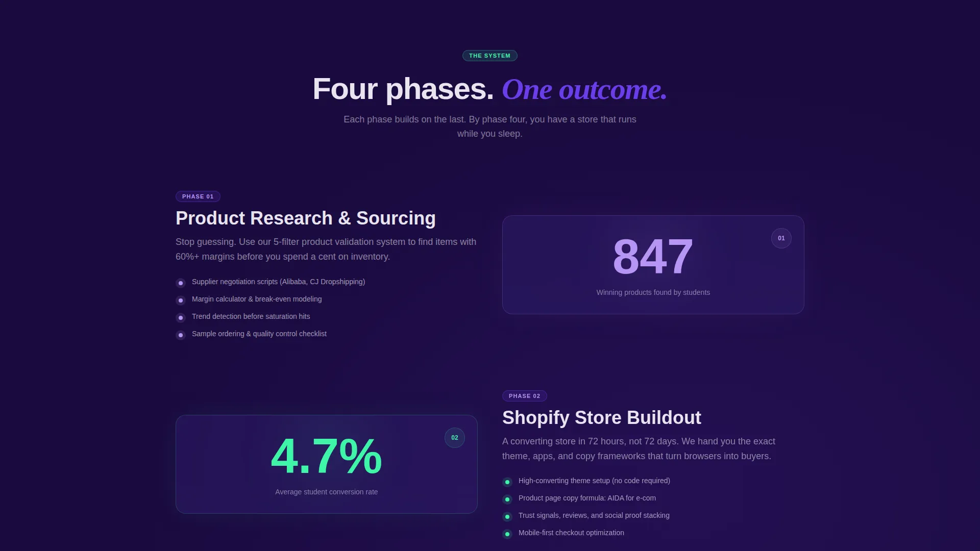
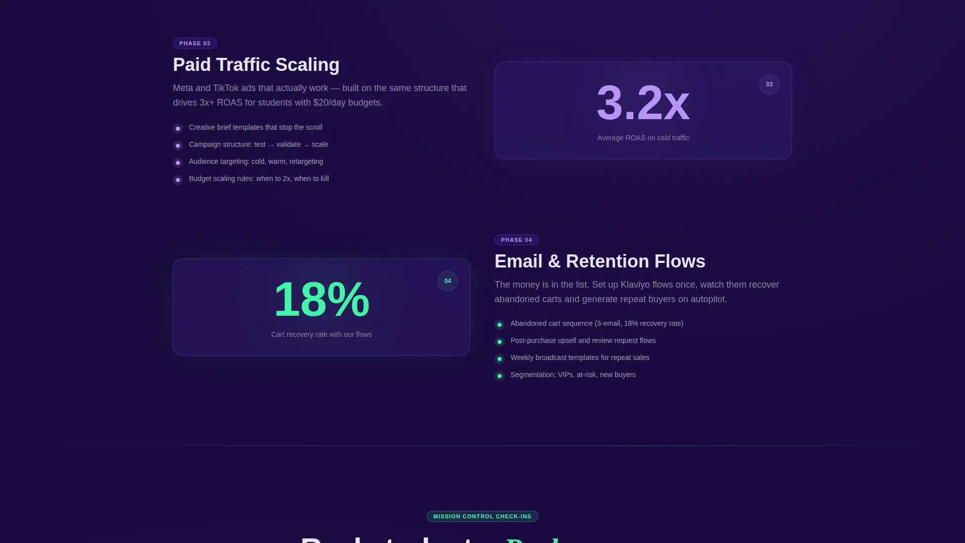
The page is structured as an escalating countdown sequence. Each scroll section raises the stakes, moving from initial product research through store build, first sale, and scaling. The split screen alternates which side carries the lesson and which side carries the proof, keeping the reader visually engaged throughout.
Before-and-After Proof Sections
Below the header, the left panel shifts to show the student's starting point while the right reveals the outcome. Confused ad manager screenshots and zero-sale dashboards give way to scaling campaigns and full fulfillment queues. This contrast is built into the layout so the transformation feels visible and credible.
Testimonial Video Interruptions
Testimonial video blocks are woven into the scroll sequence like mission control check-ins. Real student moments reading revenue numbers off their phones break the layout rhythm intentionally, adding a human pulse between the more designed sections.
Sticky Call-to-Action Bar
The primary call to action, labeled "Start Building Your Store," appears first inside the header's frosted glass card. After the visitor scrolls past the second section, it reappears as a sticky bottom bar that stays visible for the rest of the page without blocking content.
Dual Call-to-Action System
A secondary call to action, "Watch the Free Masterclass," is styled as a violet-outlined ghost button. It appears mid-page and gives hesitant visitors a lower-commitment path. Both calls to action route to off-page destinations, keeping the landing page itself form-free.
Page sections overview
| Section | Purpose |
|---|---|
| Split-screen header | Leads with revenue metrics and dashboard mockup to establish immediate credibility |
| Metrics display card | Shows live-styled numbers with counting animation to make results feel tangible |
| Before state panel | Displays the student starting point to create emotional identification |
| After state panel | Reveals the transformation outcome to make the result feel achievable |
| Escalation section one | Covers product research phase with lesson on one side and proof on the other |
| Escalation section two | Covers store build phase, alternating panel roles for visual rhythm |
| Escalation section three | Covers first sale milestone with supporting proof content |
| Scaling section | Shows paid traffic and retention email results at the growth stage |
| Testimonial video block | Interrupts scroll flow with real student revenue readings |
| Secondary call to action block | Presents ghost button for visitors who need more proof before committing |
| Sticky call to action bar | Floats at the bottom after second scroll, keeping the primary action always visible |
Design & branding system
The visual identity is built on a Tech Glass theme using an Electric Indigo color system. The palette is designed to feel luminous and futuristic, like a holographic trading card caught under ultraviolet light.
- Four-color palette: deep void indigo (#1A0A3E) for backgrounds, glowing electric violet (#6C3CE9) for gradients and accents, frosted glass panel white (#E8E4F0) for card surfaces, and neon conversion green (#3DF5A7) reserved strictly for calls to action and live metric accents
- Frosted glass cards float above deep indigo backgrounds, violet gradients pulse behind section transitions, and the neon green appears only where money or action is present
- The isometric dashboard mockup uses glass refraction edges and violet ambient lighting to reinforce the futuristic aesthetic without breaking layout clarity
Mobile & speed optimization
The template is built with a responsive layout in mind, ensuring the split-screen structure adapts cleanly across different screen sizes. The stacked mobile view preserves the narrative sequence so the escalation logic still lands for users on smaller devices.
- The frosted glass cards and counting animation elements are designed to render without disrupting the scroll experience on mobile
- The sticky call-to-action bar is sized and positioned to remain functional on touch screens without covering key content
- Section transitions and violet gradient pulses are kept visually focused so they enhance momentum rather than slow the page down
How this template helps you convert
The entire layout is engineered around a single conversion goal: getting the visitor to click through to a free training registration. No form appears on this page. The ask happens off-page, which lowers friction significantly.
- The header leads with specific, live-styled revenue numbers rather than vague promises, so skeptical visitors see proof before they read a single benefit claim.
- The escalating scroll structure mirrors the student journey, making the transformation feel personal and earned rather than sold, which builds the trust needed for the final click.
- The sticky call-to-action bar and the mid-page ghost button create two separate decision points, catching both fast-moving visitors and those who need extra convincing before they commit.
Other information about this template
This template sits at the intersection of the Technology category and the E-Commerce Software and SaaS subcategory. It is specifically designed for the e-commerce training platform niche, where conversion depends on emotional resonance as much as logical proof.
- The Intersection Match Score for this template is 13, reflecting a strong alignment between the Tech Glass theme, Launch Energy creative direction, and the click-through landing page objective
- The header concept is built around a Stats and Metrics display, which is one of the highest-trust opener formats for training and coaching pages
- The template style is a strict 50/50 Split Screen, a layout format that naturally separates lesson from proof and keeps both in view simultaneously
- Creators using platforms that connect to tools like Shopify storefronts or Klaviyo email flows will find the "after state" proof sections easy to populate with real screenshots and real numbers
Theme
Tech Glass
Creative direction
Launch Energy
Color system
Electric Indigo
Style
Split Screen (50/50)
Direction
Click-Through
Page Sections
Split-screen Header with Metrics Card
Launch Energy Scroll Narrative
Before-and-after Proof Layout
Sticky Primary Call-to-action Bar
Dual Call-to-action System
Testimonial Video Interruptions
Related questions
Does this landing page include a sign-up form?
Can I change the metric numbers in the header card?
Who is the target visitor for this landing page?
What makes the scroll structure different from a standard landing page?
Is this template suitable for a paid traffic campaign?



