Consulting Course Comparison Table Landing Page
Launchpad is a comparison table landing page template built for a consulting business setup online course. It walks first-time consultants from raw expertise to a registered business, a pricing model, and a first signed client. The design follows a warm Community Hearth theme with a Hero's Journey scroll flow and a freemium call-to-action strategy.
by Rocket studio
Quick summary
Launchpad is a single-page template designed for a consulting business setup online course. It uses a Hero's Journey scroll structure, a before-and-after comparison table, and a freemium conversion path. The visual identity is warm and energizing. The page is built to meet mid-career professionals exactly where they are and move them toward signing up.
Who this template is for
This template is built for course creators and educators who teach professionals how to launch a consulting business. It speaks directly to the mid-career expert who has deep specialized knowledge but has never formalized it into a business. If you run a cohort-based or self-paced course in this space, this page is built for you.
- Educators and coaches who teach consulting business setup to first-time consultants
- Course creators targeting mid-career professionals with ten or more years of specialized experience
- Online skill course operators who want a freemium or free-trial conversion model
What problem this template solves
Most consulting course pages either feel too corporate or too vague. They list features without connecting to the visitor's real situation. This template solves that by opening with a mirror: the visitor sees their exact reality reflected back before a single sales claim is made.
- Visitors arrive unsure whether the course is for someone like them; the Hero's Journey structure answers that question immediately
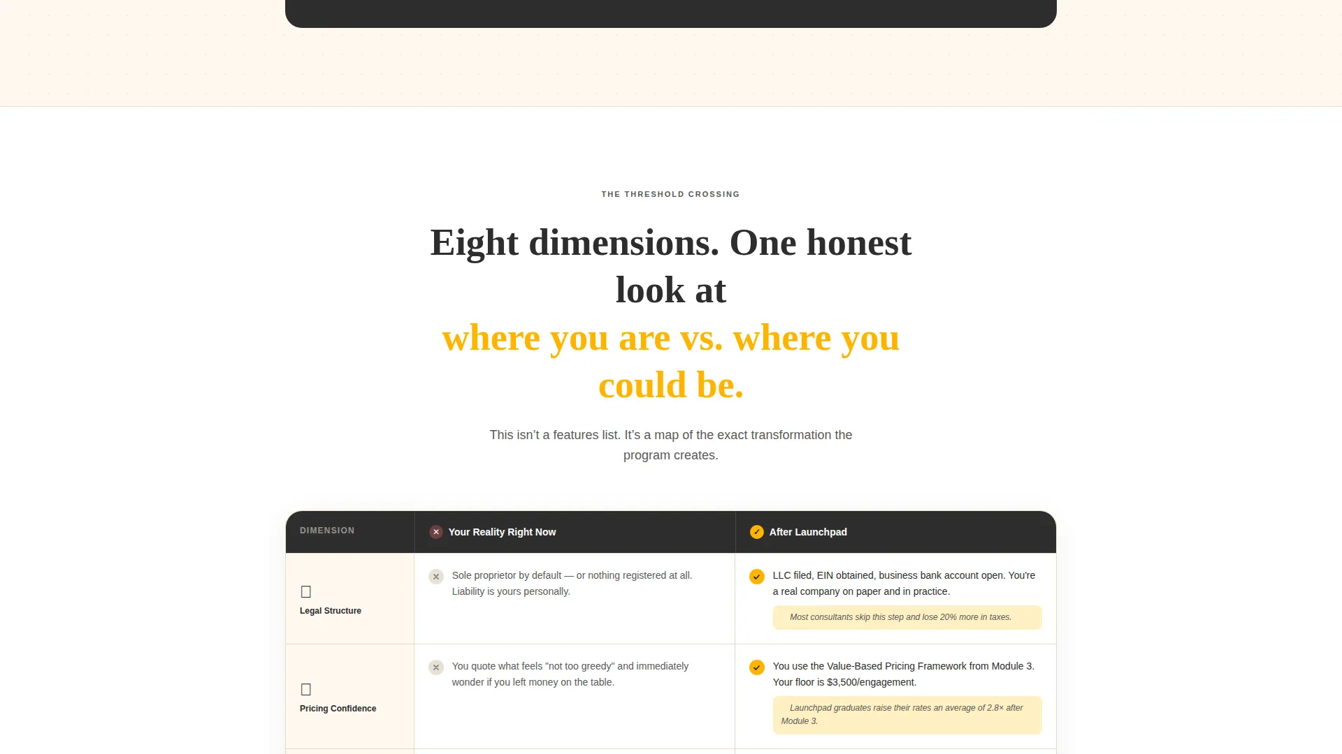
- The comparison table replaces abstract promises with eight concrete before-and-after dimensions, making the value tangible at a glance
- The freemium call-to-action lowers the commitment barrier so visitors can experience real value before deciding to enroll
What you get with this template
The template delivers a fully structured single-page layout ready to be customized for your consulting course. Every section has a clear purpose and a defined place in the scroll journey. The copy direction, visual system, and conversion logic are all built in.
- A Hero's Journey scroll architecture that takes visitors from their current reality through the course value and into a confident call-to-action
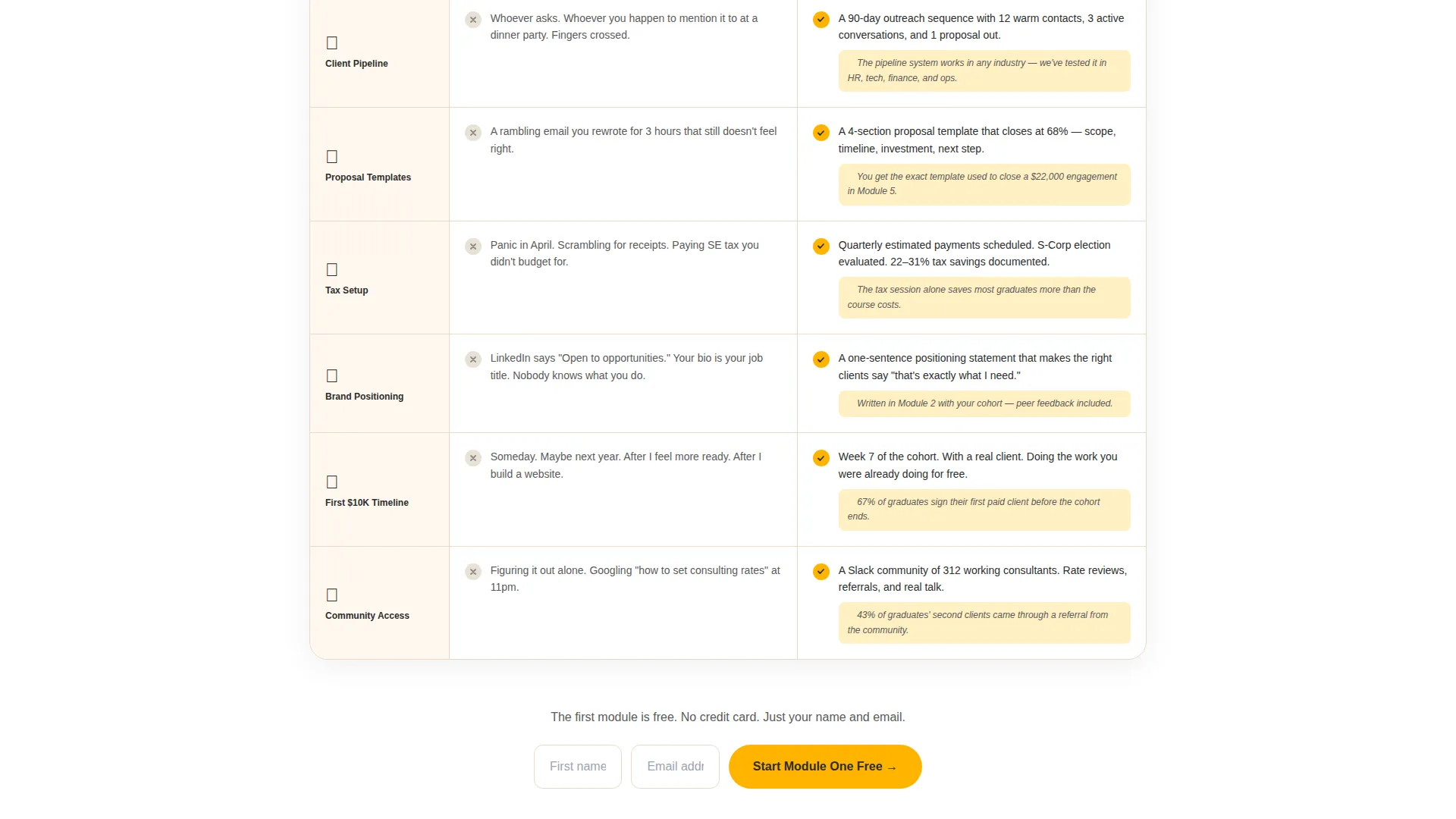
- An eight-row before-and-after comparison table covering legal structure, pricing confidence, client pipeline, proposal templates, tax setup, brand positioning, first income timeline, and community access
- A dual conversion path: a primary freemium sign-up and a secondary downloadable checklist for visitors who need more time
Feature list
This section covers the core built-in components that make the Launchpad template work as a conversion-focused landing page for a consulting business setup online course.
Before-and-After Comparison Table
The centerpiece of the page is an eight-row table that contrasts the visitor's current reality with their post-course reality. Each row covers a specific dimension: legal structure, pricing confidence, client pipeline, proposal templates, tax setup, brand positioning, first income timeline, and community access. The table is designed to deliver real insight, so visitors feel informed before they ever reach a call-to-action.
Hero's Journey Scroll Architecture
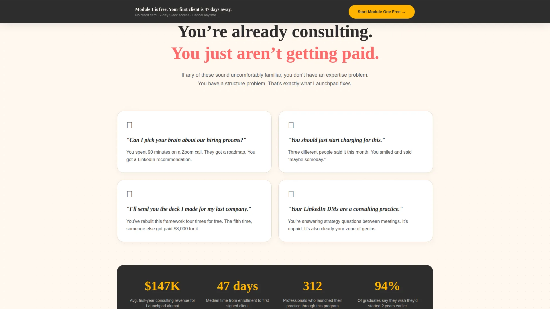
The page opens in the visitor's "ordinary world" with a section titled "You're Already Consulting, You Just Aren't Getting Paid." From there, the scroll descends through the comparison table as a threshold crossing, then rises through mentor introductions, student transformation stories, and a module-by-module roadmap. The structure builds momentum naturally from recognition to readiness.
Dual Freemium Conversion Path
The primary call-to-action button, styled in saffron yellow, invites visitors to start the first module at no cost. A sticky bottom bar reinforces this offer after 40 percent of the page has been scrolled. A secondary coral-colored button in the final section offers a downloadable consulting launch checklist for visitors who want more time before committing.
Logo Bar Header
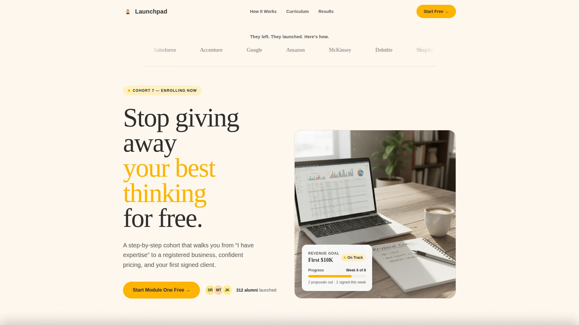
The page opens with a horizontal ribbon of recognizable company logos representing organizations where current students previously worked. A single line above the bar reads: "They left. They launched. Here's how." This immediately establishes peer credibility and signals that the course is for experienced professionals, not beginners.
Student Transformation Stories
First-person transformation stories from students are woven into the lower half of the page. These narratives follow real before-and-after arcs, reinforcing the comparison table with lived experience. The section is positioned after the table and before the module roadmap to maintain emotional momentum.
Module-by-Module Roadmap
A structured roadmap section breaks the course into visible steps. Each module is presented in sequence to help visitors understand the learning journey from business model selection through to a first signed client. The roadmap builds confidence that the path is clear and achievable.
Page sections overview
| Section | Purpose |
|---|---|
| Logo Bar Header | Establishes peer credibility with recognizable employer logos |
| Hero Opening Section | Mirrors the visitor's current situation to create immediate recognition |
| Comparison Table | Contrasts before-and-after realities across eight consulting dimensions |
| Primary call to action Block | Invites visitors to start the first module free with a minimal sign-up form |
| Mentor Introductions | Builds trust by introducing the course instructors and their backgrounds |
| Student Stories | Reinforces value through first-person transformation narratives |
| Module Roadmap | Shows the step-by-step course structure from signup to first client |
| Checklist call to action Section | Offers a downloadable PDF to capture emails from undecided visitors |
| Sticky Bottom Bar | Keeps the freemium call to action visible after 40 percent scroll depth |
Design & branding system
The visual identity follows a Community Hearth theme expressed through a Dopamine Pop color system. The palette is warm, bold, and deliberately human. It avoids corporate coldness by pairing deep grounding tones with energizing accent colors that feel like a well-decorated living room rather than a pitch deck.
- Saffron yellow (#FFB400) is used for primary accents and all call-to-action buttons; electric coral (#FF6B6B) appears on highlights and testimonial cards; deep charcoal (#2D2D2D) grounds body text and headers; soft cream (#FFF8F0) serves as the background canvas
- The header includes a warm lifestyle photograph: a laptop open on a wooden dining table, a half-drunk coffee, a notebook with handwritten revenue goals, and morning light catching steam from the cup
- Typography and visual styling reinforce the "kitchen table playbook" tone: inviting, practical, and personal rather than polished or distant
Mobile & speed optimization
The template is structured for clean rendering across screen sizes. The comparison table, sticky bar, and dual conversion forms are all laid out to remain functional and readable on smaller screens without requiring horizontal scrolling or excessive zooming.
- The comparison table is formatted to scroll vertically on mobile, keeping all eight rows accessible without layout breakage
- The sticky bottom bar is designed to appear after 40 percent scroll on both desktop and mobile, keeping the primary call-to-action within reach at all times
- The sign-up form is minimal by design, asking only for a first name and email address, which reduces friction on touchscreen keyboards
How this template helps you convert
The page earns conversion by delivering genuine value before it asks for anything. By the time a visitor reaches the call-to-action, they have already learned something useful from the comparison table. The freemium model and the secondary checklist path together capture visitors at two different levels of readiness.
- The comparison table functions as a pre-conversion education tool: visitors who reach the end of it already understand the gap between their current situation and what the course delivers, making the free module offer feel like a natural next step rather than a sales trap
- The dual call-to-action structure captures two visitor segments in one scroll: those ready to sign up click the primary saffron yellow button, while those still evaluating can download the checklist and enter the email nurture path
Other information about this template
This template was designed specifically for the consulting business setup online course category within the broader education and training space. It is built around the intersection of online skill courses and the unique psychology of mid-career professionals who are already informally consulting but have not yet formalized their practice.
- The template style is a comparison table layout, making it well suited to courses where the value is best communicated as a before-and-after transformation rather than a feature list
- The creative direction follows a Hero's Journey narrative arc, a proven structure for course and coaching pages where the visitor needs to see themselves in the story before they trust the offer
- The header concept uses a Logo Bar referencing well-known organizations to establish immediate social proof targeted at experienced professionals
- The color system is Dopamine Pop, delivering visual energy through warm saffron and coral tones without sacrificing the approachable, human feel of the Community Hearth theme
- The freemium conversion model unlocks the full first module on business model selection and seven days of community access, with no credit card required at sign-up
Theme
Community Hearth
Creative direction
Hero's Journey
Color system
Dopamine Pop
Style
Comparison Table
Direction
Freemium/Trial
Page Sections
Before-and-after Comparison Table
Hero's Journey Scroll Architecture
Dual Freemium Conversion Path
Logo Bar Social Proof Header
Student Transformation Story Section
Module-by-module Course Roadmap
Related questions
What kind of course is this template designed for?
Who is the target student shown in this template?
How does the freemium conversion model work on this page?
What does the comparison table actually compare?
Is there a second conversion option for visitors who are not ready to sign up?



