Highvelocity Startup | Free Website Template | Rocket
Launchpad is a split-screen landing page template built for first-time founders who need a professional web presence fast. Designed around a high-energy Startup Velocity theme, it pairs bold visual contrast with a focused lead generation flow. From a looping editor preview to real student results, every section is engineered to earn trust and drive sign-ups.
by Rocket studio
Quick summary
Launchpad is a single-page, split-screen landing page template for a video tutorial series that teaches first-time founders to build a live, revenue-ready website in one weekend. It uses a Carbon Fiber color system, Launch Energy creative direction, and a focused lead generation structure designed to convert curious visitors into committed learners.
Who this template is for
This template is built for early-stage builders who are serious about getting online without hiring an agency. If you teach, coach, or sell a digital product aimed at that audience, this layout was made for you.
- Solo entrepreneurs who registered a business and need a site to match
- Side-hustlers moving from marketplace platforms to their own standalone brand
- Freelancers who want to stop sending prospects to a simple link-in-bio page
What problem this template solves
Most tutorial landing pages feel like documentation. They list modules, drop a price, and hope the visitor connects the dots. Launchpad solves a different problem: it has to convince a skeptical beginner that a polished, revenue-ready website is genuinely within reach this weekend.
- First-time founders lack proof that the process is achievable before they commit
- Generic layouts fail to communicate urgency or momentum for time-boxed learning offers
- Weak conversion paths ask for an email before earning any trust from the visitor
What you get with this template
You get a fully structured, single-page layout with every section pre-built and ready to customize. The design system is already applied, so you are not starting from scratch with color palettes or type choices.
- A 50/50 split-screen layout with distinct left-and-right panel zones across multiple sections
- A Logo Bar header, a sticky mobile call-to-action bar, and a dual-path conversion form
- Pre-built sections covering the problem, module breakdown, student results, and sign-up flow
Feature list
This template is built around specific visual and functional decisions. Each feature below is drawn directly from the design brief.
Split-Screen Section Architecture
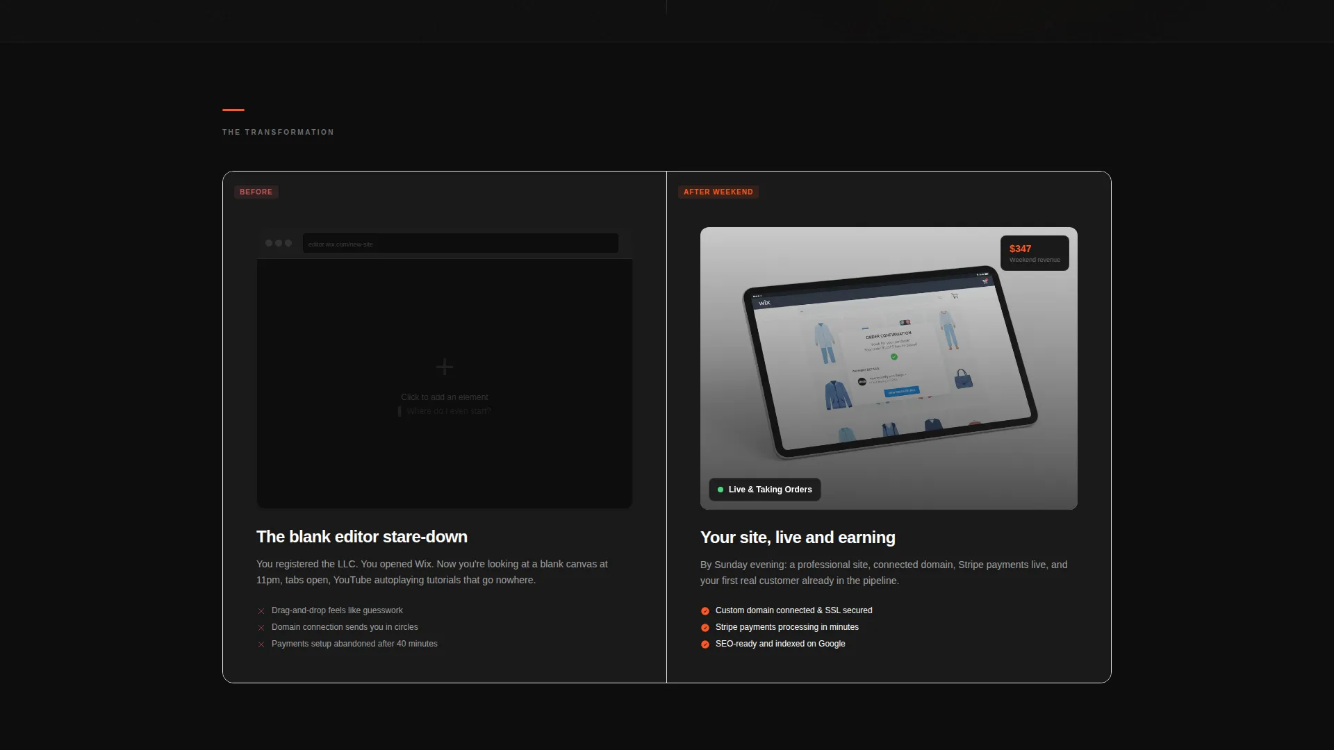
Every major content block uses a 50/50 panel format. Left and right panels carry distinct roles: one side presents the problem or lesson content, the other delivers the proof or preview. This structure keeps the scroll dynamic and prevents content fatigue.
Logo Bar Credibility Header
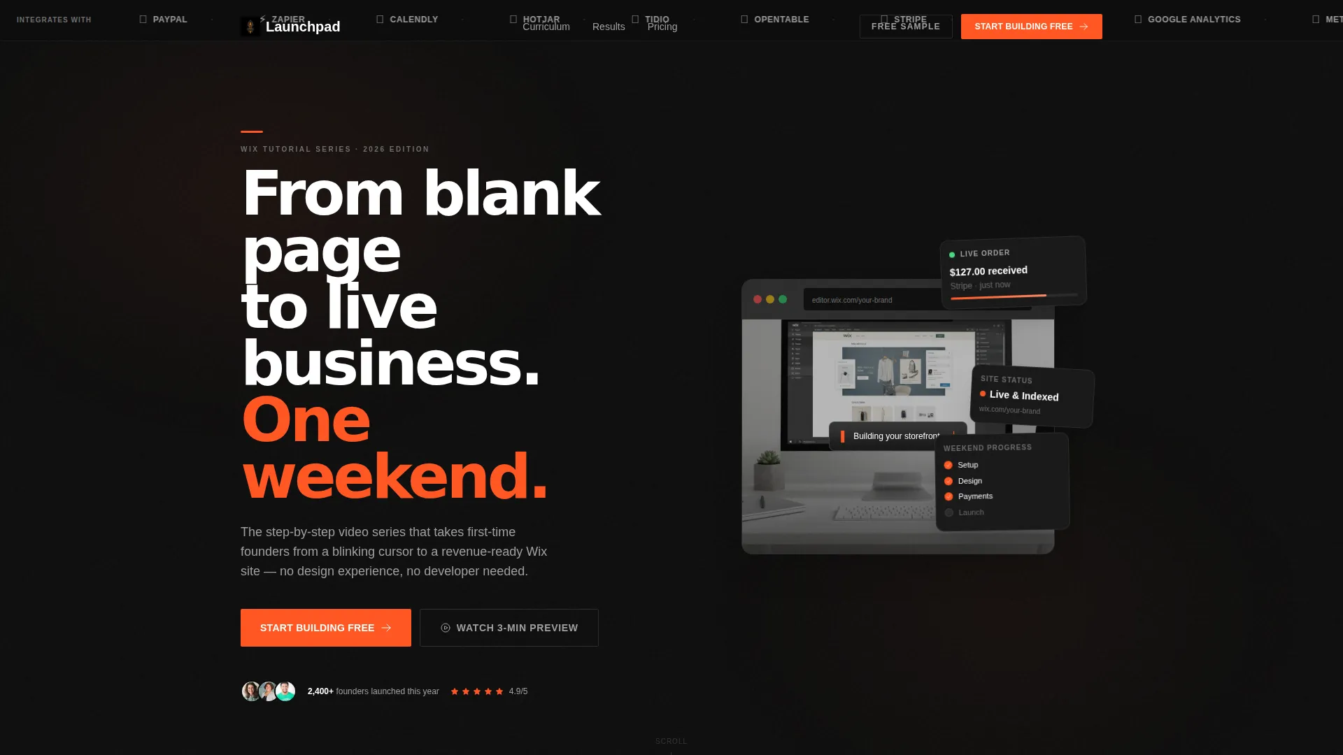
The header opens with a horizontal scrolling bar of recognized tools and platforms that integrate with the editor being taught. It establishes ecosystem trust before a single headline is read, so visitors arrive at the hero already primed.
Looping Editor Preview Panel
The right panel of the hero section plays a looping screen capture showing the editing environment transforming from an empty canvas to a finished storefront. The cursor moves with purpose and the transformation runs in accelerated time, making the learning curve feel conquerable.
Dual-Path Lead Generation Form
The primary conversion form captures email address, business type, and one qualifying question. A secondary path offers a free sample lesson delivered directly to the inbox, lowering the commitment barrier for visitors who are not yet ready to sign up fully.
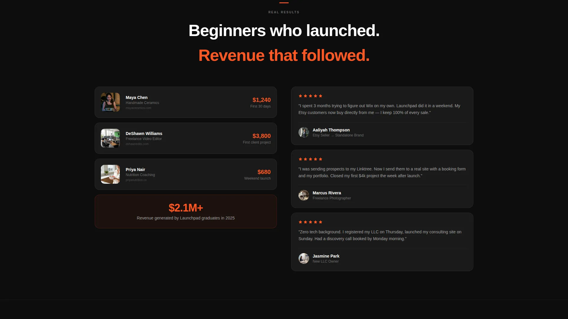
Student Results Section
A dedicated split features real revenue screenshots alongside video testimonials. Faces lit by laptop glow and actual income figures create social proof that resonates specifically with the beginner audience this template targets.
Sticky Mobile Call-to-Action Bar
On mobile, the primary call-to-action persists as a fixed bottom bar throughout the scroll. This means the sign-up prompt is always one tap away without interrupting the reading experience on smaller screens.
Page sections overview
| Section | Purpose |
|---|---|
| Logo Bar Header | Establish tool ecosystem credibility above the fold |
| Hero Split Panel | Deliver headline and looping editor preview side by side |
| Problem versus. Promise | Contrast the blank-editor pain with the finished-site outcome |
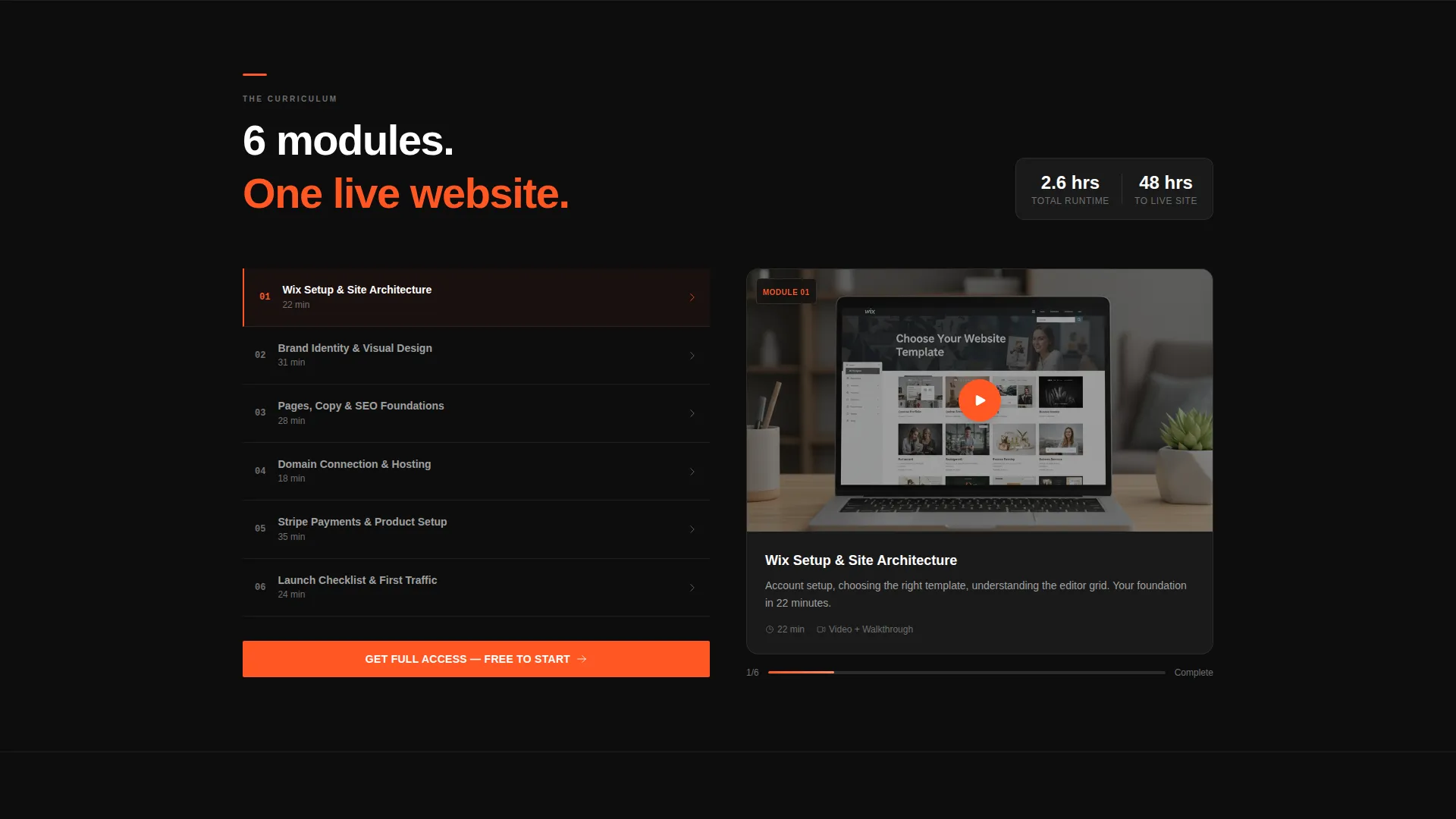
| Module Breakdown | Show lesson thumbnails and a 15-second preview reel |
| Student Results | Display revenue screenshots and video testimonials |
| Lead Generation Form | Capture email, business type, and qualifying question |
| Secondary Conversion | Offer a free sample lesson to reduce sign-up friction |
| Sticky Mobile Bar | Keep the primary call-to-action reachable on mobile |
Design & branding system
The Carbon Fiber color system drives every visual decision in this template. The palette is minimal by design, so nothing competes with the interactive elements.
- Background layers use deep cockpit black (#0D0D0D) and woven carbon gray (#2B2B2B) for section dividers and card surfaces
- Titanium midtone (#6E6E6E) handles supporting text and subtle structural detail without pulling focus
- Ignition orange (#FF5722) is reserved strictly for calls-to-action, progress indicators, and hover states so every interactive element feels urgent and deliberate
Mobile & speed optimization
The template is built with a mobile-first scroll experience in mind. The sticky bottom bar and the single-column reflow of split panels ensure the layout works at any screen width.
- The sticky call-to-action bar fixes to the bottom of the viewport on mobile throughout the entire scroll
- Split-screen panels reflow into stacked single-column blocks on smaller screens to preserve readability
- The looping video preview is positioned to load as a contained panel element, keeping the above-the-fold experience immediate
How this template helps you convert
The conversion strategy in this template is sequenced deliberately. Proof comes before the ask, and every section adds a layer of confidence before the form appears.
- The Logo Bar and looping editor preview establish credibility and demonstrate the product before any copy makes a claim, so the visitor arrives at the headline already trusting the offer.
- The student results section, with real revenue screenshots and video testimonials, delivers transformation proof exactly where visitor skepticism peaks, right before the sign-up form appears.
- The dual-path form structure lets hesitant visitors opt into a free sample lesson instead of committing fully, which reduces drop-off and keeps more leads inside the funnel.
Other information about this template
This template lives within the Documentation and Support category, specifically in the Wix Documentation subcategory for Wix video tutorial series. It is an ideal fit for educators and course creators building in the Wix ecosystem.
- The template theme is Startup Velocity with Launch Energy creative direction, giving it a distinct visual personality suited to tech-adjacent and startup-focused audiences
- The header concept is a Logo Bar, referencing tools commonly associated with the Wix platform including Stripe, Mailchimp, Google Analytics, and Meta Pixel as stated in the brief
- The Intersection Match Score for this template is 13, indicating strong alignment between the template style, niche, and category context
- This is a single landing page layout, not a multi-page website, making it a focused and fast-to-deploy option for a specific campaign or product launch
Theme
Startup Velocity
Creative direction
Launch Energy
Color system
Carbon Fiber
Style
Split Screen (50/50)
Direction
Lead Generation
Page Sections
Split-screen Section Architecture
Logo Bar Credibility Header
Looping Editor Preview Panel
Dual-path Lead Generation Form
Student Results Social Proof Section
Sticky Mobile Call-to-action Bar
Related questions
Who is this landing page template designed for?
Can I customize the color system in this template?
What does the lead generation form collect?
Does the template include a mobile call-to-action experience?
Is this template suitable for campaigns outside of tutorial content?


