Launchpad - Powerful Startup Landing Page Template
Launchpad is a hub-and-spoke landing page template built for startup membership communities. It features a Feature Tab Switcher header, a Problem-to-Solution arc with stat-driven spoke sections, and a lead generation flow with an early-access application form. The dark Midnight Blue palette and electric cyan accents make it feel like a late-night coding session come to life.
by Rocket studio
Quick summary
Launchpad is a single-page membership landing page template designed for startup communities and founder networks. It combines an interactive Feature Tab Switcher header, a stat-anchored Problem-to-Solution arc, and a three-field early-access form. The deep navy and electric cyan palette channels the energy of a late-night build session and earns trust before the first scroll.
Who this template is for
This template is built for founders and community operators who want to launch a credible membership site without starting from scratch. It works especially well for people who already have an audience and need a conversion-focused page to formalize it.
- Solo technical founders building products in stealth who want a community around them
- Non-technical founders validating ideas with landing pages and simple tools
- Repeat operators and community builders launching a paid or gated membership network
What problem this template solves
Early-stage founders often face the same invisible wall: isolation, blind spots, and costly mistakes made without access to the right people or resources. A generic page template cannot reflect that urgency. Launchpad is designed around those exact pain points and flips each one into a membership value proposition.
- Isolation and loneliness metrics that solo founders instantly recognize go unaddressed on most community pages
- Visitors need to see the product experience before they commit, not after
- Most landing pages ask for sign-up before earning the click, which kills conversions for high-intent but skeptical founders
What you get with this template
You get a fully structured, single-page layout that takes a visitor from cold to converted using a deliberate narrative arc. Every section connects to the next, and the anchor navigation lets users jump to the spoke that matters most to them.
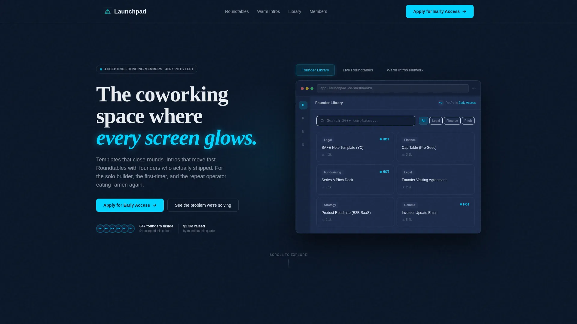
- A Feature Tab Switcher header with three tabs showing distinct dashboard states: Founder Library, Live Roundtables, and Warm Intros Network
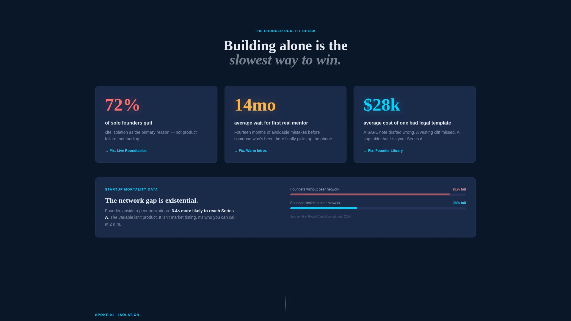
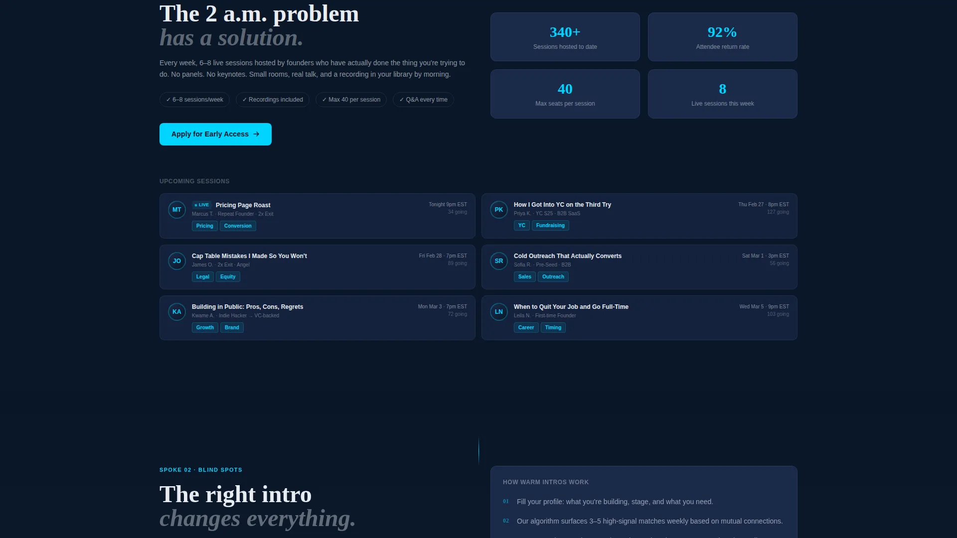
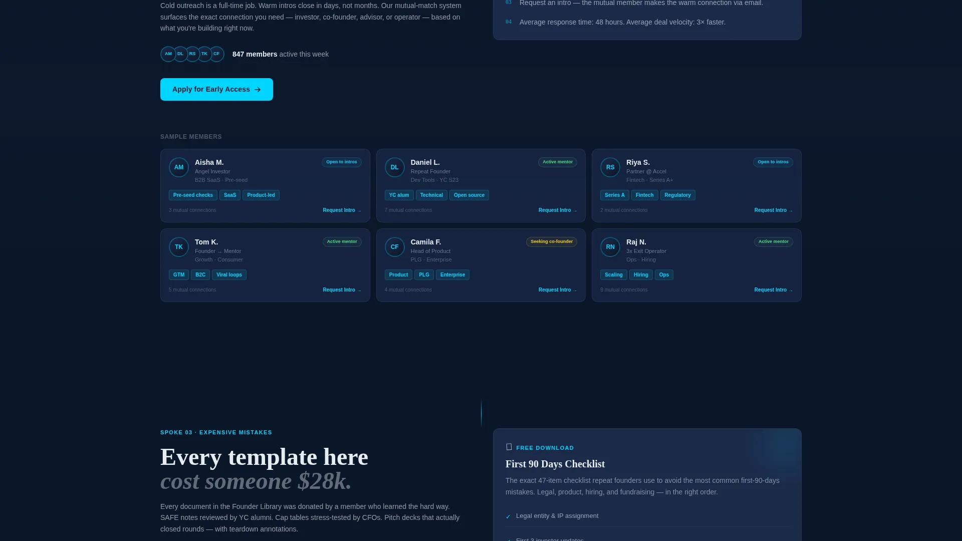
- A Problem-to-Solution arc with three stat-driven spoke sections, each pairing a founder pain point with a specific membership feature
- A lead generation system with a primary early-access application form and a secondary free-download path for visitors not yet ready to commit
Feature list
This template ships with purpose-built components drawn directly from the brief. Each one serves a specific role in moving a founder from curious to converted.
Feature Tab Switcher Header
The header contains three labeled tabs sitting above a browser-chrome dashboard mockup. Each tab swaps the visible dashboard content: a searchable template grid, a live roundtable calendar with founder headshots, and a connection-request interface with mutual-match tags. The active tab glows cyan against the navy background so the interaction is immediately clear.
Stat-Anchored Spoke Sections
Three loneliness and risk metrics open the Problem-to-Solution arc. Each stat anchors a dedicated spoke section that the anchor navigation links to directly. The stakes escalate from inconvenience to existential, ending with a survival-rate comparison for founders with and without peer networks.
Anchor Navigation Bar
A persistent anchor nav links visitors to each spoke section from anywhere on the page. The primary call to action, "Apply for Early Access," is pinned inside this nav so it stays visible throughout the scroll journey.
Three-Field Application Form
The primary conversion path uses a focused three-field form: work email, a one-line description of what the founder is building, and a stage dropdown with four options (Idea, Pre-Revenue, Post-Revenue, Between Startups). The form is short enough to reduce friction while capturing meaningful qualification data.
Free Checklist Secondary Path
A secondary lead capture path offers a free downloadable "First 90 Days Checklist" gated behind email only. This captures visitors who are interested but not yet ready to apply, keeping them inside the funnel without pressure.
Repeating call to action Rhythm
The "Apply for Early Access" call to action appears after each spoke section, not just at the top and bottom. This rhythm reinforces the offer at every moment of conviction without feeling pushy.
Page sections overview
| Section | Purpose |
|---|---|
| Tab Switcher Header | Introduces three core membership features through an interactive dashboard mockup |
| Isolation Stat Spoke | Opens the problem arc with a loneliness metric and pivots to live roundtables |
| Blind Spots Spoke | Addresses knowledge gaps and introduces the curated intros feature |
| Costly Mistakes Spoke | Highlights template-related risks and presents the vetted resource library |
| Mortality Rate Close | Escalates stakes with peer-network survival data to drive urgency |
| Early Access Form | Primary three-field application form with stage qualification dropdown |
| Checklist Download Gate | Secondary email capture for the free First 90 Days Checklist |
| Anchor Navigation Bar | Persistent nav with pinned call to action linking to all spoke sections |
Design & branding system
The visual identity is built around the Midnight Blue color system. Every color decision reinforces the feeling of a focused late-night build environment, where the only light comes from the screen in front of you.
- Deep terminal navy (#0A1628) fills full-bleed backgrounds, desaturated slate (#1B2A4A) surfaces cards and section dividers, electric cyan (#00D4FF) highlights every interactive element and hover state, and chalk white (#E8ECF1) keeps body text readable against the dark field
- The dashboard mockup uses pixel-sharp browser chrome to make the membership experience feel real and immediately familiar to a technical audience
- The active tab state and all call-to-action buttons glow cyan, creating a single clear visual signal for every interactive moment on the page
Mobile & speed optimization
The layout is built as a single-page flow, which naturally reduces navigation overhead and keeps the experience clean on smaller screens. The anchor nav and tab-switching interaction are designed to remain functional and clear across device sizes.
- The hub-and-spoke structure means all key content lives on one page, reducing load fragmentation across multiple routes
- The three-field form is compact enough to display cleanly on mobile without requiring horizontal scrolling or layout shifts
- Section-by-section call to action placement means mobile visitors never have to scroll back to find the application prompt
How this template helps you convert
The conversion strategy is built into the page architecture itself. Visitors are shown the product experience before they are ever asked to act, which dramatically reduces resistance at the form.
- The Feature Tab Switcher lets visitors explore the dashboard before signing up, so by the time they reach the application form they have already mentally engaged with the membership
- The Problem-to-Solution arc connects each pain point directly to a feature, making the value proposition specific and personal rather than generic
- The dual conversion path captures both ready-to-apply founders and early-research visitors through the free checklist download, so no high-intent visit is wasted
Other information about this template
This template is built within the Startup Velocity theme, which shapes both the visual tone and the content strategy. It is best suited for operators who already have a founder community forming and want to give it a professional, credible home on the web.
- The template style is Hub and Spoke with Anchor Navigation, meaning each problem spoke is a self-contained section that also feeds into the central membership offer
- The creative direction follows a Problem-to-Solution Arc, a proven narrative structure for community and membership products targeting skeptical, busy founders
- The Midnight Blue color system is designed to resonate with technical founders who spend time in code editors and terminal windows
- This is a lead generation landing page, not a full membership portal; it captures early interest and qualifies applicants before any backend system is needed
- The template works as a standalone early-access page and can be paired with a separate onboarding flow once applicants are approved
Theme
Startup Velocity
Creative direction
Problem→Solution Arc
Color system
Midnight Blue
Style
Hub & Spoke (Anchor Nav)
Direction
Lead Generation
Page Sections
Feature Tab Switcher Header
Stat-anchored Problem Spokes
Persistent Anchor Navigation
Three-field Application Form
Free Checklist Secondary Capture
Repeating Call to Action Placement
Related questions
Can I edit the tab labels and dashboard content in the header?
Is this template designed for paid or free membership communities?
How does the free checklist download path work?
Do the three spoke sections cover all my use cases, or can I add more?
What stage of community is this template best suited for?



