Launchpad - Progressive Founder Academy Landing Page Template
Launchpad is a scroll reveal landing page template built for startup course and training platforms. It uses a progressive Feature Matrix layout to unveil curriculum tracks, module cards, and tier comparisons as visitors scroll. The AI Iridescent color system and product screenshot header create an immersive, discovery-driven experience that moves first-time founders toward enrollment without a single form field.
by Rocket studio
Quick summary
Launchpad is a single-page, scroll-driven template for digital academies that guide first-time founders from early idea to fundraising. It reveals curriculum architecture layer by layer as visitors scroll, making the platform feel explorable before anyone commits. The iridescent dark-palette design and click-through call to action structure keep every section purposeful and conversion-ready.
Who this template is for
This template is built for founders and educators running structured startup training programs. It works especially well when your curriculum has depth and your audience needs to see the full scope before deciding.
- Solo technical founders who build product but need help with financial modeling and fundraising fundamentals
- Non-technical founders who have validated demand but need to understand cap tables before their first angel meeting
- Corporate professionals with domain expertise who want a systematic, step-by-step path from idea to incorporation
What problem this template solves
Most course landing pages bury their curriculum or hide it behind a paywall teaser. Founders arrive, skim a bullet list, and leave unconvinced. This template solves that trust gap by turning the page itself into a curriculum preview.
- Visitors never feel overwhelmed because content reveals progressively, one scroll at a time
- The tiered comparison layout lets founders self-identify which track fits them before they click through
- The click-through call to action model removes friction entirely by sending visitors to a dedicated enrollment page only after they have already explored the full offering
What you get with this template
You get a fully structured landing page that mirrors the clarity of your platform inside the page design itself. Every component is laid out to reflect how a well-organized digital academy actually works.
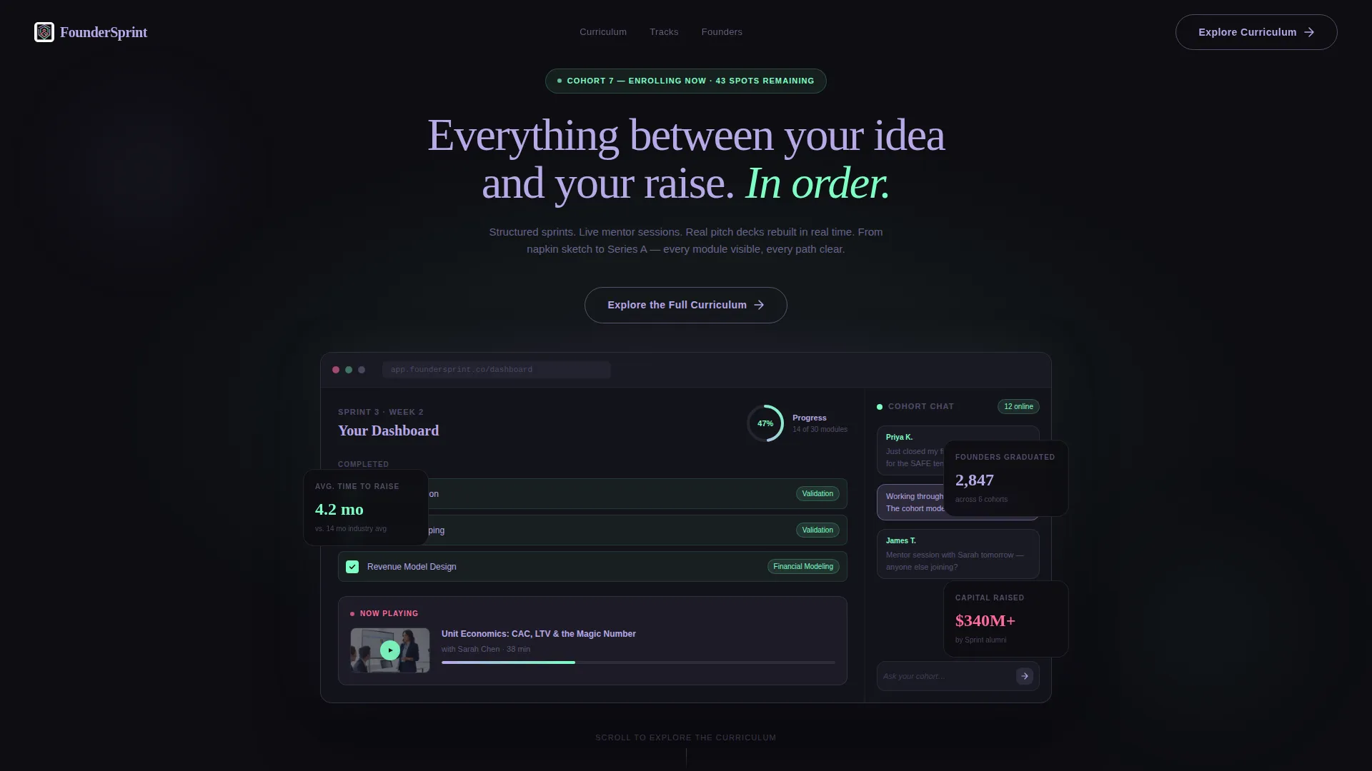
- A full-width product screenshot header showing a founder mid-sprint with progress indicators, module states, and a cohort chat sidebar
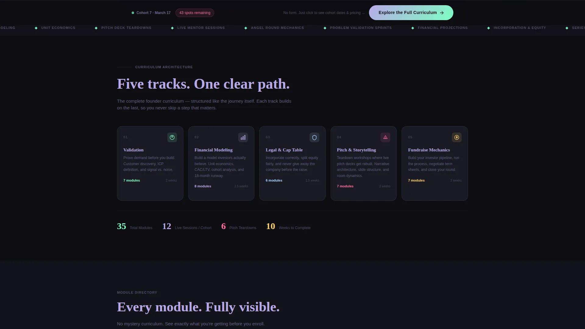
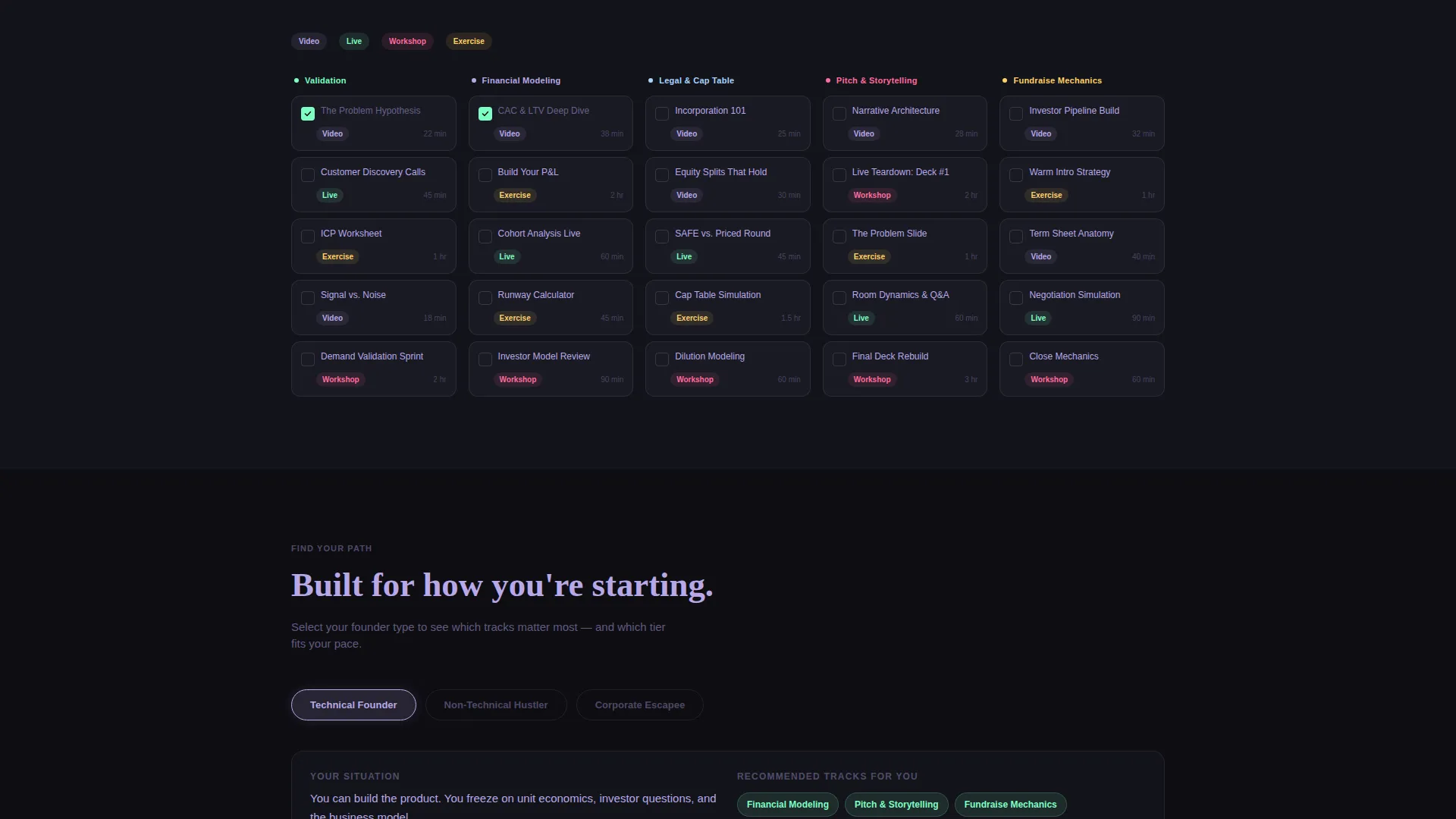
- A five-column Feature Matrix that progressively reveals curriculum tracks and module cards as visitors scroll deeper
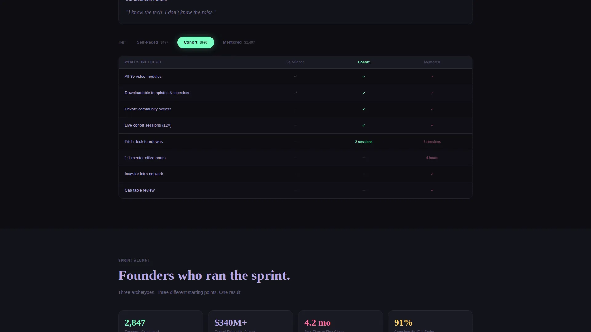
- A tiered comparison section with iridescent toggle filters so visitors can self-select by founder type
- A persistent bottom call to action bar that solidifies after the second scroll reveal and shifts its label as the matrix becomes visible
Feature list
This template includes purpose-built components designed for startup training platforms. Each one reflects a specific moment in how a founder evaluates and commits to a program.
Full-Width Product Screenshot Header
The header displays a pixel-perfect platform dashboard capture. It shows completed modules in holographic mint, an expanded current lesson with a live mentor video thumbnail, a 47% progress ring, and a cohort chat sidebar. A parallax-style gradient shifts between lavender and mint as the visitor's mouse moves, giving the static image a sense of dimensional depth.
Progressive Scroll Reveal Curriculum Matrix
As visitors scroll, the five core tracks appear first as labeled columns: Validation, Financial Modeling, Legal and Cap Table, Pitch and Storytelling, and Fundraise Mechanics. On the next scroll, each column populates with individual module cards that slide up into place. This layered reveal makes the page feel like zooming into a map, adding resolution without overwhelming the reader.
Iridescent Tier Comparison Toggles
A comparison section materializes deeper in the scroll, showing what is included at each program tier: self-paced, cohort, and mentored. Iridescent toggle controls let visitors filter the view by their founder type. The toggles use the AI Iridescent color system, activating in shifting rose on hover and active states.
Adaptive Click-Through call to action Bar
The primary call to action starts as a ghost button beneath the header that reads "Explore the Full Curriculum." After the second scroll reveal, it solidifies into a persistent bottom bar. Once the Feature Matrix is fully visible, the label shifts to "Pick Your Track." There is no form on this page; the click carries visitors directly to a dedicated enrollment page with cohort dates and pricing.
Void-Black Dark Palette with Iridescent Accents
The color system uses deep void black as the base background, spectral lavender for body text, and holographic mint plus shifting rose reserved for interactive states. Accents appear on cards, toggles, and progress indicators like bioluminescence surfacing from deep water, giving the page a sense of life that responds to curiosity rather than announcing itself.
Directory and Discovery Layout Structure
The page is structured around a directory unfolding metaphor. Content is organized so the visitor always knows where they are in the curriculum map. Each scroll reveal adds a layer of context, and the visual hierarchy guides attention from overview to detail without requiring any instructions.
Page sections overview
| Section | Purpose |
|---|---|
| Header Screenshot | Anchors the page with a live platform preview and the hero headline |
| Core Tracks Columns | Reveals the five curriculum tracks on first scroll |
| Module Cards Grid | Populates each track column with individual lesson cards on second scroll |
| Tier Comparison Rows | Shows self-paced, cohort, and mentored tier differences with toggle filters |
| Persistent call to action Bar | Solidifies at the bottom after scroll two and shifts label as matrix completes |
Design & branding system
The template uses an AI Iridescent color system built on a Directory and Discovery theme. The result is a dark, focused workspace aesthetic that feels alive only when interacted with.
- Base palette: deep void black (#0D0D12) for all backgrounds, spectral lavender (#B8A9E8) for body text, holographic mint (#7DFFC3) for completed states and active accents
- Hover and active states use shifting rose (#FF6B9D) exclusively, so interactive elements reveal themselves through touch rather than competing for attention at rest
- The mouse-reactive gradient in the header and the slide-up card animations reinforce a sense of dimensional depth without relying on video or heavy assets
Mobile & speed optimization
The progressive reveal structure is designed to stay readable and navigable at every viewport width. Layered content that works vertically on desktop translates cleanly to a stacked scroll experience on smaller screens.
- Module card columns reflow into a vertical stack on mobile, preserving the reveal sequence without horizontal scrolling
- The persistent call to action bar anchors to the bottom of the screen on mobile, keeping the enrollment action accessible throughout the full scroll journey
- Lightweight interaction states, such as hover gradients and slide-up animations, are scoped to visible elements so the page does not load assets before they are needed
How this template helps you convert
The template earns every click by letting visitors self-qualify before they ever see a price or a form. The conversion logic is embedded in the scroll experience itself.
- The product screenshot header immediately establishes platform credibility. Visitors see real progress states, a real cohort sidebar, and a real lesson in progress, so they are evaluating a product, not reading a pitch.
- The progressive matrix reveals curriculum depth at the visitor's own pace. By the time the call to action solidifies, the visitor has already mentally mapped which track fits their situation and which tier matches their goals.
- The shifting call to action label from "Explore the Full Curriculum" to "Pick Your Track" reflects where the visitor actually is in their decision journey, making the next step feel like a natural continuation rather than a sales push.
Other information about this template
This template is part of a broader family of startup digital presence templates designed for the Technology category. It suits any digital academy that teaches structured, multi-track programs to early-stage founders.
- The template style is Scroll Reveal (Progressive), meaning each content layer appears as the visitor reaches it rather than loading all at once
- The creative direction follows a Feature Matrix approach, which works especially well for programs with multiple curriculum tracks or tier-based pricing
- The header concept is a Product Screenshot, making this template a strong fit for platforms that already have a dashboard or course interface worth showcasing
- The landing page direction is Click-Through, so this template is purpose-built to route qualified visitors to a separate enrollment page rather than capturing leads directly on this page
- The Directory and Discovery theme makes it suitable for any training program where transparency and curriculum visibility are core selling points
Theme
Directory & Discovery
Creative direction
Feature Matrix
Color system
AI Iridescent
Style
Scroll Reveal (Progressive)
Direction
Click-Through
Page Sections
Progressive Scroll Reveal Curriculum Matrix
Full-width Product Screenshot Header
Iridescent Tier Comparison with Toggle Filters
Adaptive Click-through Call to Action Bar
AI Iridescent Dark Color System
Directory and Discovery Page Structure
Related questions
Does this template include the enrollment or pricing page?
Can I adapt the five curriculum tracks to match my own program?
Is there a lead capture form on this landing page?
What type of platform or business is this template best suited for?
Can the color system be updated to match a different brand identity?



