Online Skill Courses Reviews Website Template
Launchpad is a single-column landing page template built for online SaaS startup courses. It opens with an interactive founder diagnostic, guides visitors through real student case studies, and closes with a quiz-driven assessment that personalizes the curriculum preview. The Teal Catalyst color system keeps the page focused and energizing from the first click to the final call to action.
by Rocket studio
Quick summary
Launchpad is a focused, single-column landing page template designed for SaaS startup online courses. It combines a multi-step founder diagnostic header, scrollable case study narrative sections, and a quiz-based assessment funnel. The result is a page that feels personal before the visitor has scrolled a single pixel, then compounds evidence with real student outcomes until they are ready to act.
Who this template is for
This template is built for course creators and educators who teach first-time founders how to build and grow a software-as-a-service business. It suits instructors whose students arrive at very different stages and need a page that speaks to all of them at once.
- Solo developers who want to move beyond freelancing and build a product of their own
- Product managers prototyping on weekends who need a structured path to their first paying customer
- Non-technical founders who have done the research but have never shipped a live product
What problem this template solves
Most online course landing pages treat every visitor the same. A solo developer and a product manager with five years of experience have completely different blockers, yet they land on the same generic headline. That mismatch costs conversions.
- Visitors leave because the page does not reflect where they actually are in their founder journey
- Generic testimonials fail to make the outcome feel real or achievable for someone in their specific situation
- A single static call to action asks for commitment before the visitor has seen enough evidence to trust the offer
What you get with this template
You get a complete, ready-to-customize single-column landing page structured around three conversion layers: personalization, evidence, and assessment. Every section has a clear job to do, and nothing is included just to fill space.
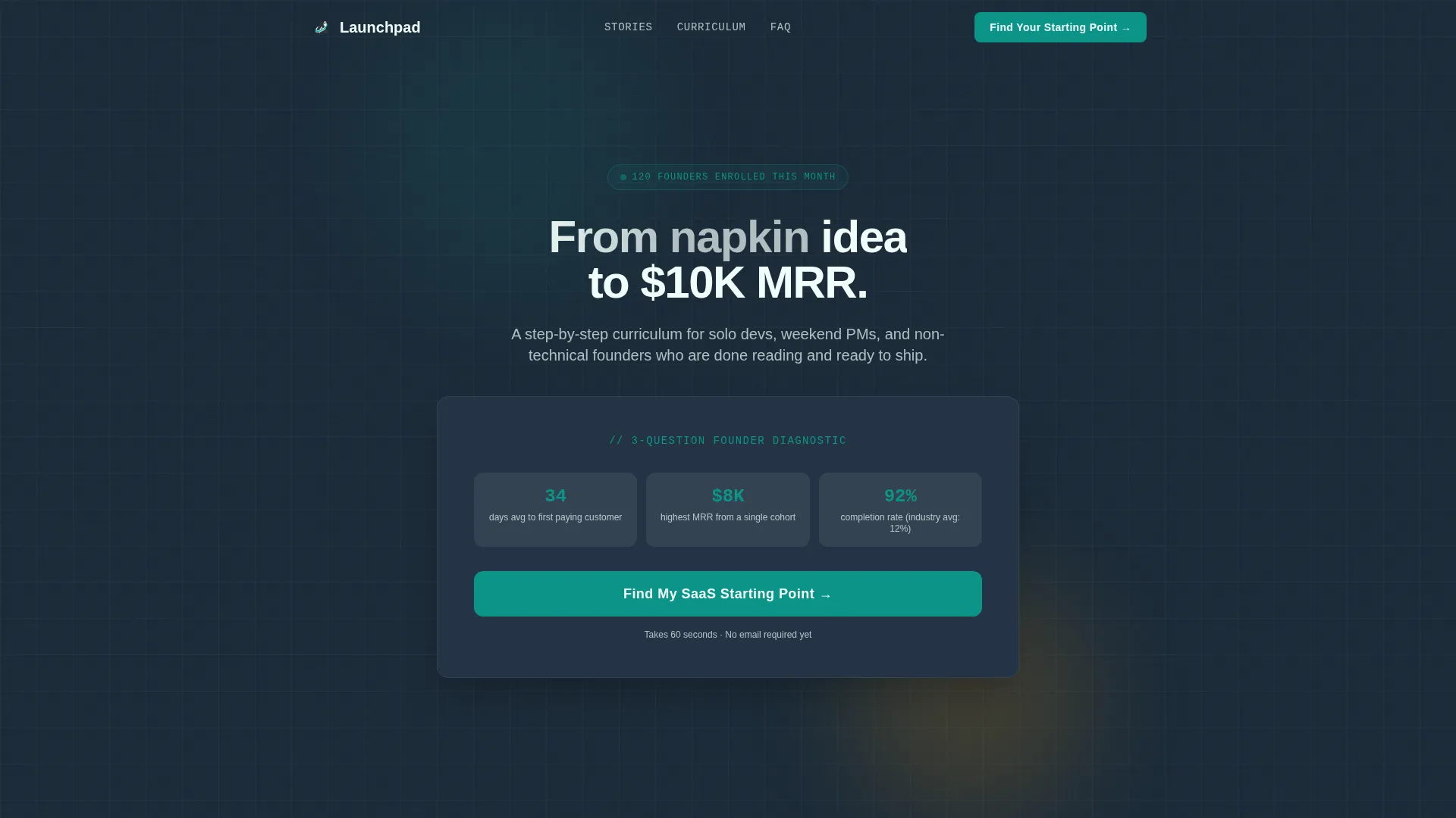
- A multi-step founder diagnostic header with animated card selectors and a dynamic headline that reshapes based on answers
- Scrollable case study narrative sections with pull-quotes, stat interstitials, and space for real student outcome screenshots
- A five-question quiz assessment funnel with a live curriculum preview panel and a low-friction email capture at the end
Feature list
This template ships with purpose-built components tied directly to the course sales flow described in the brief.
Interactive Founder Diagnostic Header
The header opens with three large, clickable question cards covering idea stage, biggest blocker, and weekly time commitment. Each selection animates a teal progress bar forward and subtly reshapes the headline beneath it. Visitors watch the page respond to their choices before they scroll.
Case Study Narrative Scroll Sections
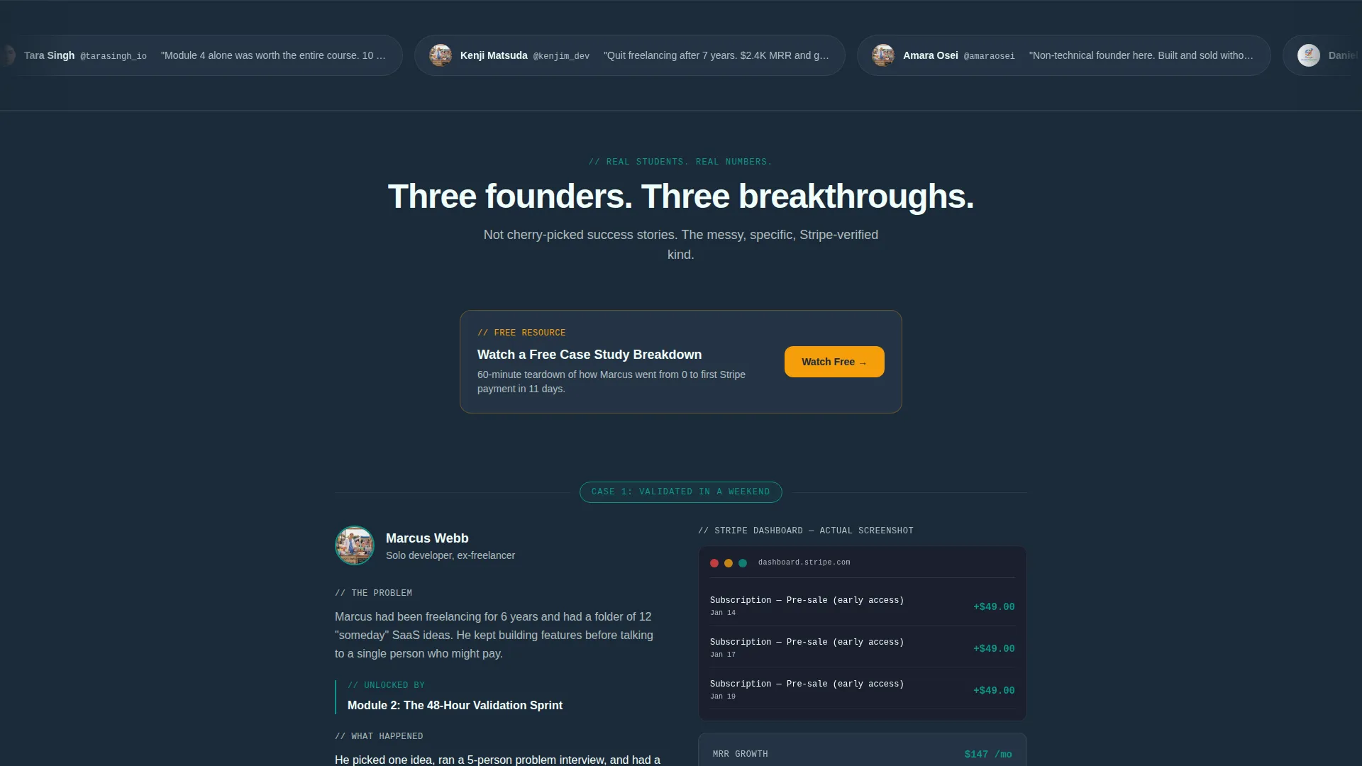
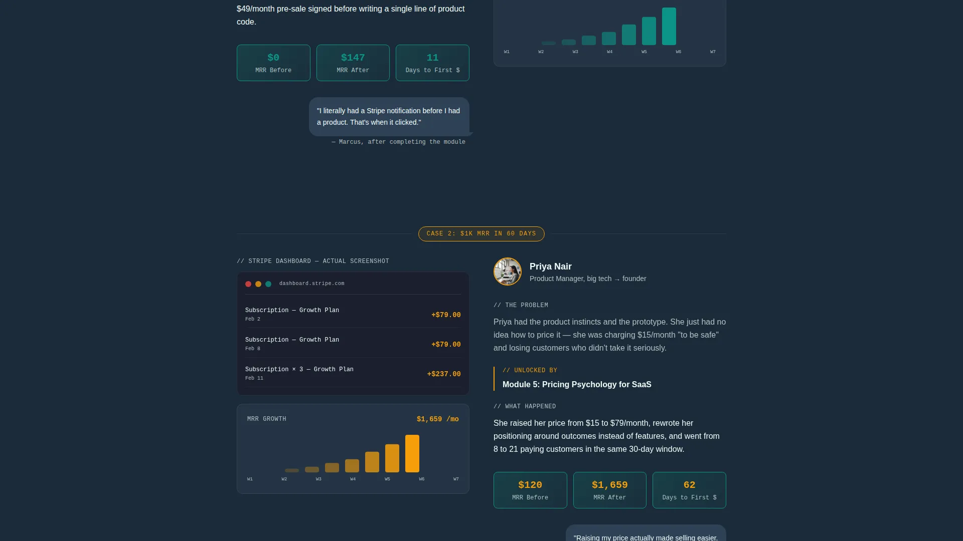
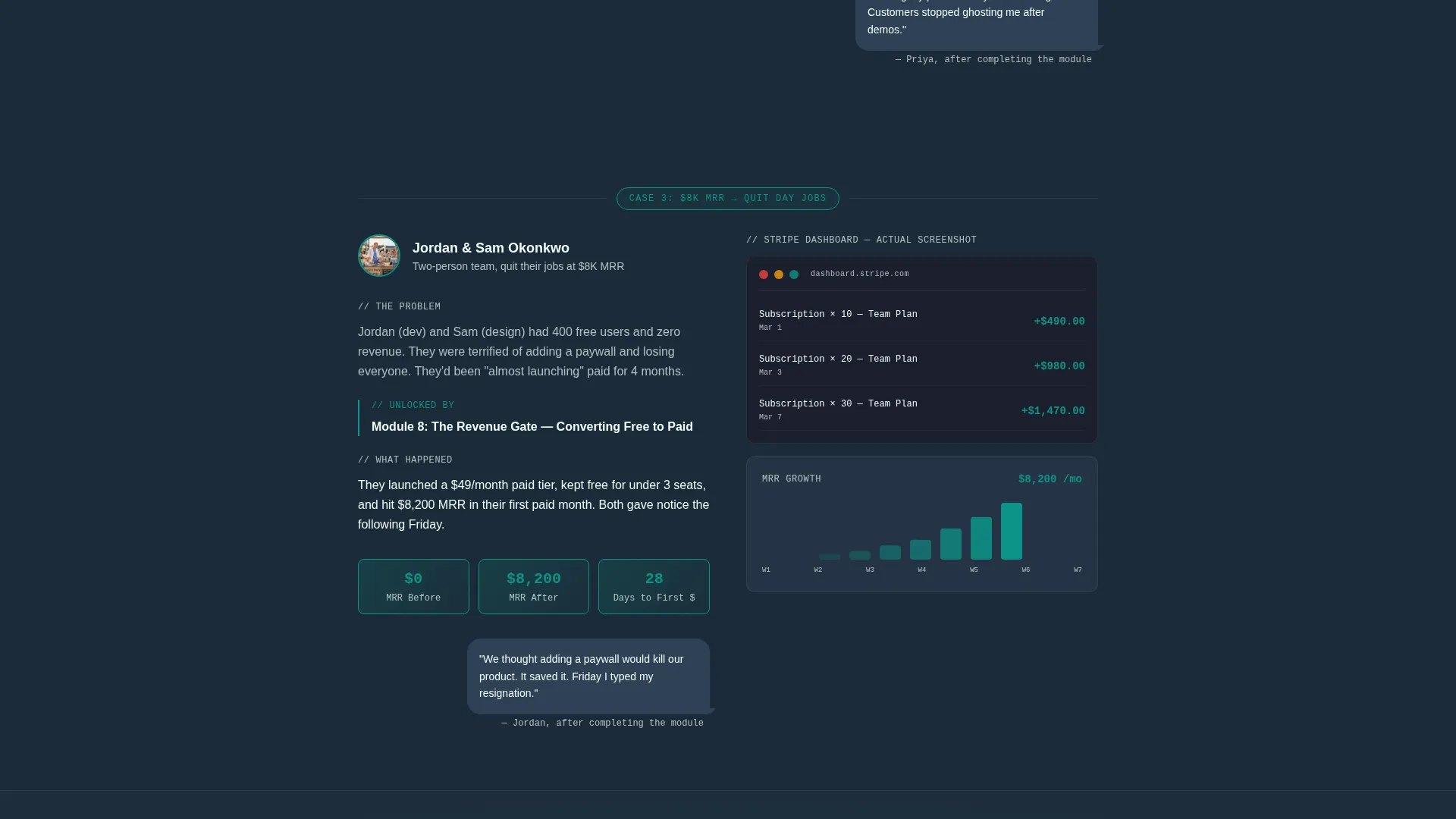
Each scroll section tells one student story: the problem they were stuck on, the module that changed things, and the measurable result. Evidence includes space for Stripe dashboard screenshots, MRR graphs, and first customer emails. Stakes escalate across three stories, from weekend validation to a team crossing $8,000 in monthly recurring revenue.
Single-Stat Interstitial Blocks
Between case studies, full-width interstitial blocks display one compelling number at a time. An example from the brief: "Average time from enrollment to first paying customer: 34 days." These blocks keep the evidence building without breaking the narrative rhythm.
Quiz Assessment Conversion Funnel
The primary call to action routes visitors into a five-question assessment. Visual card selectors replace radio buttons, and each answer updates a "Your Custom Curriculum" preview panel on the right side. The session ends with a first name and email capture only, no credit card required.
Gated Mid-Page Video call to action
A secondary call to action, "Watch a Free Case Study Breakdown," appears mid-page for visitors who are not yet ready to enter the full assessment. It captures an email address in exchange for immediate, practical video content.
Teal Catalyst Color System
The design uses four named colors with specific roles. Deep lecture-hall charcoal (#1B2A38) anchors backgrounds, catalyst teal (#0D9488) drives interactive and progress elements, chalk-dust white (#F0FDFA) opens up reading areas, and signal amber (#F59E0B) pulses on progress indicators and call-to-action buttons.
Page sections overview
| Section | Purpose |
|---|---|
| Founder Diagnostic Header | Personalizes headline via three-card multi-step form |
| Teal Progress Bar | Visualizes assessment completion in real time |
| Case Study One | Validates idea-stage outcome: weekend validation story |
| Stat Interstitial One | Compounds evidence with a single enrollment-to-customer stat |
| Case Study Two | Builds trust with $1K monthly recurring revenue in 60-day story |
| Stat Interstitial Two | Adds a second compelling outcome number between stories |
| Case Study Three | Escalates stakes with $8K MRR team-quit-their-jobs story |
| Mid-Page Video call to action | Captures email via gated free case study video |
| Quiz Assessment Section | Diagnoses founder stage and shows custom curriculum preview |
| Email Capture Close | Collects first name and email to unlock personalized roadmap |
Design & branding system
The visual identity follows an Educational Guide theme. The overall feel has been described as a well-organized workspace at 2 AM: focused, energizing, and intentional. Every color has a defined role and nothing competes for attention it has not earned.
- Deep lecture-hall charcoal (#1B2A38) for dark section backgrounds and anchoring text
- Catalyst teal (#0D9488) for interactive elements, progress bars, and hover states; signal amber (#F59E0B) reserved strictly for progress indicators and call-to-action pulses
Mobile & speed optimization
The single-column layout is inherently well-suited to mobile screens. Stacked sections, large card selectors, and full-width interstitials translate cleanly from desktop to phone without requiring a separate design pass.
- Large clickable card selectors in the header and assessment funnel are touch-friendly by design
- Single-column flow means content reads top to bottom without horizontal scrolling or layout breakage on smaller screens
How this template helps you convert
The page is built around a quiz-and-assessment conversion strategy that earns trust before asking for commitment. Every section adds a layer of evidence or personalization that moves the visitor closer to action.
- The header diagnostic makes the page feel personal immediately, so visitors stay engaged long enough to read the case studies that follow.
- The three escalating student stories compound evidence in a specific, believable sequence, ending with the mid-page video call to action for visitors who need one more proof point before committing.
- The assessment funnel closes the loop by showing a personalized curriculum preview, making the enrollment decision feel like a logical next step rather than a leap of faith.
Other information about this template
This template sits at the intersection of online skill course design and SaaS startup course content strategy. It is built specifically for the education and training category, where generic layouts consistently underperform against personalized, evidence-led pages.
- The template style is Single Column Flow, which keeps the reading experience linear and distraction-free
- The creative direction is Case Study Narrative, meaning the persuasion structure relies on real student outcomes rather than feature lists or instructor credentials
- The header concept is Multi-Step Form, and the primary conversion direction is Quiz and Assessment, making this template especially well-suited to courses with diverse student entry points
- The theme is Educational Guide, which informs every layout and color decision across the full page
Theme
Educational Guide
Creative direction
Case Study Narrative
Color system
Teal Catalyst
Style
Single Column Flow
Direction
Quiz/Assessment
Page Sections
Interactive Founder Diagnostic Header
Escalating Case Study Narrative
Quiz-driven Assessment Funnel
Gated Mid-page Video Call to Action
Teal Catalyst Color System
Single-stat Interstitial Blocks
Related questions
Do I need technical skills to customize this template?
Can I use this template for a course that is not about SaaS?
What makes this different from a standard course landing page?
Is there a way to capture leads before visitors reach the full assessment?
What do visitors need to provide to unlock their personalized roadmap?



