White-Label Social Networking App Landing Page
Launchpad is a hub-and-spoke landing page template built for white-label social networking app platforms. It leads with an interactive cost calculator, walks visitors through a side-by-side comparison table, and funnels them into a two-step sign-up form. The AI Iridescent color system and Startup Velocity theme give it a futuristic, high-momentum feel that matches the "launch fast" promise.
by Rocket studio
Quick summary
Launchpad is a single-page, anchor-nav landing page template designed to sell a white-label social networking app platform. It opens with a live cost calculator, builds the case through a comparison table and feature spokes, and closes with a two-step conversion form. The design runs on a void-black and holographic-violet palette that communicates speed, credibility, and modern technology.
Who this template is for
This template is built for entrepreneurs and platform operators who want to launch a branded social networking app without writing a single line of code. It speaks directly to people who have an audience ready but no development team behind them.
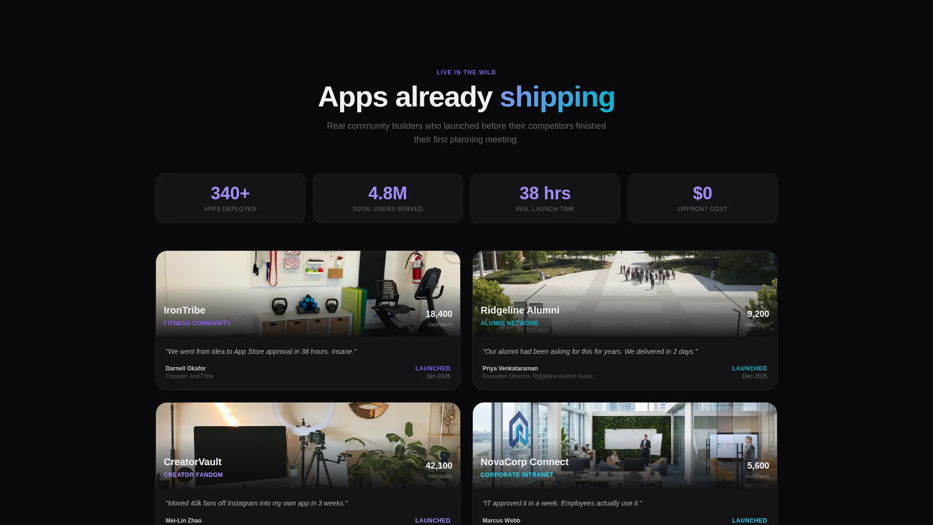
- Community builders launching niche networks for fitness groups, alumni chapters, creator fandoms, or corporate intranets
- Founders who need native iOS and Android apps shipped fast and fully branded under their own name
- Operators pitching white-label app solutions to clients who compare costs before committing
What problem this template solves
Building a social networking app from scratch is slow and expensive. Most community founders lose months to vendor selection, scoping, and developer negotiations before a single line of code is written. This template short-circuits that delay by putting the cost argument front and center.
- Visitors arrive skeptical about price and timeline, and the interactive calculator answers both objections immediately
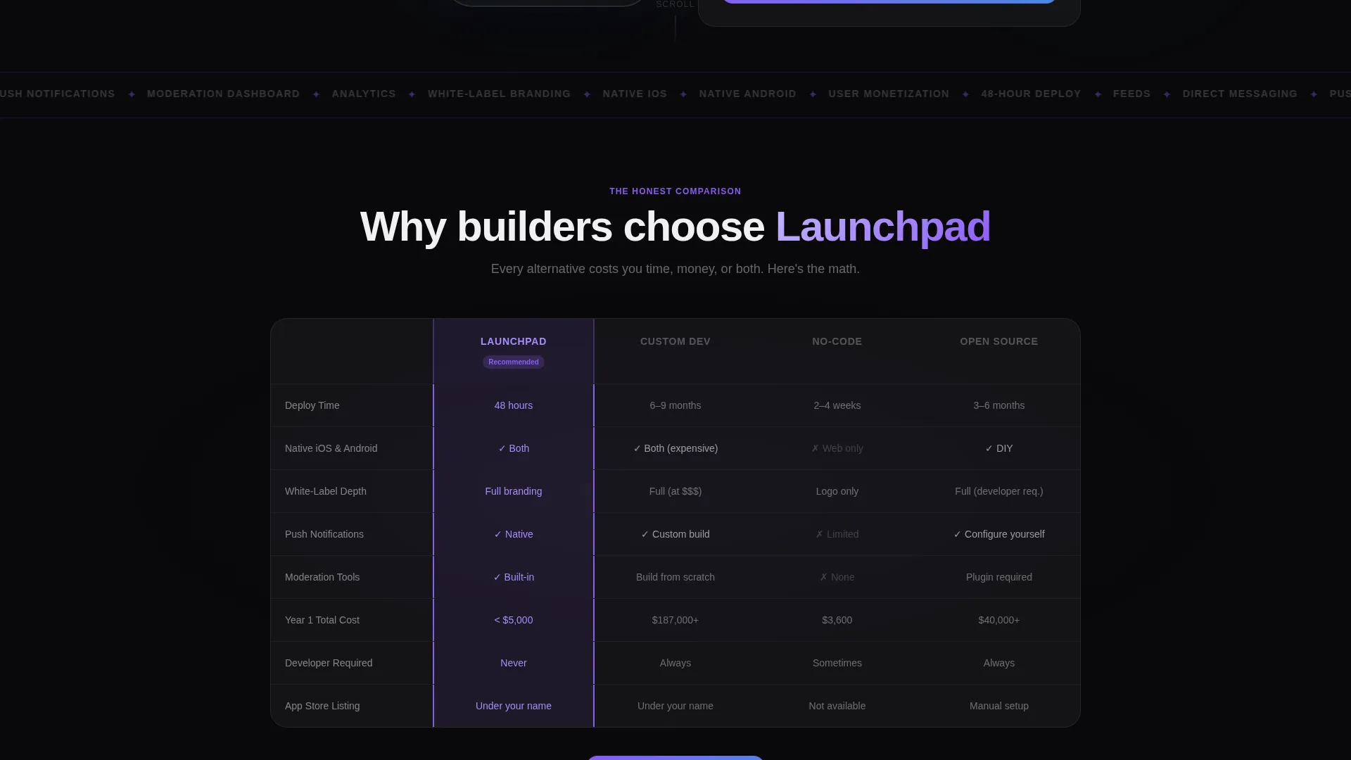
- The comparison table removes the need for long sales calls by contrasting this platform against custom dev shops, no-code builders, and open-source frameworks
- The two-step form reduces friction so interested visitors convert before doubt creeps back in
What you get with this template
You get a fully structured, single-page landing page with an anchor navigation system, an interactive estimator, a versus table, and a spoke-based feature showcase. Every section is designed to carry visitors from curiosity to conversion in one downward scroll.
- A hero section with a product screenshot mockup, a pulsing notification badge, and a live two-slider cost calculator
- A comparison table section, a clickable feature-spoke hub graphic, and a two-step sign-up form with a secondary demo gallery link
- An AI Iridescent visual system using void black, holographic violet, shimmer cyan, and soft pearl across all components
Feature list
This template is built around a clear set of interactive and visual components drawn directly from the source brief.
Live Cost Calculator with Dual Sliders
Two sliders let visitors adjust "Number of Users" and "Feature Modules" and instantly see a monthly price output. A side-by-side line shows a custom development cost estimate alongside the platform price, letting the numbers do the persuading before the visitor reads a single headline.
Animated Comparison Table
A structured table contrasts the platform against custom dev shops, no-code builders, and open-source frameworks. Rows cover deployment time, native performance, white-label branding depth, and total cost of ownership. Each row animates in with the platform column highlighted in holographic violet.
Hub-and-Spoke Feature Showcase
A central hub graphic radiates outward to individual feature spokes covering Feeds, Messaging, Moderation, Analytics, and Monetization. Each spoke is clickable and expands a mini-demo screenshot, letting visitors explore specific capabilities without leaving the page.
Two-Step Conversion Form
The primary call to action opens a two-step form. Step one captures the app name and niche category. Step two asks for an email address and expected user count. This staged approach reduces the perceived effort of signing up and keeps drop-off low.
Pinned Anchor Navigation with Persistent call to action
A sticky anchor nav sits at the top of the page throughout the scroll journey. It links to each spoke section and always surfaces the primary call-to-action button, so visitors can convert at any point without scrolling back to the top.
Product Screenshot Hero with Brand Mockup
The header features a pixel-perfect phone frame mockup showing a populated social app feed. A notification badge pulses on the chat icon, and a placeholder brand name appears in the top bar, helping visitors mentally place their own brand inside the product.
Page sections overview
| Section | Purpose |
|---|---|
| Hero with Calculator | Opens with a phone mockup and live cost estimator to hook attention immediately |
| Anchor Navigation Bar | Stays pinned at the top and links to each spoke section with a persistent call to action button |
| Comparison Table | Contrasts the platform against three alternatives across key buying criteria |
| Feature Spokes Hub | Visual hub graphic with five clickable spoke sections expanding mini-demo screenshots |
| Feeds Spoke | Showcases the user feed capability with an inline demo screenshot |
| Messaging Spoke | Details direct messaging features with a supporting visual |
| Moderation Spoke | Covers the moderation dashboard with an expandable screenshot |
| Analytics Spoke | Highlights platform analytics tools within the spoke layout |
| Monetization Spoke | Explains monetization options in its own expandable spoke block |
| Two-Step Sign-Up Form | Captures app name, niche, email, and user count across two lightweight steps |
| Demo Gallery Link | Offers a secondary path to a live gallery of shipped client networks |
Design & branding system
The visual identity is built on the AI Iridescent color system, which pairs a deep void-black base with refractive accent tones to create a futuristic yet tactile feel. The palette is precise and purposeful, with each color assigned a specific interaction role.
- Void black (#09090B) dominates backgrounds; soft pearl (#F0F0F3) lifts card surfaces above the dark base
- Holographic violet (#8B5CF6) marks interactive hotspots, active anchor nav states, and the highlighted column in the comparison table
- Shimmer cyan (#06B6D4) runs through progress bars, toggle animations, slider tracks, and hover glow effects to suggest live data in motion
Mobile & speed optimization
The template is designed around a single-page, section-led scroll flow that performs well on mobile viewports. The layout prioritizes lightweight interactive components over heavy media assets.
- The phone frame mockup and hub graphic are optimized for responsive scaling across screen sizes
- Slider inputs and the two-step form are built for touch interaction, with clear tap targets and minimal input friction
- The anchor nav collapses cleanly on smaller screens so the pinned call to action remains accessible throughout the scroll
How this template helps you convert
The entire page is architected around a "Calculator/Tool First" creative direction. Visitors encounter the strongest objection-crushing argument before they read a single feature claim, then each subsequent section deepens the case.
- The cost calculator creates an immediate personal stake by showing the visitor their own estimated price and a stark comparison to custom development costs, earning attention through contrast rather than copy
- The animated comparison table removes the need for a sales call by answering competitive objections in a single scannable view, and the spoke gallery lets skeptical visitors verify product depth before committing
- The pinned call-to-action button and the two-step form keep conversion accessible at every scroll depth, while the secondary demo gallery link gives cautious visitors a low-commitment next step
Other information about this template
This template fits neatly into the Consumer App and Platform category within the broader Technology space. It was designed specifically for the white-label social networking app niche, where buyers compare multiple solutions before making a decision.
- The template style is Hub and Spoke with Anchor Navigation, meaning each feature area lives in its own addressable section that visitors can jump to directly
- The Startup Velocity theme and AI Iridescent color system together produce a visual atmosphere that feels aligned with fast-moving technology ventures
- The Comparison/Versus landing page direction makes it particularly effective when the target audience is actively evaluating competing solutions before purchase
- A secondary call-to-action path, "See Live Demo Apps," links to a gallery of real shipped client networks, giving skeptical visitors a verification step without requiring sign-up


Theme
Startup Velocity
Creative direction
Calculator/Tool First
Color system
AI Iridescent
Style
Hub & Spoke (Anchor Nav)
Direction
Comparison/Versus
Page Sections
Live Cost Calculator with Dual Sliders
Animated Comparison Table
Hub-and-spoke Feature Showcase
Two-step Conversion Form
Pinned Anchor Navigation with Persistent Call to Action
Product Screenshot Hero Mockup
Related questions
What kind of business is this template designed for?
Does the template include the actual app or platform functionality?
How does the two-step sign-up form work?
Can I replace the placeholder brand name and mockup with my own?
Is the cost calculator connected to live pricing data?


