Engineering Education Education Website Template
The Lecture landing page template is built for engineering education platforms that need to convert visitors into free trial signups. It combines a browser-mockup hero, an instructor credential grid, a three-tier comparison table, and a streamlined signup form into one focused, desktop-first layout. The design feels clean and focused, like a well-prepared engineering workspace.
by Rocket studio
Quick summary
This template is a single-page, comparison-table layout for an engineering video lesson library. It guides visitors from a free-trial hero through instructor introductions, a feature comparison across three subscription tiers, and a low-friction signup form. The design uses a Corporate Precision visual system built for trust, focus, and steady conversion.
Who this template is for
This template suits teams and businesses in the professional development and engineering education space. It is purpose-built for organizations offering on-demand technical instruction to working engineers and corporate teams.
- Engineering educators and EdTech founders launching a video lesson library for PE exam prep or code compliance training
- Plant managers and corporate learning and development directors who need a clear way to present tiered access for team onboarding
- Solo instructors or small academies looking to position credentialed, whiteboard-driven content against free alternatives
What problem this template solves
Deep technical knowledge in fields like finite element analysis or ASME pressure vessel standards is hard to package and sell online. Generic course platform templates do not communicate credibility or depth the way a specialized engineering audience demands.
- Engineers evaluating a subscription need to see who teaches, what is covered, and exactly what each pricing tier includes before they commit
- Corporate buyers need measurable proof of outcomes, such as reduced onboarding time and improved exam pass rates, before presenting a tool to leadership
- Most landing pages either overwhelm with features or undersell the expertise behind the content, causing hesitant visitors to bounce without exploring
What you get with this template
You get a fully structured, section-led landing page ready to customize with your own instructor profiles, lesson counts, and pricing tiers. Every section has a clear job to do, and nothing is included that does not serve the conversion goal.
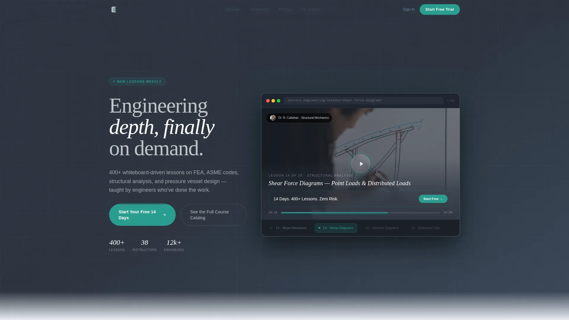
- A hero section with a browser mockup showing a paused whiteboard video, a translucent overlay with your trial offer, and a pulsing play button animation
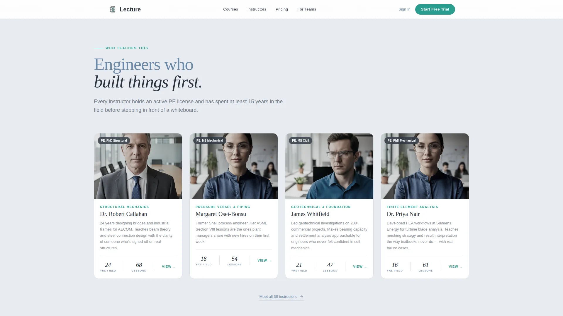
- An instructor grid introducing educators by name, credential, specialty, and years of field experience, with warm portrait photography slots
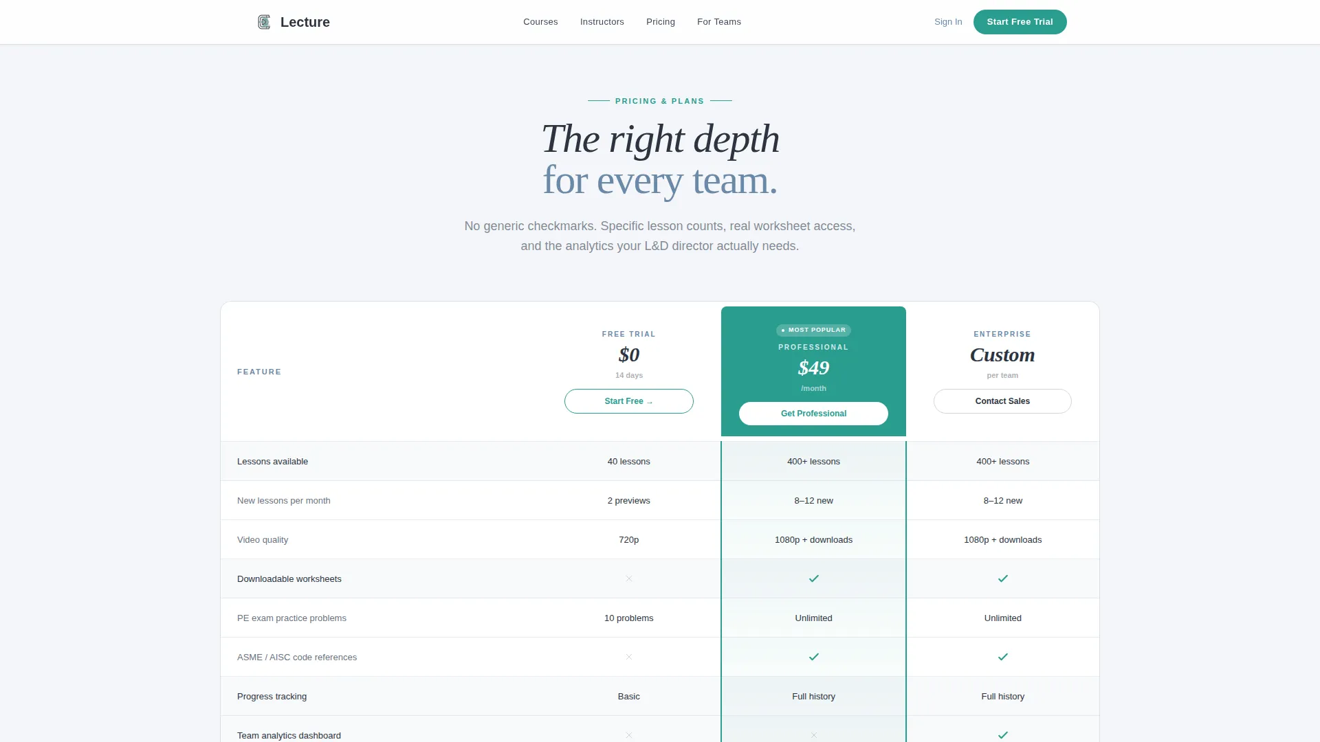
- A three-column comparison table contrasting Free, Professional, and Enterprise tiers using specific lesson counts, downloadable worksheet access, and team analytics dashboards
Feature list
This template delivers focused, prompt-backed components that work together toward one goal: turning engineering professionals into active trial users.
Browser Mockup Hero with Trial Overlay
The header centers a crisp browser mockup showing a whiteboard video paused mid-sketch. A translucent overlay displays the trial offer copy, and the play button pulses once on load. This opening frame immediately signals real content in progress.
Three-Tier Comparison Table
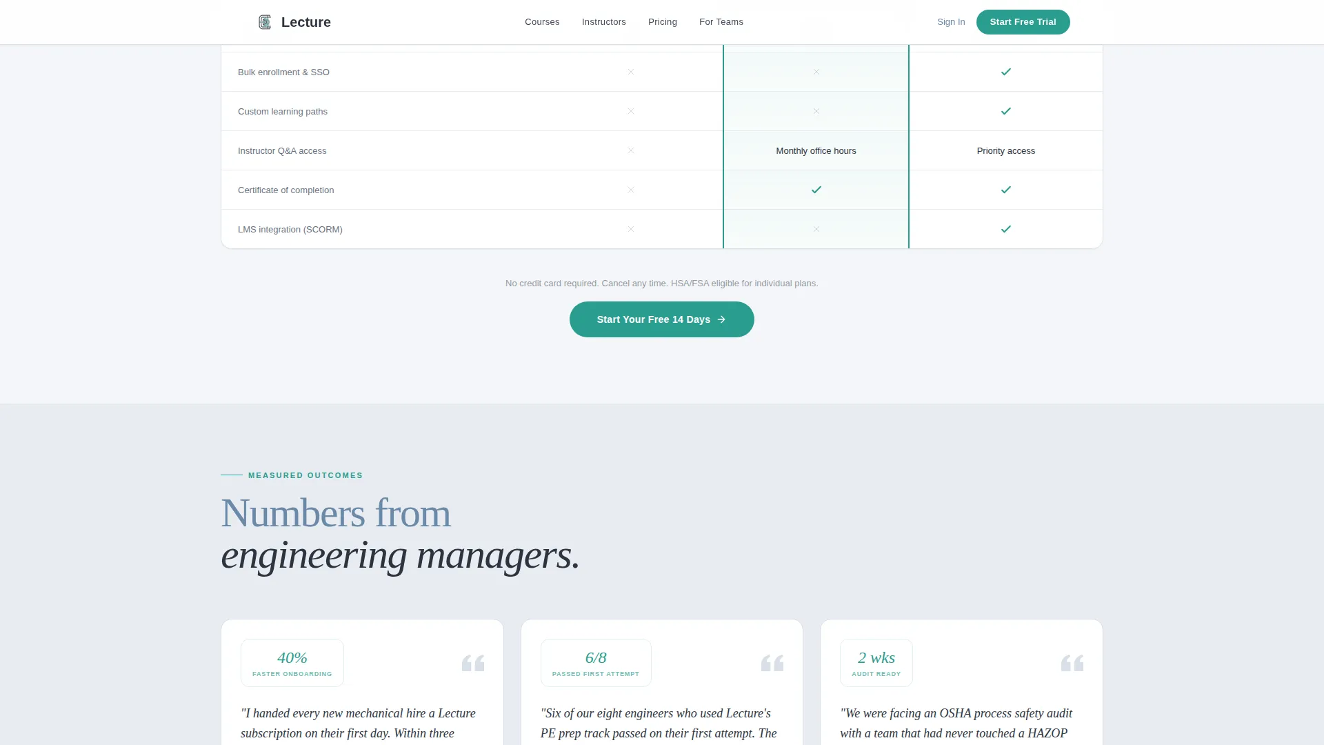
The comparison table contrasts Free, Professional, and Enterprise plans using specific lesson counts, worksheet downloads, and team analytics access rather than generic checkmarks. Column highlight interactivity lets visitors focus on the tier most relevant to them.
Instructor Credential Grid
A dedicated team section introduces instructors by name, credential, engineering specialty, and years of field experience. Each card pairs a warmly lit portrait with role details, building trust through visible expertise before any purchase decision.
Testimonial Clips with Measurable Outcomes
Below the comparison table, short testimonial blocks from engineering managers describe concrete results such as onboarding time reduced and exam pass rates improved. These are not generic quotes; they are outcome-specific validations for a skeptical, data-oriented audience.
Low-Friction Signup Form
The signup form collects only a work email address and an engineering discipline selected from a dropdown. No credit card, no company size field, no phone number. This intentional minimalism removes the most common reasons a hesitant visitor abandons the form.
Scroll Reveal and Spotlight Animations
Sections enter through scroll-triggered reveal effects. Instructor cards use spotlight hover behavior. A marquee ticker and the pulsing play button add gentle motion without distracting from the focused editorial feel.
Page sections overview
| Section | Purpose |
|---|---|
| Hero browser mockup | Establish free trial offer with paused whiteboard video and overlay copy |
| Instructor credential grid | Introduce educators by name, specialty, and field experience to build trust |
| Comparison table | Contrast Free, Professional, and Enterprise tiers with specific feature details |
| Testimonial outcome clips | Show measurable results from engineering managers to validate the platform |
| Signup call to action | Collect work email and discipline with a no-credit-card, minimal-field form |
| Single-row footer | Provide navigation and legal links in a clean linear layout |
Design & branding system
The visual identity follows a Corporate Precision theme. The palette and typography choices reinforce a quiet, editorial tone that serious engineers find credible rather than promotional.
- Colors: cool fog gray (#E8ECF1) for section backgrounds, deep graphite (#2C3440) for body text and table borders, muted steel blue (#6B89A8) for secondary headings and inactive states, and decisive teal (#2A9D8F) reserved exclusively for call-to-action elements and progress indicators
- Typography: Fraunces serif for display headlines creates a considered, editorial authority; DM Sans handles all body text for clean legibility at small sizes
Mobile & speed optimization
The template is designed desktop-first, reflecting how the target audience most often engages with technical content. That said, the layout is built to hold up solidly on mobile for engineers who study late or review lessons away from their desks.
- Server Components handle static sections such as the instructor grid and footer, keeping JavaScript overhead low where interactivity is not needed
- Scroll reveal effects, spotlight card hover states, and the comparison table column highlight are built with minimal JavaScript so they load efficiently without blocking content
How this template helps you convert
Every section in this layout has been positioned to reduce friction and build confidence at the exact moment a visitor needs it.
- The primary call to action, "Start Your Free 14 Days," appears three times: inside the hero mockup, pinned below the Free column in the comparison table, and again above the footer. Repeat placement ensures the offer is always one click away without feeling aggressive.
- A secondary path, "See the Full Course Catalog," gives hesitant visitors a low-commitment way to browse lesson titles and durations before signing up. This confidence-building step means visitors arrive at the form already sold on the content depth.
Other information about this template
This template was designed specifically for the engineering education and professional development vertical. It reflects the expectations of a technically sophisticated audience who values precision, credibility, and directness over decorative design.
- The page is localized for United States engineering context, including references to the Professional Engineer (PE) exam and ASME standards, making it immediately relevant to the core audience
- Animation intensity is set to medium: subtle enough to feel polished, restrained enough not to distract an engineer reviewing lesson details at midnight
- The footer uses a linear single-row pattern to keep the end of the page clean and uncluttered, consistent with the overall editorial tone
- The template supports a freemium conversion model where the goal is email capture with minimal commitment, then upsell through demonstrated content value
Theme
Corporate Precision
Creative direction
Team & People
Color system
Soft Mist
Style
Comparison Table
Direction
Freemium/Trial
Page Sections
Browser Mockup Hero with Trial Overlay
Three-tier Comparison Table
Instructor Credential Grid
Outcome-specific Testimonial Blocks
Low-friction Signup Form
Scroll Reveal and Spotlight Interactions
Related questions
What type of page is this template?
Can I adjust the comparison table tiers and feature labels?
Is this template suitable for both individual instructors and corporate training teams?
What engineering disciplines does the signup form support?
Does the template include animations or interactive elements?



