Financial Services Software & SaaS Booking Website Template
Ledger is a financial services booking landing page template built for wealth managers, mortgage brokers, and independent financial advisors. It uses a modular card grid layout to showcase automated scheduling, compliance logging, and client self-service booking in one focused, click-through flow. The deep obsidian design and iridescent accents make it feel precise, premium, and immediately trustworthy.
by Rocket studio
Quick summary
Ledger is a single-page, click-through landing page template for financial services booking software. It presents a modular card grid of scheduling and compliance features, a logo bar with custodian integrations, live social proof, and a persistent call-to-action pill. Every section is designed to move a qualified visitor toward a free trial signup.
Who this template is for
This template is built for financial services teams and solo practitioners who need to convert web visitors into booked appointments without friction. It speaks directly to professionals managing complex, compliance-sensitive calendars.
- Solo registered investment advisors (RIAs) running high volumes of weekly discovery calls
- Mortgage teams coordinating rate-lock windows across processors and underwriters
- Enterprise compliance officers who require every meeting to be logged and recorded
What problem this template solves
Financial advisors and mortgage professionals waste time on manual scheduling and risk falling behind on regulatory recordkeeping. They need a page that communicates automated, compliant booking instantly, without burying the message in paragraphs.
- Visitors leave before understanding the software's compliance value without a clear visual hierarchy
- Generic SaaS templates fail to signal trust to regulated-industry buyers who expect precision
- Multi-feature platforms appear overwhelming when every capability competes for attention at once
What you get with this template
You get a fully structured, single-page layout that presents scheduling software features in a digestible, scrollable card grid. The template organizes capabilities into thematic rows, escalating from individual booking tools to enterprise orchestration.
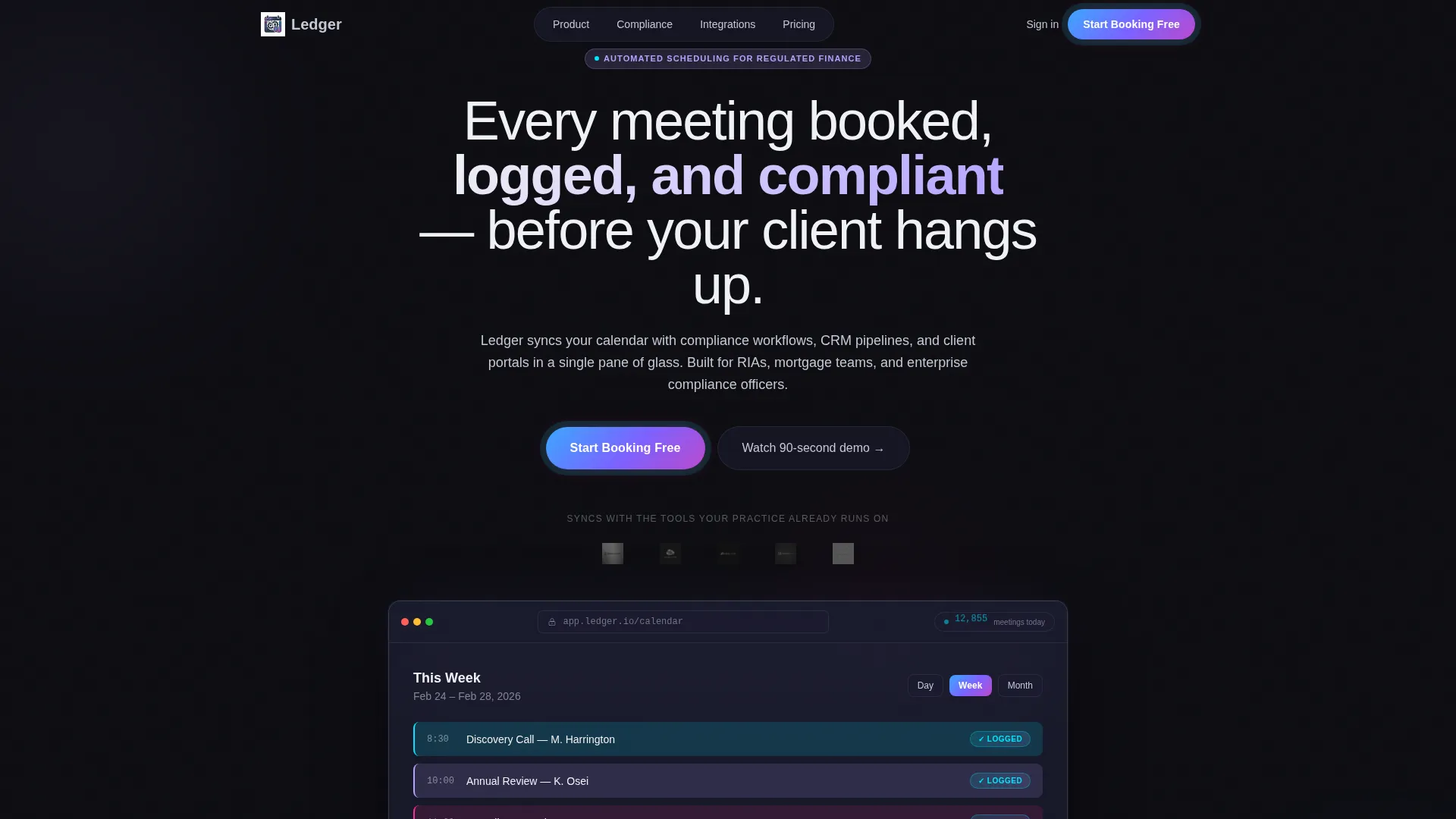
- A header section with integration logo bar, browser mockup, headline, and live booking counter
- A modular card grid grouped into Booking, Compliance, and Integration thematic rows with iridescent divider lines
- A testimonial card row with advisor firm name, AUM tier, and a single quoted statement per card
Feature list
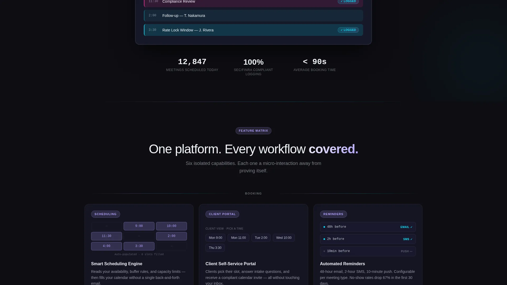
This template is built around a Feature Matrix creative direction, where each card isolates one platform capability. Cards are uniform in size and each contains a micro-interaction to give visitors the sensation of testing the product.
Smart Scheduling Cards
Each card presents the automated scheduling capability with a calendar micro-interaction that populates on hover. Visitors see appointment types, color-coded slots, and confirmed booking states without leaving the page.
Compliance Badge Stamping
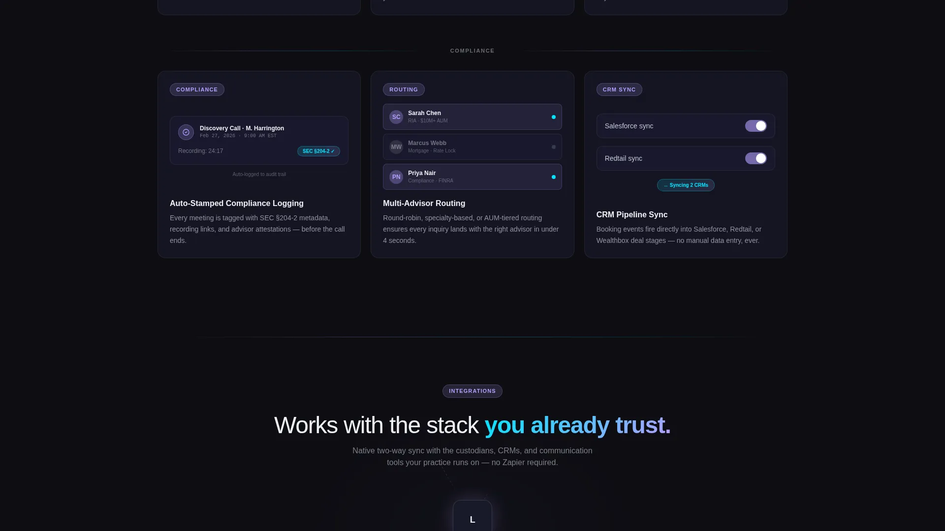
A dedicated card displays the compliance recording feature through an animated badge that stamps onto a meeting entry. This makes the compliance workflow tangible and immediately understandable to regulated-industry buyers.
CRM and Portal Sync Display
Cards in the Integration row illustrate how the software connects with CRM pipelines and client portals in a single interface. Each card uses a toggle micro-interaction to show connected and disconnected states.
Multi-Advisor Routing Card
A card in the Booking row shows how incoming appointment requests are distributed across multiple advisors. The layout communicates enterprise-scale routing without requiring a written explanation.
Persistent call to action Pill
After the second card row, a floating pill button carrying the primary call-to-action appears and stays visible as the visitor scrolls. The button uses the cyan-to-magenta gradient and pulses once on idle to recapture attention.
Testimonial Card Row
Three short advisor testimonials are presented in a uniform card row at the bottom of the page. Each card shows the advisor's firm name, assets under management (AUM) tier, and one quoted sentence for credibility.
Page sections overview
| Section | Purpose |
|---|---|
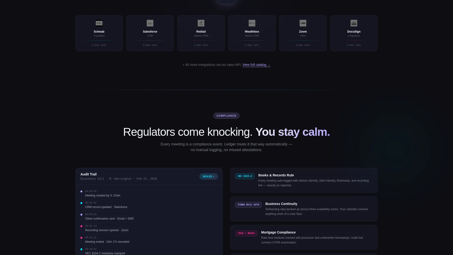
| Integration Logo Bar | Signals trusted connections to recognizable fintech platforms |
| Hero Headline Block | States the core compliance and booking value in one line |
| Browser Calendar Mockup | Shows the product interface with live booking counter |
| Booking Feature Cards | Highlights smart scheduling and self-service portal capabilities |
| Compliance Feature Cards | Communicates logging, recording, and badge-stamping workflows |
| Integration Feature Cards | Shows CRM, pipeline, and client portal sync in card form |
| Floating call to action Pill | Keeps the trial signup prompt visible throughout scrolling |
| Testimonial Card Row | Builds trust with advisor quotes, firm names, and AUM tiers |
Design & branding system
The template uses a Tech Glass visual identity with an AI Iridescent color system. Every color decision creates hierarchy through brightness, not through heavy use of color variation.
- Obsidian base (#0D0D12) for backgrounds, frosted glass panels (#1A1B2E at 60% opacity) for card surfaces, and cool silver (#C5C8D4) for body text
- Iridescent lilac (#B4A0FF) reserved for hover states and active card accents, with white (#F0F1F5) used only for headlines and numerical data
- A cyan-to-magenta gradient (#00E5FF to #FF2D95) applied exclusively to call-to-action buttons and progress indicators, with 1px luminous card borders that shift hue on scroll
Mobile & speed optimization
The card grid layout is modular by design, which means each card scales and reflows independently on smaller screens. The template keeps visual complexity high without adding unnecessary page weight.
- Uniform card sizing ensures consistent reflow across breakpoints without breaking the thematic row grouping
- The floating call to action pill is positioned to remain usable on touch devices without obstructing card content
- Deep background colors and glass-panel overlays use CSS-level styling rather than large image assets
How this template helps you convert
Every layout decision in this template points toward one outcome: getting the visitor to click through to a free trial registration screen. There is no form on this page, which removes friction and keeps the visitor focused.
- The live booking counter ("12,847 meetings scheduled today") and logo bar create immediate social proof before the visitor reads a single feature card
- The escalating card row structure moves the visitor from curiosity to confidence by the time they reach the testimonial row, where the call to action is most persuasive
Other information about this template
This template is designed as a click-through landing page, meaning all calls to action route to a single external trial registration screen. There are no embedded forms, intake fields, or multi-step flows on the page itself.
- The template is part of a financial services software category and suits SaaS products targeting regulated industries
- The ghost-browser mockup in the header is a static interface illustration, not a live product embed
- No lifestyle photography or stock imagery is used; the visual language relies entirely on product user interface representation and typographic hierarchy
Theme
Tech Glass
Creative direction
Feature Matrix
Color system
AI Iridescent
Style
Card Grid (Modular)
Direction
Click-Through
Page Sections
Modular Feature Card Grid
Integration Logo Bar
Live Booking Counter
Compliance Badge Card
Persistent Floating Call to Action Pill
Advisor Testimonial Cards
Related questions
Who is this landing page template best suited for?
Does this template include a signup form?
Can I customize the card content for my specific features?
What makes this template feel credible to financial industry visitors?
Is this template suitable for a product with fewer than six features?



