Ledger - Crystalline Fintech Landing Page Template
Ledger is a fintech consultancy landing page template built on a modular card grid layout with a Tech Glass visual identity. It opens with a live financial calculator above the fold, guides visitors through a Problem-to-Solution card arc, and converts through a freemium signup flow. It is purpose-built for financial services brands that want clarity, confidence, and action from every visitor.
by Rocket studio
Quick summary
Ledger is a single-page fintech landing page template designed for financial consultancies and planning services. It leads with an interactive calculator, walks visitors through a pain-to-clarity narrative, and closes with a two-step freemium signup. The Carbon Fiber color system and frosted glass card surfaces make every number feel intentional and trustworthy.
Who this template is for
This template is built for financial service providers who need to earn trust fast and convert visitors before they bounce. It suits teams who speak in data and want their landing page to do the same.
- Fintech consultancies offering financial planning or forecasting services
- Independent financial advisors and freelance bookkeepers presenting their services online
- Early-stage startups and mid-market finance teams looking to replace legacy spreadsheet workflows
What problem this template solves
Most financial service landing pages describe what they do without ever showing it. Visitors arrive anxious about numbers and leave more confused than when they came. This template replaces that friction with immediate, personal proof.
- Visitors can enter their own numbers before scrolling, making the value instantly tangible
- The Problem-to-Solution card arc addresses real objections in the sequence they arise
- The two-step signup removes commitment barriers by letting visitors self-segment their needs
What you get with this template
You get a fully structured, single-page layout ready to present a financial planning or forecasting service with professional confidence. Every section has a defined purpose, and every interactive element is tied to conversion.
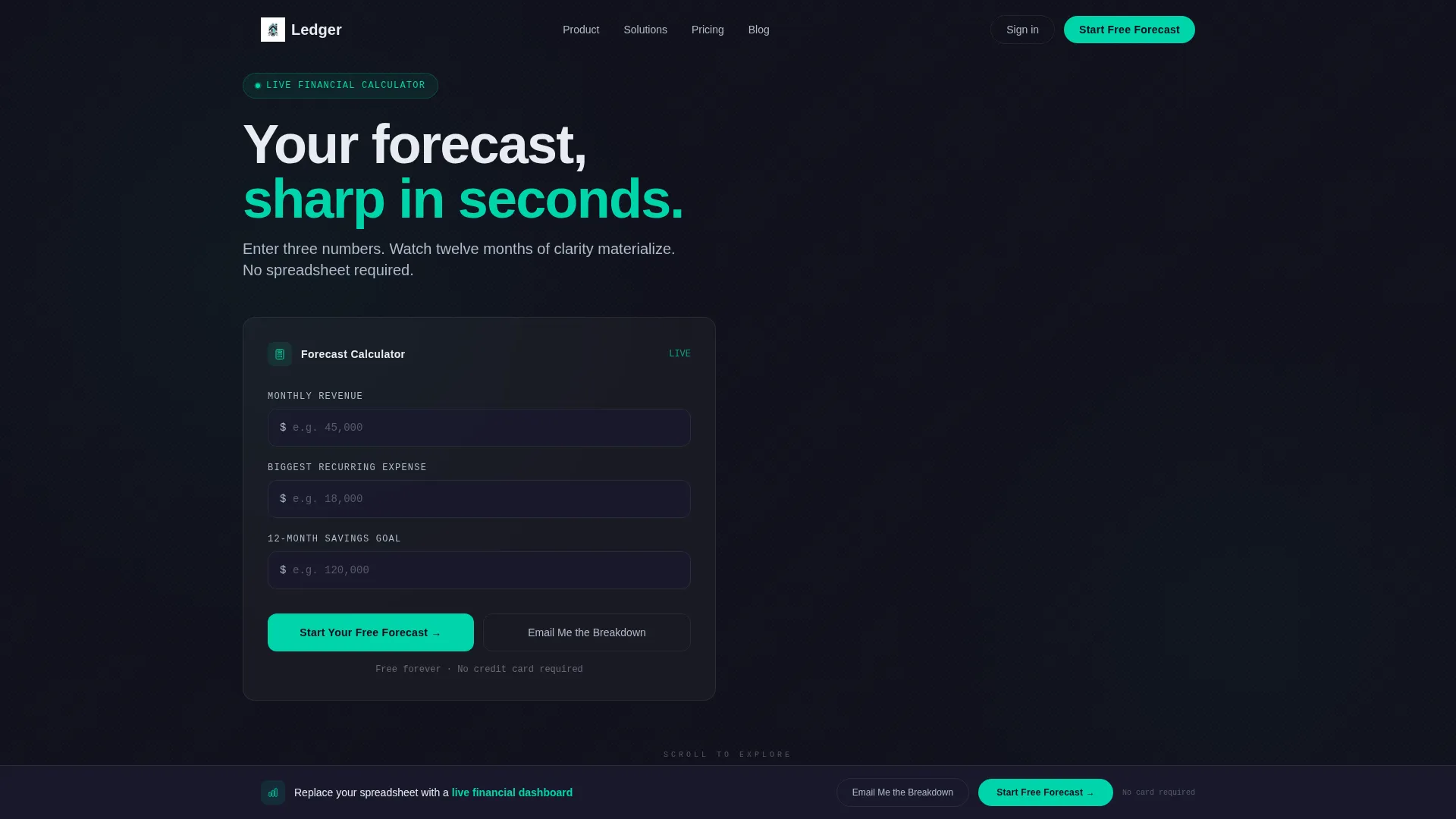
- A live calculator hero with three input fields and an animated results card
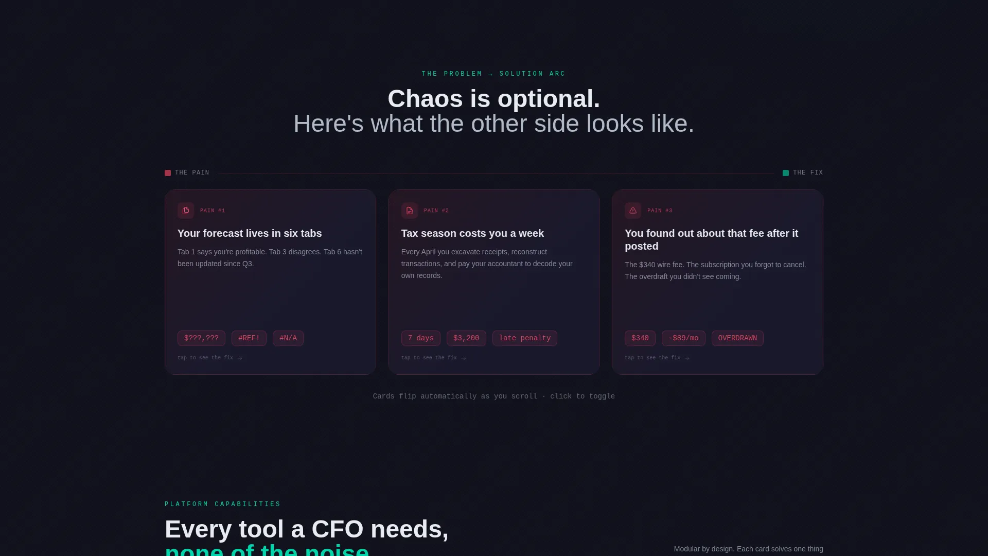
- A modular card grid that flips from pain-point scenarios to solution counterparts as the visitor scrolls
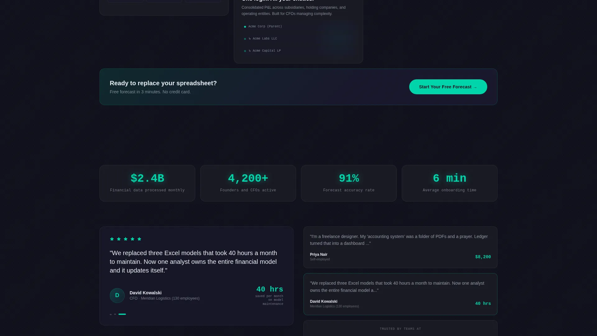
- A floating call-to-action bar, a primary signup flow, and a secondary lead-capture path for soft conversions
Feature list
This template ships with six purpose-built components, each grounded in the source brief and designed to carry visitors from curiosity to commitment.
Live Financial Calculator Header
Three input fields sit above the fold: monthly revenue, biggest recurring expense, and savings goal. As the visitor types, a frosted-glass results card animates into view on the right, projecting twelve-month savings, tax exposure, and runway in real time. Numbers tick upward in electric teal, making the data feel alive.
Problem-to-Solution Card Arc
The first card row presents three dark, slightly glitchy pain-point scenarios. As the visitor scrolls, each card flips to its solution counterpart. The grid escalates from individual frustrations to full financial clarity, building a cumulative case without a single word of generic marketing copy.
Floating Call-to-Action Bar
After the second card row, a persistent bar pins to the viewport and stays visible as the visitor scrolls. It keeps the primary action in reach without interrupting the reading flow. The bar reinforces the offer at the exact moment the narrative peaks.
Two-Step Freemium Signup Flow
Clicking the primary call-to-action opens a two-step form. The first step collects email and company name. The second step presents three toggles, freelancer, startup, or small-to-medium business, that personalize the dashboard preview shown immediately after.
Secondary Lead Capture Path
Visitors who engage the calculator but are not ready to sign up see a second option: "Email Me the Breakdown." This path captures their projected numbers and frames them as a branded output, keeping warm leads inside the funnel without forcing a decision.
Modular Card Grid Layout
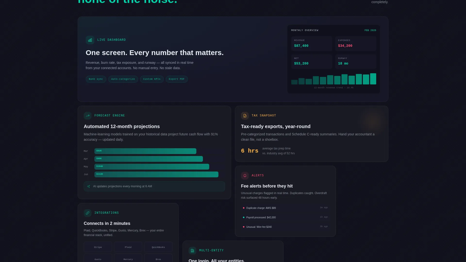
Every content block is self-contained and independently readable. Cards can be scanned in any order, but the designed sequence builds a logical argument. The modular structure makes the layout adaptable to different service offerings without restructuring the page.
Page sections overview
| Section | Purpose |
|---|---|
| Calculator Hero | Engages visitors immediately with personal financial inputs |
| Animated Results Card | Displays live projections for savings, tax, and runway |
| Pain Point Row | Surfaces three relatable financial frustrations |
| Solution Flip Row | Resolves each pain card with a clean counterpart |
| Feature Escalation Grid | Builds from single features to full financial clarity |
| Floating call to action Bar | Keeps the primary action visible after the second card row |
| Two-Step Signup | Collects lead details and personalizes the onboarding preview |
| Secondary Capture Path | Retains calculator-engaged visitors who need more time |
Design & branding system
The visual identity follows a Tech Glass theme layered over a Carbon Fiber color system. Every design decision reinforces precision and control, which is exactly the feeling a financial planning service needs to project.
- Deep graphite (#1A1A2E) and woven carbon black (#0F0F1A) dominate backgrounds, keeping the focus on data
- Frosted glass white (#E8ECF1) sits on card surfaces with a subtle backdrop-blur translucency, separating content layers without borders
- Electric teal (#00D4AA) appears only on interactive states, live-updating numbers, buttons, and toggles, so the eye always knows where to act next
Mobile & speed optimization
The card grid structure and component-level modularity keep this layout well-suited for responsive adaptation across screen sizes. Each section is designed to reflow cleanly without breaking the visual hierarchy.
- Frosted glass cards and teal highlight states retain their visual logic at smaller breakpoints
- The calculator hero and results card are structured to stack vertically on narrow screens without losing the input-to-output relationship
- The floating call-to-action bar is designed for persistent visibility across device heights
How this template helps you convert
The conversion architecture here is deliberate. Every section earns the next click rather than demanding it.
- The live calculator makes the value personal before the visitor reads a single headline, turning abstract service claims into numbers they recognize from their own business.
- The Problem-to-Solution arc removes objections in the exact order they surface for real prospects, so the visitor arrives at the call-to-action already agreeing with the argument.
- The two-step signup and secondary capture path give visitors two clear exits, one for the ready buyer and one for the curious lead, so no engaged visitor leaves empty-handed.
Other information about this template
This template is categorized under Technology and Financial Services, reflecting its positioning at the intersection of fintech product presentation and promotional email design sensibilities. It is built as a card grid layout with a modular structure, making individual sections easy to update or reorder without redesigning the full page.
- The template style is Card Grid (Modular), suited for teams who need flexibility within a fixed visual system
- The creative direction follows a Problem-to-Solution Arc, a proven narrative structure for financial services messaging
- The header concept is a Calculator or Estimator, which replaces passive hero imagery with an active, data-driven first impression
- The landing-page direction is Freemium or Trial, optimized for consultancies offering a no-commitment entry point
- No stock photography or illustration is used anywhere in the layout; the interactive tool and live data carry the visual weight
Theme
Tech Glass
Creative direction
Problem→Solution Arc
Color system
Carbon Fiber
Style
Card Grid (Modular)
Direction
Freemium/Trial
Page Sections
Live Financial Calculator Hero
Problem-to-solution Card Arc
Floating Call-to-action Bar
Two-step Freemium Signup
Secondary Lead Capture Path
Modular Card Grid Layout
Related questions
Who is the Ledger template built for?
Can I change the calculator inputs to match my service?
Does the template include the two-step signup form?
What makes this different from a standard financial services landing page?
Is this template suitable for a promotional email campaign?



