Education Software Directory Website Template
Ledger is a bold brutalist education order management landing page template built for K-12 district procurement teams. It combines a hard-edged monochrome steel visual system with an interactive hub and spoke structure, guiding business managers, curriculum directors, and superintendents from procurement chaos to a single traceable dashboard through four anchor-nav spokes and a frictionless three-field free trial signup.
by Rocket studio
Quick summary
Ledger is a single-page, hub and spoke landing page template designed for school district procurement platforms. It delivers a bold brutalist web design experience built around four interactive anchor-nav spokes: TRACK, APPROVE, RECONCILE, and REPORT. The visual system uses monochrome steel tones with signal-yellow call-to-action elements. The conversion goal is a free district trial signup requiring only three form fields.
Who this template is for
This landing page template is built specifically for B2B EdTech software-as-a-service (SaaS) products serving K-12 school districts. If your platform helps district offices manage purchase orders, vendor invoices, or budget reconciliation, Ledger gives you a landing page structure that speaks directly to your audience's reality. The template is also well suited for any education software team that wants to embrace a distinctive, bold web design identity rather than defaulting to polished, cookie-cutter educational sites.
- District procurement platform teams who need a landing page that earns trust by showing the product working, not simply describing it in marketing copy.
- EdTech founders and product managers who want to create a high-converting SaaS landing page without starting from a blank canvas.
- Education software studios looking to embrace bold brutalist web design principles and stand out from conventional school-software aesthetics in a competitive world of EdTech products.
What problem this template solves
District procurement offices face a specific and painful annual cycle. Every August, business managers juggle hundreds of open purchase orders (POs), curriculum directors chase textbook shipments across multiple warehouses, and superintendents struggle to produce board-level reports that trace every dollar back to an approved line item. The landing pages that exist for most education software feel generic and give no sense of how the product actually works. They describe features without demonstrating them. They ask for trust before they earn it.
Ledger solves a dual problem: the procurement chaos that the platform itself addresses, and the landing page design problem of how to communicate that value clearly and honestly to a skeptical, time-poor audience.
- Generic landing pages fail procurement buyers. District finance officers do not respond to polished marketing copy. They respond to data, clarity, and the immediate sense that a tool will perform under real-world conditions.
- Vague feature descriptions lose high-intent visitors. When a landing page cannot show the product in action, visitors leave. Ledger's interactive spoke structure lets visitors click, explore, and realize the value before they ever reach the signup form.
- Cluttered onboarding forms create friction. Long signup flows with phone numbers and credit card fields protect no one and lose everyone. This template's three-field form strips the process to the minimum needed to start a free district trial.
What you get with this template
Ledger delivers a complete, ready-to-customize hub and spoke landing page. Every section serves a specific purpose in the Problem to Solution arc, and every interactive element is defined in the template brief. You are not buying a vague layout. You are getting a structured, opinionated landing page system that already knows what it wants to accomplish and how it plans to accomplish it.
- A five-section hub and spoke page structure with a pinned vertical anchor navigation system labeled in blocky uppercase: TRACK, APPROVE, RECONCILE, and REPORT, plus the hero header section.
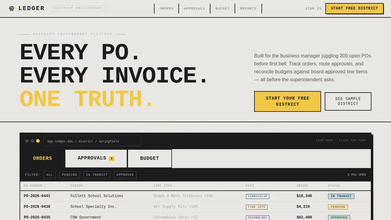
- An interactive Feature Tab Switcher header with three brutalist concrete-slab tabs labeled Orders, Approvals, and Budget, each displaying a distinct product mockup with hard-cut tab switching and no easing or fade animations.
- A freemium conversion system including a signal-yellow primary call-to-action button reading "Start Your Free District," a three-field signup form, a persistent bottom conversion bar after the second spoke, and a secondary "See a Sample District" sandbox path.
Feature list
This landing page template includes a set of purpose-built components. Each one is grounded in the template brief and designed to support the procurement platform's conversion goals. The description below covers every major functional element included in the template.
Interactive Feature Tab Switcher Header
The header is built around three brutalist concrete-slab tabs: Orders, Approvals, and Budget. Each tab slams into view with a hard cut, no easing, no fade. The Orders tab displays a filterable purchase order queue with vendor names and delivery statuses. The Approvals tab reveals a stack of pending sign-offs with one-click approve and deny stamps. The Budget tab shows a real-time burn-down chart with fund codes color-mapped to departments. This is a living product mockup that visitors can interact with from the first moment they land on the page.
Hub and Spoke Anchor Navigation System
A vertical anchor navigation rail pins to the left side of the page throughout the scroll. Each label is set in blocky uppercase lettering: TRACK, APPROVE, RECONCILE, REPORT. Clicking any label does not smooth-scroll but snaps hard to the corresponding section. This behavior is intentional. It reinforces the brutalist web design ethos and gives the landing page the feel of a well-organized filing system, where every tab is labeled and every drawer slides shut with a satisfying click.
Problem to Solution Arc Spoke Sequence
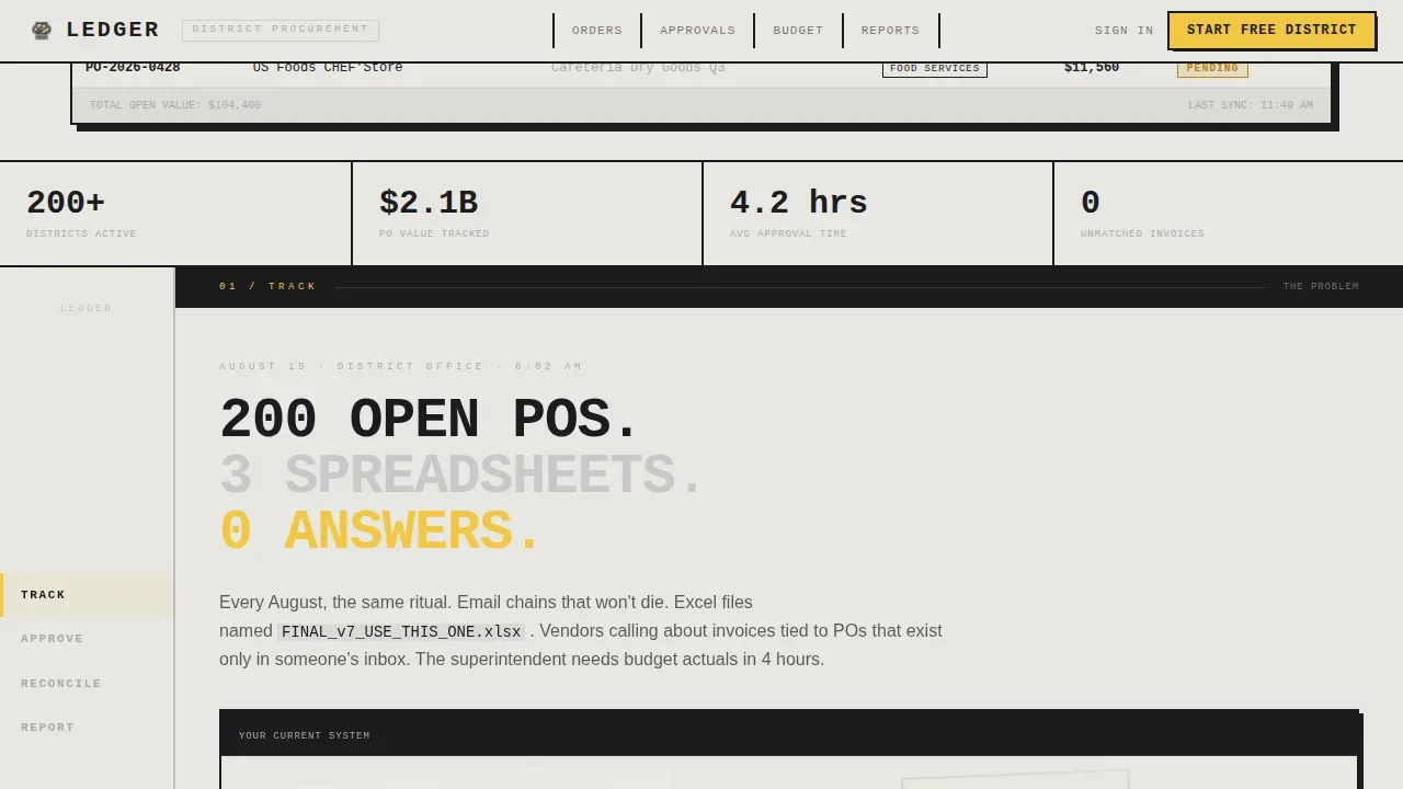
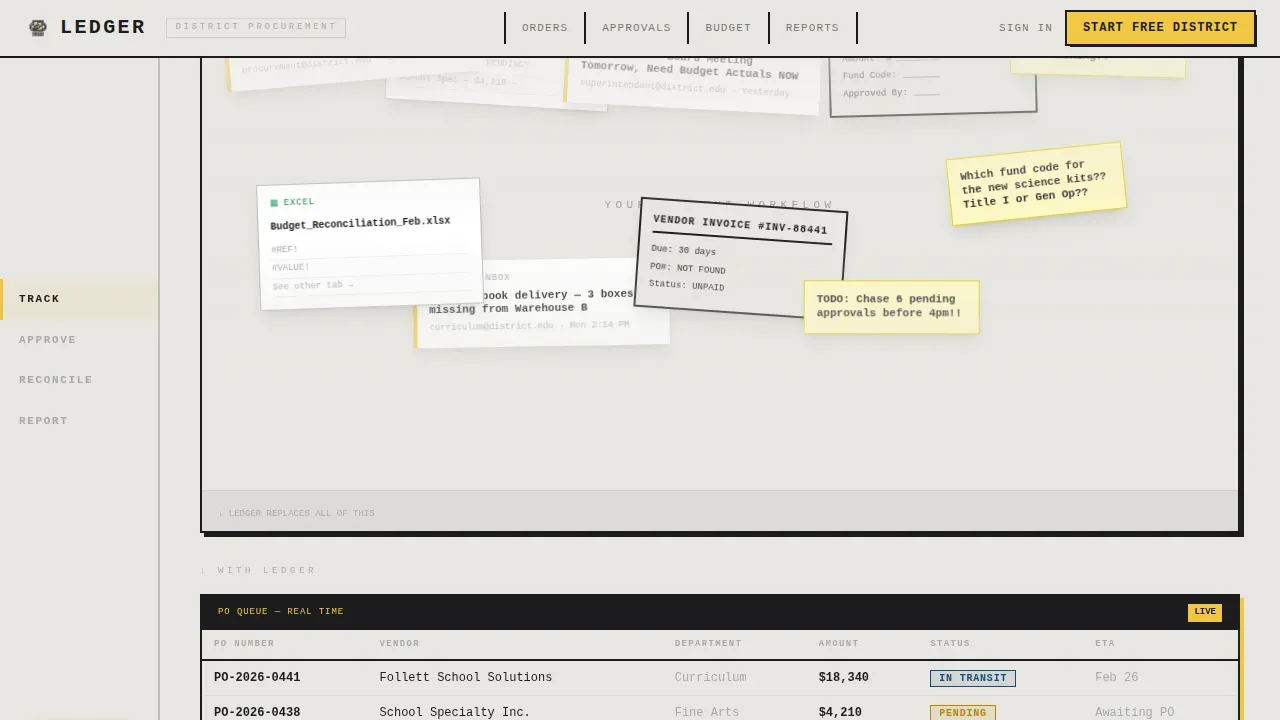
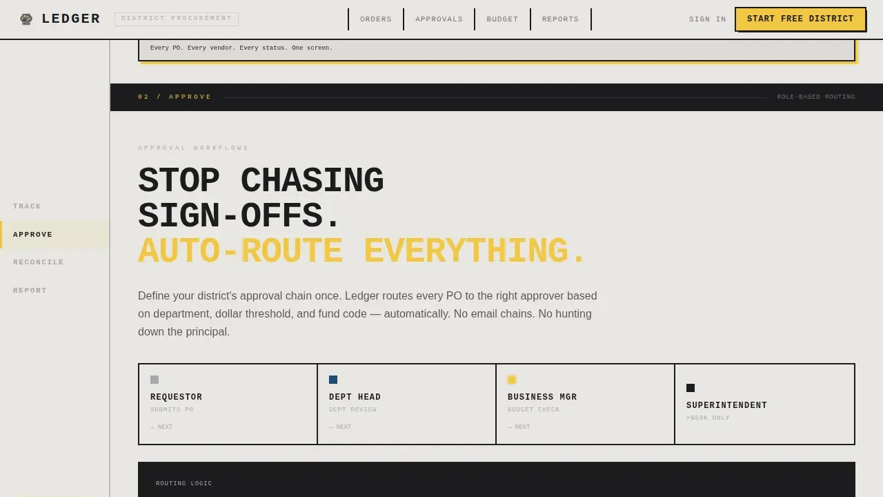
The page's four main spokes form a visual narrative. The first spoke presents a deliberate problem wall: overlapping paper forms, email threads, and spreadsheet fragments that crowd the viewport. Each subsequent spoke strips one layer of chaos away. Spoke two collapses vendor communication into a unified thread. Spoke three displays role-based approval routing with one-click workflow stamps. Spoke four reconciles budgets against actuals in real time. By the final spoke, the screen is clean, sparse, and honest. This arc is the core storytelling engine of the landing page.
Freemium Conversion System with Sandbox Path
The primary call-to-action button, "Start Your Free District," appears in signal-yellow against charcoal inside the header mockup and again as a persistent bottom bar after the second spoke. The signup form asks only for district name, role selection from a dropdown, and work email. No credit card. No phone number. A secondary path labeled "See a Sample District" drops visitors into a read-only sandbox pre-loaded with dummy POs, fake vendors, and a mid-year budget so they can click before they commit.
Social Proof Integration Points
The template includes dedicated placement for district-specific metrics, business manager testimonials, and superintendent quotes. Key trust signals in brutalist web design include immediate metrics presented in a raw format, and this template embraces that principle. Rather than hiding performance data behind polished graphics, the social proof blocks display numbers directly, in the manner of a raw ledger entry, so visitors can make an informed decision about whether to sign up.
Monochrome Steel Design System
The visual system uses four defined values: structural charcoal (#1C1C1E), cold-rolled silver (#A8A9AD), exposed concrete off-white (#E8E6E1), and signal yellow (#F2C744). Signal yellow is reserved exclusively for call-to-action elements, active states, and notification badges. Typography is set in JetBrains Mono for headlines, which creates the stamped-metal aesthetic, and DM Sans for body copy. Every typographic choice reinforces the idea that this is a platform built for people who need answers, not aesthetics.
Page sections overview
| Section | Purpose |
|---|---|
| Hero Tab Switcher | Displays the Orders, Approvals, and Budget product mockup tabs with the primary call-to-action button |
| TRACK Spoke | Shows the problem wall of forms and emails collapsing into a unified purchase order queue |
| APPROVE Spoke | Demonstrates role-based approval routing with one-click stamp workflow |
| RECONCILE Spoke | Presents real-time budget burn-down against board-approved fund code line items |
| REPORT Spoke | Delivers the clean single dashboard endpoint with the persistent three-field signup conversion bar |
| Minimal Footer | Provides a single-row footer with copyright left and links centered, no visual clutter |
Design & branding system
The Ledger template follows a bold brutalist web design philosophy that prioritizes raw functionality over decorative finish. Brutalist web design is characterized by strong, contrasting colors and bold typography. It rejects polished aesthetics in favor of direct, honest presentation. For district procurement buyers, this is not a liability. It is a strength. Younger audiences and forward-thinking procurement officers often perceive high-finish glossy sites as hiding less-than-stellar services. The raw, honest look of brutalism signals transparency. This landing page's visual identity is built to stand out from conventional educational software pages in every dimension of web design decision-making.
- Color system: Structural charcoal (#1C1C1E) forms the base, exposed concrete off-white (#E8E6E1) provides contrast, cold-rolled silver (#A8A9AD) handles secondary labels and borders, and signal yellow (#F2C744) is used exclusively for call-to-action elements and active states.
- Typography: JetBrains Mono handles all headline lettering in an oversized, monospaced style that feels stamped onto sheet metal. DM Sans handles all body copy for readability without breaking the industrial tone.
- Animation and interaction: Tab switching uses a hard-cut with no easing or fade. Anchor navigation snaps rather than smooth-scrolls. Intersection Observer reveals animate sections into view as the visitor scrolls through each spoke.
Mobile & speed optimization
The Ledger template is designed desktop-first, reflecting the reality that district business managers and finance officers work primarily at desktop machines in district offices. The layout adapts responsively to tablet viewports, ensuring that curriculum directors and other secondary users who access the landing page on a tablet can still navigate the anchor rail, interact with the tab switcher, and reach the signup form without friction.
Brutalist order management landing pages achieve faster loading speeds due to being light on CSS and heavy, high-resolution image assets. The Ledger template embraces this principle by design. The hard-cut tab switching, snap-scroll behavior, and Intersection Observer section reveals are implemented without heavy animation libraries, keeping the page lean and responsive.
- Desktop-first layout optimized for district office workers on standard desktop monitors, with full anchor navigation, interactive mockups, and the persistent bottom conversion bar visible at typical screen widths.
- Tablet-responsive adaptation ensures the anchor nav, feature tabs, and three-field signup form remain functional and readable on tablet devices used by curriculum directors and administrators.
How this template helps you convert
A brutalist approach can lead to dramatically increased conversion rates by removing distractions and focusing visitors on form completion. Ledger is designed to do exactly that. The landing page earns trust through product demonstration, not through promotional language. By the time a visitor reaches the bottom call-to-action, they have already interacted with the Orders tab, clicked through the Approvals workflow, and watched the budget burn-down chart update in the RECONCILE spoke. The conversion is a natural conclusion to a journey that already began.
Effective SaaS landing pages often include testimonials or case studies to build trust with potential customers, and Ledger includes social proof placement for district metrics and superintendent quotes. A strong call-to-action is essential on a SaaS landing page, and this template delivers two: a persistent bottom bar and the header call-to-action, both in signal yellow against charcoal so they are impossible to miss.
- The interactive product experience converts passive visitors into active users. Every tab is clickable, every spoke is interactive, and the sandbox path lets visitors explore a pre-loaded sample district before they sign up. By the time they reach the form, they have already used the tool and understand its value.
- The three-field signup form eliminates the friction that kills conversion. District name, role dropdown, and work email. No credit card. No phone number. The form is the simplest possible path to starting a free district trial, and its brevity signals respect for the visitor's time.
Other information about this template
Ledger represents a specific design philosophy in the world of web design. It does not try to be everything. It does not embrace soft gradients, rounded cards, or animation that eases into view like a slow breath. It is a landing page built for people whose lives depend on things being in order, and it looks exactly like that. The landing page structure follows the Hub and Spoke with Anchor Navigation template style, which is one of the more demanding formats in web design because every spoke must earn its place in the narrative arc. Ledger does this through the Problem to Solution arc creative direction, where each section strips away one more layer of procurement disorder until the final dashboard is clean and silent.
From a web design production standpoint, the template uses a defined technical stack. Server Components handle static sections for performance, and Client Components manage the interactive tabs, sandbox call-to-action path, and persistent bottom conversion bar. This split architecture allows the landing page to perform well under real-world conditions without compromising the high interactivity that makes the template distinctive.
The ledger bold brutalist education order management landing page template is a product category unto itself. There is no such thing as a generic brutalist EdTech page that performs this specific function out of the box. Most education software landing pages default to approachable pastels and friendly rounded type. Ledger deliberately breaks from those habits. It treats the audience, district procurement professionals, as people who respect directness, trust data, and have no patience for landing pages that talk around the product instead of showing it.
- Design style: Bold Brutalist, following web design principles that prioritize function over form and embrace high-contrast, monochrome aesthetics with a single accent color.
- Template style: Hub and Spoke with Anchor Navigation, a web design structure suited to platforms with multiple distinct use cases that must each earn attention within a single landing page.
- Creative direction: Problem to Solution Arc, a narrative web design approach that begins with the pain and ends with the answer, stripping away disorder one spoke at a time.
- Header concept: Feature Tab Switcher, a web design pattern that puts the product's core modes, Orders, Approvals, and Budget, directly into the hero section as interactive mockups rather than static screenshots.
- Conversion direction: Freemium and Trial, a web design conversion model that lowers the risk of signing up by removing payment requirements and offering a pre-loaded sandbox as a secondary discovery path.
- Localization: English, United States dollar (USD) currency, and United States date format (MM/DD/YYYY) throughout all displayed data fields and mockup content.
- Footer pattern: A minimal single-row footer with copyright information on the left and navigation links centered, following a developer-minimal web design convention that keeps the bottom of the landing page clean and uncluttered.
- Social proof approach: District-specific metrics, business manager testimonials, and superintendent quotes are embedded at defined points in the landing page structure, presented in the raw, direct manner consistent with brutalist web design trust-signal conventions.
- Audience scope: Primary users are Business Managers and District Finance Officers managing two hundred or more open purchase orders. Secondary users include Curriculum Directors tracking textbook shipments and Superintendents who need board-level reporting from a single dashboard.
- No-code and low-code compatibility: The template structure is designed to support teams who want to create and launch a procurement platform landing page quickly. AI-powered no-code tools and platforms enable non-technical users to build and deploy production-ready pages and websites from natural-language prompts, and Ledger's clearly defined component structure makes it well suited to that kind of build process.
Theme
Bold Brutalist
Creative direction
Problem→Solution Arc
Color system
Monochrome Steel
Style
Hub & Spoke (Anchor Nav)
Direction
Freemium/Trial
Page Sections
Interactive Feature Tab Switcher
Hub and Spoke Anchor Navigation
Problem to Solution Arc Structure
Freemium Conversion System
Social Proof Placement Blocks
Monochrome Steel Visual System
Related questions
Who is the Ledger template designed for?
Can I customize the color system and typography?
Does the template include the interactive sandbox conversion path?
Is this template suitable for education software outside of procurement?
How many sections does the Ledger landing page include?



