Accounting Flashcard App Landing Page Template
Ledger is a Hub and Spoke (Anchor Nav) landing page template built for an accounting flashcard and review app. It opens with a five-question diagnostic quiz, then rebuilds the page around each visitor's weakest topics. The Playful Geometric design, Dopamine Pop color system, and interactive flashcard carousels make studying feel energizing rather than overwhelming.
by Rocket studio
Quick summary
Ledger is a single-page, anchor-nav landing page template designed for an accounting flashcard and review app. A diagnostic mini-quiz personalizes the entire scroll experience for each visitor. Bright geometric visuals, flippable flashcard carousels, and a frictionless free sign-up flow make this template feel less like marketing and more like the product itself.
Who this template is for
This template is built for teams or founders launching an accounting study and review app. It works best when your core product is flashcard-based learning tied to accounting exams or coursework.
- Accounting flashcard app creators targeting college students and exam candidates
- CPA and CMA (Certified Management Accountant) review course builders who want a freemium funnel
- EdTech product teams who need a quiz-driven, personalized landing page out of the box
What problem this template solves
Generic study-app landing pages look the same to every visitor. They cannot adapt to what the visitor actually needs, so engagement drops before the sign-up form even appears. Ledger fixes this by making the page feel personally relevant from the first click.
- Visitors have no quick way to discover which accounting topics they need to focus on
- Static pages cannot show a study app's interactivity, so visitors leave before they feel the product
- Long sign-up forms add friction that kills freemium conversions before they start
What you get with this template
You get a complete, ready-to-customize Hub and Spoke landing page with a personalized quiz flow at its center. Every section below the quiz is designed to feel like a continuation of the product experience, not a sales pitch.
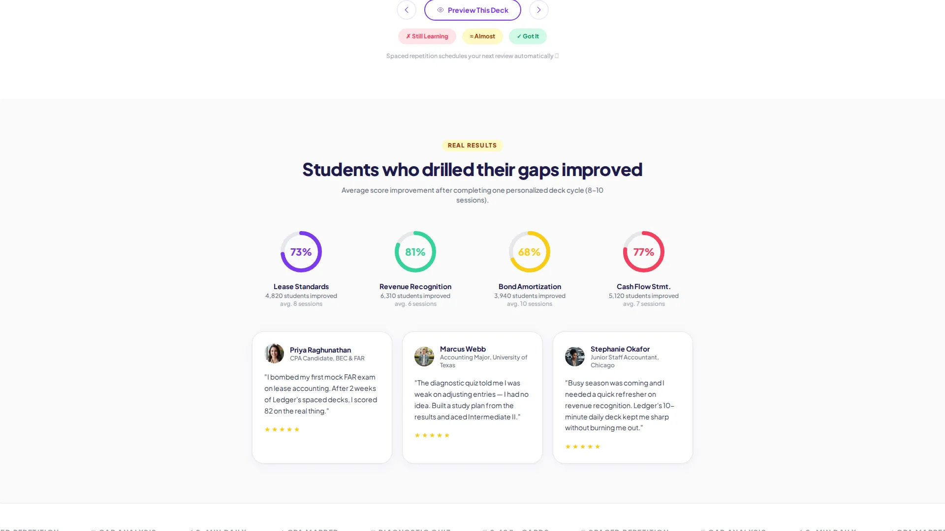
- A five-question diagnostic mini-quiz covering revenue recognition, adjusting entries, cash flow classification, bond amortization, and lease accounting
- Personalized anchor navigation that populates based on quiz results, pointing visitors to their weakest and strongest topics
- Flippable flashcard carousels, animated progress rings, and short looping screen-recording sections built into each spoke
Feature list
This template delivers a focused set of interactive and visual components grounded in the source brief. Each feature works together to move a first-time visitor from curiosity to sign-up.
Diagnostic Mini-Quiz Engine
A five-question multiple-choice quiz launches directly from the hero headline. Each answer triggers an instant color flash, mint for correct, coral for missed, plus a micro-animation of geometric shapes rearranging. The quiz creates a personalized entry point for every visitor.
Personalized Anchor Navigation
After the quiz, the anchor nav rebuilds itself around the visitor's results. Labels like "Your Gap: Lease Standards" or "Recommended Deck: Intermediate II Final" replace generic menu items. This makes each scroll-through feel curated rather than templated.
Interactive Flashcard Carousels
Each spoke section includes a sample flashcard carousel visitors can actually flip without signing up. A secondary call-to-action (call to action) button, "Preview This Deck," lets visitors enter a five-card demo instantly. This captures engagement before asking for any commitment.
Freemium Sign-Up Flow
The primary call to action, "Start Reviewing Free," appears first at the quiz results summary and repeats as a sticky bottom bar on mobile. Sign-up requires only an email address and one dropdown to select a current goal: College Exam, CPA, CMA, or Refresher.
Animated Progress Rings
Each spoke section includes animated progress rings showing how other users improved in that specific topic. These rings add social proof without requiring a written testimonial block. They reinforce that the app produces measurable results.
Logo Bar Header
A slim header displays the Ledger wordmark alongside a horizontal scroll of grayscale logos from accounting programs and review providers. This builds immediate credibility with visitors who recognize familiar names in the accounting education space.
Page sections overview
| Section | Purpose |
|---|---|
| Logo Bar Header | Establishes brand credibility with program logo scroll |
| Hero Headline Quiz | Launches the five-question diagnostic mini-quiz |
| Quiz Results Summary | Displays personalized topic gaps and first call to action |
| Personalized Anchor Nav | Populates spoke links based on quiz results |
| Topic Spoke: Gaps | Targets visitor's weakest identified topic areas |
| Topic Spoke: Strengths | Highlights confirmed strong topics with sample decks |
| Recommended Deck Spoke | Surfaces the most relevant flashcard deck for visitor |
| Flashcard Carousels | Lets visitors flip sample cards before signing up |
| Progress Rings Section | Shows peer improvement data per topic area |
| Screen Recording Loops | Demonstrates spaced-repetition timer in context |
| Sticky Mobile call to action Bar | Keeps "Start Reviewing Free" always visible on mobile |
Design & branding system
The visual identity follows a Playful Geometric theme with a Dopamine Pop color system. Colors are bold and purposeful, each assigned a specific functional role across the interface.
- Electric violet (#7C3AED) anchors the primary brand; serotonin yellow (#FACC15) marks highlights and progress indicators; mint punch (#34D399) signals correct answers; hot coral (#F43F5E) flags missed answers; chalk white (#FAFAFA) keeps backgrounds clean and open
- Typography uses a rounded geometric sans-serif set in oversized weights for headlines, keeping the page energetic without feeling chaotic
- Floating geometric shapes (triangles, circles, and hexagons) drift subtly behind text, reinforcing the Playful Geometric theme without distracting from content
Mobile & speed optimization
The template is designed with mobile study sessions firmly in mind. The sticky call to action bar and swipeable carousels reflect how accounting students actually interact with review tools on the go.
- The sticky bottom bar on mobile keeps "Start Reviewing Free" visible throughout the entire scroll without interrupting content
- Flashcard carousels are built for swipe interaction, matching the natural gesture pattern of a mobile study session
- The five-question quiz is designed for quick multiple-choice taps, making it fast to complete between lectures or during a commute
How this template helps you convert
The conversion path in this template is layered and low-pressure. It earns commitment gradually rather than demanding it upfront.
- The diagnostic quiz creates productive anxiety by showing visitors exactly which accounting topics need work, making the free tier feel like a solution rather than a sales ask.
- The "Preview This Deck" button on every carousel lets visitors experience the product before providing their email, reducing resistance at the sign-up step.
- The sticky mobile call to action bar and repeated "Start Reviewing Free" placement keep the primary action visible at every point in the scroll without feeling pushy.
Other information about this template
This template sits at the intersection of accounting education and interactive EdTech landing page design. It is particularly well suited for teams building tools that compete in the accounting exam prep and continuing professional education space.
- The template style is Hub and Spoke with Anchor Navigation, meaning each spoke section is a self-contained content block linked from a central nav
- The creative direction is Quiz and Personalize, a pattern proven to increase engagement by making visitors feel the page was built for them
- The Freemium and Trial landing page direction means the template is optimized for low-barrier sign-ups, not direct purchase funnels
- This template can support positioning for accounting review tools aimed at students studying for the Uniform CPA Examination or similar professional credentials


Theme
Playful Geometric
Creative direction
Quiz & Personalize
Color system
Dopamine Pop
Style
Hub & Spoke (Anchor Nav)
Direction
Freemium/Trial
Page Sections
Diagnostic Mini-quiz Engine
Personalized Anchor Navigation
Interactive Flashcard Carousels
Freemium Sign-up Flow
Animated Progress Rings
Logo Bar with Program Scroll
Related questions
Can visitors use the flashcard carousels without creating an account?
What accounting topics does the diagnostic quiz cover?
How does the anchor navigation work after the quiz?
What information does the free sign-up form collect?
Is this template suited for a product targeting both students and working professionals?


