Ledger - Dynamic Financial Landing Page Template
Ledger is a bento grid financial services landing page built around radical transparency. A live calculator header, animated comparison modules, and a persistent shortlist bar give visitors a full picture of their financial options before any form appears. The page earns its conversion by showing users their own numbers first, then gating a personalized comparison report behind just two fields.
by Rocket studio
Quick summary
Ledger is a single-page financial services landing page that puts every fee, rate, and fund option in plain view. The bento grid layout delivers interactive comparison modules, a real-time loan calculator, and a persistent shortlist bar. Visitors build their own data picture as they scroll, arriving at the call to action with a report that already feels personally built.
Who this template is for
This template is designed for financial services businesses that compete on clarity rather than obfuscation. It works best when the product itself is the most persuasive thing on the page.
- Mid-career professionals comparing refinancing options or mortgage rates on a tight schedule
- Small business owners evaluating merchant cash advances against small business loan products
- Financial advisors and wealth management firms presenting structured product comparisons to new or inherited-wealth clients
What problem this template solves
Most financial landing pages bury the numbers. Fine print lives three clicks deep, comparison tables are static, and visitors leave before they trust the product. Ledger solves the credibility gap by making the data interactive and personal.
- Visitors often abandon pages when fees and rates require manual research elsewhere
- Static product pages give no sense of how options compare in a real scenario
- Forms that appear before value is demonstrated produce low conversion rates in financial services contexts
What you get with this template
You get a fully structured bento grid landing page organized around live data interaction. Every cell in the grid is a discrete comparison or calculator module, and the layout guides visitors from personal inputs through product matchups to a gated report.
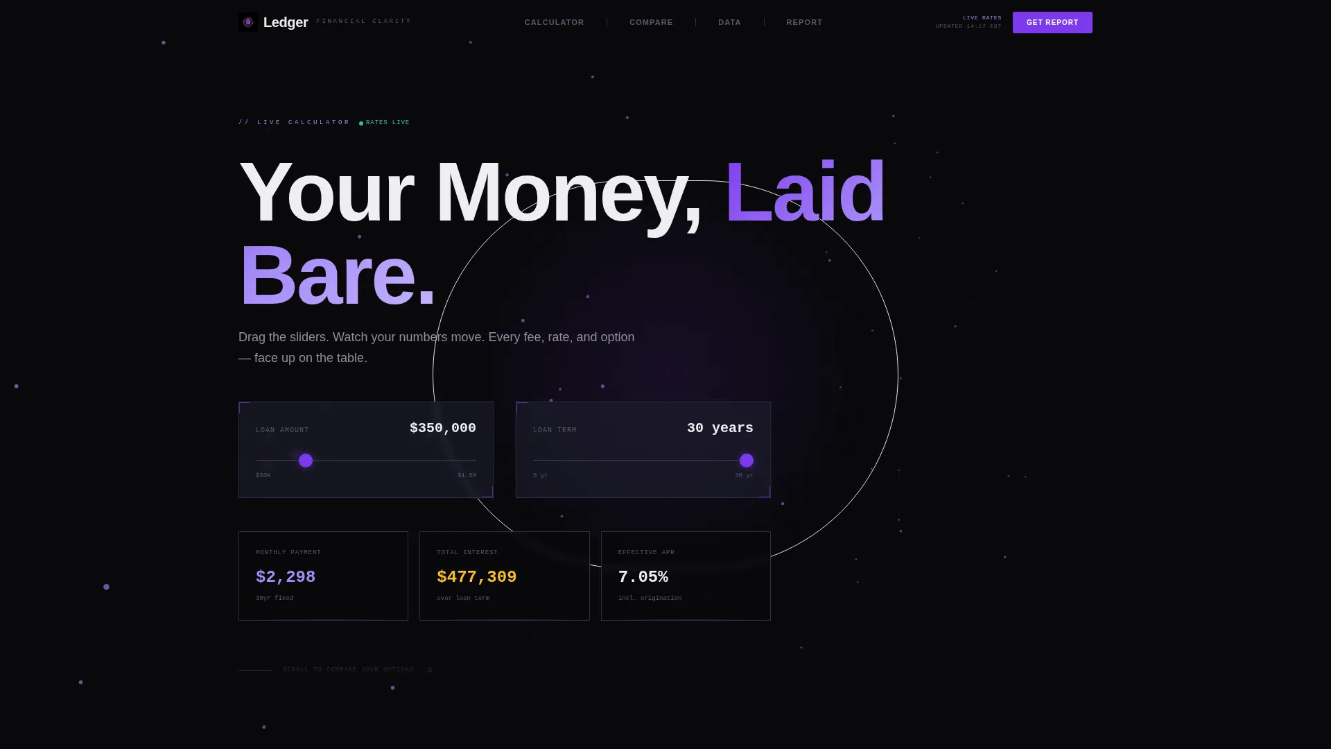
- A live calculator header with two interactive sliders and three animated output tiles
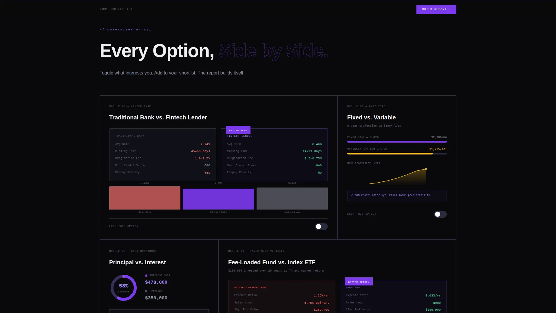
- Animated bento cells covering bank versus fintech, fixed versus variable, and fund versus index comparisons
- A persistent bottom bar that accumulates toggled selections and anchors the primary call to action
Feature list
The following features are built into the Ledger template as described in the source brief.
Real-Time Loan Calculator Header
Two input sliders float over a slowly rotating three-dimensional mesh of interconnected nodes. As the visitor adjusts loan amount or term length, the mesh responds visually and three output tiles update live: monthly payment, total interest, and effective annual percentage rate. The numbers animate like an exchange board ticker.
Animated Bento Grid Comparison Cells
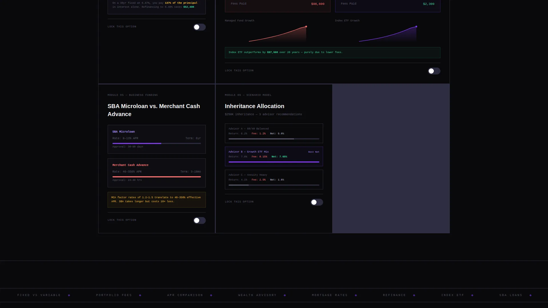
Each bento cell presents a discrete financial comparison module. Options include traditional bank versus fintech lender, fixed versus variable rate, and fee-loaded fund versus index exchange-traded fund. Data visualizations animate into frame as each cell enters the viewport, with bar charts racing, pie slices separating, and line graphs drawing themselves in sequence.
"Lock This Option" Shortlist Toggle
Every comparison module includes a toggle that adds the selected option to a persistent bottom bar. Visitors build a personalized shortlist as they scroll. By the time they reach the call to action, their selections are already accumulated and visible, making the next step feel natural rather than pressured.
Gated Comparison Report call to action
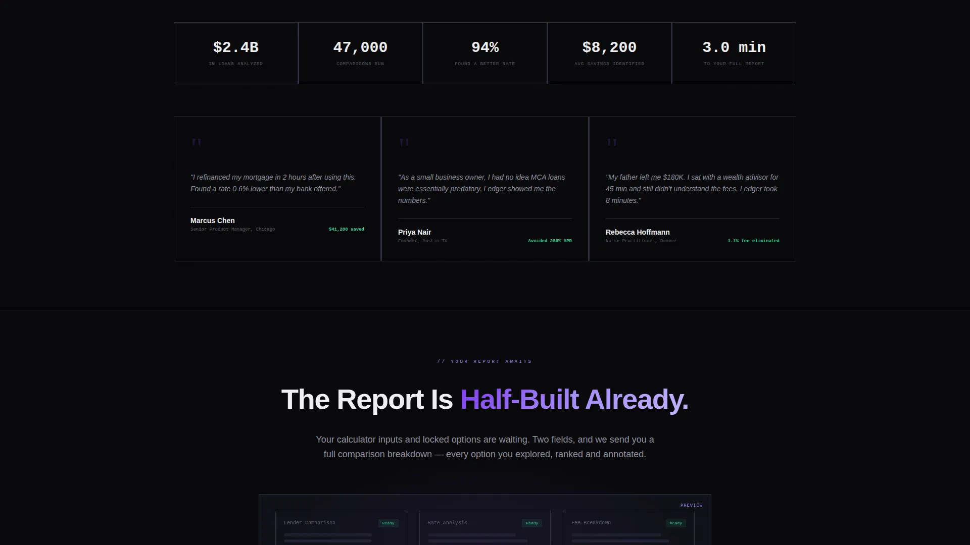
The primary call to action reads "See Your Full Comparison Report" and is gated behind just two input fields: an email address and a phone number. A secondary path lets visitors download a branded portable document format version of their comparison without booking a call. The gate appears after the visitor has already seen their own data, not before.
Viewport-Triggered Data Animations
Data visualizations do not load all at once. Each chart or graph animates into view only when its bento cell enters the viewport. This cadence mirrors the pacing of a research report, escalating from simple product matchups to portfolio-level scenario modeling as the visitor scrolls deeper.
Dynamic Motion Visual System
The Void and Violet color palette drives all motion states. Electric violet pulses on hover, animates along progress bars, and highlights the winning column in every comparison table. Graphite tones separate each bento cell like mullions on a high-rise window, keeping the layout structured without feeling static.
Page sections overview
| Section | Purpose |
|---|---|
| Calculator Header | Live loan estimator with sliders and animated output tiles |
| Bank versus. Fintech Cell | Side-by-side lender comparison with animated bar chart |
| Fixed versus. Variable Cell | Rate-type comparison with animated line graph |
| Fund versus. ETF Cell | Cost comparison module with animated pie chart |
| Scenario Modeling Cell | Portfolio-level projection and comparison module |
| Persistent Shortlist Bar | Accumulated toggled selections anchoring the primary call to action |
| Report Gate Section | Two-field form gating the personalized comparison report |
| PDF Download Path | Secondary call to action for branded report without a sales call |
Design & branding system
The visual identity follows a Dynamic Motion theme built on the Void and Violet color system. The palette is purpose-built for financial data: high contrast, low distraction, and structured enough to let numbers carry the message.
- Core palette: absolute void black (#09090B), electric violet (#7C3AED), muted graphite (#1E1E2E), and phosphor white (#EEEEF0)
- Violet is the active color: it pulses on hover states, runs along progress bar fills, and marks the preferred column in comparison tables
- Graphite acts as a structural separator between bento cells, mimicking the mullions of a commercial tower window at night
Mobile & speed optimization
The bento grid layout is designed to reflow cleanly across screen sizes. Each cell is a self-contained module, which makes responsive stacking straightforward without losing the comparison logic.
- Slider inputs and animated output tiles are built for touch interaction on smaller screens
- Viewport-triggered animations fire per cell, so each module loads its visual only when needed rather than all at once
- The persistent shortlist bar remains accessible as a fixed element during scroll on both desktop and mobile viewports
How this template helps you convert
Ledger is built around a single conversion principle: show visitors their own data before asking for anything. By the time the gate appears, the report already feels half-built and too valuable to leave behind.
- The calculator at the top of the page gives visitors a personalized number immediately, anchoring them to the page with their own scenario before any product is introduced.
- The "Lock This Option" toggles let visitors invest in their shortlist as they scroll, creating a sense of ownership that increases the perceived value of the final report.
- The two-field gate and the no-call PDF download path remove friction at the moment of conversion, giving hesitant visitors a lower-commitment way to still receive value.
Other information about this template
Ledger is part of a focused set of financial services digital presence templates designed for comparison-led conversion flows. It suits any context where the product selection process benefits from side-by-side data presentation.
- The template style is bento grid, which means each comparison module is visually isolated and can be reordered to match your specific product lineup
- The creative direction follows an industry report cadence, moving the visitor from simple matchups at the top to complex scenario modeling deeper in the page
- The header concept is a calculator and estimator combined, making it one of the more interactive entry points available in financial services landing page design
- The template is suitable for mortgage refinancing services, small business lending platforms, investment product comparison tools, and wealth advisory firms introducing new clients to their product range
Theme
Dynamic Motion
Creative direction
Industry Report
Color system
Void & Violet
Style
Bento Grid
Direction
Comparison/Versus
Page Sections
Real-time Loan Calculator Header
Animated Bento Grid Comparison Cells
Lock This Option Shortlist Toggle
Two-field Gated Report Call to Action
Viewport-triggered Data Animations
Dynamic Motion Visual System
Related questions
Can I change the financial products shown in the comparison cells?
Does the calculator require a backend connection to work?
What does the Lock This Option toggle actually do?
Is the PDF download path included in the template?
Who is this template best suited for?



