Encrypted Privacy-First CRM Landing Page Template
Ledger is a privacy-first CRM landing page template built for teams that cannot afford data leaks. It uses a modular card grid layout, a stats-first visual rhythm, and a dark encrypted-teal palette to help SaaS companies, healthcare startups, and agencies present their secure contact management offering with confidence and clarity.
by Rocket studio
Quick summary
Ledger is a single-page CRM landing page template designed for privacy-first software products. It opens with an animated code snippet, moves through evidence-led stat cards, and closes with a head-to-head comparison grid. The layout communicates security, speed, and compliance at a glance, built for teams selling to buyers who take data protection seriously.
Who this template is for
This template is built for founders, product marketers, and CTOs who need to communicate a privacy-first CRM offering to skeptical, detail-oriented buyers. It speaks directly to audiences that live inside compliance workflows every day.
- General Data Protection Regulation (GDPR) officers at mid-market SaaS companies who need audit-ready proof, not promises
- CTOs at healthcare startups who require HIPAA-grade contact management without enterprise-level pricing
- Agency founders who have committed to data privacy on behalf of their clients and need software that backs that promise
What problem this template solves
Most CRM marketing pages bury the technical detail buyers actually need. Privacy-conscious buyers arrive with specific questions about encryption, data residency, and third-party subprocessors. Generic templates cannot answer those questions fast enough to hold attention.
- Visitors leave before they find the compliance evidence they came for
- Feature grids obscure the critical differences between privacy-first tools and conventional CRM platforms
- Technical buyers have no clear path to evaluate the product before speaking to sales
What you get with this template
You get a fully structured, modular landing page that leads with data and closes with action. Every section is purpose-built to move a cautious, research-heavy buyer toward a decision.
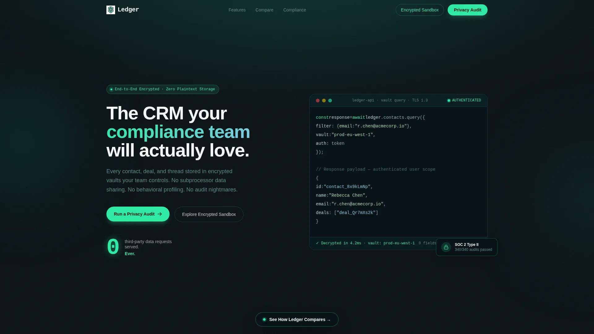
- An animated code snippet header that visually demonstrates encrypted API responses and access control
- A scrolling card grid where each modular card leads with an oversized stat and flips to reveal methodology or a mini case study
- A sticky comparison bar and a feature-by-feature grid for direct product comparisons
- A primary lead capture form tied to a personalized privacy audit report and a secondary sandbox entry path for technical evaluators
Feature list
This section describes the key interactive and structural components built into the Ledger template.
Animated Code Snippet Header
The header opens with a syntax-highlighted API call block. Characters type themselves left to right, encrypted hashes resolve into readable names, and a small lock icon pulses green. A single stat fades in below: "0 third-party data requests served. Ever." rendered in 72-pixel signal green on terminal black.
Stats-First Modular Card Grid
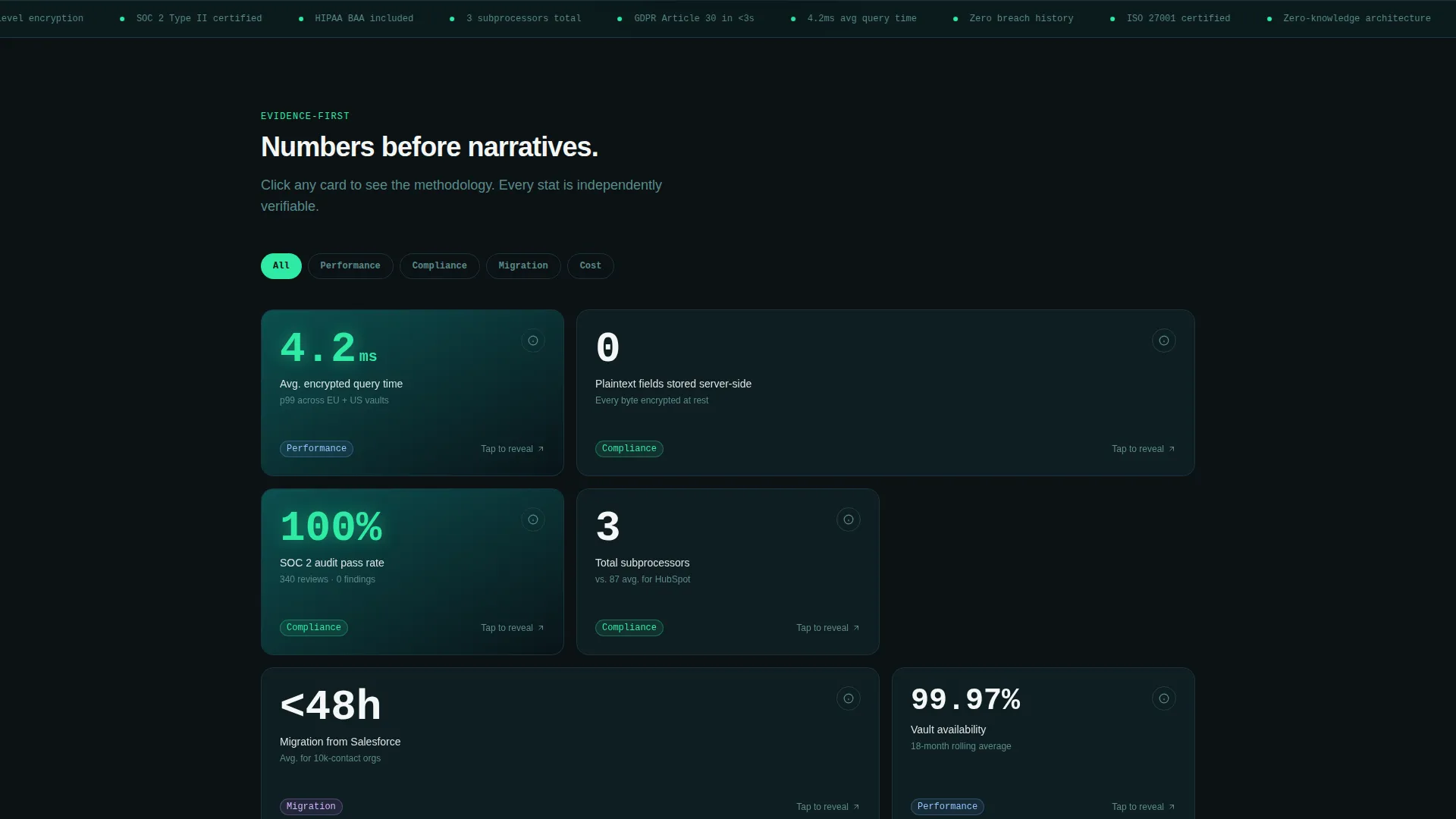
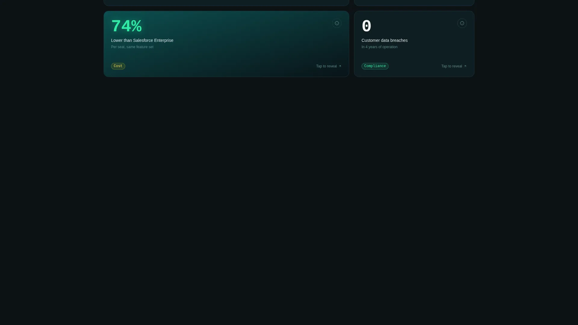
Each card in the grid leads with a single oversized number before any explanatory copy. Examples include "4.2 ms" average query time, "0" plain-text fields stored server-side, and "100%" audit pass rate. Cards are interactive and flip on click to reveal methodology or a condensed case study.
Dynamic Grid Clustering
As visitors scroll, the card grid reorganizes itself to cluster cards by concern category. Groups include speed, compliance, migration, and cost. This creates a self-guided research experience where each visitor assembles their own evidence set in a logical order.
Sticky Comparison Bar
A persistent sticky navigation bar labeled "See How We Compare" remains visible as the visitor scrolls. Clicking it jumps directly to a detailed feature-by-feature comparison grid covering encryption method, data residency options, subprocessor count, and breach history.
Privacy Audit Lead Form
The primary call to action prompts visitors to run a privacy audit on their current CRM. A single-field form collects the competitor CRM name followed by a work email, then delivers a personalized comparison report in under sixty seconds.
Encrypted Sandbox Entry Path
A secondary conversion path labeled "Explore the Encrypted Sandbox" gives technical buyers a way to test the API directly before speaking to sales. This path keeps developer-oriented visitors engaged without forcing them into a sales conversation prematurely.
Page sections overview
| Section | Purpose |
|---|---|
| Animated code header | Opens with visual proof of encrypted API responses |
| Hero stat callout | Reinforces zero data-sharing with a single bold claim |
| Stats card grid | Delivers scrollable, evidence-led proof points |
| Grid cluster navigation | Organizes cards by speed, compliance, migration, cost |
| Sticky compare bar | Provides persistent access to the comparison section |
| Comparison feature grid | Benchmarks encryption, residency, and subprocessors |
| Privacy audit form | Captures leads via a personalized CRM audit report |
| Sandbox entry path | Converts technical buyers before a sales conversation |
Design & branding system
The template uses the Teal Catalyst color system, designed to feel like the interior of a secure server room. Every color choice reinforces a sense of controlled precision and quiet authority.
- Deep encrypted teal (#0D4F4F) for primary backgrounds and structural framing, terminal black (#0B1215) for content surfaces, signal green (#2EEAA3) for live-data accents and hover states, and clean-room white (#F4F7F6) for card surfaces and breathing space
- The Directory and Discovery theme organizes content into scannable modular units, making dense technical information easy to navigate
- Typography and spacing follow a dark, climate-controlled aesthetic where every element feels deliberately placed
Mobile & speed optimization
The modular card grid layout is inherently responsive, adapting from a multi-column desktop arrangement to a single-column scroll on smaller screens without losing the stats-first rhythm.
- Cards restack cleanly on mobile so oversized stat numbers remain prominent and readable at smaller viewport sizes
- The sticky comparison bar maintains its persistent position across device sizes, keeping the comparison shortcut accessible throughout the scroll journey
- Animated elements such as the typing code snippet are scoped to the header section, keeping the rest of the page lightweight and smooth to navigate
How this template helps you convert
The entire page is structured around a buyer who arrives skeptical and needs to build their own business case. Every section is sequenced to reduce friction and move that buyer forward.
- The animated header creates an immediate, visceral demonstration of the encryption concept before the visitor reads a single marketing claim, establishing credibility in the first three seconds.
- The stat card grid lets visitors self-select the evidence most relevant to their role, whether they care about compliance, cost, or migration risk, reducing the cognitive load of a traditional feature list.
- The dual conversion paths separate technical evaluators from decision-makers, routing each audience to the right next step without forcing either group through an irrelevant funnel.
Other information about this template
This template is designed for the privacy-first CRM category, where buyers routinely compare products across compliance dimensions before making contact with sales teams.
- The comparison grid is pre-structured to accommodate direct benchmarks across multiple competing platforms, making it straightforward to update with current product data
- The "Run a Privacy Audit" form mechanic is designed to feel consultative rather than transactional, lowering the psychological barrier to submitting a work email
- The template style is Card Grid (Modular), which means individual sections can be reordered, removed, or duplicated without breaking the overall page rhythm
- The Directory and Discovery theme makes this layout suitable for product-led growth teams who want their landing page to function as an interactive research tool, not just a static brochure
Theme
Directory & Discovery
Creative direction
Stats-First Impact
Color system
Teal Catalyst
Style
Card Grid (Modular)
Direction
Comparison/Versus
Page Sections
Animated Encrypted API Header
Stats-first Flippable Card Grid
Scroll-triggered Grid Clustering
Persistent Sticky Comparison Bar
Privacy Audit Lead Capture Form
Sandbox Entry for Technical Buyers
Related questions
Who is the Ledger template best suited for?
Can I update the comparison grid with different competitors?
How does the dual conversion path work?
Is the animated code snippet header customizable?
Does this template work for privacy-first software products beyond CRM?



