Ledger - Highperformance Banking Landing Page Template
Ledger is a high-performance banking analytics landing page built around a head-to-head comparison layout. It targets VP-level risk officers, fintech COOs, and credit union analysts who need to see real-time transaction data, capital adequacy metrics, and compliance signals in one sharp, fast-loading interface. The dark Dashboard Pro theme and signal-green accents make every number feel live.
by Rocket studio
Quick summary
Ledger is a single-page banking analytics dashboard landing page. It uses a Spec Sheet creative direction to pit itself against legacy tools in a scrollable comparison table. The dark Monochrome Steel palette and a live-preview header give it the feel of an active trading floor. The primary call to action drives benchmark sign-ups; a secondary path captures PDF leads.
Who this template is for
This template is built for banking and fintech teams who live and die by data accuracy and speed. It speaks directly to the people making decisions at quarter-end or during a Friday afternoon fraud spike.
- VP-level risk officers at regional banks tracking Basel III capital adequacy ratios
- Fintech Chief Operating Officers monitoring real-time fraud velocity metrics
- Credit union analysts who are still exporting data to spreadsheets because their current dashboards are too slow
What problem this template solves
Legacy business intelligence tools make banking operations teams wait. Slow load times, shallow regulatory support, and weak role-based access create gaps that cost both time and trust. This template makes the performance gap visible before a prospect is ever asked to commit.
- Dashboards that load slowly during high-stakes moments like quarter-end reporting
- Comparison pages that rely on adjectives instead of letting actual specification differentials argue the case
- Conversion flows that ask for too much too soon before the visitor feels the value
What you get with this template
You get a fully structured, single-page comparison landing page designed for the banking analytics SaaS market. Every section is built to move a technically minded buyer from skeptical to convinced using hard numbers and side-by-side data.
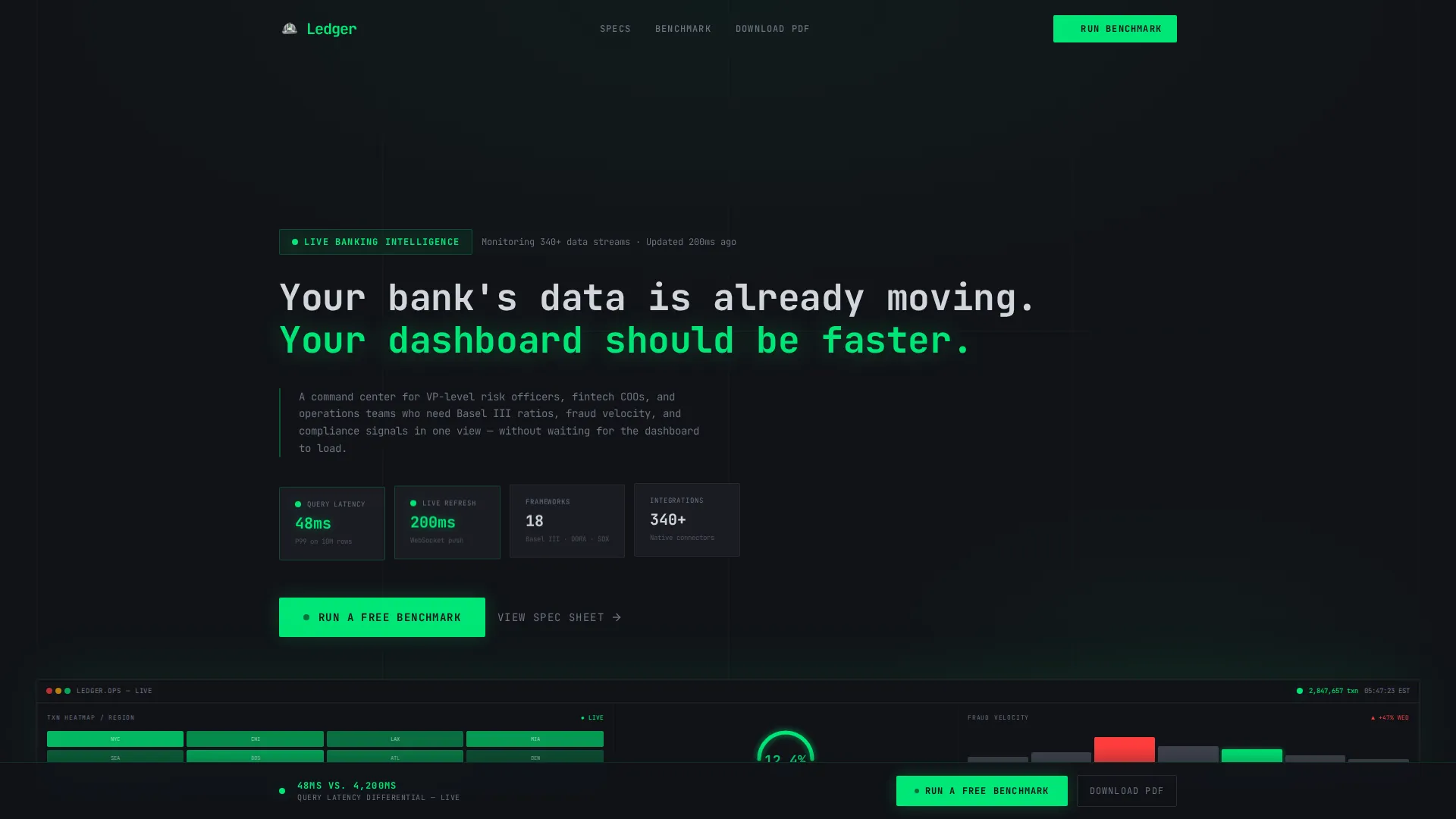
- A full-width animated header showing a live dashboard preview with a ticking transaction counter, capital adequacy gauge, fraud waterfall chart, and compliance status ribbon
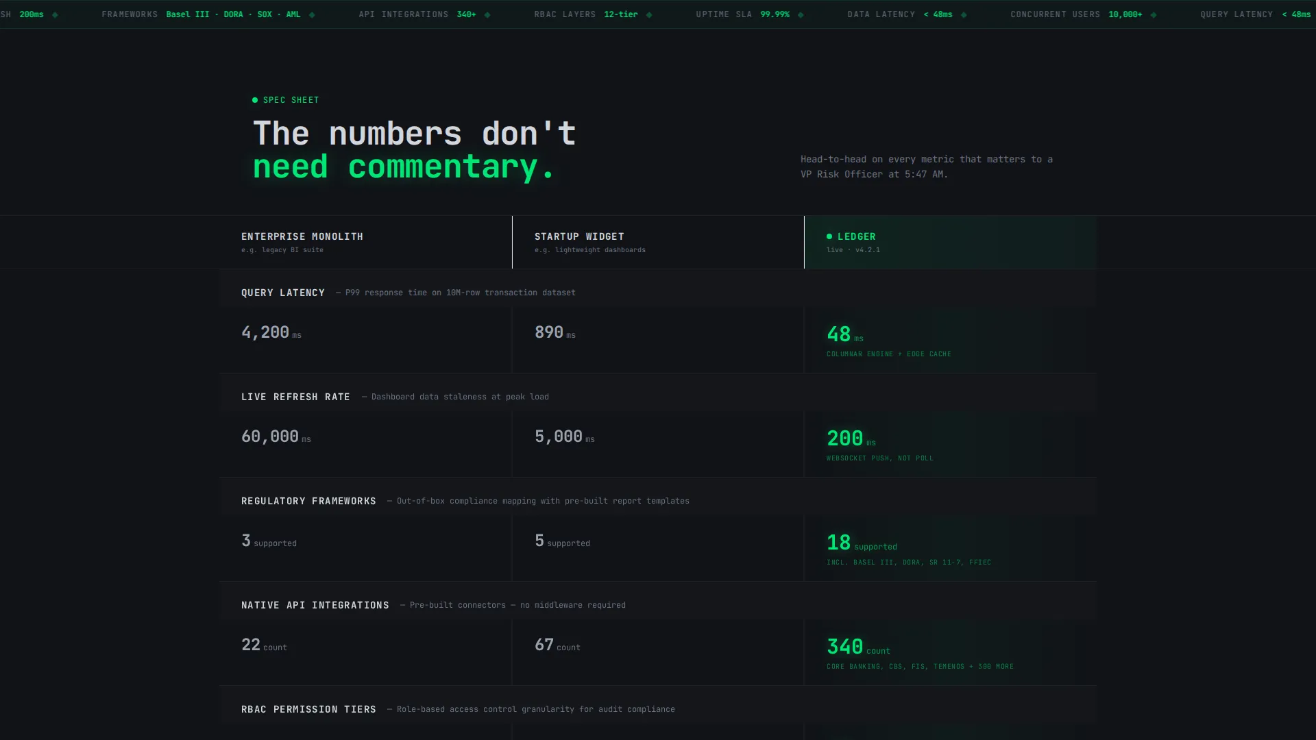
- A scrollable comparison table with rows covering query latency, regulatory framework support, application programming interface integration count, real-time refresh rate, and role-based permissioning depth
- A two-step benchmark form and a secondary email-gated PDF download path for capturing leads at two different intent levels
Feature list
This template delivers a focused set of components that work together to build confidence and drive action across the full page scroll.
Live Dashboard Preview Header
The header fills the full viewport width with a pixel-accurate screenshot of the analytics interface. It shows a multi-panel layout including a real-time transaction heatmap by region, a capital adequacy ratio gauge at 12.4 percent, a fraud detection waterfall chart, and a compliance ribbon with seven green indicators and one amber warning. One counter is visibly mid-update.
Monospace Typewriter Headline
The headline types itself letter by letter in monospace font: "Your bank's data is already moving. Your dashboard should be faster." This animation lands the value proposition before any scroll happens and reinforces the speed-first positioning from the first second on page.
Scrollable Spec Comparison Table
Each row of the table compares Ledger against two competitor archetypes: an enterprise monolith and a startup widget. Rows cover query latency in milliseconds, supported regulatory frameworks, API integration count, real-time refresh rate, and role-based permissioning depth. The Ledger column's numbers appear last on scroll and pulse once in signal green on arrival.
Pinned Benchmark call to action Rail
After the third comparison row, a persistent call-to-action rail pins to the bottom of the viewport. It stays visible through every subsequent scroll. The primary button reads "Run a Free Benchmark" and opens a two-step form collecting current tool name, average load time, work email, and institution size.
Two-Step Benchmark Form
Step one of the form captures the visitor's current business intelligence tool from a dropdown of twelve options plus "Other," and their average dashboard load time. Step two asks for a work email address and institution size. The two-step structure reduces friction by leading with curiosity before asking for contact details.
Email-Gated PDF Download
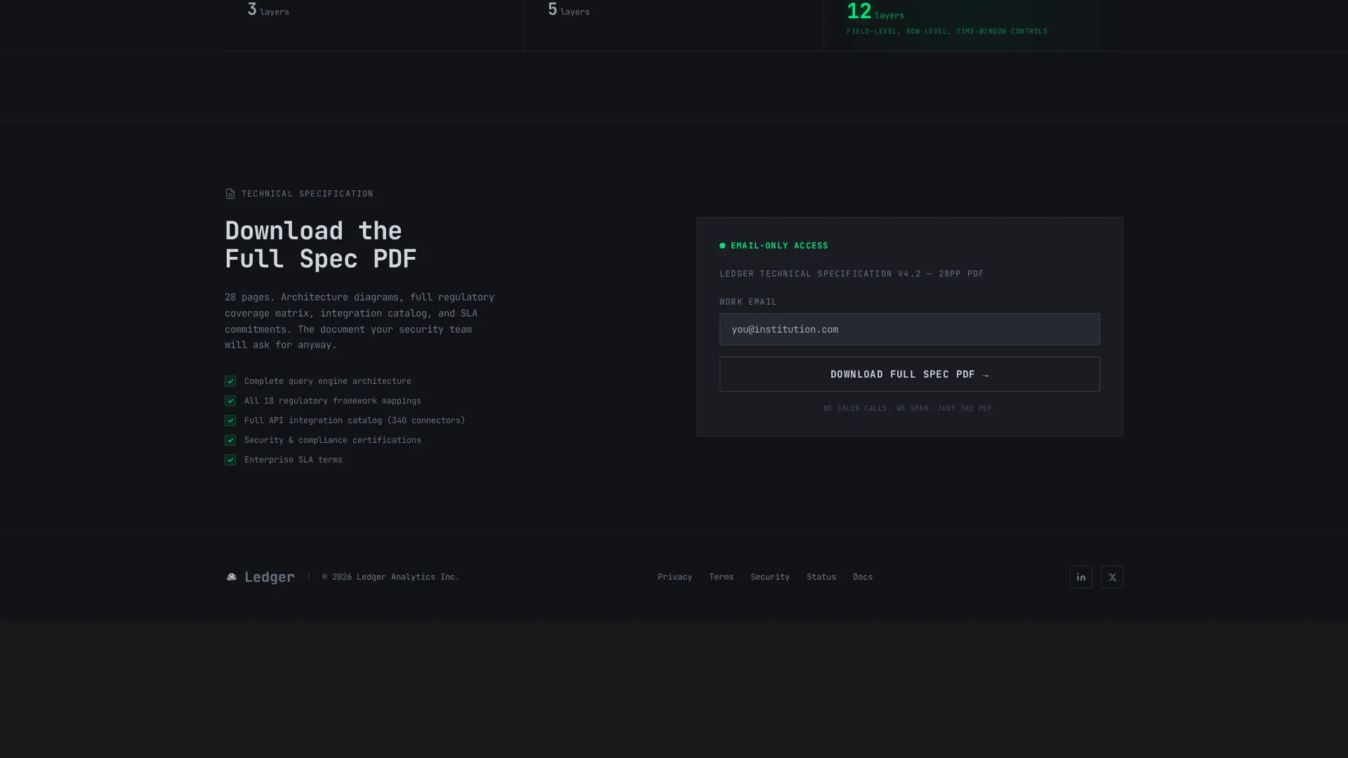
A secondary conversion path labeled "Download the Full Spec PDF" sits below the primary call to action. It requires only an email address to unlock. This path captures lighter-intent visitors who are not yet ready to run a benchmark but are willing to take a specification document into an internal review.
Page sections overview
| Section | Purpose |
|---|---|
| Live Preview Header | Anchors attention with an animated, data-rich dashboard screenshot and typewriter headline |
| Comparison Table Row 1 | Contrasts query latency in milliseconds across Ledger and two competitor archetypes |
| Comparison Table Row 2 | Shows supported regulatory frameworks side by side |
| Comparison Table Row 3 | Compares API integration counts and real-time refresh rates |
| Pinned call to action Rail | Keeps "Run a Free Benchmark" visible from row three onward through end of page |
| Comparison Table Row 4 | Covers role-based permissioning depth differences |
| Two-Step Benchmark Form | Collects tool name, load time, email, and institution size across two low-friction steps |
| PDF Download Path | Captures email-only leads with a specification document download offer |
Design & branding system
The visual identity uses the Dashboard Pro theme with a Monochrome Steel color system. Every color choice is functional, not decorative. The palette feels precise and high-stakes, like the interface of a professional-grade instrument.
- Base layer in gunmetal (#1C1F26), mid-tone in brushed aluminum (#6B7280), and highlights in polished chrome (#D1D5DB)
- Signal green (#00E676) used exclusively for live-data indicators, scroll-triggered number pulses, and primary call-to-action buttons
- Monospace typography for the headline animation and data cells, reinforcing the real-time, technical character of the dashboard
Mobile & speed optimization
The template is structured to perform on smaller screens and under real network conditions without compromising the data-dense layout that makes it credible.
- The comparison table is horizontally scrollable on mobile so no data is hidden or collapsed
- The pinned call to action rail adapts to the mobile viewport bottom bar without overlapping content
- The header dashboard preview scales down proportionally to maintain panel readability at smaller sizes
How this template helps you convert
The page is engineered to earn the click by making the performance gap feel real before asking for any action. Every section moves the visitor one step closer to committing.
- The header immediately establishes credibility by showing a fully populated, mid-update dashboard rather than an illustration or a generic screenshot, so the visitor knows exactly what kind of product they are evaluating.
- The scroll-reveal comparison rows build a cumulative case with hard specification numbers, each row widening the gap and making it progressively harder to justify the status quo.
- The pinned benchmark call to action stays in view through the entire lower half of the page, so the moment a visitor is convinced, the action is one tap away without requiring them to scroll back up.
Other information about this template
This template is categorized under Technology, specifically within the Banking Vertical SaaS subcategory. It is designed for the banking analytics dashboard niche and pairs well with product-led growth go-to-market strategies where the product itself is the primary sales argument.
- The template style is a Comparison Table layout, meaning the persuasion mechanism is structural and data-driven rather than copy-heavy
- The creative direction follows a Spec Sheet approach, which suits technically literate buyers like risk officers and operations leads who distrust marketing language
- The landing page direction is Comparison/Versus, making it a strong fit for teams launching against an established incumbent or positioning a newer tool against a slower enterprise solution
- The header concept is Dashboard Preview, which means the very first thing a visitor sees is the product in action rather than a brand promise

Theme
Dashboard Pro
Creative direction
Spec Sheet
Color system
Monochrome Steel
Style
Comparison Table
Direction
Comparison/Versus
Page Sections
Live Dashboard Preview Header
Typewriter Monospace Headline
Scroll-reveal Comparison Table
Pinned Call to Action Bottom Rail
Two-step Benchmark Form
Email-gated PDF Download
Related questions
Who is this landing page template designed for?
What does the comparison table include?
How does the two-step benchmark form work?
What is the secondary conversion path on this page?
Can this template be adapted for other financial technology products?



