Blockchain-Based Enterprise Software Specialist Directory Website Template
Ledger is a blockchain-based IT service management landing page template built for compliance-driven enterprises. It uses a split-screen layout, a Feature Tab Switcher header, and a Spec Sheet creative direction to present immutable ticketing, chain-verified SLAs, and audit replay capabilities with raw technical credibility to CISOs, IT directors, and managed service providers.
by Rocket studio
Quick summary
Ledger is a single-page landing page template for a blockchain-based IT service management platform. It uses a 50/50 split-screen layout and a Feature Tab Switcher header to show real product specs alongside live user interface panels. The design speaks directly to compliance-burdened buyers who need verifiable proof, not marketing promises.
Who this template is for
This template is designed for technology companies and platform teams selling enterprise-grade IT service management software to regulated industries. The tone and structure are built to earn trust from highly technical, risk-conscious buyers.
- Chief Information Security Officers (CISOs) at regulated financial institutions who must satisfy audit requirements
- IT directors at hospital networks defending Health Insurance Portability and Accountability Act (HIPAA) audits
- Managed service providers that need to demonstrate documented incident handling to skeptical enterprise clients
What problem this template solves
Regulated buyers do not respond to generic software landing pages. They need to see evidence before they act. This template addresses the gap between vague capability claims and the hard technical proof that compliance-focused buyers demand.
- Buyers abandon pages that lead with marketing language and bury the specifications
- Audit-trail integrity is a serious concern, and a page that cannot demonstrate it loses credibility immediately
- High-intent technical buyers often need documentation before they will interact with a live demo
What you get with this template
You get a fully structured, single-page landing page built around one conversion goal: getting the right buyer into a live sandbox environment. Every section is designed to build trust through technical specificity before asking for any commitment.
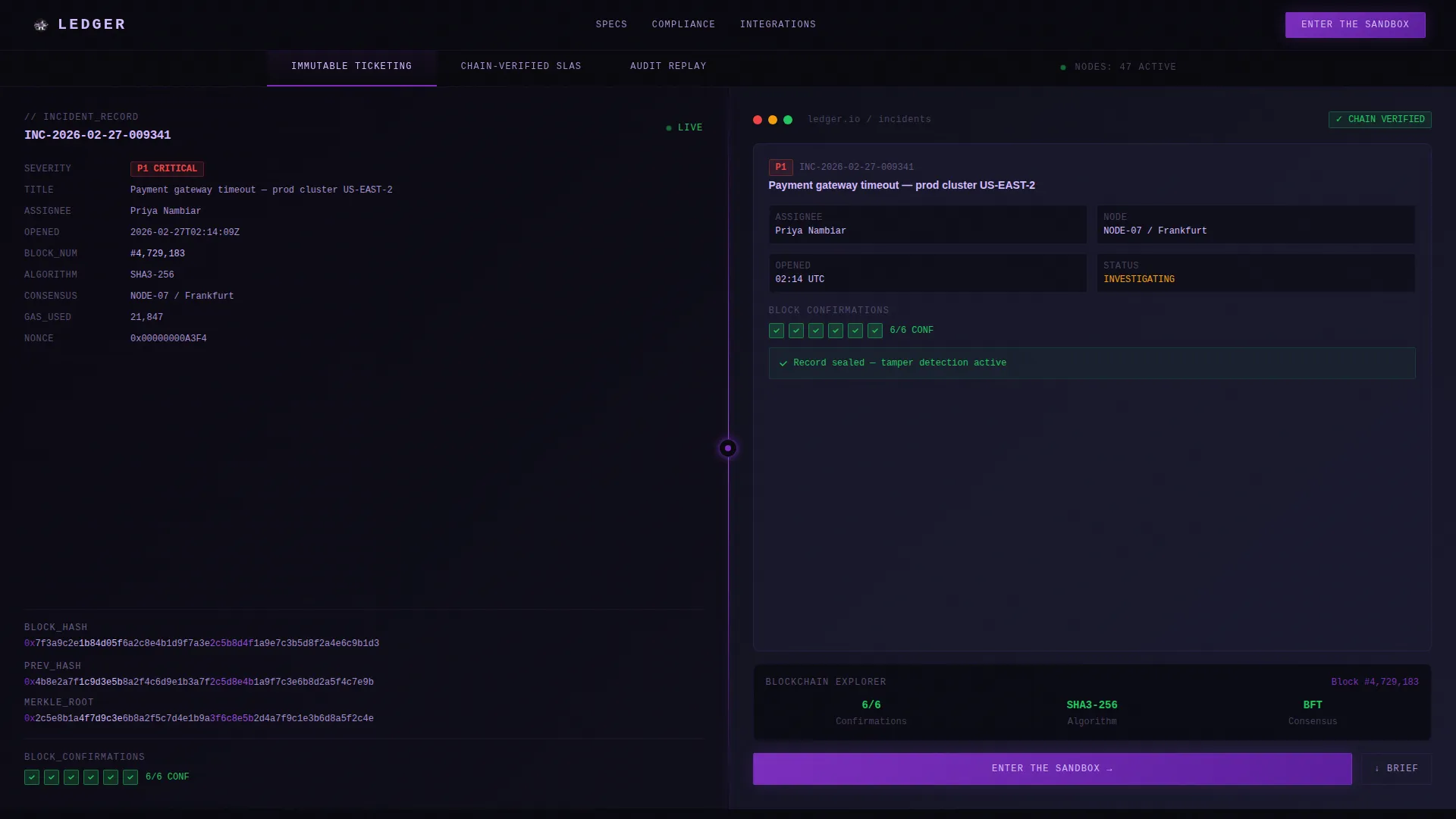
- A Feature Tab Switcher header with three tabs: "Immutable Ticketing," "Chain-Verified SLAs," and "Audit Replay"
- A split-screen (50/50) layout pairing dense spec sheets on the left with live product user interface panels on the right
- A persistent bottom call-to-action bar, a primary "Enter the Sandbox" button, and a secondary "Download the Architecture Brief" text link
Feature list
This template includes purpose-built components that deliver technical authority and drive qualified conversions.
Feature Tab Switcher Header
Three labeled tabs sit across the top of the viewport. Each tab activates a split-screen view: the left half renders field names, hash signatures, consensus timestamps, and block confirmations in monospaced type. The right half displays the corresponding live user interface panel with ticket metadata, a blockchain explorer sidebar, and green verification badges. The default tab loads mid-animation with a block confirmation counter ticking from 0/6 to 6/6.
Split-Screen Spec and user interface Pairing
Every tab presents a side-by-side comparison of raw technical specification and real product interface. This pairing lets technical buyers validate the platform's claims in real time without leaving the page. The 50/50 layout keeps both sides equally weighted and readable.
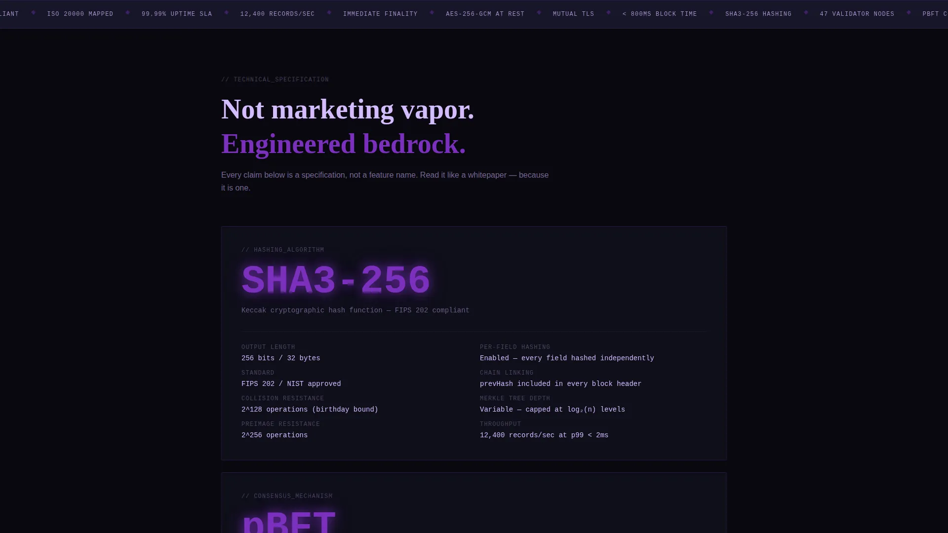
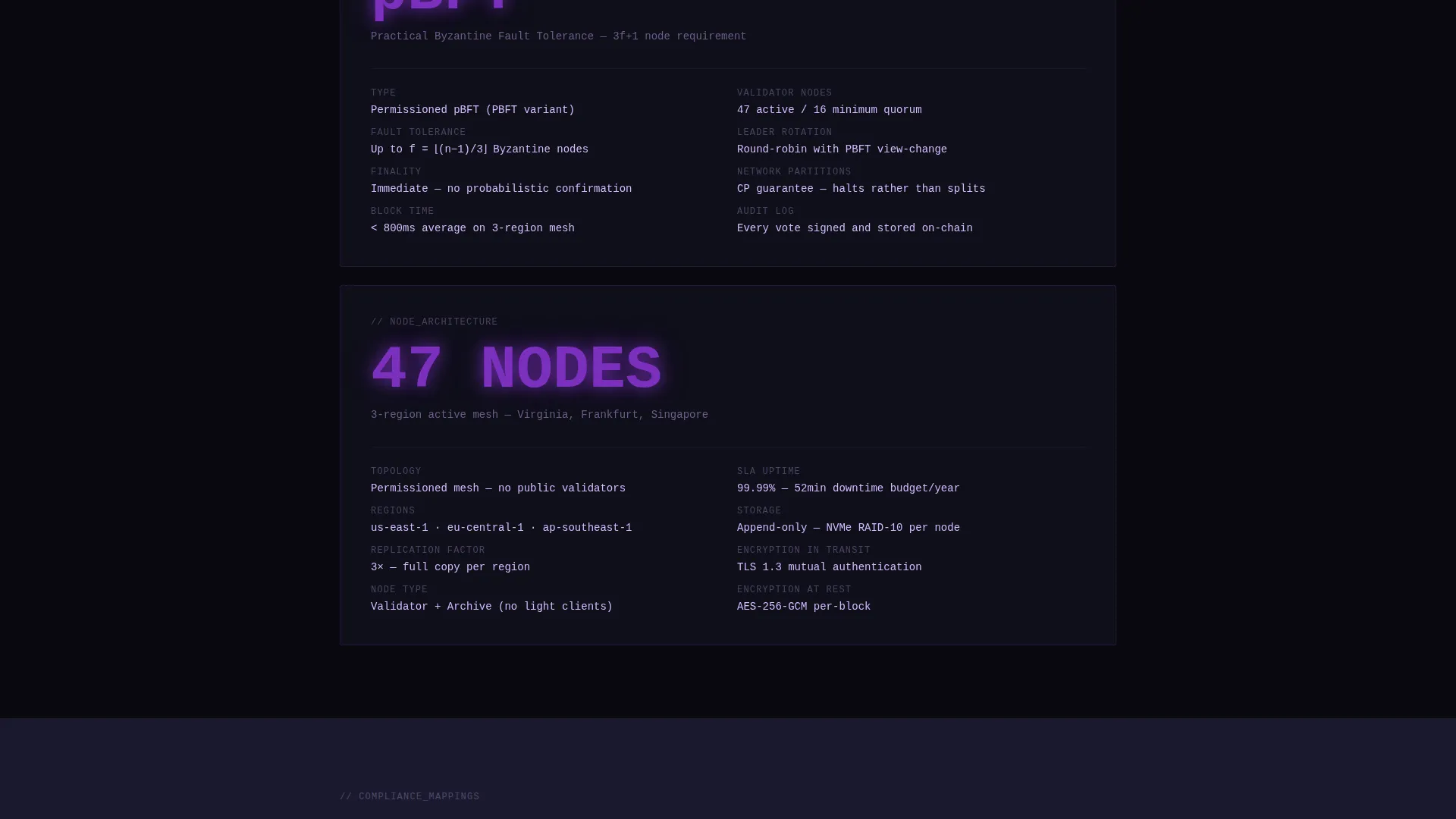
Spec Sheet Deep-Dive Cards
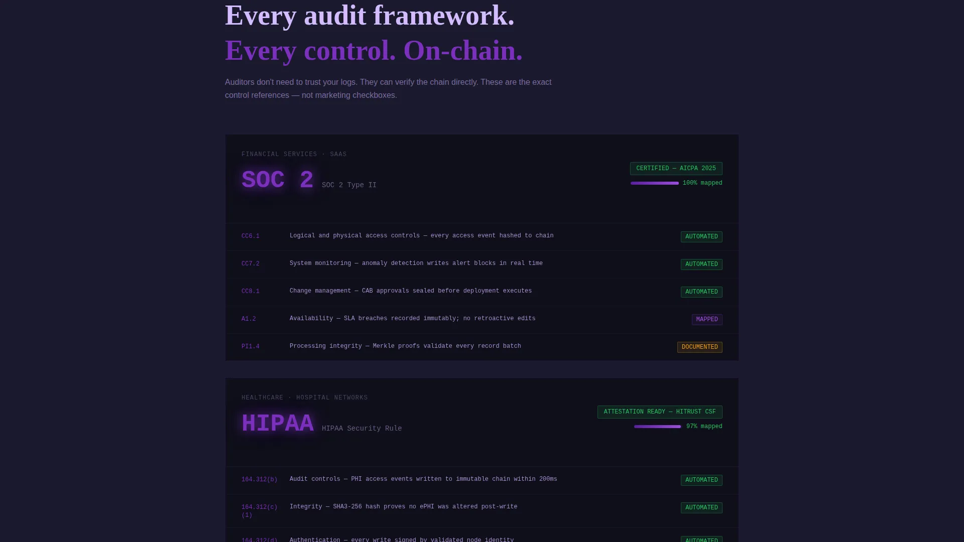
Below the fold, each content card leads with a single metric or protocol name in oversized violet type. The specification unpacks beneath in two tight columns. Cards cover hashing algorithm, consensus mechanism, node architecture, integration endpoints, and compliance mappings including SOC 2, HIPAA, and ISO 20000.
Click-Through Conversion Architecture
The primary call to action, "Enter the Sandbox," appears first inside the header's right panel and then repeats as a persistent bottom bar after the second scroll. There are no form fields on the page. The button routes directly to a pre-loaded demo instance, removing all friction between intent and action.
Secondary Architecture Brief Download
A text link labeled "Download the Architecture Brief" sits alongside the primary call to action. It captures high-intent buyers who prefer to review documentation before touching a live environment. This dual-path approach serves both the ready-to-act visitor and the careful technical evaluator.
Void and Violet Design System
The color palette uses abyssal black (#09090F) as the primary background, deep space indigo (#1A1A2E) for layered surfaces, electric violet (#7B2FBE) on interactive elements and data highlights, and pale holographic lilac (#D4BBFF) for text and label contrast. The visual identity supports a Data Command theme that feels precise and unyielding.
Page sections overview
| Section | Purpose |
|---|---|
| Feature Tab Switcher | Presents three core platform capabilities with paired spec and user interface views |
| Block Confirmation Animation | Opens with a live-ticking 0/6 to 6/6 counter to establish real-time credibility |
| Immutable Ticketing Tab | Shows ticket metadata and hash signatures alongside the live ticketing panel |
| Chain-Verified SLAs Tab | Displays SLA breach records and consensus timestamps with verification badges |
| Audit Replay Tab | Renders blockchain explorer sidebar with full audit trail replay interface |
| Spec Sheet Cards | Deep-dive cards unpacking hashing, consensus, nodes, endpoints, and compliance |
| Persistent call to action Bar | Repeating "Enter the Sandbox" bottom bar activating after the second scroll |
| Architecture Brief Link | Secondary text link for documentation-first buyers |
Design & branding system
The visual language of this template is built around a Data Command theme. Every color choice, typographic decision, and layout detail reinforces the feeling of absolute technical authority.
- Color system uses abyssal black (#09090F), deep space indigo (#1A1A2E), electric violet (#7B2FBE), and pale holographic lilac (#D4BBFF)
- Monospaced typography renders field names, hash values, and timestamps with clinical precision
- Interactive elements and data highlights use electric violet to draw attention without softening the overall severity of the design
Mobile & speed optimization
The template is structured to remain functional and legible across device sizes. The split-screen layout adapts to narrower viewports without losing the core spec-and-user interface pairing that makes the design effective.
- The 50/50 layout is designed to stack gracefully on smaller screens, keeping both spec content and user interface panels accessible
- Persistent call-to-action bar stays anchored at the bottom of the viewport on all screen sizes for consistent conversion access
- Monospaced type blocks and two-column card layouts are sized for readability at both desktop and tablet breakpoints
How this template helps you convert
This template is built around a single, deliberate conversion path. It earns the click by presenting real technical evidence before asking for any commitment.
- The Feature Tab Switcher immediately surfaces block hashes, node counts, and verification timestamps, giving technical buyers the proof they need to stay engaged
- The persistent "Enter the Sandbox" call-to-action bar removes re-engagement friction by staying visible throughout the scroll journey without requiring a form submission
- The secondary "Download the Architecture Brief" link creates a second conversion path for evaluators who need documentation before they will commit to a live demo interaction
Other information about this template
This template is positioned at the intersection of blockchain-based enterprise software and IT service management. It is well suited for teams building go-to-market pages for platforms that compete in the compliance-heavy regulated infrastructure space.
- The template follows a Click-Through landing page direction, routing visitors to a pre-loaded demo with no on-page form fields
- Compliance mappings referenced in the spec sheet cards include SOC 2, HIPAA, and ISO 20000, making the template directly relevant to regulated industry buyers
- The Spec Sheet creative direction is designed to feel like reading a whitepaper, rewarding technical depth with increasing credibility as the visitor scrolls
Theme
Data Command
Creative direction
Spec Sheet
Color system
Void & Violet
Style
Split Screen (50/50)
Direction
Click-Through
Page Sections
Feature Tab Switcher Header
Split-screen Spec and User Interface Layout
Spec Sheet Deep-dive Cards
Click-through Conversion Path
Architecture Brief Download Link
Void and Violet Color System
Related questions
Who is the intended buyer for this template?
Does the page include any form fields or lead capture?
What are the three Feature Tab Switcher tabs?
Can I update the compliance mappings in the spec sheet cards?
What animation plays when the page first loads?


