Ledger - Immutable Supplychain Landing Page Template
Ledger is a single-page blockchain-based supply chain landing page template built for enterprise operations teams. It combines a dark glass panel header, an animated stats counter, and a twelve-row comparison table to make the case for immutable traceability. The design uses a Void and Violet color system to keep every critical metric front and center.
by Rocket studio
Quick summary
Ledger is a comparison table landing page template designed for blockchain-powered supply chain platforms. It opens with live-style metric panels, builds its argument through a direct three-column comparison table, and closes the case with expandable case-study cards. The visual identity is a cold, data-forward Void and Violet palette that makes every number feel urgent.
Who this template is for
This template is built for teams that sell or communicate blockchain-based supply chain intelligence to serious enterprise buyers. It speaks the language of operations, compliance, and procurement professionals who need proof before they commit.
- Logistics directors at mid-market manufacturers who need real-time shipment visibility
- Procurement leads at pharmaceutical distributors managing cold-chain compliance
- Compliance officers at food-safety enterprises tracking audit trails across fragmented systems
What problem this template solves
Enterprise supply chain buyers are skeptical. They have heard cloud promises before, and they are still managing audit trails across seventeen different spreadsheets. This template addresses that credibility gap directly by leading with irrefutable metrics and a structured side-by-side comparison.
- Legacy and cloud SCM tools cannot prove tamper resistance or provenance depth at audit time
- Compliance officers waste hours pulling records from disconnected systems before a regulatory review
- Sales teams struggle to communicate the concrete advantage of blockchain traceability over familiar alternatives
What you get with this template
You get a complete, production-ready single-page layout structured around a prosecutorial content flow: numbers first, comparison second, story third. Every section has a defined purpose and a consistent visual treatment.
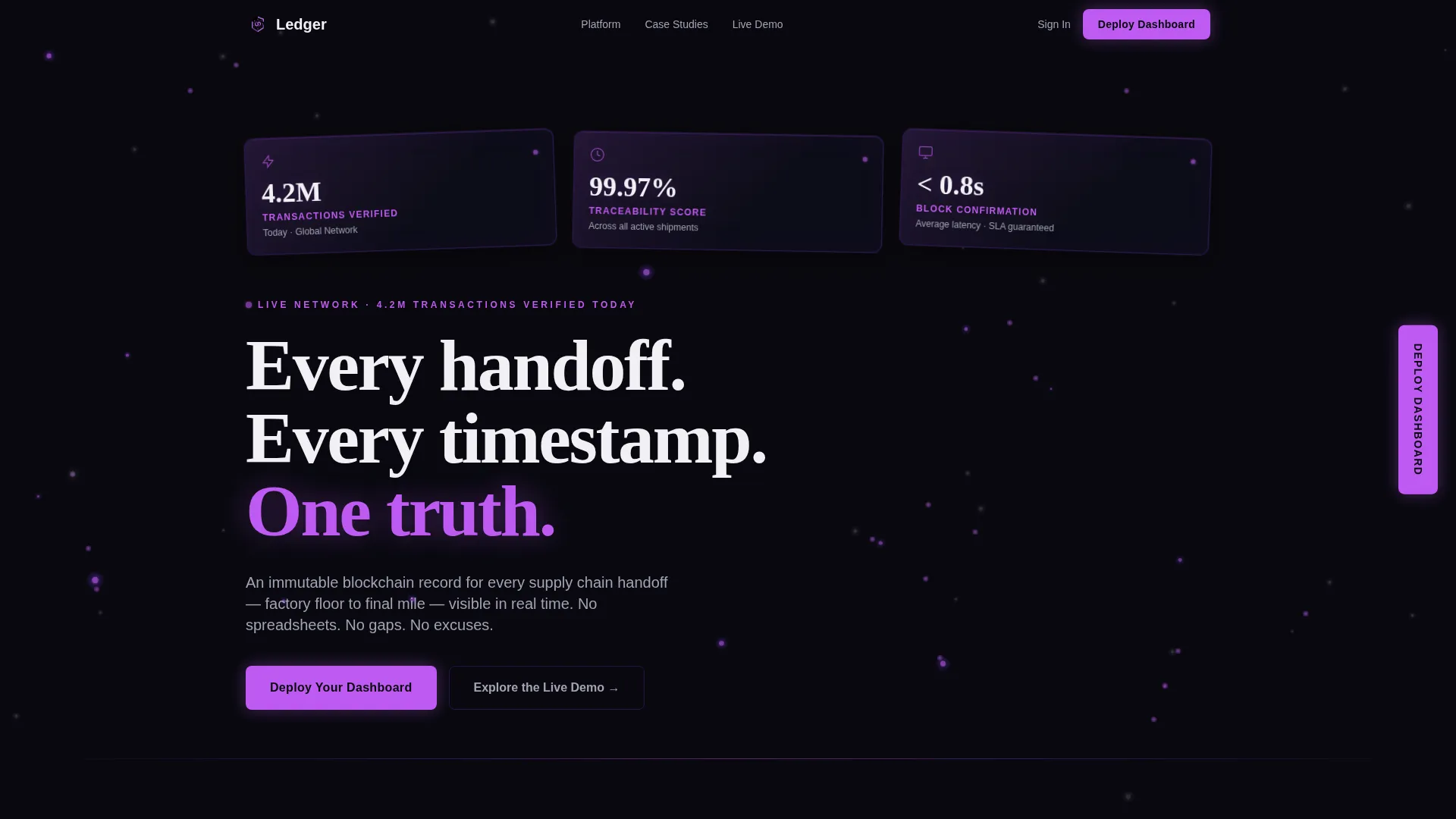
- Dark glass panel header with three live-style metric callouts and an animated node-graph background
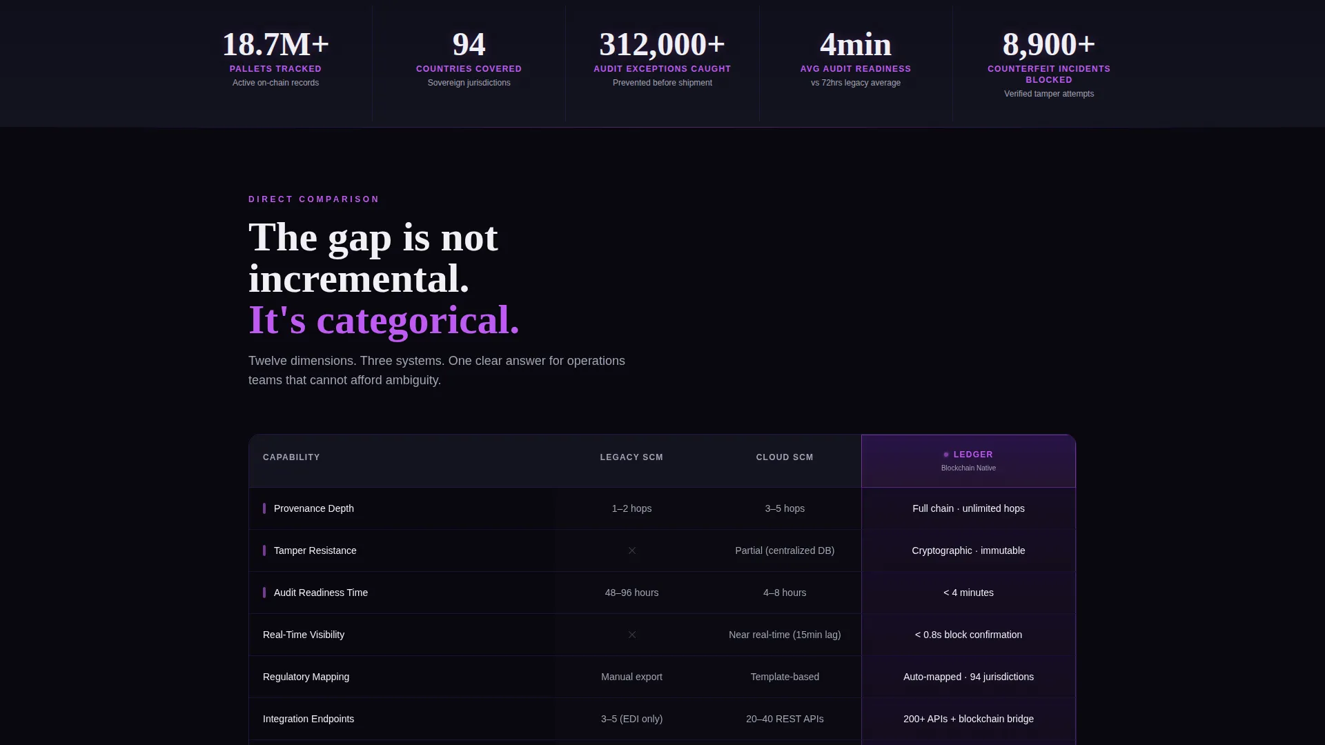
- Full-width animated counter bar and a twelve-row, three-column comparison table with glowing Ledger column
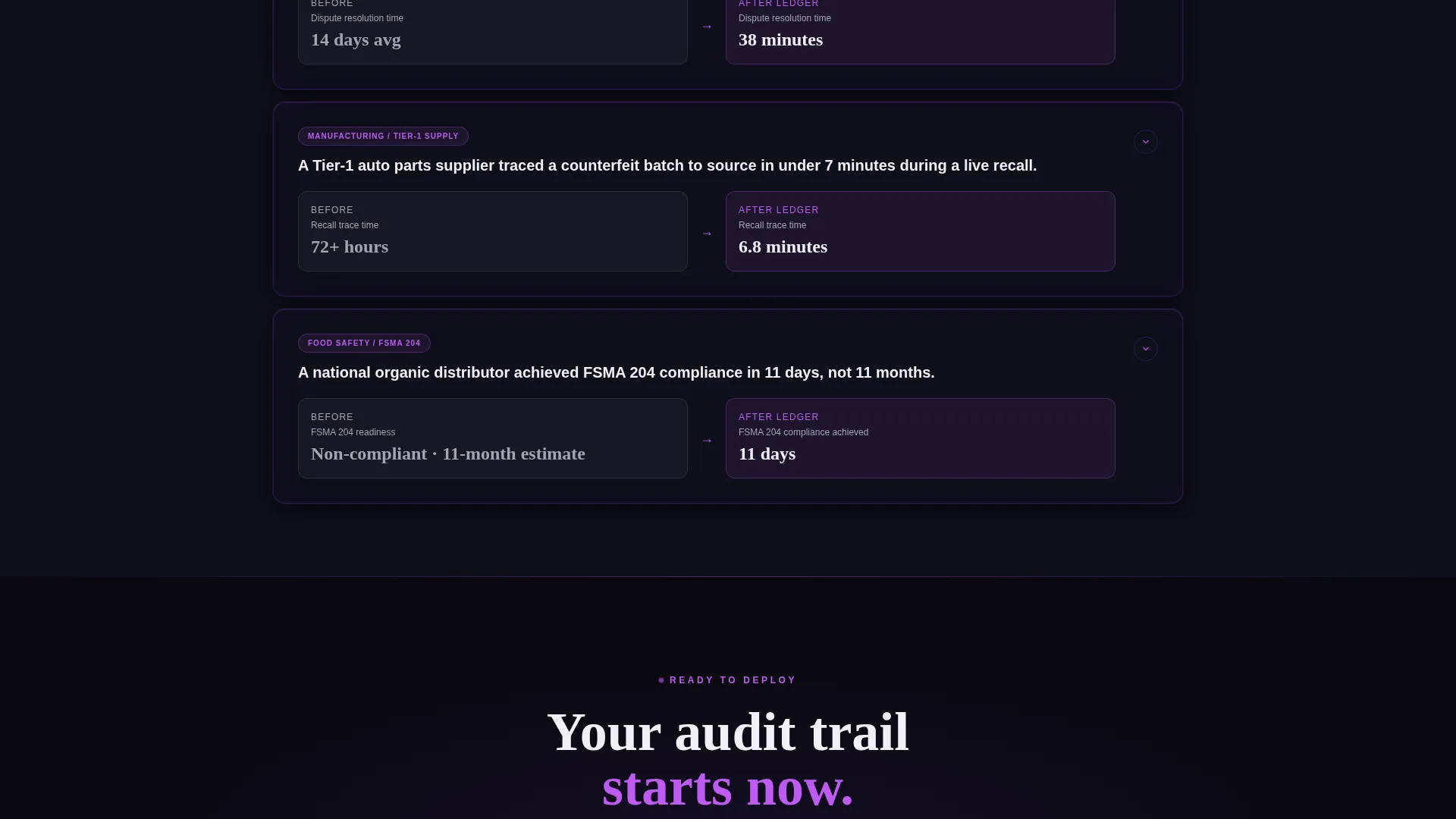
- Three expandable case-study cards covering pharma cold-chain, automotive parts, and organic produce
Feature list
This template is built around six core design and content capabilities drawn directly from the brief.
Dark Glass Panel Header
Three frosted-glass cards are angled in perspective against a pure black field. Each card displays a live-style metric such as "4.2M Transactions Verified" or "99.97% Traceability Score." A faint animated node-graph drifts behind the panels to suggest a live blockchain network.
Animated Stats Counter Bar
A full-width counter bar sits immediately below the header. It ticks aggregate platform statistics upward in real time, covering pallets tracked, countries covered, and audit exceptions caught. This section is designed to open the scroll with proof rather than promises.
Twelve-Row Comparison Table
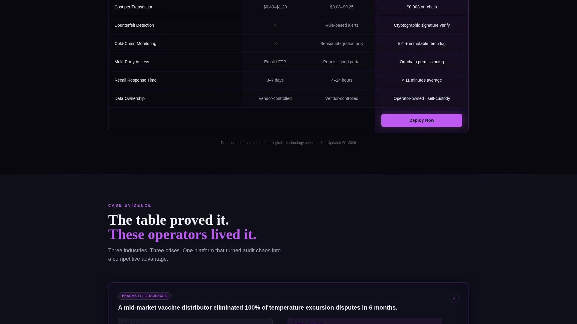
The core section compares three columns: Legacy SCM, Cloud SCM, and Ledger (Blockchain). Twelve rows cover criteria including provenance depth, tamper resistance, audit-readiness time, regulatory mapping, real-time visibility, integration endpoints, and cost per transaction. The Ledger column glows faintly violet; checkmarks appear in electric orchid and gaps render in void black.
Expandable Case-Study Cards
Three cards below the comparison table each expand to reveal a before-and-after stat pair. The cards cover pharma cold-chain, automotive parts, and organic produce. They reinforce the table's claims with short narrative evidence without breaking the data-first rhythm.
Two-Step App Download Modal
The primary call to action opens a focused two-step modal. Step one lets the visitor choose their platform: iOS, Android, or Web Console. Step two captures work email and company name. This flow keeps friction low and intent high.
No-Credential Live Demo Path
A secondary call to action, labeled "Explore the Live Demo," links to a sandboxed dashboard environment. Visitors can explore real sample data without creating an account. This path is designed specifically for skeptical operations leads who need to see before they sign up.
Page sections overview
| Section | Purpose |
|---|---|
| Dark Glass Header | Display live-style metric panels with animated node-graph background |
| Animated Counter Bar | Open scroll with ticking aggregate platform statistics |
| Comparison Table | Compare Legacy SCM, Cloud SCM, and Ledger across twelve criteria rows |
| Case Study Cards | Expand to show before-and-after stat pairs for three industry verticals |
| Primary call to action Rail | Sticky orchid button drives visitors toward the app download modal |
| Demo Access Link | Secondary path lets skeptical buyers explore sample data without signing up |
Design & branding system
The Void and Violet color system is built to make data feel like the most important thing on screen. Every background recedes into near-black while critical figures float forward as lit pixels.
- Core palette: abyssal black (#09090F) for backgrounds, deep interstellar violet (#6C2DC7) for structural accents, muted titanium (#A3A3B5) for secondary text, and electric orchid (#BF5AF2) reserved for live-data accents and interactive hover states
- White (#F0F0F5) appears only inside table cells and stat callouts, giving each figure a lit-pixel quality against the dark field
- Section dividers are thin violet gradients that pulse faintly; backgrounds carry a subtle noise texture that reinforces the ops-center aesthetic
Mobile & speed optimization
The layout adapts thoughtfully for mobile without sacrificing the data-dense feel that enterprise buyers expect on desktop.
- The primary call-to-action appears as a sticky bottom bar on mobile and a fixed right-rail button on desktop, both styled in electric orchid on void black
- The comparison table is structured to remain readable on smaller screens, keeping the Ledger column's violet glow visible as a visual anchor
- The two-step modal is sized for thumb-friendly interaction on mobile, with clearly labeled platform selection in step one
How this template helps you convert
The page is structured as a prosecutorial argument. Each scroll step adds a layer of evidence, and every conversion element appears only after that evidence has been presented.
- The animated stats counter and dark glass header establish immediate credibility before any marketing copy appears, making the platform feel real and operational from the first second.
- The twelve-row comparison table gives skeptical buyers a direct, criteria-level reason to choose blockchain traceability over legacy or cloud alternatives, removing the need for a sales call to explain the difference.
- The no-credential demo path removes the single biggest barrier for cautious enterprise buyers by letting them experience the product before providing any contact information.
Other information about this template
This template belongs to the Dashboard Pro theme family and is categorized under blockchain-based enterprise software. It is built for the blockchain-based SCM niche where trust, auditability, and real-time visibility are the deciding factors in a purchase.
- The template style is a comparison table layout, a format well suited to enterprise software buying decisions where feature parity matters
- The creative direction is Stats-First Impact, meaning proof-of-value content appears before any narrative or brand messaging
- The header concept is Dark Glass Panels, a component style that communicates operational sophistication without relying on photography or illustration
- This template sits at the intersection of the Technology category and the Blockchain-Based Enterprise Software subcategory, making it relevant for teams selling immutable ledger solutions to regulated industries
Theme
Dashboard Pro
Creative direction
Stats-First Impact
Color system
Void & Violet
Style
Comparison Table
Direction
App Download
Page Sections
Dark Glass Panel Header
Animated Stats Counter Bar
Twelve-row Comparison Table
Expandable Case-study Cards
Two-step App Download Modal
No-credential Demo Access
Related questions
Who is this landing page template designed for?
Can I edit the comparison table rows and criteria?
What does the two-step modal capture?
Does the live demo path require any backend setup?
Is this template suited for regulated industries like pharma or food safety?



