Micro-SaaS & Developer Tools Comparison Website Template
Ledger is a single-page comparison landing page template built for expense tracker products. It follows a Problem-to-Solution scroll arc, opens with a high-fidelity dashboard screenshot, and leads visitors through a glowing comparison table. The Tech Glass visual identity uses deep obsidian backgrounds, frosted card panels, and iridescent highlights to make every number feel sharp and worth acting on.
by Rocket studio
Quick summary
Ledger is a comparison landing page template designed for expense tracker tools. It opens with a product screenshot inside a glass-morphism card, walks visitors through a visceral pain section, then snaps into a full competitor comparison table. The Tech Glass design uses obsidian backgrounds and iridescent accents. A pinned call-to-action and savings calculator drive conversion without upfront form friction.
Who this template is for
This template fits product teams and solo founders launching or repositioning an expense tracker tool. It speaks directly to the people their tool serves, so the page feels personal before a visitor even scrolls.
- Micro-SaaS founders who need a high-converting landing page without starting from scratch
- Freelancers and indie developers building expense tracking tools for tax-time clarity or subscription management
- Startup teams whose product targets young couples, freelancers, or budget-conscious founders who want spending visibility
What problem this template solves
Most expense tracker landing pages list features in a vacuum. They do not show why the product is better than what the visitor already uses. This template fixes that gap with a structured comparison layout.
- Visitors arrive skeptical after trying other tools; the comparison table gives them a clear, row-by-row reason to switch
- The page lacks an upfront sign-up form, which removes the friction that typically kills conversion on cold traffic
- Without a visual pain sequence, visitors do not feel the cost of inaction; the desaturated chaos section makes that cost visible
What you get with this template
You get a complete, single-page landing page layout with every section pre-built and purposefully sequenced. Nothing needs to be invented from scratch.
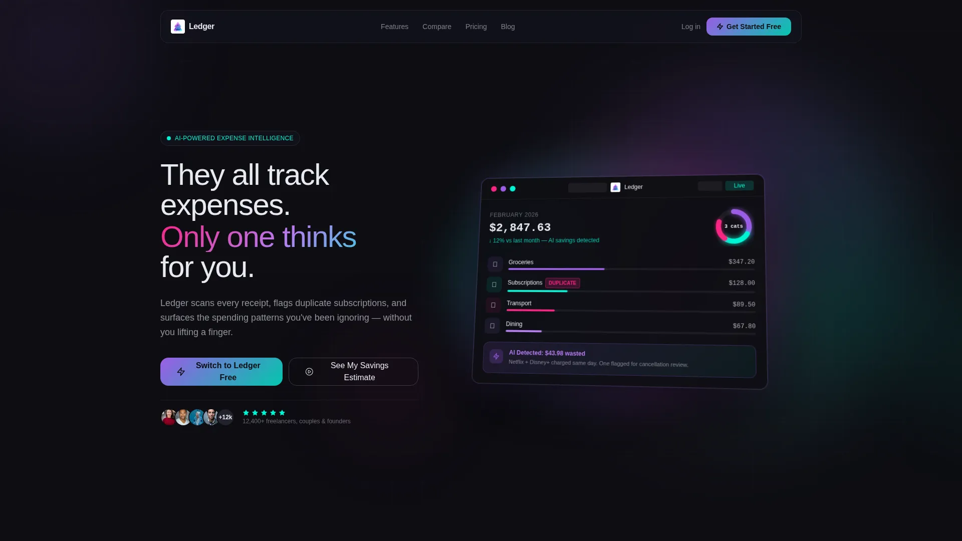
- A hero section with a 3D-tilted product screenshot on a frosted glass card, plus a headline and primary call-to-action button
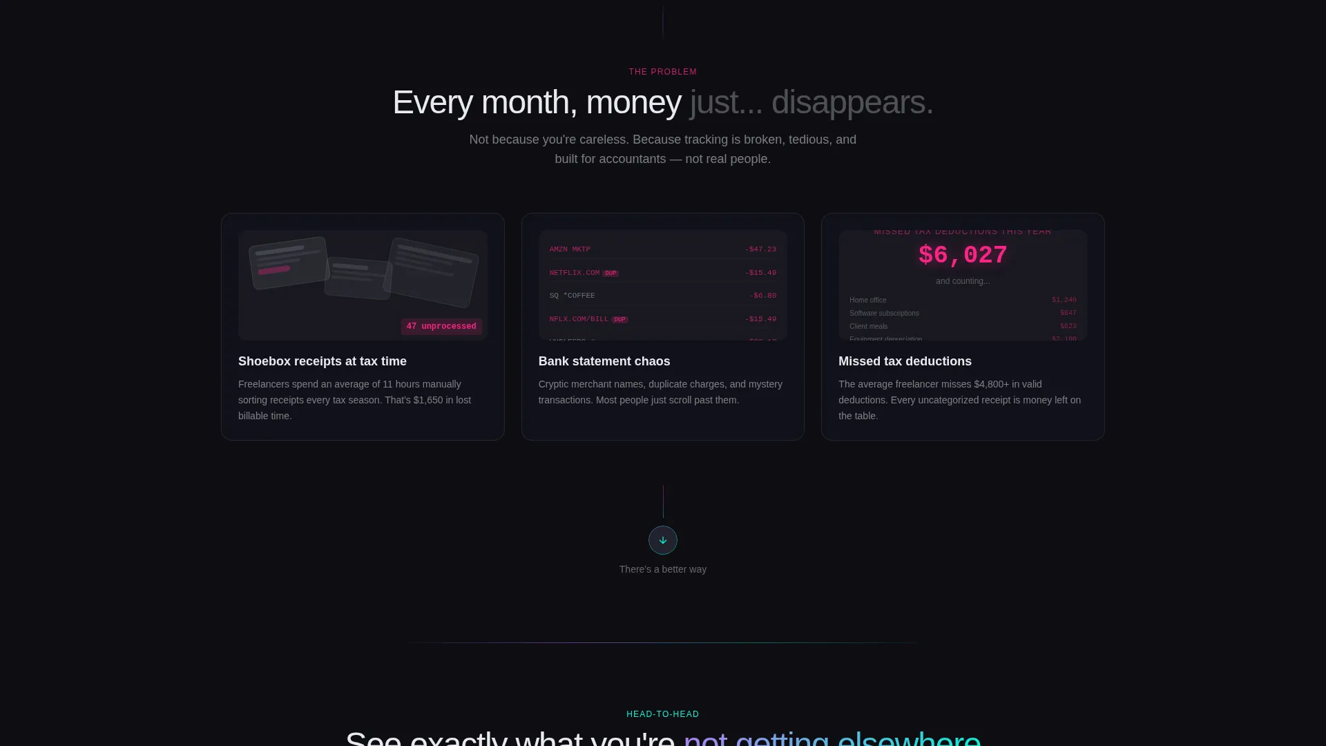
- A problem section rendered in desaturated grays showing receipt chaos, bank statement clutter, and a missed tax deduction counter
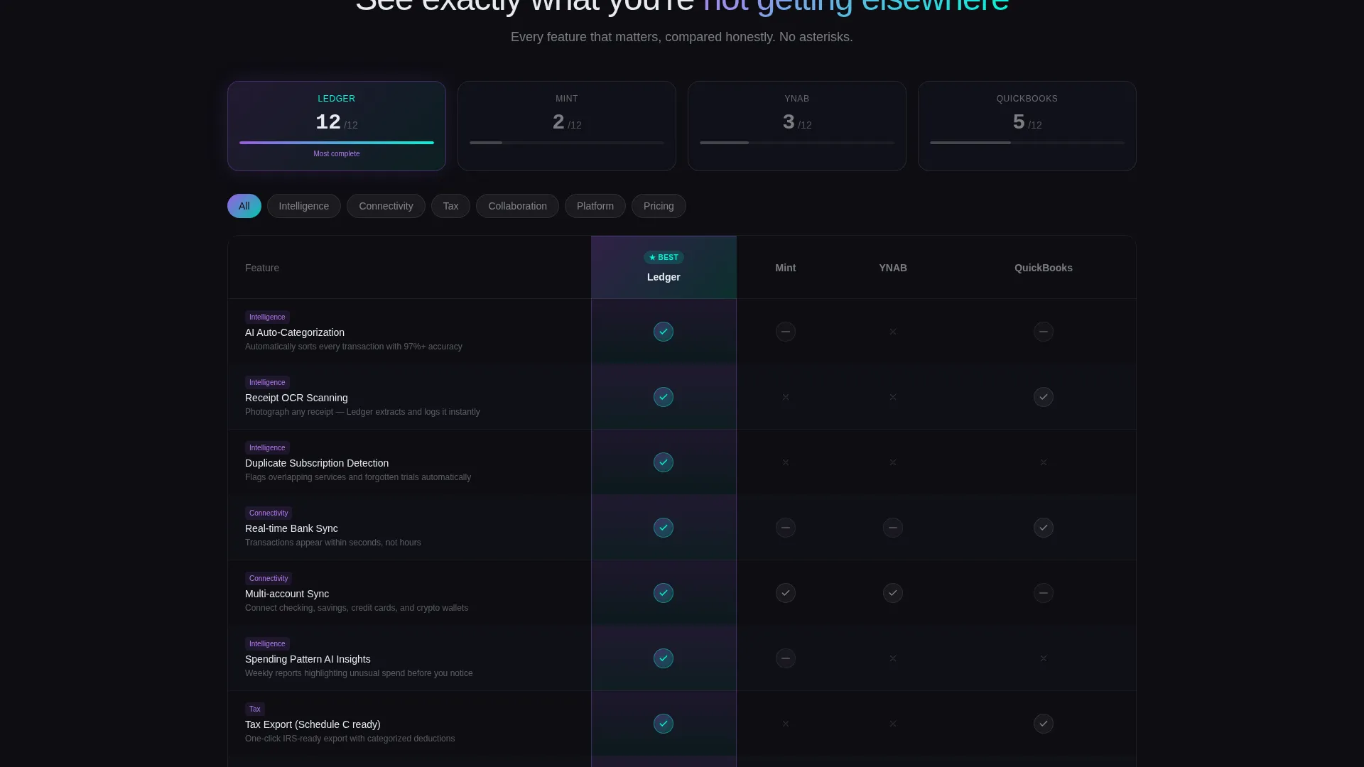
- A glowing comparison table with iridescent checkmarks for your product column, a floating call-to-action bar on scroll, and a savings calculator section
Feature list
This template is built around specific design and conversion components. Each one is drawn directly from the Ledger brief.
Frosted Glass Hero with 3D Product Screenshot
The header drops visitors into a high-fidelity dashboard render tilted at a subtle 3D angle. The card floats on an obsidian void with an iridescent glow bleeding from behind it. A single bold headline sits above the image to anchor the value proposition immediately.
Desaturated Pain Section
Before the comparison table appears, the page walks through a visual problem sequence. Messy receipt photos, bank statement chaos, and a ticking missed-tax-deduction counter are rendered in muted grays. This contrast makes the color snap of the comparison section feel like a genuine reveal.
Iridescent Comparison Table
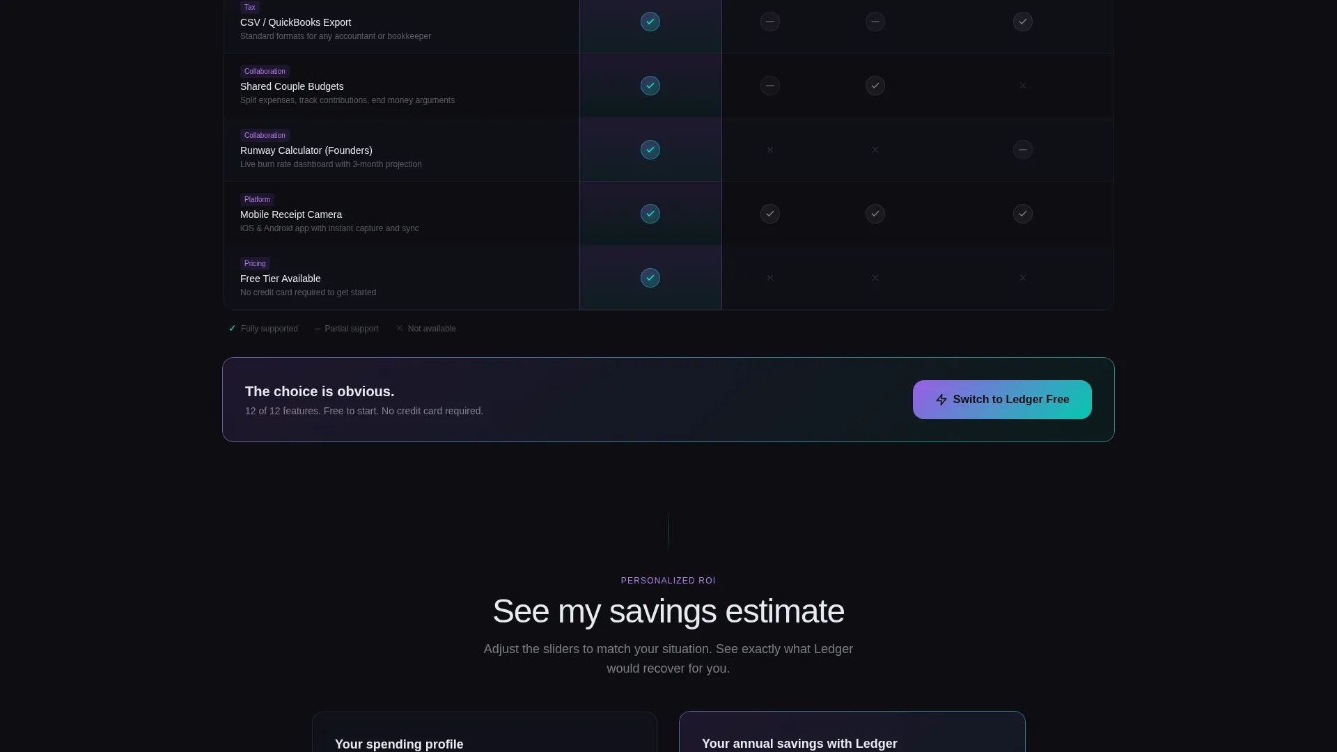
The core conversion section is a structured feature-by-feature comparison grid. Each row covers a real decision point such as auto-categorization, receipt scanning, bank sync speed, subscription detection, and tax export options. Your product column glows with iridescent checkmarks while competitor columns show partial support or empty cells.
Floating Call-to-Action Bar
A sticky bar containing the primary call-to-action button follows the visitor as they scroll past the comparison table. It stays visible without interrupting the reading flow. The two-step conversion flow collects an email first, then prompts the visitor to connect their bank.
Savings Calculator Section
A secondary conversion path lets visitors enter their monthly spending total to see a projected savings estimate. This interactive section creates a personalized reason to convert before any account is created. It works as a soft qualifier and a motivator in the same interaction.
AI Iridescent Color System
The entire template uses a four-color palette built for depth and visual drama. Deep obsidian and frosted white form the structural layer. Holographic violet and shifting cyan appear on interactive elements, toggle switches, and winning checkmarks throughout the comparison grid.
Page sections overview
| Section | Purpose |
|---|---|
| Hero with Screenshot | Anchors the product visually and states the core value claim |
| Problem Pain Section | Shows receipt chaos and missed deductions in desaturated tones |
| Comparison Table | Compares features row by row with iridescent win indicators |
| Floating call to action Bar | Keeps the primary action visible throughout the scroll |
| Savings Calculator | Personalizes the value proposition with a spend-based estimate |
| Two-Step Sign-Up | Converts intent with email capture then bank connection prompt |
Design & branding system
The template uses a Tech Glass theme paired with an AI Iridescent color system. The palette is built for dark-mode interfaces where surfaces feel like they generate their own light.
- Core colors: deep obsidian (#0D0D12) for backgrounds, frosted glass white (#E8EAF0) for card panels, holographic violet (#9B5DE5) for primary accents, and shifting cyan (#00F5D4) for interactive highlights and hover states
- Cards use frosted blur effects that simulate glass layered over dark surfaces, with iridescent tones bleeding across borders and toggle switches
- The comparison grid uses iridescent checkmarks in the winning column and muted or empty cells in competitor columns to create visual hierarchy at a glance
Mobile & speed optimization
The template is structured with a mobile reading flow in mind. Scroll-driven sections and sticky elements are sized and spaced for smaller screens.
- The floating call-to-action bar is designed to sit cleanly at the bottom of mobile viewports without covering critical content
- The comparison table layout is built to remain scannable on narrow screens, with rows that do not require horizontal scrolling to read
- The hero screenshot and its 3D tilt effect are proportioned to render clearly on both desktop and mobile display sizes
How this template helps you convert
The page is engineered around a single principle: remove every reason to leave before the visitor reaches the call-to-action. The Problem-to-Solution Arc and frictionless entry flow work together to build that momentum.
- The pain section creates emotional urgency before any product feature is shown, so visitors arrive at the comparison table already primed to look for a better option
- The comparison table answers the specific objections a skeptical switcher carries, with each row resolving a real decision point rather than restating marketing copy
- The savings calculator makes the value personal and quantifiable, turning an abstract promise into a number the visitor generated themselves
Other information about this template
This template is categorized under Technology, specifically within the Micro-SaaS and Developer Tools subcategory, with a niche focus on expense tracking products. It is a strong fit for any product that competes in the personal finance or business expense management space.
- The Comparison/Versus landing page direction means this template is optimized for audiences who have already tried at least one competing tool and are actively evaluating alternatives
- The two-step sign-up flow, email first then bank connection, is designed to reduce drop-off by splitting commitment into two smaller decisions rather than one large one
- The template style is a Comparison Table layout, which works well for products with clear feature advantages over existing market options
Theme
Tech Glass
Creative direction
Problem→Solution Arc
Color system
AI Iridescent
Style
Comparison Table
Direction
Comparison/Versus
Page Sections
3D Tilted Hero Screenshot
Problem-to-solution Scroll Arc
Iridescent Comparison Table
Floating Call-to-action Bar
Savings Calculator Section
AI Iridescent Color System
Related questions
Can I customize the comparison table rows for my own product features?
Does this template include the savings calculator logic, or is it a visual placeholder?
Is this template suitable for products outside the expense tracker niche?
What does the two-step sign-up flow look like in practice?
Can I update the color palette to match my own brand?



