Accounting Firm Case Study Landing Page Template
Ledger is a dark-mode accounting firm landing page built for firms that transform founder-stage financial chaos into investor-ready books. It features an animated dashboard header, interactive before-and-after comparison tables, and a case study flow that guides Series A founders, SaaS operators, and fractional CFOs toward a single app download conversion.
by Rocket studio
Quick summary
Ledger is a single-page accounting firm landing page template built around one core idea: showing potential clients exactly what clean financials look like before asking them to act. It uses a live dashboard header, interactive comparison tables, and progressive case studies to move visitors from recognition to download in one confident scroll.
Who this template is for
This template speaks directly to people who know their books are broken and need proof that someone can fix them. It is built for service providers who want their results to do the talking.
- Accounting firms and fractional CFO practices targeting early-stage and growth-stage founders
- Professionals serving bootstrapped SaaS operators who have crossed significant revenue milestones but lack clean financial infrastructure
- Firms pitching board-ready reporting and investor-ready cleanup work to clients preparing for funding rounds
What problem this template solves
Accounting firms often struggle to communicate value on a page. A list of services does not answer the question a founder is actually asking: "Can you fix the specific mess I am in?" This template solves that gap.
- Founders and operators arrive skeptical, so the template leads with real outcomes shown through animated financial data and before-and-after comparisons rather than feature lists
- Most accounting pages bury the conversion point; this template places a focused app download action after each case study so the decision happens at peak trust
- Visitors at different company stages self-select through escalating case studies, reducing friction by matching their situation before they reach a call to action
What you get with this template
You get a fully structured landing page layout built around financial storytelling and outcome-first credibility. Every section is designed to reduce doubt and build momentum toward a single download action.
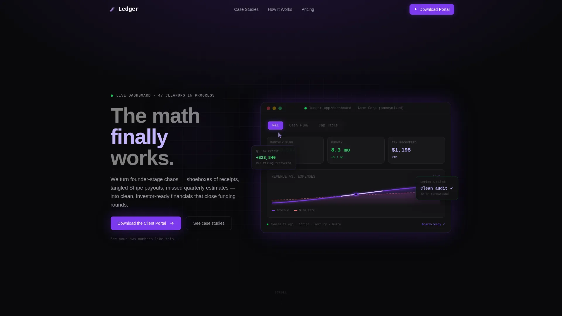
- An animated dashboard preview header showing live-feeling financial metrics including burn rate, runway extension, and a tax savings counter
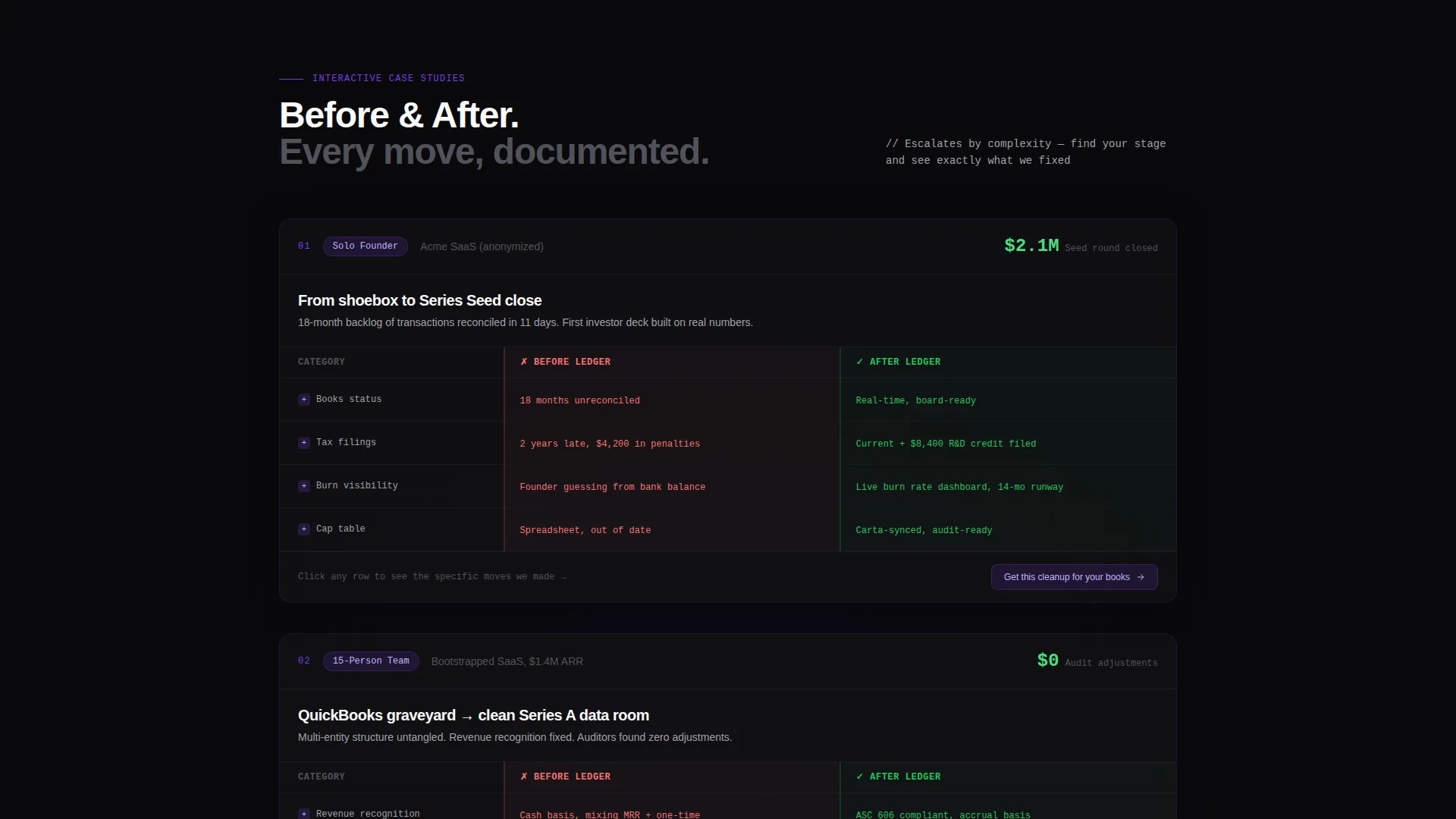
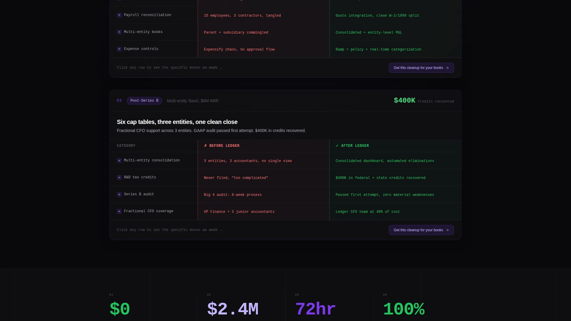
- Three-stage interactive case study comparison tables with expandable rows covering a solo founder, a 15-person team, and a post-Series B multi-entity structure
- A focused app download flow requiring only a phone number and company name before the download link activates
Feature list
This template includes purpose-built components that work together to turn skeptical visitors into confident leads.
Animated Dashboard Header
The header renders a pixel-perfect client portal preview with subtly animating financial figures. Burn rate trends downward, runway extends rightward, and a tax savings counter ticks upward in violet. A ghost cursor moves through portal tabs including profit and loss, cash flow, and cap table views, giving visitors a realistic preview of what their own dashboard could look like.
Interactive Before-and-After Tables
Each case study is built around a structured comparison table with a Before column and an After column. Before states include late filings, penalty fees, and opaque books. After states show clean audits, recovered credits, and board-ready reports. Rows are expandable, revealing the specific moves the firm made to achieve each outcome.
Escalating Case Study Flow
Three case studies are sequenced by company complexity. The first covers a solo founder, the second a 15-person team, and the third a post-Series B company with a multi-entity structure. This progression lets each visitor find their own stage and recognize that the firm has already solved their specific situation.
Contextual Micro-calls to action
Each case study ends with a short, direct call to action: "Get this cleanup for your books." This links to the same app download flow as the primary call to action and keeps conversion pressure distributed throughout the page rather than concentrated at the bottom.
App Download Conversion Flow
The primary conversion action is a focused app download. The form asks for only two fields: a phone number and a company name. Once submitted, the download link fires. The secondary headline beneath the main call to action reads "See your own numbers like this," reinforcing the value shown throughout the page.
Void and Violet Design System
The visual identity uses a precisely defined four-color palette. Void black dominates backgrounds, deep orbital violet drives call-to-action elements and active states, phosphor lilac highlights data points and hover interactions, and terminal white carries all body typography. Financial figures use monospaced type treatment for added precision and credibility.
Page sections overview
| Section | Purpose |
|---|---|
| Dashboard Preview Header | Opens with animated client portal metrics to establish immediate credibility |
| Solo Founder Case Study | First comparison table showing cleanup outcomes for an early-stage founder |
| Team-Stage Case Study | Second comparison table escalating complexity to a 15-person company |
| Multi-Entity Case Study | Third comparison table covering post-Series B structure and board-ready results |
| Primary App Download call to action | Collects phone number and company name to trigger the portal download |
| Micro-call to action Blocks | Contextual download prompts placed below each individual case study |
Design & branding system
The design language is built for financial credibility in a startup-native context. It reads like a code editor at the moment a deployment passes: dark, precise, and purposeful.
- Four-color Void and Violet palette: absolute void black (#09090B) for backgrounds, deep orbital violet (#7C3AED) for calls to action and active states, phosphor lilac (#C4B5FD) for data highlights and hover states, and terminal white (#FAFAFA) for all body text
- Monospaced typeface treatment on all financial figures reinforces precision and distinguishes data from prose
- Violet pulses through interactive states while lilac handles secondary highlights, creating a visual hierarchy that guides attention without clutter
Mobile & speed optimization
The layout is structured to remain legible and functional across screen sizes, with particular attention to the data-heavy comparison tables that sit at the core of the experience.
- Comparison tables and expandable rows are designed to reflow cleanly so mobile visitors can navigate case study detail without horizontal scrolling
- The two-field download form is minimal by design, reducing tap friction on smaller screens where long forms create drop-off
- The animated dashboard header uses contained motion so the visual storytelling reads clearly on mobile without overwhelming the viewport
How this template helps you convert
This template converts by showing results before asking for anything. Every structural decision is made to build trust incrementally and then capture it at the right moment.
- The animated dashboard header creates immediate aspiration, letting visitors picture their own financials looking that clean before they have read a single word of copy
- The escalating case study sequence with expandable before-and-after rows keeps visitors engaged longer and delivers the specific proof point most relevant to their company stage
- The two-field download form placed after each trust moment removes nearly all friction from the conversion step, making the app feel like a natural next action rather than a sales gate
Other information about this template
This template is part of the Startup Velocity theme family, which is designed for technology-sector service providers operating in fast-moving founder ecosystems. A few additional details worth noting:
- The template is categorized under accounting firm website templates with a specific niche focus on accounting firm case study pages, making it suitable for firms whose primary sales tool is proof of past outcomes
- The Void and Violet color system is purpose-built for this theme and can be adapted to match a firm's own brand by swapping accent colors while preserving the dark background structure
- The Interactive Explorer creative direction means the page is built for engagement depth, not just surface-level scrolling; case study rows are designed to reward visitors who want more detail
- The header concept is a Dashboard Preview, which means the top of the page functions as a product demonstration rather than a headline-and-hero image pattern typical of most service pages
- The page direction targets an app download as the single primary conversion goal, keeping all secondary actions subordinate to that one outcome
Theme
Startup Velocity
Creative direction
Interactive Explorer
Color system
Void & Violet
Style
Comparison Table
Direction
App Download
Page Sections
Animated Dashboard Preview Header
Before-and-after Comparison Tables
Three-stage Escalating Case Studies
Two-field App Download Form
Contextual Micro-cta Blocks
Void and Violet Visual Identity
Related questions
Who is this landing page template designed for?
What makes the comparison table layout effective for accounting firms?
Can I adapt this template to fit my own firm's branding?
How does the app download conversion flow work?
Do I need existing case study data to use this template?



