Architecture Firm Software Professional Website Template
Ledger is a card grid landing page template built for architecture firm accounting software. It combines an interactive dashboard preview, stats-first modular cards, and a lead generation flow into one focused page. The design uses a Data Command visual theme to make complex financial data feel immediate, organized, and trustworthy to managing partners, office managers, and CFOs.
by Rocket studio
Quick summary
Ledger is a single-page template designed for architecture firm accounting software. It opens with a live-feeling dashboard mockup, builds a case through data-led cards, and closes with a focused lead capture form. Every section is built around the specific financial pain points architecture firms face daily.
Who this template is for
This template was designed for software teams and marketers selling financial tools to architecture and design practices. It speaks directly to the people who manage money inside those firms.
- Managing partners at small-to-mid-size firms drowning in spreadsheets and project fee tracking
- Office managers reconciling consultant invoices against fee proposals across multiple active projects
- CFOs at multi-studio practices who need real-time project profitability across offices
What problem this template solves
Architecture firms lose billable time and project margin because their financial data lives in disconnected tools. The gap between fee proposals, consultant invoices, and actual hours burned is hard to see until it is too late.
- Budget overruns are discovered after invoicing, not before, leaving firms unable to course-correct
- Manual reconciliation of consultant costs against project phases wastes hours every week
- Profitability across principals, phases, and offices is nearly impossible to track without a single command center
What you get with this template
This template delivers a complete, structured landing page layout for architecture accounting software. Every section earns visitor trust before asking for anything in return.
- An interactive header dashboard showing phase-by-phase burn rates, consultant costs, and margin percentages for real project scenarios
- A modular card grid where each card leads with a compelling industry statistic before revealing the specific feature that solves it
- A dual conversion path: a primary demo request form and a secondary gated PDF download for visitors who are not yet ready to book
Feature list
This template is built around six purposeful content blocks. Each one carries a distinct role in moving a skeptical visitor toward conversion.
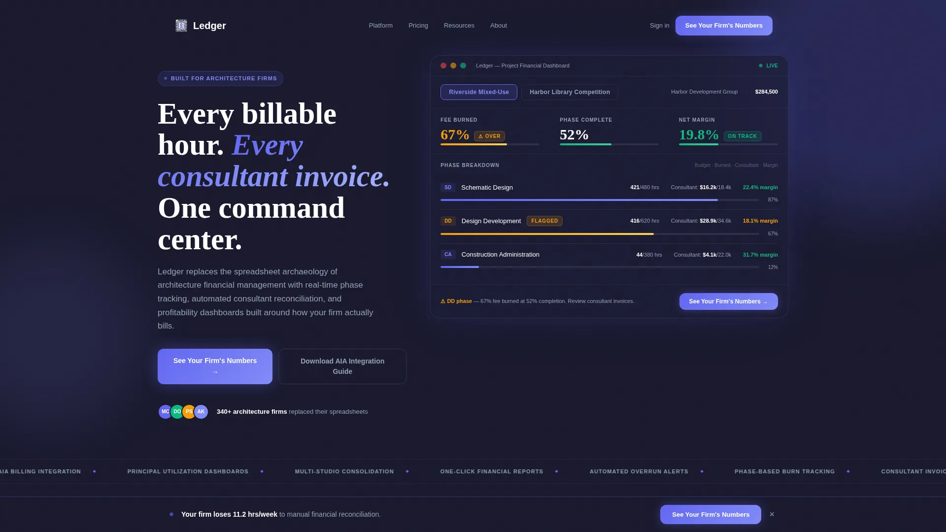
Interactive Dashboard Header
The header presents a functioning mockup of an architecture project dashboard. Visitors can click between two projects, "Riverside Mixed-Use" and "Harbor Library Competition", and watch phase-level data shift in real time. Billable hours burned versus budgeted, consultant costs, and margin percentages update on click. A flagged amber indicator at 67% fee burned against 52% phase completion makes the stakes feel immediate.
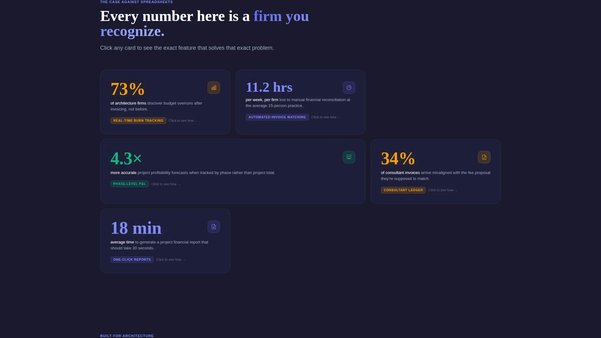
Stats-First Modular Card Grid
Every card in the grid opens with a single, arresting industry statistic. One card states that 73% of architecture firms discover budget overruns after invoicing, not before. Another notes that the average 15-person firm loses 11.2 billable hours per week to manual financial reconciliation. Each card then expands or flips to reveal the specific feature solving that exact problem, building a cumulative case for change.
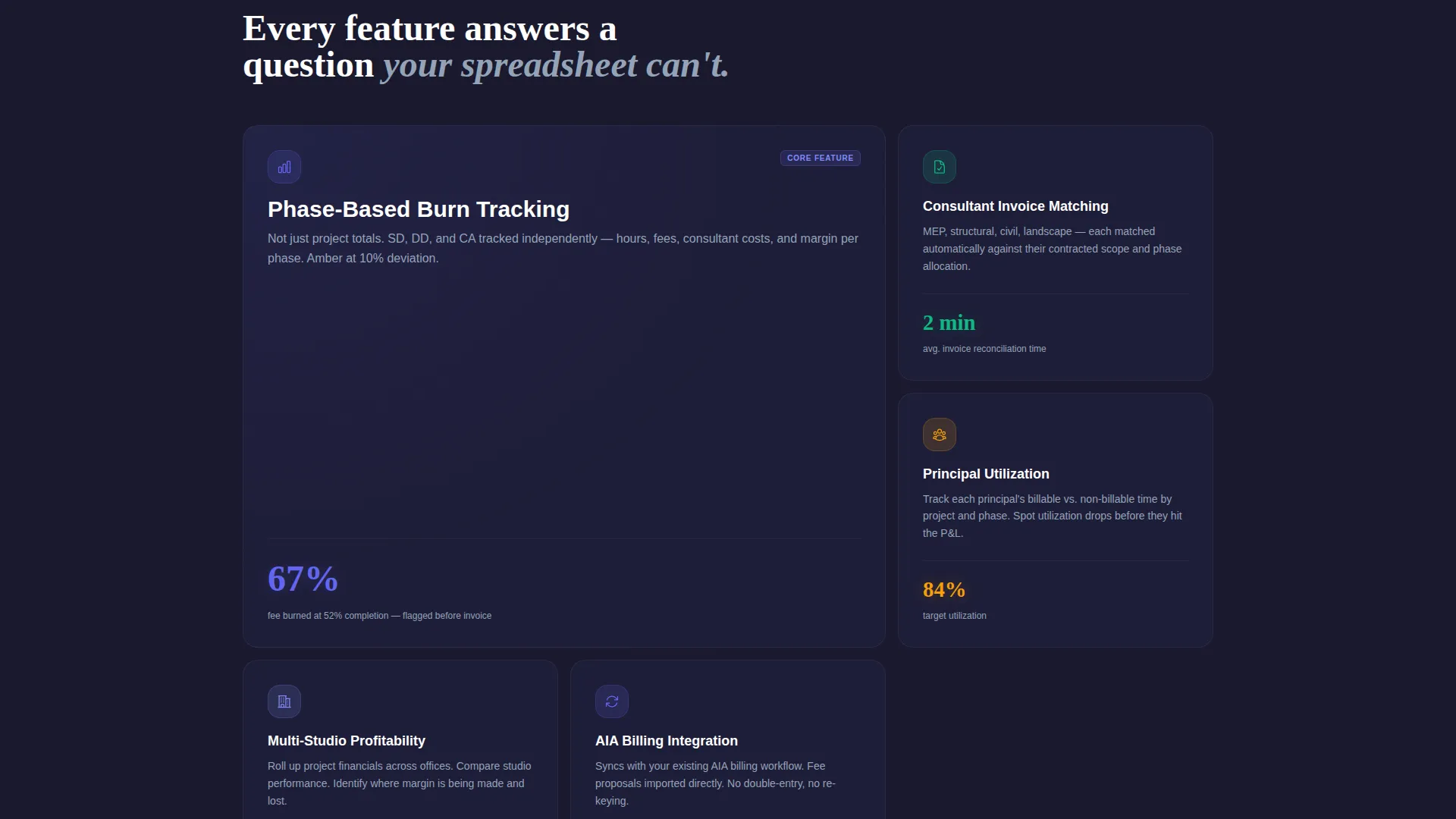
Phase-Based Burn Tracking Display
The template includes a dedicated content block showing how the software tracks financial performance by project phase. Schematic Design, Design Development, and Construction Administration each carry their own burn rate, making it clear when a phase is running over budget before the invoice arrives.
Automated Consultant Invoice Matching
A feature card explains how the platform matches consultant invoices against original fee proposals automatically. This directly addresses the office manager persona who spends hours each month on manual reconciliation across active projects.
Dual Conversion Path
The primary call to action, "See Your Firm's Numbers", appears inside the header dashboard and again in a persistent bottom bar that activates after the visitor scrolls past the third card. A secondary path offers a gated PDF download for visitors who are not ready to book a demo. The lead form asks for firm size, current accounting tool, and work email only.
Real-Time Profitability Dashboard Block
A content section demonstrates how the platform surfaces profitability by project, by phase, and by principal simultaneously. This directly serves CFOs at multi-studio practices who need a single view across offices without manual data consolidation.
Page sections overview
| Section | Purpose |
|---|---|
| Interactive Header Dashboard | Hook visitors with a live-feeling project data preview and primary call to action |
| Stats Card: Budget Overruns | Lead with industry data to establish the cost of inaction |
| Feature Reveal: Burn Tracking | Show phase-based tracking as the direct solution to the overrun problem |
| Stats Card: Billable Hours Lost | Quantify weekly time loss from manual reconciliation |
| Feature Reveal: Invoice Matching | Present automated invoice matching as the time-saving answer |
| Real-Time Profitability Block | Demonstrate cross-office, cross-principal profitability visibility |
| Persistent Bottom Bar call to action | Reinforce the primary demo request after enough evidence has accumulated |
| Gated PDF Secondary Path | Capture visitors who want value before committing to a demo |
| Lead Capture Form | Collect firm size, current tool, and work email in three fields |
Design & branding system
The visual identity follows a Data Command theme that feels like a Bloomberg terminal rebuilt with intentional negative space. The palette is charged and precise without ever feeling cold or clinical.
- Deep workspace charcoal (#1A1A2E) forms the base layer, grounding the dashboard in a focused, distraction-free environment
- Electric indigo (#6366F1) pulses across active states, data highlights, and call-to-action elements to draw the eye where it matters
- Cool slate (#94A3B8) handles secondary text and card borders, while crisp white (#FAFBFC) keeps card surfaces clean and readable
Mobile & speed optimization
The card grid layout is inherently responsive, allowing modular cards to restack cleanly on smaller screens. The dashboard header mockup adapts to viewport width so the interactive preview remains usable on mobile devices.
- Modular card structure means each content block reflows independently without breaking the visual hierarchy
- The persistent bottom bar call to action remains accessible on mobile scroll, keeping the conversion path present throughout the experience
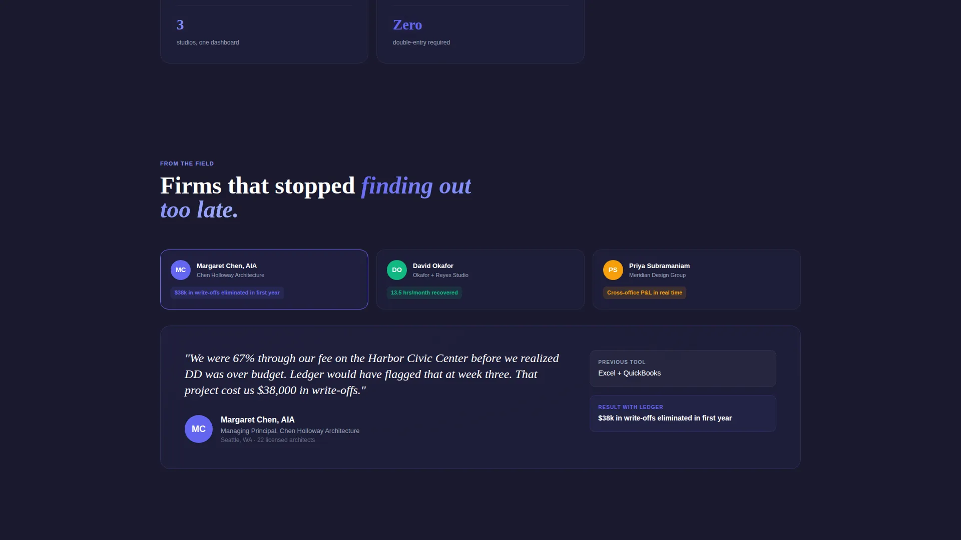
How this template helps you convert
The page is structured to earn trust through evidence before it ever asks for a click. The conversion architecture is deliberate and layered.
- The interactive header dashboard gives visitors a hands-on preview of the product's core value within seconds of landing, removing abstraction and replacing it with specific, recognizable data
- The stats-first card sequence builds a cumulative argument, with each card making the current status quo feel more costly, so that by the time the persistent call to action appears, the case is already made
- The dual conversion path respects different buyer readiness levels, capturing both demo-ready visitors through the primary form and research-phase visitors through the gated PDF, widening the lead funnel without diluting intent
Other information about this template
This template is built specifically for the architecture firm accounting software niche, where generic SaaS landing page patterns often fail to resonate with technically sophisticated buyers.
- The template style is a card grid (modular), making it straightforward to add, remove, or reorder feature cards without restructuring the full page
- The lead form intentionally limits fields to three: firm size by number of licensed architects, current accounting tool, and work email, keeping friction low while collecting qualifying data
- The gated PDF download is positioned as an AIA Billing Integration Guide, giving the secondary conversion path a concrete, profession-specific value proposition
- The page uses no stock imagery and no illustrations; the product interface itself acts as the visual hero throughout
- This template fits naturally within a broader architecture firm software marketing stack and can support campaign traffic from paid search, direct email, and conference follow-up sequences
Theme
Data Command
Creative direction
Stats-First Impact
Color system
Electric Indigo
Style
Card Grid (Modular)
Direction
Lead Generation
Page Sections
Interactive Dashboard Header Mockup
Stats-first Card Grid Layout
Phase-based Burn Tracking Block
Dual Conversion Path Design
Automated Invoice Matching Feature Card
Real-time Profitability Display
Related questions
Who is this landing page template designed for?
What makes this template different from a generic SaaS landing page?
Can I customize the card grid to fit different features?
What information does the lead generation form collect?
Is there a conversion path for visitors who are not ready to book a demo?


