Architecture Firm Software Professional Website Template
Ledger is a modular card grid landing page template built for architecture firm asset management platforms. It opens with a terminal-style code snippet header, flows through animated problem and feature cards, and drives visitors toward a live demo. The Monochrome Steel palette and Data Command theme give every section the precise, functional feel that operations professionals expect.
by Rocket studio
Quick summary
Ledger is a single-page, card grid landing page template designed for architecture firm asset management software. It uses a dark terminal header, kinetic card modules, and a click-through layout to move operations directors, facilities managers, and CFOs directly into a live demo environment. The design is methodical, data-forward, and built to earn trust before asking for a click.
Who this template is for
This template speaks directly to software products that help architecture firms and real estate operations teams manage physical assets at scale. It works best when the product audience values structured data, portfolio control, and capital planning clarity.
- Operations directors managing deferred maintenance across large building portfolios
- Facilities managers who inherit undocumented buildings and need a fast path to visibility
- CFOs and finance leads who need reliable capital planning numbers for multi-property portfolios
What problem this template solves
Asset management for architecture firms is often handled through disconnected spreadsheets, missed inspection logs, and reactive budget decisions. A landing page that looks generic does nothing to convince a skeptical operations professional that the platform is any different. Ledger solves that credibility gap immediately.
- Spreadsheet chaos and fragmented data make it hard to show product fluency at a glance
- Generic landing pages fail to signal technical depth to operations and facilities audiences
- Click-through pages without proof points lose technical evaluators before they ever reach the demo
What you get with this template
Ledger delivers a fully structured, single-page layout built around a modular card grid system. Every section serves a defined conversion purpose, from introducing the problem to delivering the demo click.
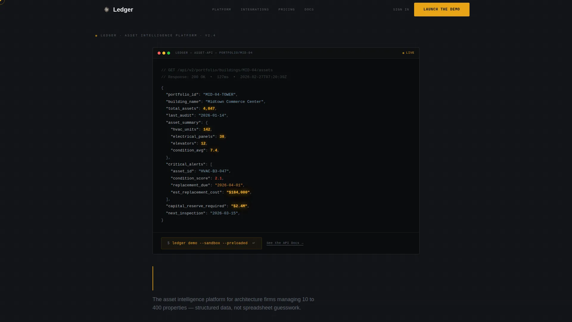
- A dark terminal-style code snippet header with a live-formatted asset data block and two distinct call-to-action paths
- Three rows of animated card modules covering the problem, product features with flip interactions, and integration proof points
- Amber-accented buttons and text links anchored at the end of each card row to drive demo traffic consistently
Feature list
This section covers the core built-in components and interaction patterns included in the Ledger template.
Terminal Code Snippet Header
The header fills the upper viewport with a dark terminal block displaying a syntax-highlighted JSON or API-style asset response. Asset IDs, condition scores, replacement dates, and cost projections are formatted in steel grays with operational amber pulsing on key data values. A typed headline sits below the block, and the primary call to action appears styled as a terminal command.
Kinetic Card Grid Layout
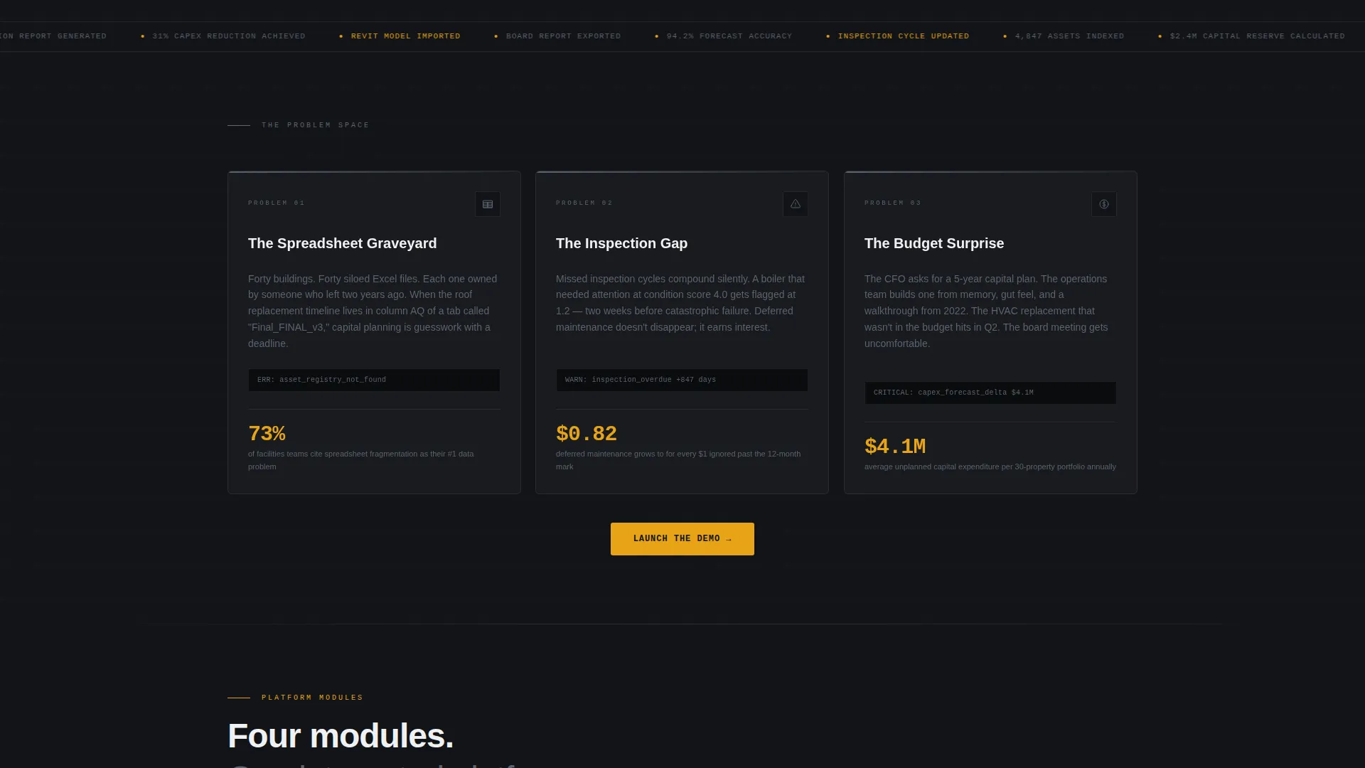
Each card module snaps into the grid with scroll-triggered precision as the visitor moves down the page. The layout assembles the full platform story in three distinct rows, moving from problem cards to feature cards to integration cards. The scroll rhythm is designed to feel like a system booting up rather than a standard page load.
Flip-on-Hover Feature Cards
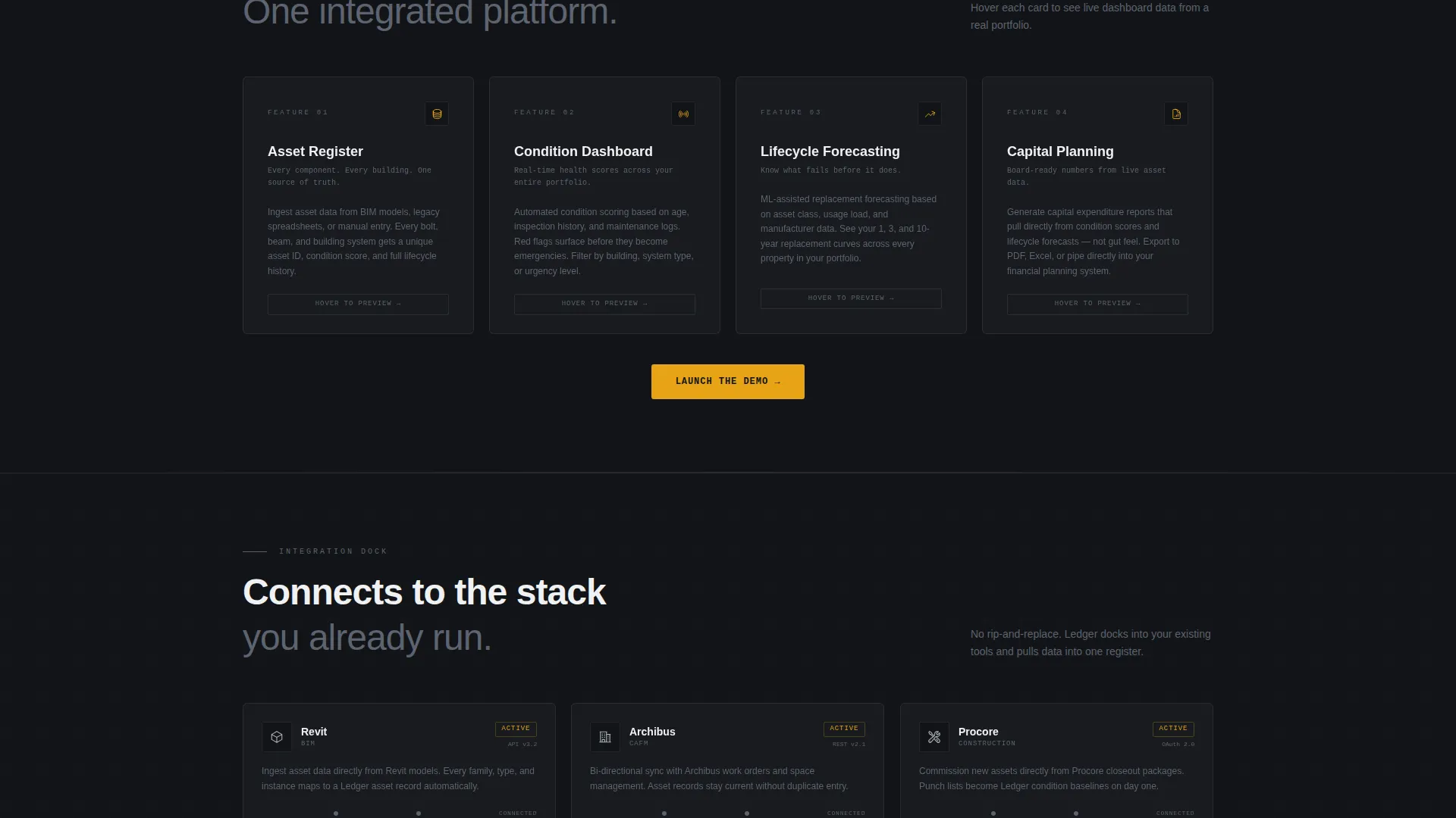
The second card row includes four feature cards that flip on hover to reveal live dashboard previews. Each card represents a core platform capability: asset registers, condition dashboards, lifecycle forecasting, and capital planning reports. The flip interaction gives technical visitors a preview of real product depth without leaving the page.
Dual Call-to-Action Architecture
The primary call to action, "Launch the Demo," appears first in the header as a terminal command and recurs as an amber button at the bottom of every card row. A secondary path, "See the API Docs," lives as an underlined text link inside the code snippet for technical evaluators. No form fields appear anywhere on the page.
Integration Dock Cards
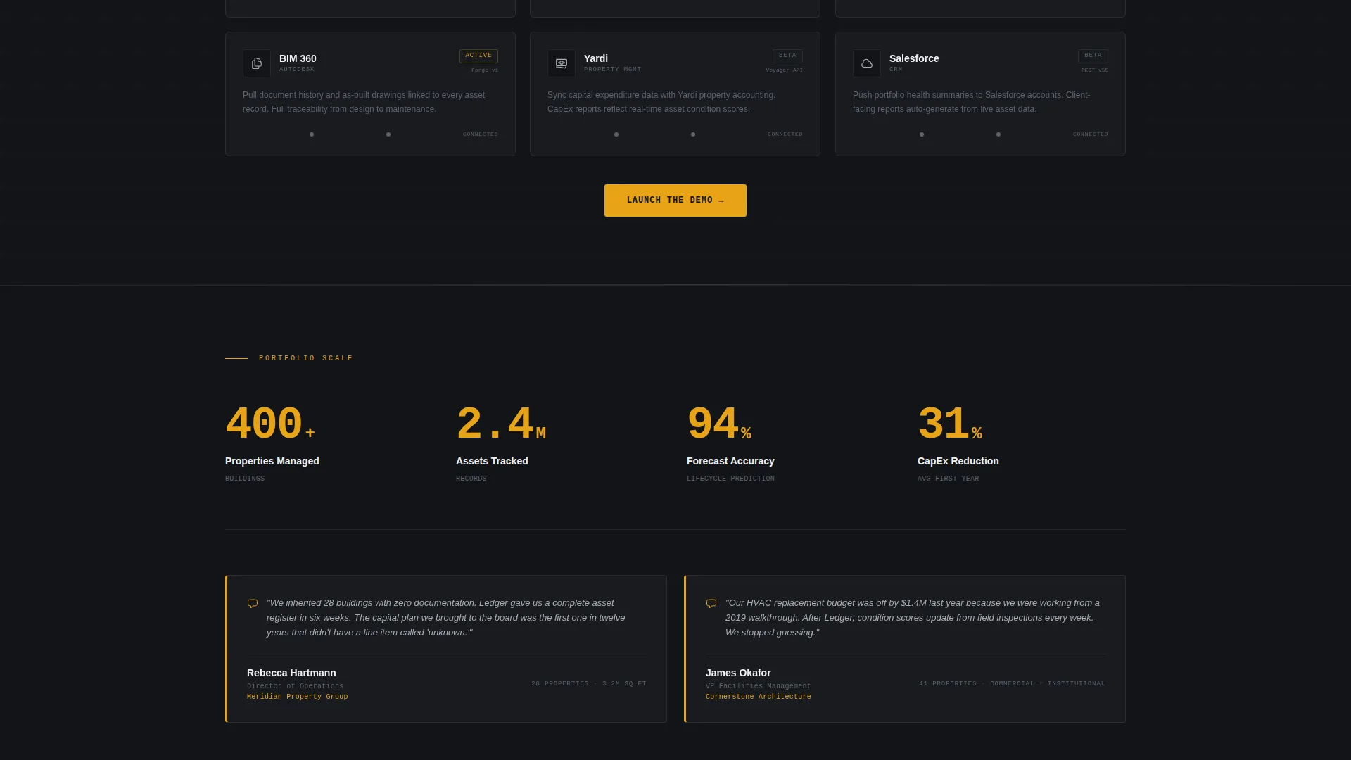
The third card row features integration reference cards that animate into position like components locking into a circuit board. Each card represents a platform connection relevant to architecture firm workflows. The visual metaphor reinforces the sense of a system that fits into existing professional toolchains.
Monochrome Steel Visual System
The entire template is built on a four-tone steel palette with a single reserved accent color. Card surfaces, backgrounds, and typography all use the steel range, while operational amber appears only on live data points and interactive states. The result is a layout that reads as functional and precise rather than decorative.
Page sections overview
| Section | Purpose |
|---|---|
| Terminal Header Block | Opens with raw asset data and sets the platform's technical tone immediately |
| Typed Headline Strip | Delivers the core value statement below the code snippet |
| Problem Card Row | Three cards naming the real pain points the platform resolves |
| Feature Card Row | Four flip cards previewing the platform's core capability areas |
| Integration Dock Row | Cards showing platform connections that animate into a locked grid |
| Metrics and Portfolio Proof | Client numbers and portfolio scale that build momentum toward the demo |
| Persistent Demo Button | Amber call-to-action anchored after every card row |
Design & branding system
The visual identity uses a Data Command theme built entirely on a Monochrome Steel color system. Nothing on the page is decorative. Every visual choice reinforces the idea of a platform that is precise, structured, and always current.
- Four-tone palette: forge black (#121417), brushed aluminum (#A8ADB5), cold rolled steel (#5C6370), and signal white (#F0F1F3) for all card surfaces and backgrounds
- Operational amber (#E8A317) appears exclusively on live data values and interactive states such as buttons and hover triggers
- No stock photography or illustration; structured data and card content carry the full visual load
Mobile & speed optimization
The card grid layout is structured to reflow cleanly across screen sizes. Each module is self-contained, which makes responsive stacking straightforward without breaking the visual logic of the page.
- Modular card blocks are individually sized and can restack into single-column layouts on smaller screens
- The terminal header block is viewport-filling and adapts to narrower widths without losing the data readability that makes the first impression work
- Scroll-triggered card animations are tied to individual module entry points, keeping the assembly metaphor intact on both desktop and mobile viewports
How this template helps you convert
Ledger is built around a single conversion goal: moving a qualified operations professional from first impression to demo click with as little friction as possible. The layout earns that click through a sequence of proof before ask.
- The terminal header leads with raw data structures, signaling platform fluency to technical visitors before any marketing copy appears, which builds credibility in the first seconds of the visit.
- The flip card row delivers capability proof in an interactive format, letting visitors explore asset registers, condition dashboards, lifecycle forecasting, and capital planning previews without navigating away from the page.
- Amber call-to-action buttons recur after every card row so the path to the demo is always one visible step away, regardless of where the visitor pauses in the scroll sequence.
Other information about this template
Ledger is part of a broader family of technology-focused landing page templates designed for software platforms serving professional and enterprise audiences. The template style is Card Grid (Modular), which makes it straightforward to adapt the number of cards per row to fit a specific platform's feature set or proof points. The creative direction is Launch Energy, which means the scroll experience is intentionally paced to build momentum rather than present all information at once. The header concept is Code Snippet, a format that performs well with technically literate audiences who evaluate tools by their data fluency before their marketing polish. The click-through landing page direction means there are no embedded forms or lead capture gates. The entire page is built to route visitors into a live interactive demo environment or a technical documentation path. This approach works well for platforms like those in the architecture firm asset management space, where buyers want to inspect before they commit.
- Template style: Card Grid (Modular) with three distinct content rows
- Theme: Data Command, reinforced by the terminal header and steel palette throughout
- Landing page direction: Click-Through with no on-page form fields
- Header concept: Code Snippet displaying syntax-highlighted asset data in a dark terminal block
- Creative direction: Launch Energy with scroll-triggered card assembly animations
Theme
Data Command
Creative direction
Launch Energy
Color system
Monochrome Steel
Style
Card Grid (Modular)
Direction
Click-Through
Page Sections
Terminal Code Snippet Header
Kinetic Scroll-triggered Cards
Flip-on-hover Feature Cards
Dual Call-to-action System
Integration Dock Card Row
Monochrome Steel Color System
Related questions
Can I customize the card content for a different type of asset management platform?
Does the template include the actual demo environment or API documentation?
How many card rows does the Ledger template include?
Is the amber accent color used throughout the entire page?
What call-to-action paths does this template support?



