Expert Software & SaaS Cost Estimator Website Template
Ledger is a split-screen asset management landing page template built for software companies targeting operations managers, IT directors, and CFOs. It opens with a live calculator that quantifies the visitor's current pain, then walks them through a methodical spec-by-spec comparison. The result is a conversion flow where the decision feels inevitable before the call to action even appears.
by Rocket studio
Quick summary
Ledger is a single-page, split-screen landing page template designed for asset management software. It leads with an interactive calculator that makes the visitor's inefficiency visible in real numbers, then uses a structured comparison layout to systematically dismantle the case for staying with spreadsheets or legacy tools. Every section earns the next click.
Who this template is for
This template is built for software companies and product teams marketing an asset management platform to mid-size and enterprise buyers. If your sales motion depends on showing a clear before-and-after, this layout does that work for you.
- Operations managers who oversee physical and digital asset inventories
- IT directors managing fleets of devices, licenses, or server infrastructure
- CFOs and finance teams who need audit-ready asset registers before quarter-end
What problem this template solves
Asset management software is a considered purchase. Buyers arrive skeptical, often mid-spreadsheet, and need to feel the cost of doing nothing before they'll act. A generic feature page doesn't create that urgency. Ledger does.
- Visitors leave without understanding how much time and money their current process wastes
- Feature lists alone don't expose the gap between manual tracking and automated asset management
- Internal champions need shareable proof before they can move a decision upward
What you get with this template
You get a fully structured landing page that takes the visitor from "curious" to "convinced" in a single scroll. Every section is intentional, and every layout decision supports the comparison-driven conversion flow described in the brief.
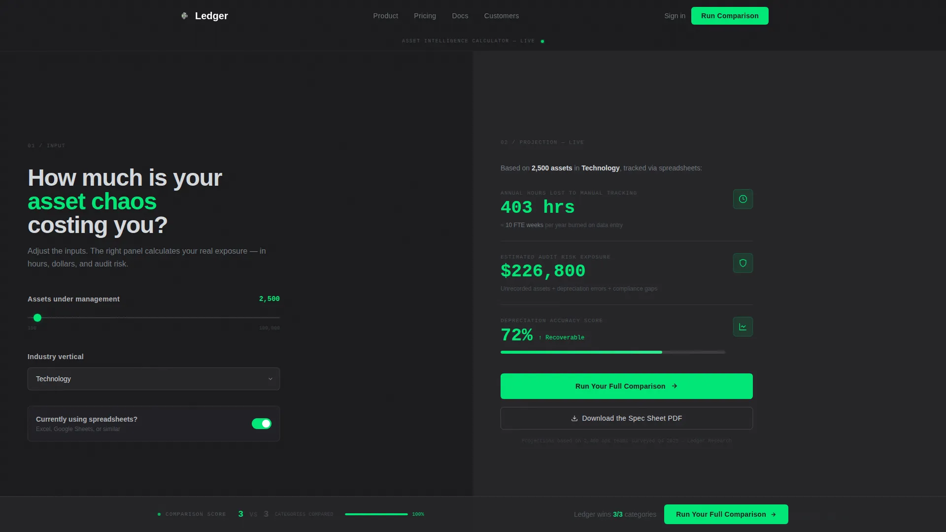
- A live calculator header with a slider, industry dropdown, and spreadsheet toggle that projects real output numbers
- A series of split-screen spec sections that place the old way and the new way side by side
- A primary call to action inside the calculator panel, a floating comparison bar, and a secondary PDF download path
Feature list
This section covers the core functional and design components built into the Ledger template.
Live Asset Cost Calculator
The header panel includes a slider ranging from 100 to 100,000 assets, an industry vertical dropdown, and a toggle for current spreadsheet use. As the visitor adjusts inputs, the right panel animates projections for annual hours lost, estimated audit risk exposure in dollars, and a depreciation accuracy score. Numbers tick with mechanical precision, like an odometer responding in real time.
Split-Screen Spec Comparison Layout
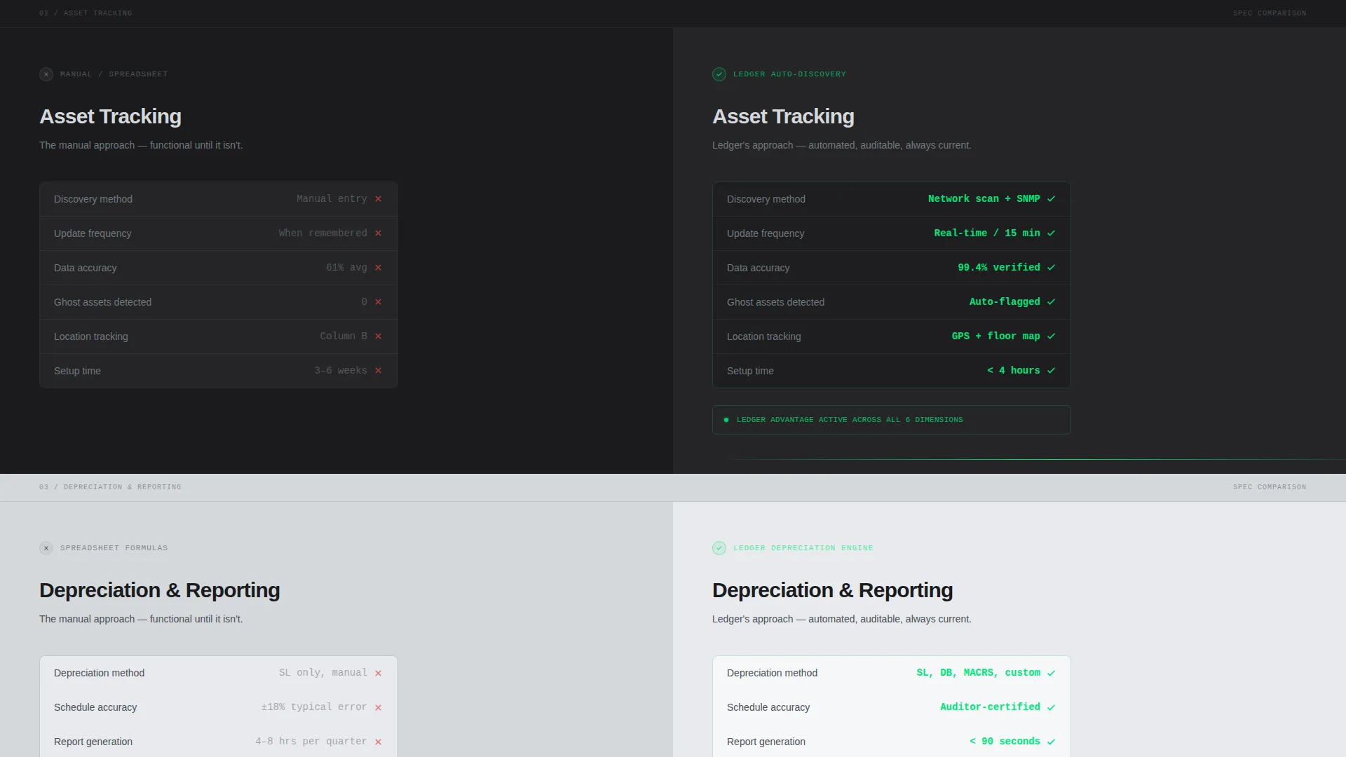
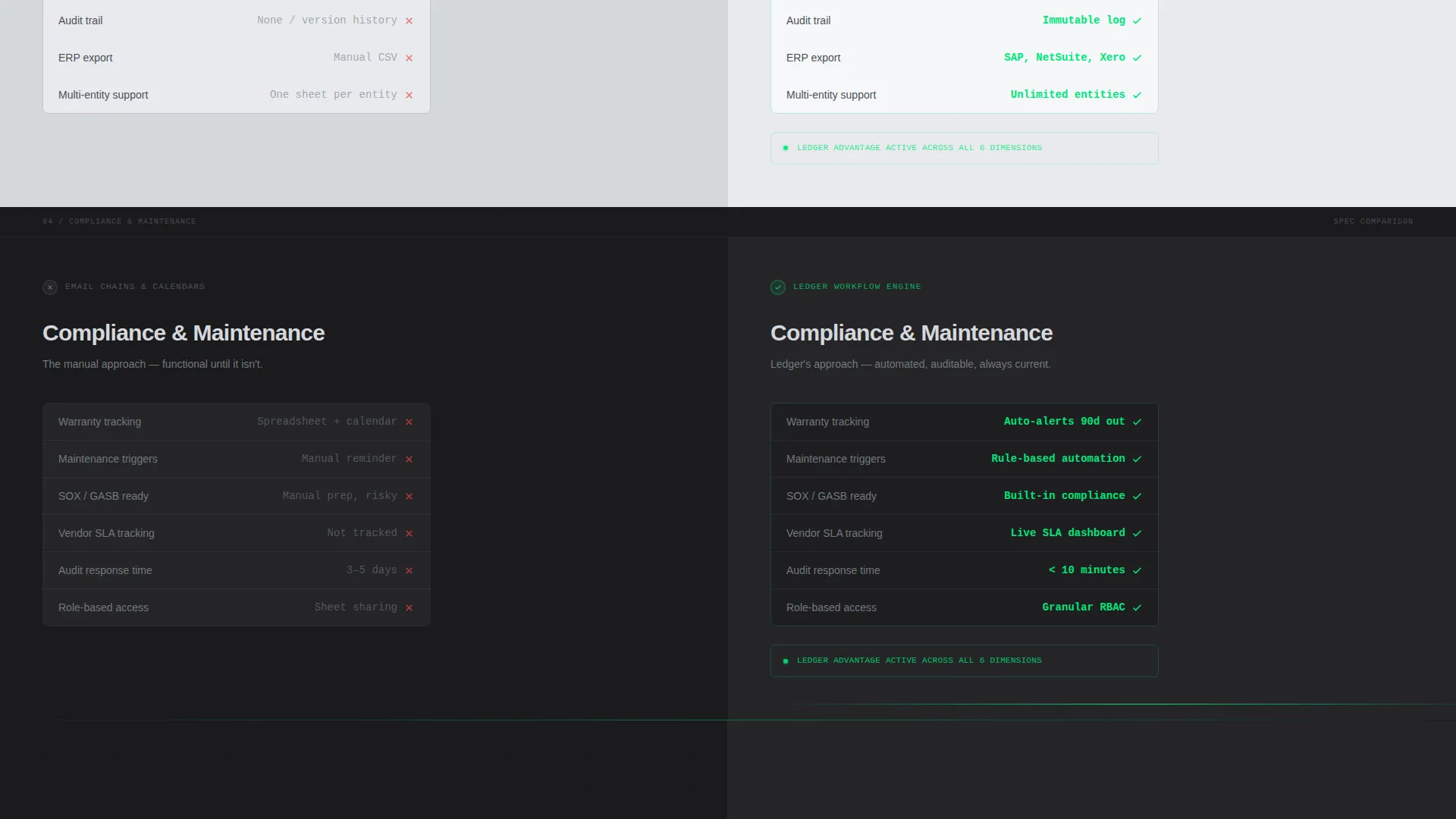
Each content section uses a strict 50/50 split. The left panel shows the visitor's current workflow, such as manual entry, spreadsheet formulas, and email-based maintenance requests. The right panel shows the software equivalent, including auto-discovery scanning, scheduled depreciation curves, and automated maintenance triggers. Specs are presented in tight data rows with checkmarks and figures, not marketing prose.
Persistent Comparison Score Bar
A comparison bar anchors to the bottom of the viewport and tallies the running score as the visitor scrolls through each spec section. It keeps the cumulative argument visible without interrupting the reading flow. By the time the visitor reaches the call to action, the score is already settled.
Dual Conversion Path Design
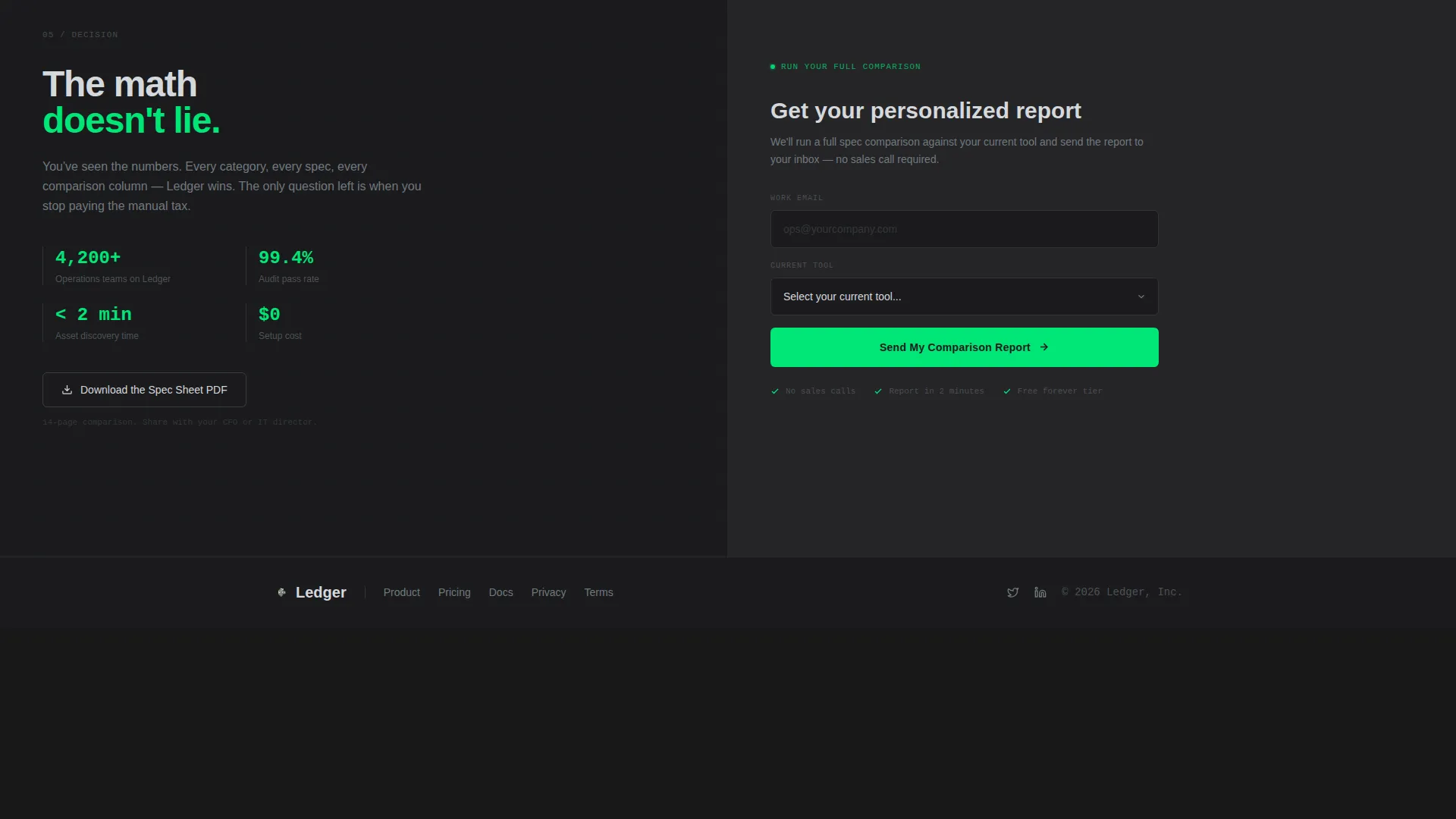
The primary call to action, labeled "Run Your Full Comparison," appears first inside the calculator result panel and again as a floating bar after the third spec section. A secondary path offers a downloadable spec sheet PDF for visitors who need to circulate the case internally before committing. Both paths are captured through a two-field form: work email and current tool selection.
Monochrome Steel Visual System
The entire template is built around a forge-black, brushed steel, and light alloy palette. A single signal-green accent color is reserved exclusively for interactive states, live data outputs, and hover effects. This restraint ensures the accent color always reads as "active" or "alive," never decorative.
Page sections overview
| Section | Purpose |
|---|---|
| Calculator header panel | Quantify visitor's asset management pain using live inputs |
| Calculator result panel | Display animated projections for hours lost and audit risk |
| Spec section one | Compare asset tracking methods side by side |
| Spec section two | Compare reporting workflows, old versus new |
| Spec section three | Compare compliance processes with data rows |
| Floating comparison bar | Accumulate and display the running comparison score |
| Primary call to action form | Capture work email and current tool via two-field form |
| PDF download path | Offer spec sheet for internal sharing before commitment |
Design & branding system
The visual identity follows a Directory and Discovery theme built on a Monochrome Steel color system. The result feels like a brushed-metal instrument panel: precise, functional, and completely unornamented. Backgrounds alternate between forge-black and light alloy to reinforce the split-screen tension throughout the page.
- Core palette: forge-black (#1B1B1E), brushed steel (#71797E), light alloy (#D5D8DC), and signal-green (#00E676)
- Signal-green appears only on interactive states, live calculation outputs, and toggled comparison columns
- No stock imagery or illustration; all visual weight comes from data, layout structure, and typographic contrast
Mobile & speed optimization
The Spec Sheet creative direction and split-screen layout are structured to adapt across viewport sizes without losing the comparison clarity that drives conversion. Tight data rows and minimal decoration keep the page lean by design.
- Alternating forge-black and light alloy backgrounds maintain visual rhythm on smaller screens
- The persistent comparison bar is designed to anchor to the bottom of the viewport on all device sizes
- Form fields use a minimal two-input structure to reduce friction on mobile entry
How this template helps you convert
Ledger is built around a single conversion philosophy: make the visitor's current pain quantifiable before asking them to act. The layout earns trust incrementally, section by section, rather than front-loading the pitch.
- The calculator header personalizes the experience immediately. The visitor inputs their own numbers and sees their own inefficiency reflected back, making the problem concrete before any feature is mentioned.
- Each split-screen spec section adds to a cumulative argument. The persistent comparison bar keeps that argument visible, so the call to action feels like a logical conclusion rather than a sales push.
- The dual conversion path removes commitment anxiety. Visitors who are ready can run the full comparison, while those who need internal buy-in can download the spec sheet PDF and keep the process moving.
Other information about this template
Ledger is categorized under Technology, specifically the Software and SaaS subcategory, with a niche focus on asset management software. The template's intersection score reflects a tight alignment between its layout style, creative direction, and the buying behavior typical of this category.
- Template style: Split Screen (50/50) with a Directory and Discovery theme
- The calculator header concept is purpose-built to reflect the visitor's own asset inventory scale back at them
- The comparison-versus landing page direction suits software products that compete directly against tools like spreadsheet-based tracking, ServiceNow, Snipe-IT, Freshservice, or homegrown systems
- The secondary call to action path (spec sheet PDF) is specifically designed for enterprise buyers who require internal circulation before a purchasing decision
- No stock imagery or illustration is used anywhere in the template; the visual language is entirely data and layout driven
Theme
Directory & Discovery
Creative direction
Spec Sheet
Color system
Monochrome Steel
Style
Split Screen (50/50)
Direction
Comparison/Versus
Page Sections
Live Asset Cost Calculator
Split-screen Spec Comparison
Persistent Comparison Score Bar
Dual Conversion Path
Monochrome Steel Color System
Related questions
Who is this landing page template designed for?
Can I adapt the calculator inputs to match my product's specific metrics?
Does the template include the form for capturing visitor details?
What makes this template different from a standard SaaS landing page?
Is there a secondary path for visitors who are not ready to convert immediately?



