Automotive Accounting Software Landing Page Template
Ledger is a hub-and-spoke anchor-nav landing page template built for automotive accounting software. It uses a dark glassmorphic visual system, live-styled data widgets, and a comparison-driven layout to position your dealership back-office platform against the competition. Every section is engineered to widen the perceived gap and move a skeptical controller toward booking a free dealership audit.
by Rocket studio
Quick summary
Ledger is a single-page, anchor-nav landing page template designed for automotive accounting software targeting dealership back-office teams. It combines a dark cockpit aesthetic with structured comparison sections, frosted-glass data widgets, and a low-friction three-field audit form. The layout escalates from calm feature parity to animated competitive charts, making the case for switching feel obvious.
Who this template is for
This template is built for founders and marketers behind automotive accounting platforms that need to convert a highly analytical, skeptical audience. The buyer is not browsing casually; they are evaluating at 11 p.m. during a month-end close.
- Dealer controllers and CFOs managing multi-rooftop groups who need proof before they trust a new tool
- Office managers still manually exporting from their dealer management system into spreadsheets
- Software vendors selling dealership back-office automation to finance and accounting decision-makers
What problem this template solves
Dealership accounting buyers are hard to convince. They have seen overpromised software before, and a generic hero-image landing page will not earn their trust. This template solves the credibility gap by leading with the product itself rather than marketing language.
- Generic software landing pages fail to speak to the specific pain of reconciling parts invoices, floor plan interest, and factory holdback in one place
- Comparison pages without structured escalation lose momentum; this template builds tension deliberately across five spoke sections
- Most templates bury the call to action before proving value; here, every form appears after a competitive data point, not before
What you get with this template
You get a fully structured, single-page layout with an anchor navigation bar, five comparison spoke sections, frosted-glass header widgets, and a repeated audit-request form. Every visual element is defined and ready to customize.
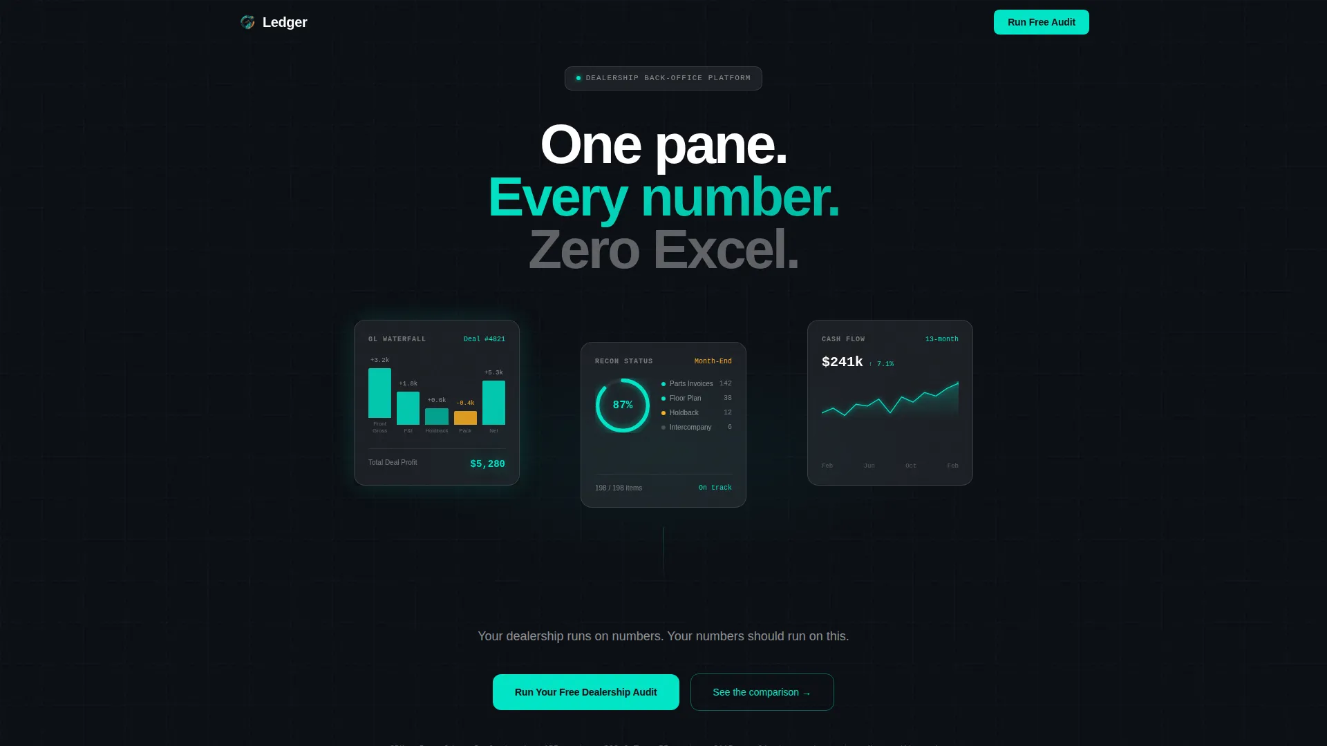
- A dark glassmorphic header with three live-styled data widgets: a general ledger waterfall, a reconciliation status ring, and a 13-month cash flow spark line
- Five anchor-nav spoke sections covering Reconciliation, Reporting, Integrations, Speed, and Switch, each ending with the primary call to action
- A ghost-button secondary path inside each comparison section that opens a frosted modal with a granular checklist table
Feature list
This section covers the core built-in capabilities delivered by the Ledger template as defined in the source brief.
Dark Glass Panel Header
The header places three translucent, frosted-glass rectangles on a pure black field. Each panel contains a live-styled data widget: a general ledger waterfall showing deal profit decomposition, a reconciliation status ring, and a 13-month cash flow spark line. A subtle parallax drift responds to cursor movement, adding depth and dimension without any photography.
Hub-and-Spoke Anchor Navigation
After the header, a frosted horizontal navigation bar locks to the top of the page. It contains five labeled spokes: Reconciliation, Reporting, Integrations, Speed, and Switch. Each spoke is a smooth-scroll anchor that takes the visitor directly to its comparison battlefield section.
Escalating Comparison Sections
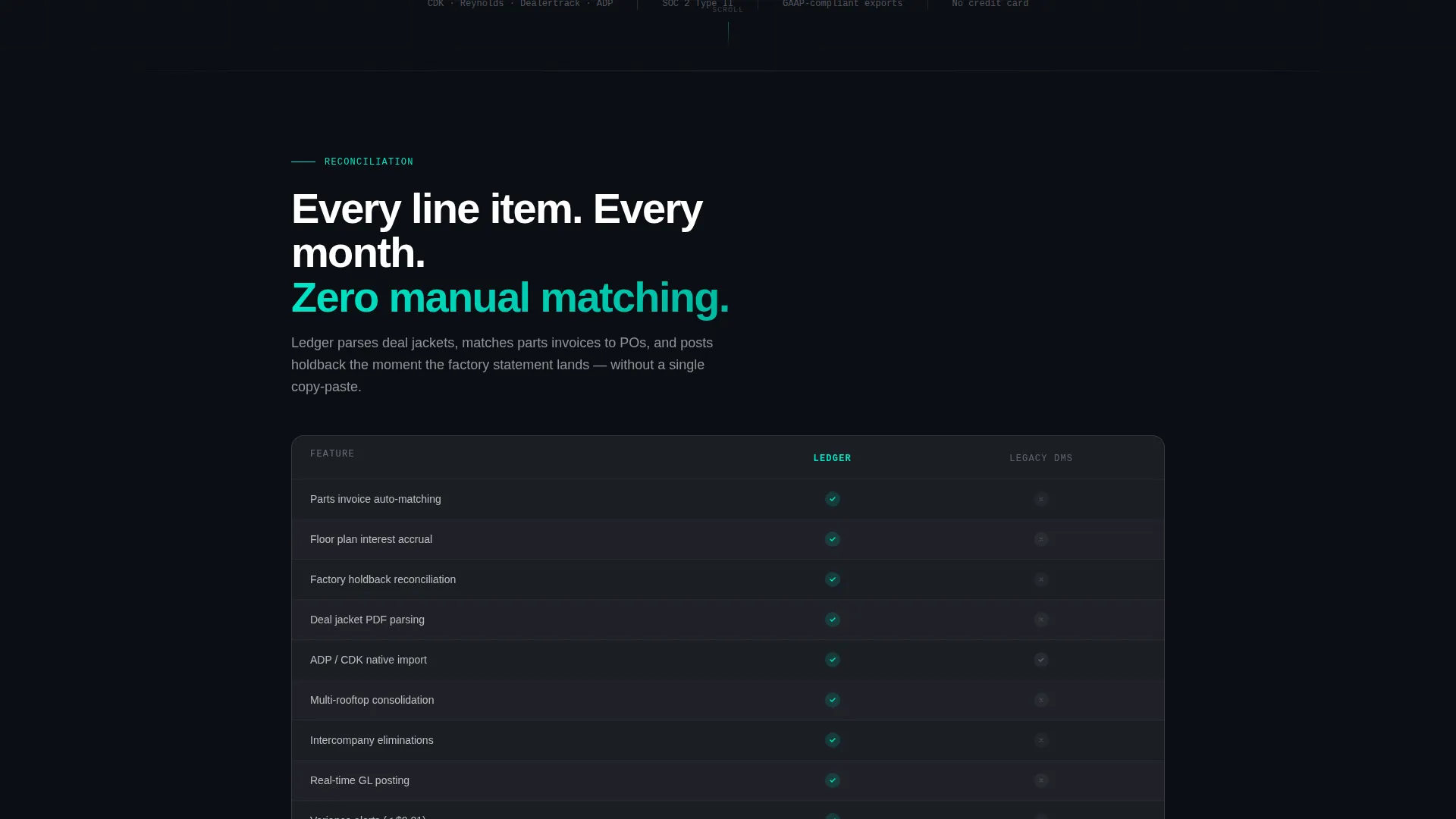
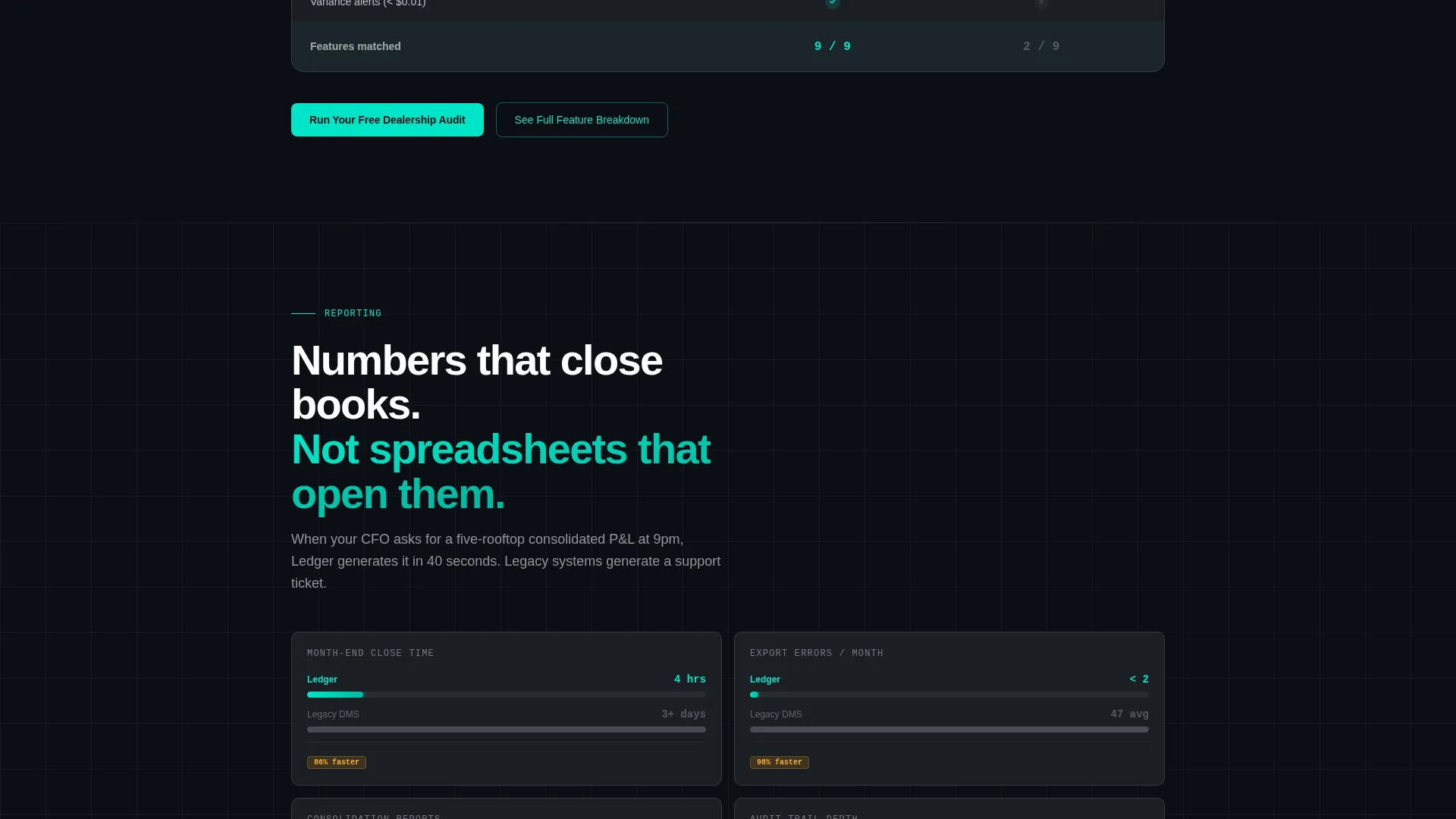
The five spoke sections are sequenced deliberately. The first shows feature parity, the second introduces performance metrics where the platform pulls ahead, and by the third the page is running animated bar charts. Competitor columns remain static gray while the platform column fills with teal, making the gap visually undeniable.
Frosted Modal Checklist
Each comparison section includes a ghost-button labeled "See Full Feature Breakdown." Clicking it opens a frosted-glass modal containing a granular checklist table. This gives detail-oriented buyers the depth they need without cluttering the main scroll flow.
Three-Field Audit Form
The primary call to action is "Run Your Free Dealership Audit." The form captures three fields only: dealer management system provider via a dropdown, rooftop count, and work email. The form appears at the hub and repeats at the end of every spoke section.
Warning Amber Competitive Callouts
The color amber is reserved exclusively for comparison callouts and competitive differentiators. It fires on pricing advantages, speed benchmarks, and missing-feature indicators in competitor columns. This controlled use of accent color trains the eye to locate the most persuasive data points instantly.
Page sections overview
| Section | Purpose |
|---|---|
| Dark Glass Header | Introduce the platform through live-styled data widgets and a parallax depth effect |
| Anchor Nav Bar | Lock five spoke links to the top so visitors can jump to any comparison section |
| Reconciliation Spoke | Compare reconciliation feature depth against a competitor baseline |
| Reporting Spoke | Show reporting metrics where the platform leads with teal-filled chart columns |
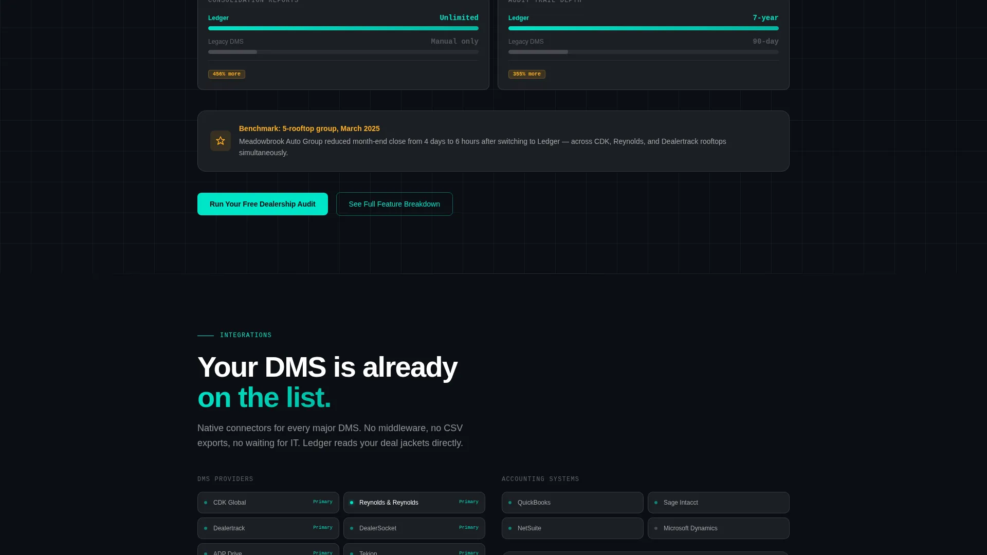
| Integrations Spoke | Stack animated bar charts for integration count with amber callouts on gaps |
| Speed Spoke | Present close-time benchmarks and export-error data in escalating visual format |
| Switch Spoke | Address switching concerns and build the case for migration as a logical next step |
| Final Audit call to action | Repeat the three-field form with full context after all five comparison sections |
Design & branding system
The visual identity follows a Data Command theme expressed through a glassmorphic color system. The palette feels like a heads-up display projected onto a rain-streaked windshield: dark, translucent, layered, and alive with signal.
- Core palette: deep cockpit black (#0B0E14) for backgrounds, frosted panel white at 12% opacity (#FFFFFF1F) for card surfaces, electric instrument teal (#00E5C7) for active states and data traces, and warning amber (#FFB020) reserved strictly for competitive callouts
- Frosted-glass cards use stacked layering with subtle backdrop blur; teal traces active navigation states, progress bars, and data visualizations
- Typography and numerals render in teal against near-black backgrounds, reinforcing the cockpit instrument aesthetic throughout the page
Mobile & speed optimization
The Ledger template is structured to maintain its visual hierarchy and conversion logic on smaller screens. The dark glassmorphic system translates naturally to mobile viewports where dark backgrounds reduce eye strain.
- The anchor navigation bar collapses into a compact frosted strip on mobile without losing spoke labels or scroll-anchor functionality
- Frosted-glass cards restack vertically on smaller screens so each data widget and comparison chart remains individually legible
- The three-field audit form is touch-optimized with a dropdown selector for dealer management system provider, keeping friction low on any device
How this template helps you convert
The Ledger template is built specifically around comparison-driven conversion. Every structural decision is designed to earn trust before asking for contact information.
- The header leads with the product interface rather than marketing copy, so analytical buyers immediately see what the platform does rather than reading claims about it
- The escalating spoke structure builds momentum section by section, using amber callouts and animated teal charts to make the competitor gap feel wider as the visitor scrolls deeper
- The three-field audit form appears only after each comparison battlefield has made its case, so the visitor reaches the call to action already convinced rather than still evaluating
Other information about this template
The Ledger template is designed as a standalone hub-and-spoke landing page rather than a multi-page site. It is purpose-built for automotive accounting software vendors competing in a market where buyers already use established dealer management platforms.
- The template is designed to work alongside platforms buyers already know, including CDK, Reynolds and Reynolds, and Dealertrack, which appear as dropdown options in the audit form's dealer management system field
- The "Launch Energy" creative direction is built into the scroll pacing: quiet confidence in the header, rising tension through the middle spokes, and a decisive close at the Switch section
- The frosted modal pattern keeps granular feature comparison data available without overwhelming the primary scroll narrative
- This template suits any automotive accounting software product that differentiates on reconciliation depth, close-time speed, or integration breadth compared to legacy back-office tools
Theme
Data Command
Creative direction
Launch Energy
Color system
Glassmorphic
Style
Hub & Spoke (Anchor Nav)
Direction
Comparison/Versus
Page Sections
Dark Glass Panel Header with Data Widgets
Sticky Hub-and-spoke Anchor Navigation
Escalating Animated Comparison Sections
Frosted Modal Feature Checklist
Three-field Low-friction Audit Form
Related questions
Who is the Ledger template designed for?
What is the primary call to action on this landing page?
How many spoke sections does the Ledger template include?
Can I replace the comparison data with my own benchmarks?
What is the purpose of the amber color in this template?



