Financial Services Software Cost Calculator Website Template
Ledger is a hub-and-spoke landing page template built for financial services case management platforms. It opens with a live triage calculator above the fold, then guides visitors through five anchor-nav spokes covering triage, routing, audit trail, reporting, and integrations. The Tech Glass visual system and dual-path lead generation setup make it ideal for compliance, claims, and operations teams.
by Rocket studio
Quick summary
Ledger is a single-page, anchor-nav landing page template designed for financial services case management platforms. It puts an interactive triage calculator above the fold, letting visitors simulate their own resolution savings before they scroll. Five spoke sections then build progressive proof, and a dual-path conversion strategy captures leads through a contextual form and a gated benchmarking report.
Who this template is for
This template is built for software vendors, product teams, and agencies marketing a financial operations case management platform to regulated institutions. It speaks directly to buyers inside those institutions who feel the daily weight of disconnected workflows.
- Compliance officers at regional banks managing Suspicious Activity Report (SAR) filings across multiple queues
- Claims managers at insurance carriers coordinating adjuster pipelines and resolution deadlines
- Operations directors at wealth management firms chasing case status across disconnected systems
What problem this template solves
Financial operations teams often rely on four or more separate tools to track a single case from intake to resolution. The result is missed Service Level Agreements (SLAs), audit gaps, and hours lost to manual status chasing. A generic software landing page cannot communicate the operational relief a purpose-built case management platform delivers.
- Visitors cannot picture the product's value without touching it first
- Scattered feature lists fail to map to real compliance and claims workflows
- Generic hero imagery undermines credibility with skeptical financial operations buyers
What you get with this template
You get a fully structured, single-page landing page with every section, interaction pattern, and conversion element already in place. The layout follows a hub-and-spoke architecture anchored by a persistent left-rail navigation.
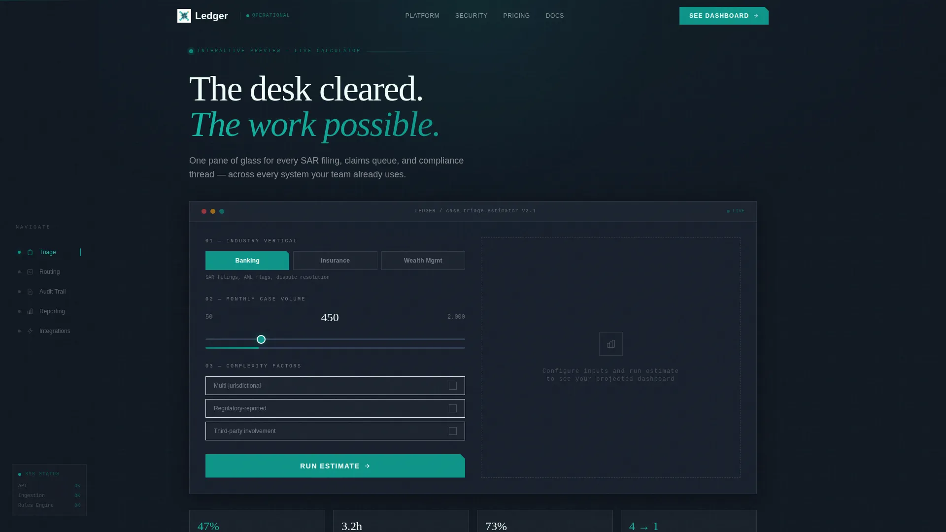
- An interactive case triage calculator embedded above the fold as the primary hero element
- Five dedicated spoke sections with micro-interaction openers tied to real case management workflows
- A dual-path lead generation system combining a progressive three-field form and a gated benchmarking PDF offer
Feature list
This template ships with six core capabilities drawn directly from the brief.
Interactive Case Triage Calculator
Visitors select their industry vertical from three glass-frosted tabs covering banking, insurance, and wealth management. They then set monthly case volume via a styled slider and toggle complexity factors such as multi-jurisdictional or regulatory-reported cases. The tool renders a simulated dashboard tile showing estimated resolution time savings, SLA compliance lift, and an animated case-flow diagram.
Hub-and-Spoke Anchor Navigation
A persistent anchor navigation rail locks to the left side of the page after the calculator section. Five spoke labels, Triage, Routing, Audit Trail, Reporting, and Integrations, let visitors jump directly to the section most relevant to their role without losing their place in the page flow.
Progressive Micro-Interaction Sections
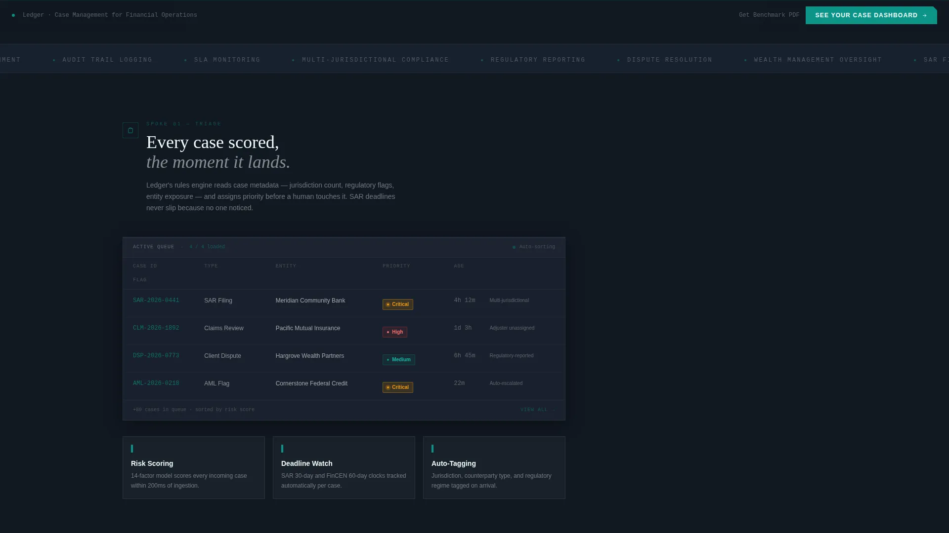
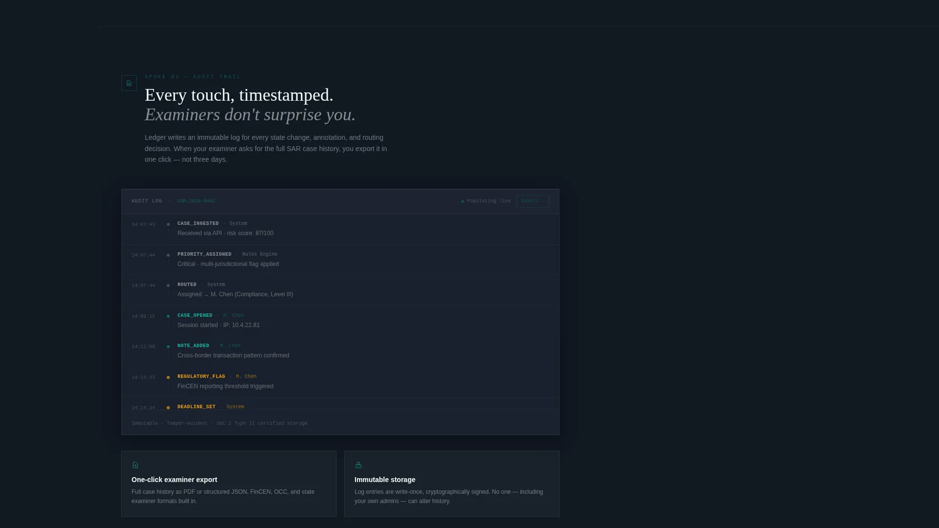
Each spoke section opens with a role-relevant micro-interaction: a case card sorting itself, a compliance flag auto-tagging, or an audit log populating in real time. These animated moments reinforce the product narrative at every scroll step without relying on static screenshots.
Dual-Path Lead Generation System
The primary call to action, "See Your Case Dashboard," appears first inside the calculator results and repeats in a persistent bottom bar after the second spoke. A secondary offer, a gated benchmarking report titled "Get the 2024 Financial Case Resolution Benchmark," appears after the Reporting spoke to capture research-stage visitors.
Three-Field Progressive Lead Form
Clicking the primary call to action opens a focused form with three fields: work email, institution type dropdown, and a single free-text line asking for the visitor's biggest case management challenge. The minimal field count reduces friction while capturing the context needed for meaningful follow-up.
Tech Glass Visual System
The entire template uses the Teal Catalyst color system: deep operational charcoal for the nav rail, catalyst teal for active states and data highlights, frosted panel white for card surfaces, and signal amber reserved exclusively for alerts and priority badges. The result is a layered glass-card aesthetic that feels like a live operational dashboard.
Page sections overview
| Section | Purpose |
|---|---|
| Calculator Hero | Triage calculator with industry tabs, volume slider, and animated results tile |
| Anchor Nav Rail | Persistent left-rail spoke navigation locking after the hero |
| Triage Spoke | Case intake and sorting workflow with opening micro-interaction |
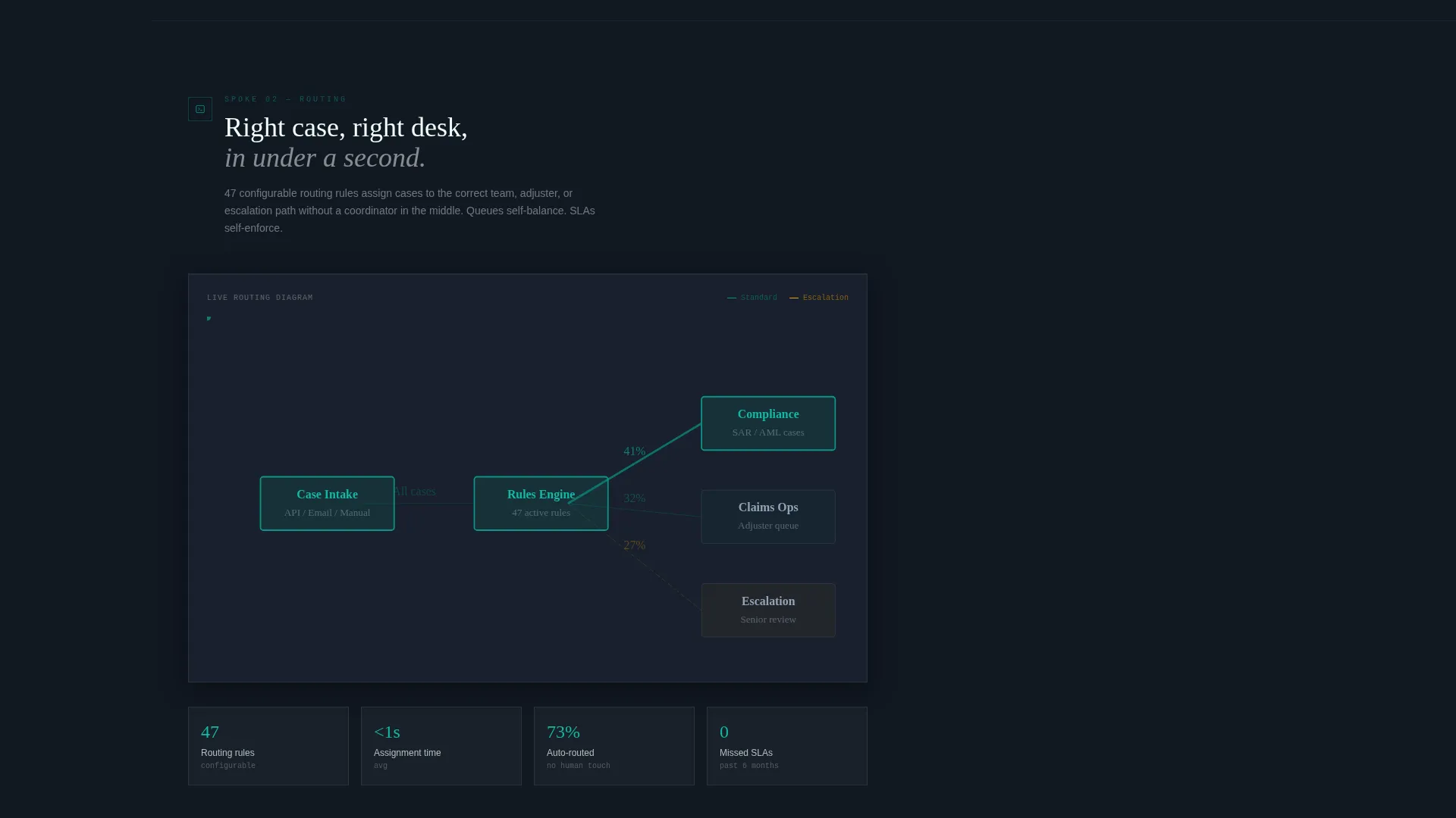
| Routing Spoke | Adjuster and compliance queue routing with animated case card |
| Audit Trail Spoke | Real-time audit log population with compliance flag auto-tagging |
| Reporting Spoke | Dashboard reporting view with benchmarking PDF lead capture |
| Integrations Spoke | Integration context section anchored to the spoke nav |
| Primary call to action Bar | Persistent bottom bar repeating the "See Your Case Dashboard" call to action |
| Progressive Lead Form | Three-field form opening from the primary call to action |
Design & branding system
The template follows the Tech Glass theme using the Teal Catalyst color system. Every color has a defined role, preventing visual noise and ensuring operational clarity at a glance.
- Deep operational charcoal (#1B2431) anchors the persistent anchor nav rail and page background
- Catalyst teal (#0D9488) drives all interactive elements, progress indicators, and data highlights
- Frosted panel white (#F0FDFA) surfaces every card panel, creating layered glass-card depth
- Signal amber (#F59E0B) appears exclusively on alert badges and priority indicators, never decoratively
Mobile & speed optimization
The layout is structured for responsive rendering across screen sizes, with the anchor nav rail adapting to smaller viewports without losing spoke accessibility. The interactive calculator is designed to remain functional and legible on touch devices.
- Glass-card panels reflow into a single-column stack on mobile without breaking the layered depth effect
- The persistent bottom call-to-action bar stays visible on all screen sizes, keeping the primary conversion path accessible
- Micro-interactions are scoped to individual spoke sections, so they trigger only when the relevant section enters the viewport
How this template helps you convert
The conversion strategy is built around progressive trust, not pressure. Visitors earn belief in the platform by using it before they ever see a form.
- The interactive calculator creates a personalized, role-specific result before any sales language appears, turning a cold visit into a relevant simulation that primes the visitor for the primary call to action.
- The gated benchmarking PDF offer after the Reporting spoke catches visitors who need internal evidence before booking a demo, capturing a second conversion path without duplicating the primary form.
Other information about this template
Ledger is part of a template category targeting financial services software vendors who need landing pages that can hold the attention of skeptical, senior operational buyers. A few additional details worth noting:
- The template style is Hub and Spoke with Anchor Navigation, a layout pattern well suited to platforms with multiple distinct feature areas
- The creative direction is Calculator or Tool First, meaning the interactive element replaces a traditional hero image entirely
- The header concept is Interactive Preview, which means the product experience is the first thing a visitor touches
- The lead generation direction supports both a direct demo request path and a content download path in a single page
- The template is categorized under Technology and the Financial Services Software subcategory, positioning it for SaaS and platform vendors in regulated industries
Theme
Tech Glass
Creative direction
Calculator/Tool First
Color system
Teal Catalyst
Style
Hub & Spoke (Anchor Nav)
Direction
Lead Generation
Page Sections
Interactive Case Triage Calculator
Hub-and-spoke Anchor Navigation
Progressive Micro-interaction Sections
Dual-path Lead Generation
Three-field Progressive Lead Form
Tech Glass Visual Identity
Related questions
Can I customize the industry tabs in the triage calculator?
Does the template include the benchmarking PDF content?
Can the anchor nav spoke labels be renamed?
Is this template suitable for a single-vertical platform?
How does the dual-path lead generation work in practice?



