Ledger - Powerful Compliance Landing Page Template
Ledger is a bento grid landing page template built for financial compliance knowledge bases. It combines a Dashboard Pro aesthetic with a Slate and Sky color system, dark glass panel headers, and a feature matrix scroll layout. Compliance officers, independent advisers, and fintech ops teams get a polished, information-dense page that converts through interactive workflow comparison and a gated live search experience.
by Rocket studio
Quick summary
Ledger is a single-page bento grid template designed for financial services knowledge bases. It presents regulatory content, compliance frameworks, and advisory playbooks through a structured, terminal-inspired interface. The layout guides visitors from a frosted-glass header through a scrolling feature matrix, ending at a two-column workflow comparison tool that earns sign-ups before asking for them.
Who this template is for
This template is built for teams and professionals who live inside compliance workflows every day. It speaks directly to people who need fast, credible access to regulatory content rather than a polished marketing brochure.
- Compliance officers at mid-tier broker-dealers who need a reliable reference hub
- Independent registered investment advisers (RIAs) preparing for SEC examination cycles
- Fintech operations teams managing licensing requirements across multiple states
What problem this template solves
Compliance research is fragmented by nature. Scattered PDFs, outdated bookmarks, and expensive legal counsel hours create real risk when a filing deadline arrives at 2 a.m. This template gives that problem a visual answer before a visitor even reads a word of body copy.
- The interface itself signals organization, replacing the anxiety of a cluttered workflow
- The feature matrix directly compares the knowledge base against manual search and generic alternatives
- The interactive comparison tool surfaces time-to-answer and coverage gaps in a way plain copy cannot
What you get with this template
You get a fully structured bento grid landing page that functions as both a marketing asset and a product demonstration. Every section is designed to build trust and reduce hesitation at once.
- A frosted dark glass panel header displaying live-looking content categories
- A scrolling feature matrix with stat callouts, micro-interaction tiles, and side-by-side comparisons
- A sticky call-to-action bar and a two-column interactive workflow comparison tool
- A gated live search experience that lets prospects run three real queries before sign-up
Feature list
This template ships with a cohesive set of design and interaction components drawn directly from the source brief. Each one serves a specific purpose in the compliance buyer journey.
Dark Glass Panel Header
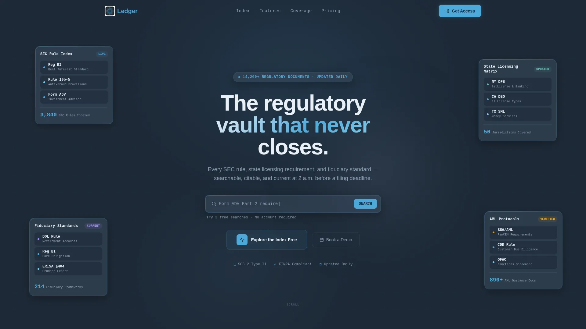
The header row uses translucent, frosted-glass cards floating against a deep charcoal background. Each panel displays a live-looking content category such as "SEC Rule Index" or "State Licensing Matrix," creating an immediate impression that the product is already running and organized.
Bento Grid Feature Matrix
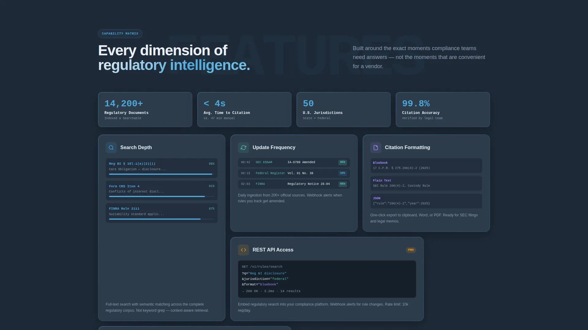
The main scroll area is a structured bento grid where each tile represents a capability dimension. Tiles alternate between stat callouts, micro-interaction elements like an auto-completing search bar, and side-by-side comparisons against outdated research methods. The rhythm tightens with each row, reinforcing urgency.
Sticky Workflow Comparison Bar
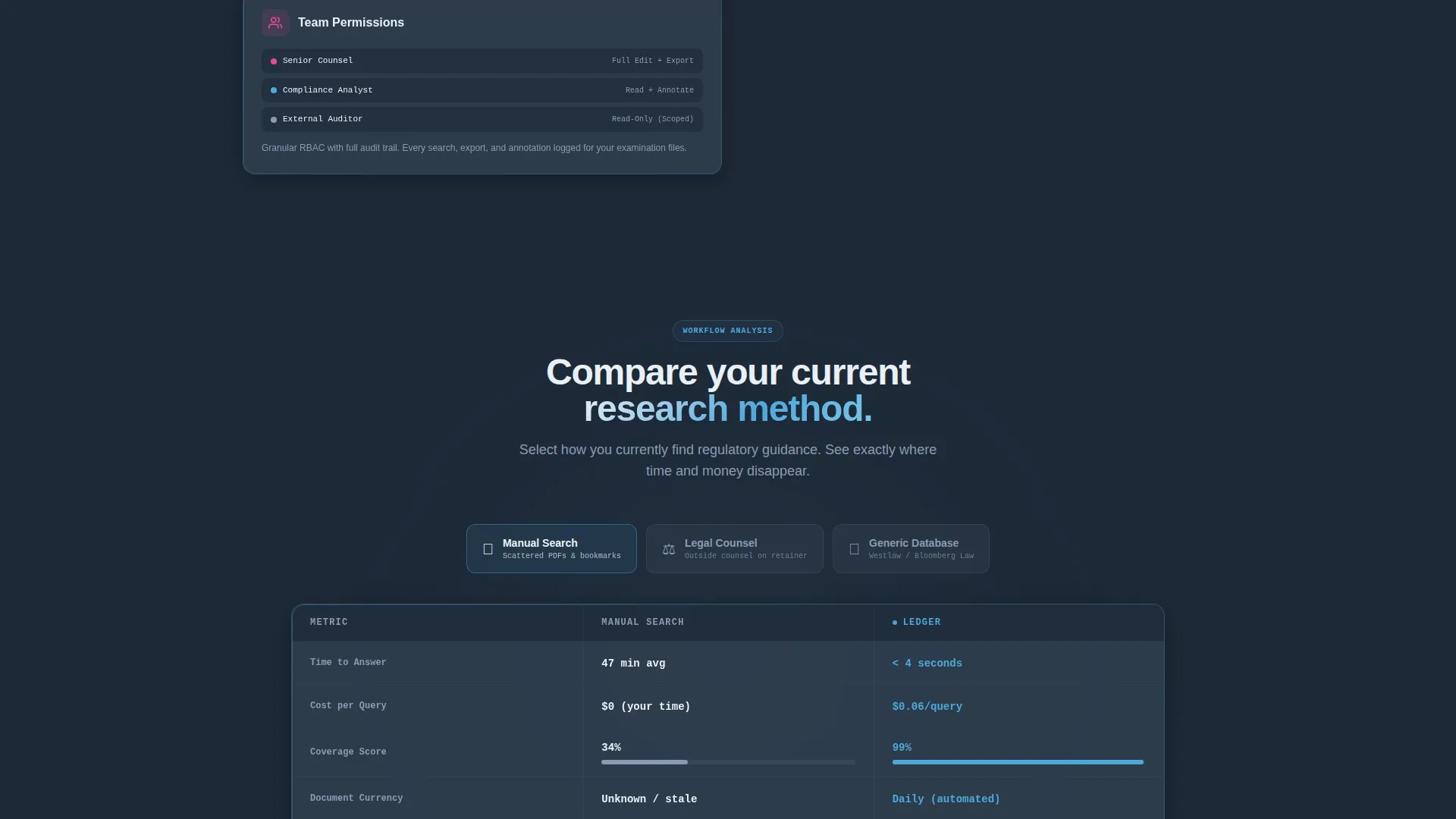
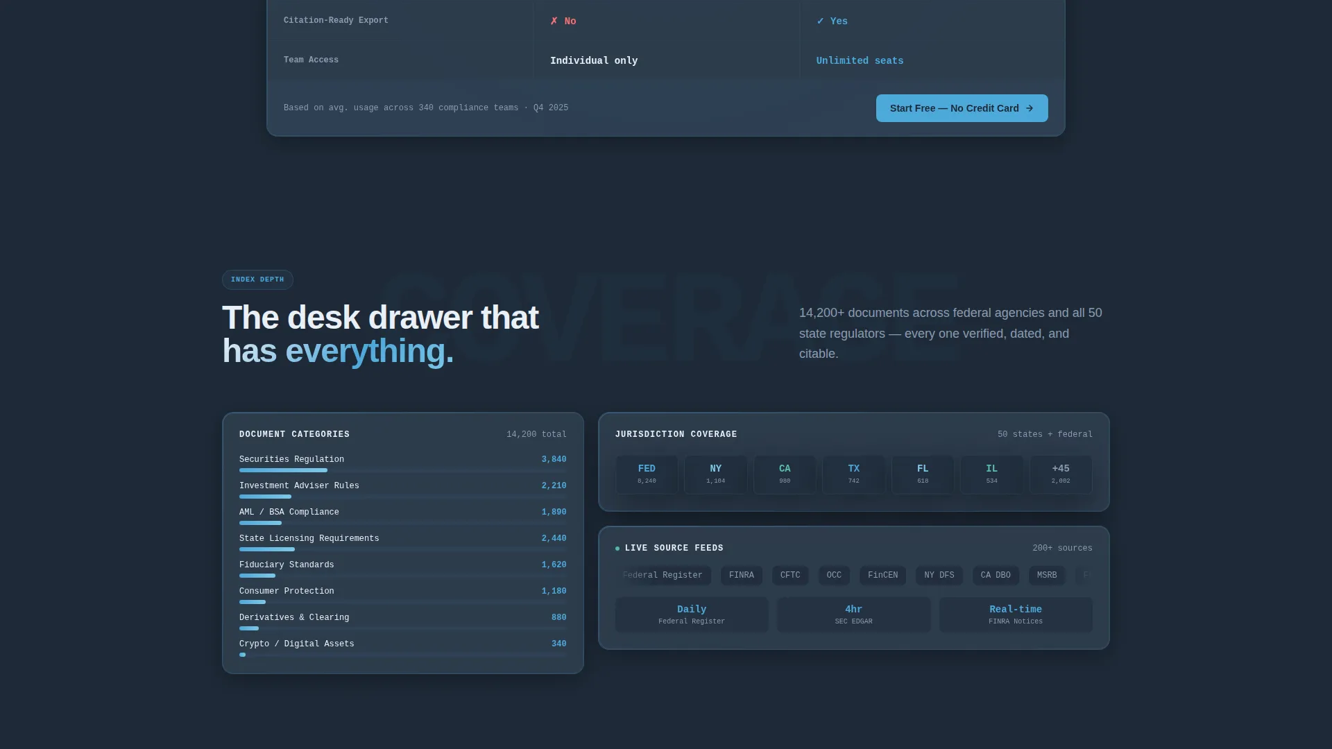
A persistent sticky bar carries the primary call to action: "Compare Your Current Workflow." It opens a two-column interactive tool where visitors select their current research method and see time-to-answer, cost-per-query, and coverage gaps mapped against the platform's benchmarks.
Gated Live Search Experience
The secondary conversion path lets prospects run up to three real regulatory queries before a sign-up gate appears. The gate asks for email, firm name, and role title in that order, leading with value before asking for commitment.
Dashboard Pro Typography System
Monospaced fonts handle all data labels and metric callouts, while a clean sans-serif carries headlines and body copy. The combination gives the interface a Bloomberg terminal density without sacrificing readability.
Stat Callout Tiles
Individual bento tiles surface specific figures such as "14,200 plus regulatory documents indexed." These callouts act as proof points embedded directly in the scroll flow, removing the need for a separate social proof section.
Page sections overview
| Section | Purpose |
|---|---|
| Dark Glass Header | Introduce content categories with frosted-glass panel cards |
| Stat Callout Tiles | Embed document-count proof points inside the scroll |
| Feature Matrix Grid | Compare capability dimensions against legacy research methods |
| Auto-Complete Search Bar | Demonstrate search depth with live regulatory query examples |
| Sticky Comparison Bar | Carry primary call to action persistently through the scroll |
| Workflow Comparison Tool | Map time, cost, and coverage gaps interactively |
| Gated Live Search | Let prospects run three queries before the sign-up gate |
| Sign-Up Gate | Collect email, firm name, and role title in that order |
Design & branding system
The visual identity is built on the Slate and Sky color system, a palette that reads like a Bloomberg terminal redesigned with Scandinavian restraint. Every color choice serves information hierarchy first.
- Deep charcoal slate (#1E2A38) anchors the primary background, keeping focus on content
- Mid-tone graphite (#3B4A5C) surfaces card backgrounds, separating tiles without loud contrast
- Horizon blue (#4DA8DA) marks active states and key metrics, acting as a small reward signal when a user finds what they need
- Pale cloud white (#EAF0F7) carries all body text and data labels for clean readability against dark surfaces
Mobile & speed optimization
The bento grid layout is structured to reflow gracefully across screen widths. The information-dense design stays usable on smaller viewports without sacrificing the terminal-like atmosphere.
- Bento tiles stack vertically on narrow screens, preserving the feature matrix reading order
- The sticky comparison bar remains accessible on mobile so the primary call to action is never out of reach
- Monospaced data labels and sans-serif headlines maintain visual hierarchy at all sizes
How this template helps you convert
The conversion strategy is built into the scroll itself. Visitors never hit a hard gate before they have experienced real product value.
- The sticky "Compare Your Current Workflow" bar stays visible throughout the scroll, lowering the friction of starting the comparison at any point in the visit.
- The three-query live search lets prospects verify coverage depth with their own real questions before the sign-up gate appears, making the ask feel earned rather than imposed.
Other information about this template
This template is part of a broader Dashboard Pro theme family and carries the full Slate and Sky color system across every component. It is matched to the Financial Services Digital Presence subcategory and the Financial Services Knowledge Base niche, making it a strong fit for technology-forward compliance products.
- The template style is classified as Bento Grid, suited for dense, multi-metric product presentations
- The creative direction follows a Feature Matrix approach, ideal for competitive positioning against manual or legacy workflows
- The header concept uses Dark Glass Panels, a visual pattern associated with high-trust financial data interfaces
- The landing page direction is Comparison and Versus, optimized for buyers actively evaluating alternatives
Theme
Dashboard Pro
Creative direction
Feature Matrix
Color system
Slate & Sky
Style
Bento Grid
Direction
Comparison/Versus
Page Sections
Dark Glass Panel Header
Bento Grid Feature Matrix
Sticky Workflow Comparison Bar
Gated Live Search Flow
Stat Callout Tiles
Dashboard Pro Typography System
Related questions
Who is this template designed for?
Can I customize the colors and typography?
How does the gated live search flow work?
What makes a bento grid the right layout for a compliance product?
Does the template include the interactive comparison tool?



