Dental Billing Landing Page Template for Revenue Teams
Ledger is a dental billing landing page template built for billing services and software providers targeting solo practitioners, group practices, and dental service organizations. It combines an interactive billing calculator, versus-comparison card grids, and dark glass panel metrics to show prospective clients exactly what uncollected revenue is costing them before they ever fill out a form.
by Rocket studio
Quick summary
Ledger is a single-page dental billing and invoicing landing page template. It opens with live-looking metric panels, then draws visitors into an interactive calculator that quantifies their collections gap. Every section below reinforces that number through versus-comparison card grids, moving from daily tasks to annual revenue impact in one focused scroll.
Who this template is for
This template is designed for dental billing companies, revenue cycle management services, and dental software providers that need to convert skeptical practice owners into paying clients. It speaks directly to the people managing money in dental practices.
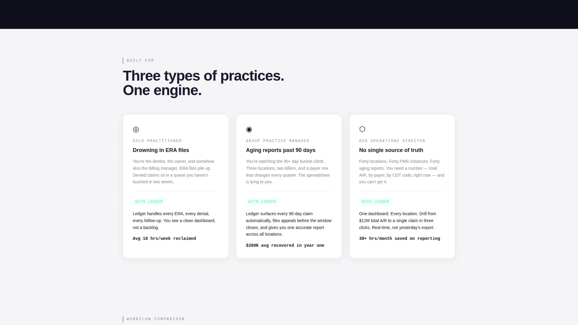
- Solo practitioners overwhelmed by explanation of benefits files and denied claims
- Group practice managers watching accounts receivable aging reports climb past ninety days
- Dental service organization operations directors who need a unified view across dozens of locations
What problem this template solves
Dental billing services struggle to explain their value in abstract terms. Prospects nod along but never feel the cost of their current workflow. This template solves that disconnect by making the financial gap visible and personal before asking for a commitment.
- Visitors calculate their own monthly claim volume loss in real time, so the pain is quantified rather than implied
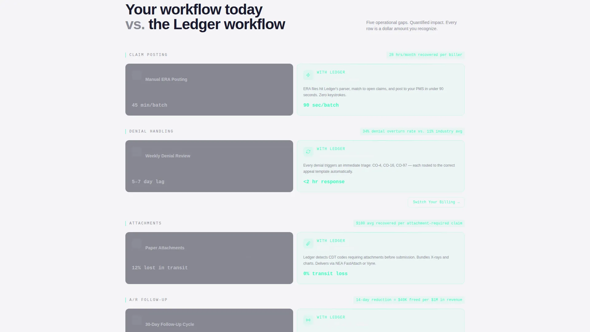
- Side-by-side versus cards expose the gap between manual and automated billing workflows at every scroll step
- The call to action only appears after the visitor already sees their own number, which removes the skepticism that kills most billing service pages
What you get with this template
You get a complete, production-ready dental billing landing page built around a Calculator/Tool First creative direction. Every section is designed to build financial urgency without relying on stock imagery or generic sales copy.
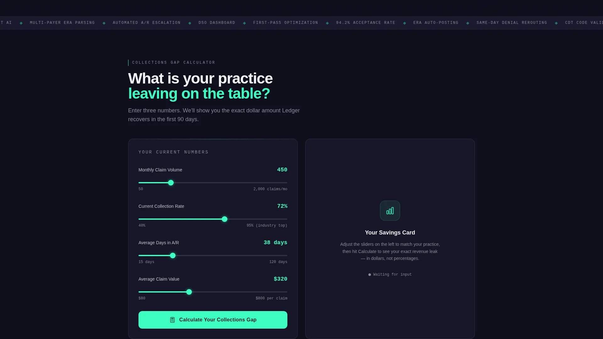
- An interactive billing calculator with three inputs and a personalized savings card output
- A full set of versus-comparison card grid modules covering daily, monthly, and annual revenue views
- A dark glass panel header with animated counter metrics and a free accounts receivable audit secondary conversion path
Feature list
This template ships with a focused set of high-impact components. Each one earns its place by moving the visitor one step closer to the primary call to action.
Dark Glass Panel Header
Three translucent, frosted-glass metric cards hover over a deep forge-black field. Each card displays a live-looking figure: average days to payment, first-pass claim acceptance rate, and revenue recovered from denied claims. Numbers appear to tick upward in a slow counter animation, and mint-colored edges give the data a faintly operational glow.
Interactive Billing Calculator
A modular billing calculator slides into view as the first interactive element on the page. Visitors enter monthly claim volume, current collection rate, and average days in accounts receivable. The moment they submit, the page generates a personalized savings card that anchors every comparison section below.
Versus Comparison Card Grids
Each scroll section renders as a pair of side-by-side mini-cards: the visitor's current workflow on one side, the Ledger workflow on the other. Comparisons cover manual posting versus auto-posting, paper attachments versus digital attachment processing, and thirty-day follow-up cycles versus same-day denial rerouting.
Escalating Scroll Stakes Structure
The page is organized so stakes increase with every row. Sections move from daily task comparisons to monthly revenue impact to annual profit delta. Each row references the number the visitor generated in the calculator, keeping the financial argument personal and cumulative.
Dual Conversion Path Design
The primary call to action, "Calculate Your Collections Gap," lives inside the calculator first and then reappears at the bottom of every versus row as "Switch Your Billing." A secondary path offers a free accounts receivable audit where the visitor can upload a redacted aging report. Both paths are present without competing.
Page sections overview
| Section | Purpose |
|---|---|
| Dark Glass Header | Display live-looking billing metrics with counter animation |
| Tagline Row | Anchor visitor attention with a single bold challenge line |
| Billing Calculator | Capture inputs and generate a personalized savings card |
| Personalized Savings Card | Anchor the financial gap number for all sections below |
| Daily Task Versus | Compare manual posting against auto-posting workflows |
| Attachment Versus | Contrast paper attachments with digital attachment processing |
| Denial Rerouting Versus | Show thirty-day follow-up against same-day denial handling |
| Monthly Revenue Module | Scale the daily gap into a monthly revenue impact view |
| Annual Profit Delta | Extend the argument to a full-year profit comparison |
| Primary call to action Row | Resurface "Switch Your Billing" with urgency framing |
| Free A/R Audit Form | Offer a low-commitment secondary conversion entry point |
Design & branding system
The visual identity follows a Startup Velocity theme built on a Monochrome Steel color system. Every color decision has a clear function: forge black grounds the page, cool-white carries readable type, brushed chromium defines card borders, and electric mint signals action and live data.
- Core palette: forge black (#1A1A2E) for backgrounds, brushed chromium (#C0C0C8) for card borders and surface detail, cool-white panel (#F4F4F6) for light-background sections, and electric mint (#3DFFC0) strictly reserved for interactive states and live data pulses
- Typography follows surface logic: cool-white type on dark backgrounds, forge-black type on light panels, with electric mint appearing only on clickable elements and animating numbers
- Background rows alternate between forge black and cool-white, creating a natural rhythm that prevents visual fatigue across a long comparison-heavy page
Mobile & speed optimization
The card grid layout is modular by design, which makes it straightforward to adapt for smaller screens. Each versus comparison pair stacks vertically on mobile without losing the side-by-side logic that drives the argument.
- Modular card components reflow cleanly from two-column desktop grids to single-column mobile stacks
- The billing calculator inputs are touch-friendly form fields that work within the same visual container on any screen width
- No stock photography or heavy image assets are used anywhere on the page, keeping the visual weight low across all device types
How this template helps you convert
The conversion strategy is built around showing visitors their own financial cost before presenting any offer. This sequencing removes the need for hard selling because the visitor does the persuasion work themselves.
- The billing calculator forces a specific, personal number onto the screen in the first interaction, making the cost of inaction concrete rather than theoretical.
- Versus-comparison card grids repeat and reinforce that number at every scroll step, so by the time the call to action appears, the visitor has already built their own case for switching.
- The dual-path design catches two types of buyers: those ready to act immediately with the primary call to action, and those who need one more proof point with the free accounts receivable audit offer.
Other information about this template
This template is built for billing service providers and dental software companies that sell to practices of any size. It is equally usable for a solo billing consultant and a venture-backed dental revenue cycle platform.
- The template style is Card Grid (Modular), making individual sections easy to reorder, remove, or duplicate without breaking the overall layout
- The Startup Velocity theme gives the page an operational, data-forward aesthetic that reads as credible to financially oriented buyers rather than clinical or generic
- The no-photography creative direction keeps the page feeling like a professional financial tool rather than a healthcare marketing brochure
- Current Dental Terminology codes, commonly referred to as CDT codes, are referenced in the template context, signaling that the page is built for an audience fluent in dental billing specifics
- The free accounts receivable audit conversion path is designed to work as a standalone lead capture option for prospects who are not yet ready to commit to a full service engagement

Theme
Startup Velocity
Creative direction
Calculator/Tool First
Color system
Monochrome Steel
Style
Card Grid (Modular)
Direction
Comparison/Versus
Page Sections
Dark Glass Panel Header with Live Metrics
Interactive Billing Calculator
Versus Comparison Card Grid Modules
Escalating Revenue Stakes Layout
Dual Conversion Path System
Related questions
Who is this landing page template built for?
What makes this template different from a generic SaaS landing page?
Can the calculator section be pre-filled with example numbers?
Do I need design experience to customize this template?
Does this template work for dental service organizations with multiple locations?



