Specialist Dental Software Cost Estimator Website Template
Ledger is a dashboard-style dental donor management landing page template built for platforms that track donated supplies across clinics, nonprofits, and mobile outreach units. It features an interactive preview header, a Problem-to-Solution scroll arc, a live comparison toggle, and a calculator modal, designed to make surplus waste feel numerically undeniable before asking for a single detail.
by Rocket studio
Quick summary
Ledger is a single-page landing page template built for a dental donor management platform. It opens with a live dashboard preview, walks visitors through a structured Problem-to-Solution arc, and anchors mid-page conversion with a side-by-side operational comparison and an interactive surplus calculator. Every scroll step turns another module of the platform visually "on."
Who this template is for
This template is built for organizations and teams that manage donated dental supplies at scale. It speaks directly to the people doing the operational work, not just the decision-makers above them.
- Clinic operations managers reconciling expired instrument write-offs and surplus composite stock
- Nonprofit directors coordinating remote dental missions in underserved regions such as Appalachian and tribal communities
- University program leads redistributing simulation lab surplus to under-resourced practices
What problem this template solves
Donated dental supplies get lost, discarded, or misrouted because no single system connects donors, recipients, and logistics in one visible place. The landing page leads with that reality before introducing any solution.
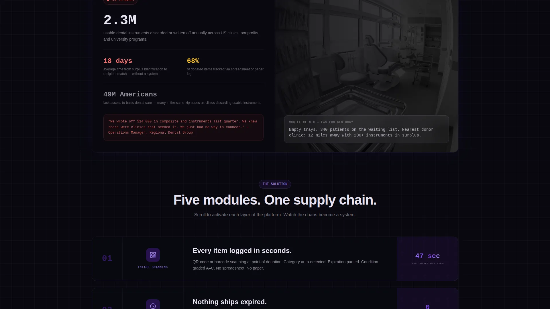
- Roughly 2.3 million usable dental instruments are discarded annually, a figure the page surfaces upfront in a stark data card
- Operations teams waste hours on manual spreadsheets, paper logs, or no tracking system at all
- Donors lose confidence when they cannot verify where their surplus ended up or access documentation for tax purposes
What you get with this template
You get a complete, scroll-driven landing page layout with interactive user interface components, a cohesive visual system, and a clear conversion structure. Every section is built and ready to configure for a dental donor management platform.
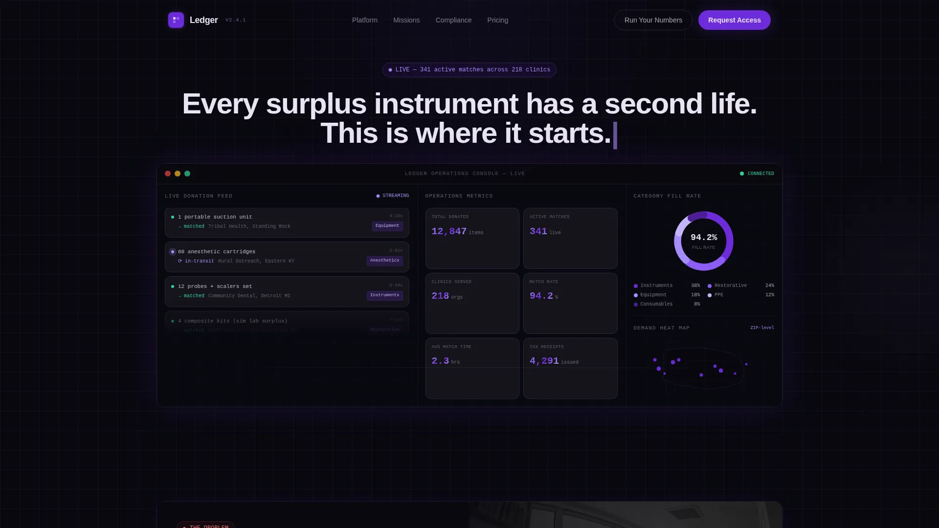
- A full-viewport interactive dashboard header with a live feed column, donut chart, and geographic heat map
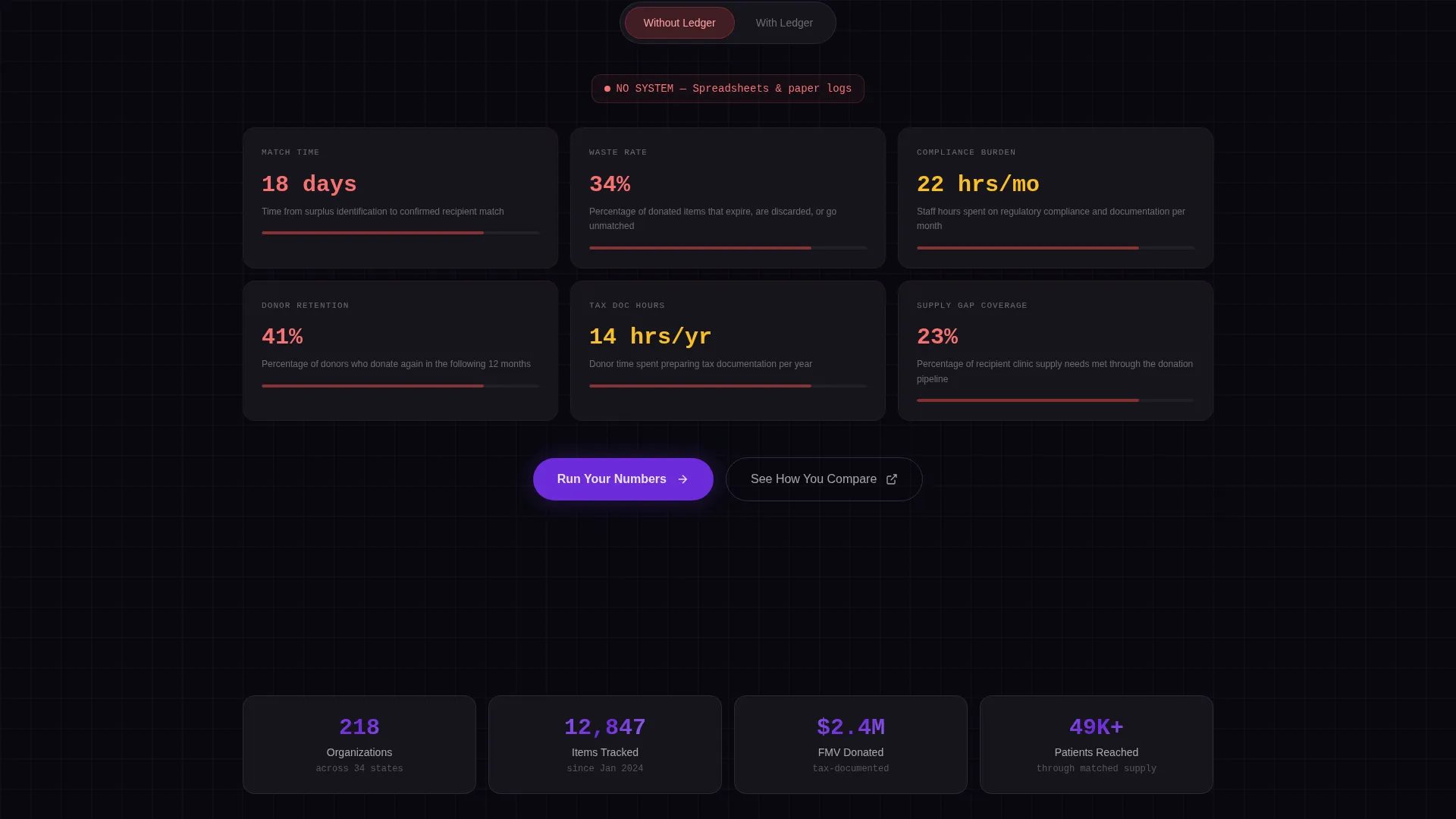
- A mid-page comparison toggle covering six operational metrics with animated value transitions
- A calculator modal and a benchmark report secondary path, both wired to the primary call-to-action flow
Feature list
This template delivers a connected set of purpose-built components. Each one addresses a specific friction point in how platform visitors understand, evaluate, and act on what they see.
Interactive Dashboard Header
The header renders a functioning dashboard mockup at full viewport width. A live feed column cascades real donation entries, a donut chart displays category fill rates, and a violet-pulsing geographic heat map highlights underserved ZIP code areas. Hovering any grid cell triggers tooltip population. The headline types itself letter by letter above the dashboard.
Problem-to-Solution Scroll Arc
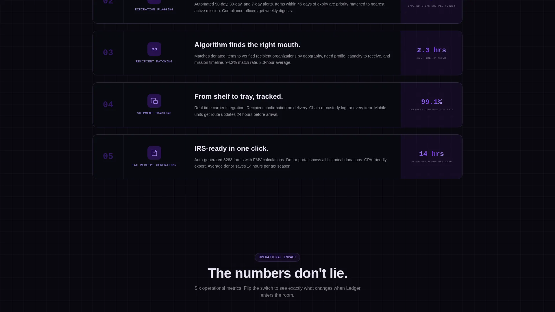
Each scroll section introduces one platform module: intake scanning, expiration flagging, recipient matching, shipment tracking, and tax-receipt generation. Sections open in grayscale and transition to full Void and Violet color as the visitor scrolls, creating a visual metaphor of turning the system on, module by module.
Comparison Toggle Component
A fixed-position toggle near mid-page lets visitors flip between "Without Ledger" and "With Ledger" states. Six operational metrics animate their values in real time: match time, waste rate, compliance burden, donor retention, tax documentation hours, and supply gap coverage.
Surplus Calculator Modal
The primary call-to-action button opens a lightweight modal. It asks for monthly surplus volume, number of partner clinics, and current donation method selected from a dropdown including spreadsheet, paper logs, or no system. The result frames the visitor's current inefficiency in concrete numbers.
Benchmark Report Secondary Path
A secondary call-to-action labeled "See How You Compare" routes visitors to an anonymized benchmark report. This path serves visitors who are not yet ready to enter their own data but want context about how peers operate.
Void and Violet Visual System
The entire template uses a strict four-value color system: absolute void black, deep orbital violet, a frosted glass panel at 60% opacity over dark backgrounds, and a clinical UV accent on hover states and live data pulses. The aesthetic reads like a surgical-grade screen glowing in a dim server room.
Page sections overview
| Section | Purpose |
|---|---|
| Interactive dashboard header | Opens with a live-feed mockup and animated headline to establish platform credibility immediately |
| Problem data card | Surfaces the 2.3 million discarded instruments statistic beside a mobile clinic image to create urgency |
| Intake scanning module | Introduces the first solution layer with a grayscale-to-color activation transition |
| Expiration flagging module | Shows automated expiration alerts as the second layer of the platform turning on |
| Recipient matching module | Visualizes the algorithm that connects surplus to specific recipient needs |
| Shipment tracking module | Demonstrates how supply movement is followed from donor to destination |
| Tax receipt module | Presents documentation generation as the final solution layer in the arc |
| Comparison toggle section | Lets visitors toggle between operational states across six metrics with animated value changes |
| Calculator modal trigger | Anchors the primary call-to-action with a personalized surplus calculation prompt |
| Benchmark report path | Offers a low-commitment secondary path to anonymized peer comparison data |
Design & branding system
The template uses a Tech Glass visual theme with a Void and Violet color system. Every surface decision reinforces the feeling of a precise, data-forward platform built for operational trust.
- Four-value palette: absolute void black (#09090F), deep orbital violet (#6C2BD9), frosted glass panel (#E8E3F3) at 60% opacity, and clinical UV accent (#A78BFA) for hover states and live data pulses
- Frosted glass panels layer over dark backgrounds to create depth without visual clutter, giving data grids a translucent, surgical quality
- Grayscale-to-color section transitions serve as a structural animation system, marking each solved problem as a new module activates during scroll
Mobile & speed optimization
The template is designed with responsive layout behavior in mind. Interactive components such as the dashboard mockup, comparison toggle, and calculator modal are structured to function across screen sizes.
- The full-viewport dashboard header adapts its grid layout so key data points remain visible and legible on smaller screens
- Hover-activated tooltip states are designed with touch-equivalent interactions in mind for mobile visitors
- The fixed-position comparison toggle maintains its usability across viewport widths without obstructing primary content
How this template helps you convert
This template is structured to move visitors from skepticism to action by making their current situation feel measurably inefficient before presenting any sign-up prompt.
- The page opens with a live operational dashboard that signals platform maturity immediately, reducing early-stage doubt before a visitor has read a single word of copy.
- The comparison toggle and calculator modal work together to personalize the value case, so visitors are not reacting to generic claims but to numbers derived from their own surplus volume and workflow.
Other information about this template
This template is a strong fit for dental software platforms operating in the donation management and supply redistribution space. It is also relevant to broader healthcare logistics and medical supply tracking contexts where visual clarity and operational credibility are essential.
- The template style is a Dashboard and Data Grid layout, which suits any data-heavy platform that needs to demonstrate live functionality before asking for user commitment
- The Tech Glass theme and Void and Violet color system give this template a distinctive identity that stands apart from generic healthcare or nonprofit landing page designs
- The Problem-to-Solution Arc creative direction and Comparison and Versus landing page direction are both well-suited to platforms competing against manual or legacy workflows
- Template category is Technology, subcategory Dental Software, and niche is Dental Donor Management
Theme
Tech Glass
Creative direction
Problem→Solution Arc
Color system
Void & Violet
Style
Dashboard/Data Grid
Direction
Comparison/Versus
Page Sections
Interactive Full-viewport Dashboard Header
Problem-to-solution Scroll Arc
Comparison Toggle with Six Live Metrics
Personalized Surplus Calculator Modal
Benchmark Report Secondary Path
Tech Glass Void and Violet Visual System
Related questions
Who is this template built for?
Can I update the comparison toggle metrics for my platform?
What inputs does the calculator modal collect?
Is this template usable outside of dental donation contexts?
What is the secondary call-to-action path?



